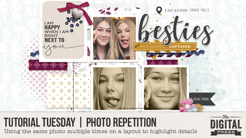
Tutorial Tuesday | Photo Repetition

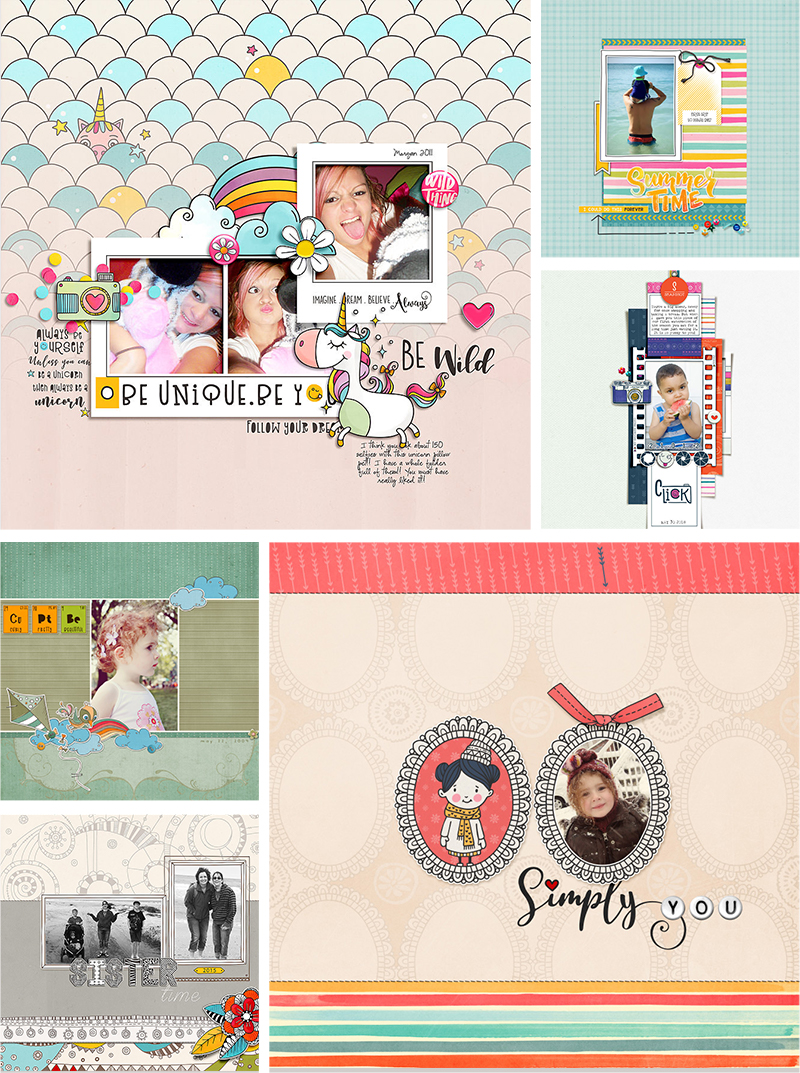
Greetings happy scrappers, and welcome to another edition of our Tutorial Tuesday series here on The Digital Press blog! This week, I am going to share some creative ways to use the same photo multiple times on your layout in order to draw attention to and highlight the important details, and more!

Using the same photo repetitively on your page is also a fantastic way to bring cohesiveness and interest to your project. As with every aspect of scrapping, there is no right or wrong way to use a photo more than once on your page… and it is fun to try different techniques!

Therefore, I’ve compiled the following list of tips/ideas for doing so…


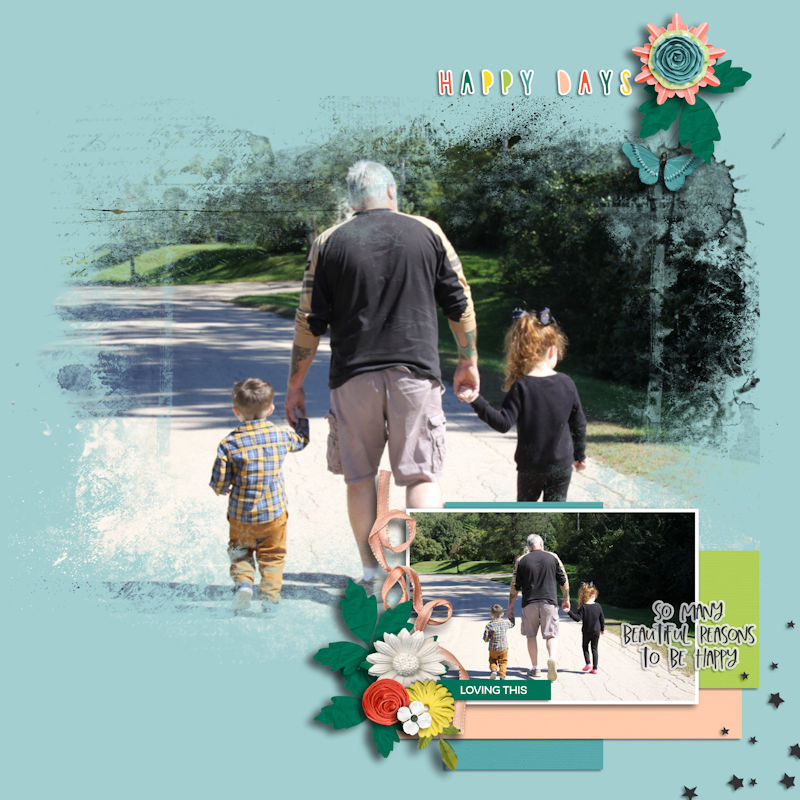
Blended photo | In the two examples shown here, the duplicated photo has been subtly blended into the background. Placement of the blended photo is important, because you want the viewer to be able to see the main subject of the photo…
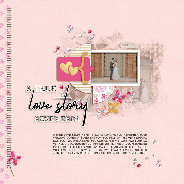
Whether the blended photo takes up a portion of the background, or fills the entire background, the effect gives the page a soft, airy feeling…

Cropped photo | Cropping the duplicated photo is a great way to emphasize your favorite part of the picture. The cropped photo can be laid on your page as a shape (square, rectangle, triangle, etc.), or the cropped area can be blended into the background. Either way, the duplicated photo provides a path for the viewer to follow on your layout…
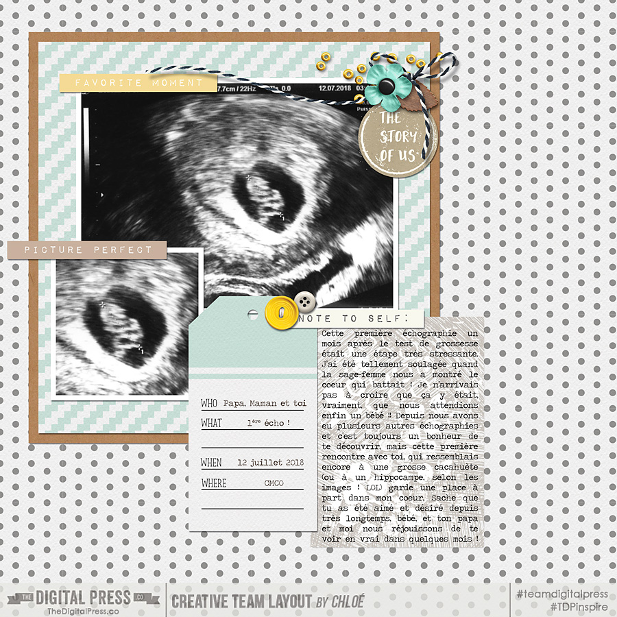
In each of these two examples, the most important part of each photo has been cropped and placed strategically on each page, creating visual triangle…
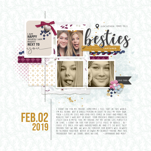
Here’s another example in which the image on the left is simply a cropped/zoomed-in version of the same photo on the right…
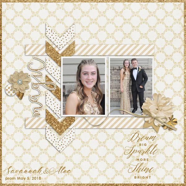

Creative cropping | In the next example, not only is the cropping super creative, but changing the photo to black and white gives the page some added interest. Think outside of the box when duplicating your photo!
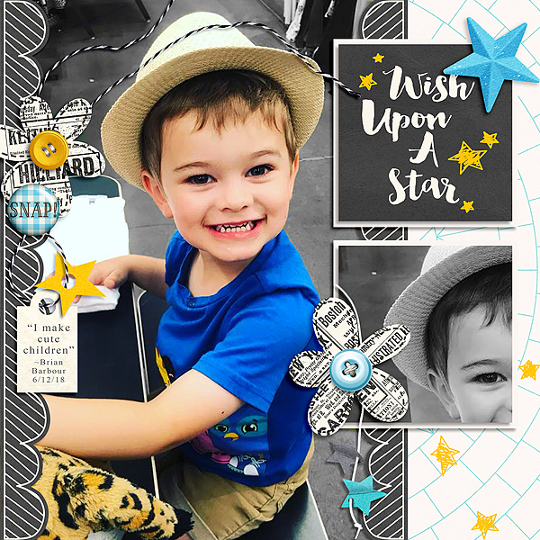

Macro cropping | Cropping the photo so it appears that it was taken using a macro lens really adds a fun aspect to the layout. When using this technique it can appear that you have used two totally different photos, when in fact it is the same one duplicated…
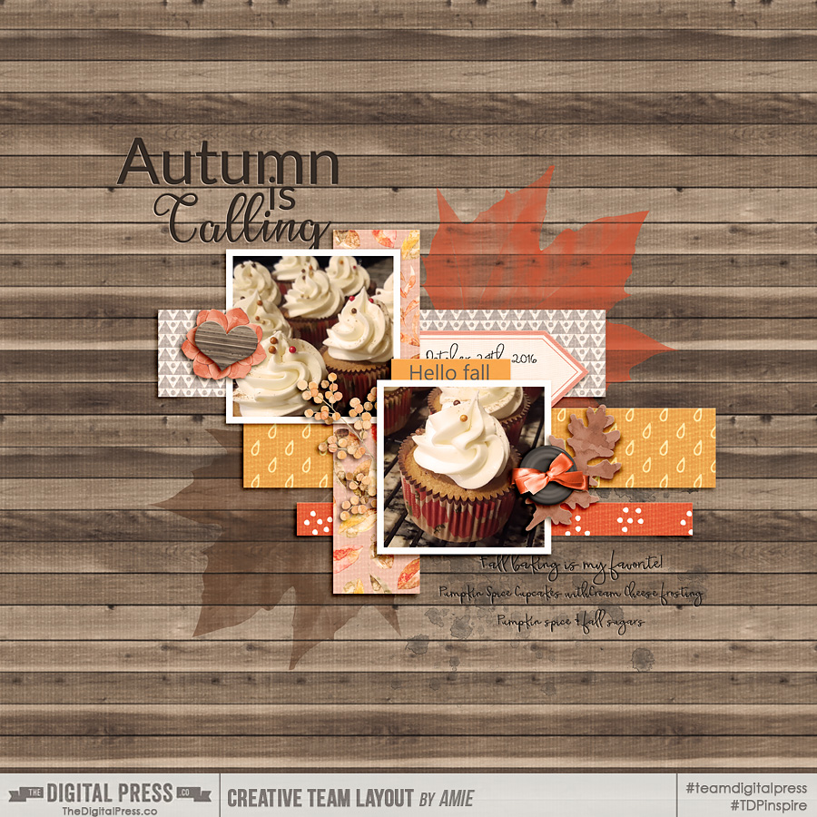
KIT & TEMPLATE: As the Leaves Turn by Designed by Irma: http://shop.thedigitalpress.co/As-the-leaves-turn-bundle.html
FONT: Touch by Karla Noel: http://shop.thedigitalpress.co/KN-Font-Touch.html

As you can see, using repetitive photos on your page is a great way to add interest to your pages… and really, the sky is the limit as to the ways the duplicated photo can be scrapped. Thanks for stopping by the blog today! I hope you’ll find this installment of Tutorial Tuesday to be useful the next time you work on a project!

Until next time… happy scrapping!!


About the Author  Jill W is a creative team member at The Digital Press and has been scrapping for over 13 years. She resides in Northwest Illinois. In addition to scrapping, she enjoys spending time with her family — especially her three young grandchildren (ages 6, 4 and 2). Retirement is getting closer for her, and she is anxious to travel the country with her husband, taking photos and scrapping them as they journey across the USA.

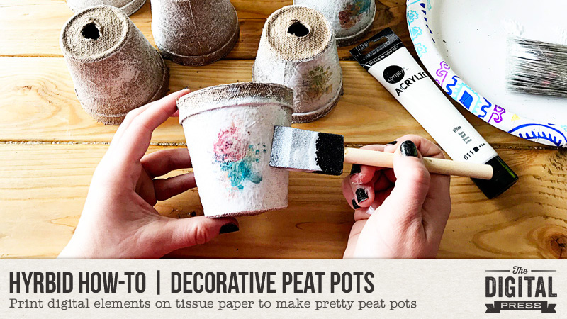
Hybrid How-To | Decorative Peat Pots

Hello, everyone, and welcome to another edition of our Hybrid How-To series here on The Digital Press blog! Today I am going to show you how to print digital elements on tissue paper to make these pretty peat pots.

This tutorial is about making the peat pots, yes… but really, it is going to teach you the trick for printing on tissue paper — a skill which opens up a bunch of new crafty possibilities. Peat pots are the object I chose for this, but you could use the tissue paper on lots of other mediums — from those cute metal buckets, to the glass inside a picture frame, to bowls or plates, etc. So many options!

Supplies Needed

  • Digital elements of your choice (I used Starting Fresh | Blendable by Calista’s Stuff)
  • Photo-editing program such as Photoshop or Photoshop Elements
  • White tissue paper
  • Cardstock
  • Tape
  • Peat pots
  • White acrylic paint
  • Mod Podge
  • Paint brush & foam brush

Instructions

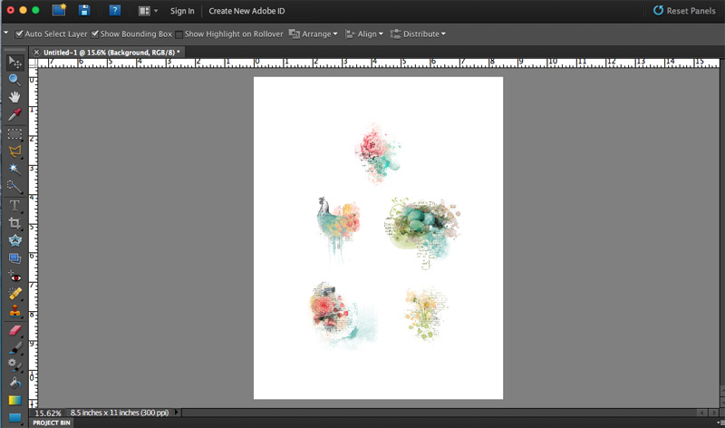
  1. First, we need to size the elements for the peat pots. Mine needed to be about 2.5″ in height (but it didn’t matter how wide)…

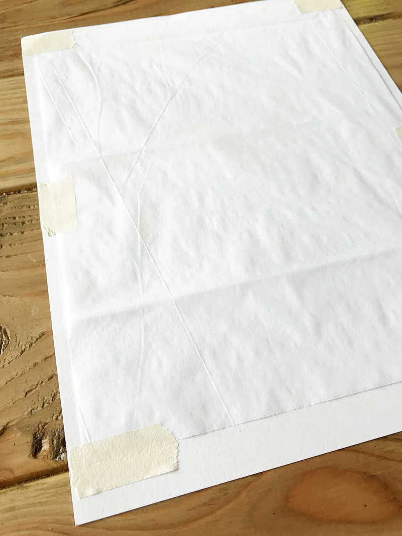
2. Next is the printing. Cut the tissue paper down to about 1″ smaller than what your printer will allow. The trick to printing on tissue paper is to tape it to a piece of cardstock and send it through the printer that way.

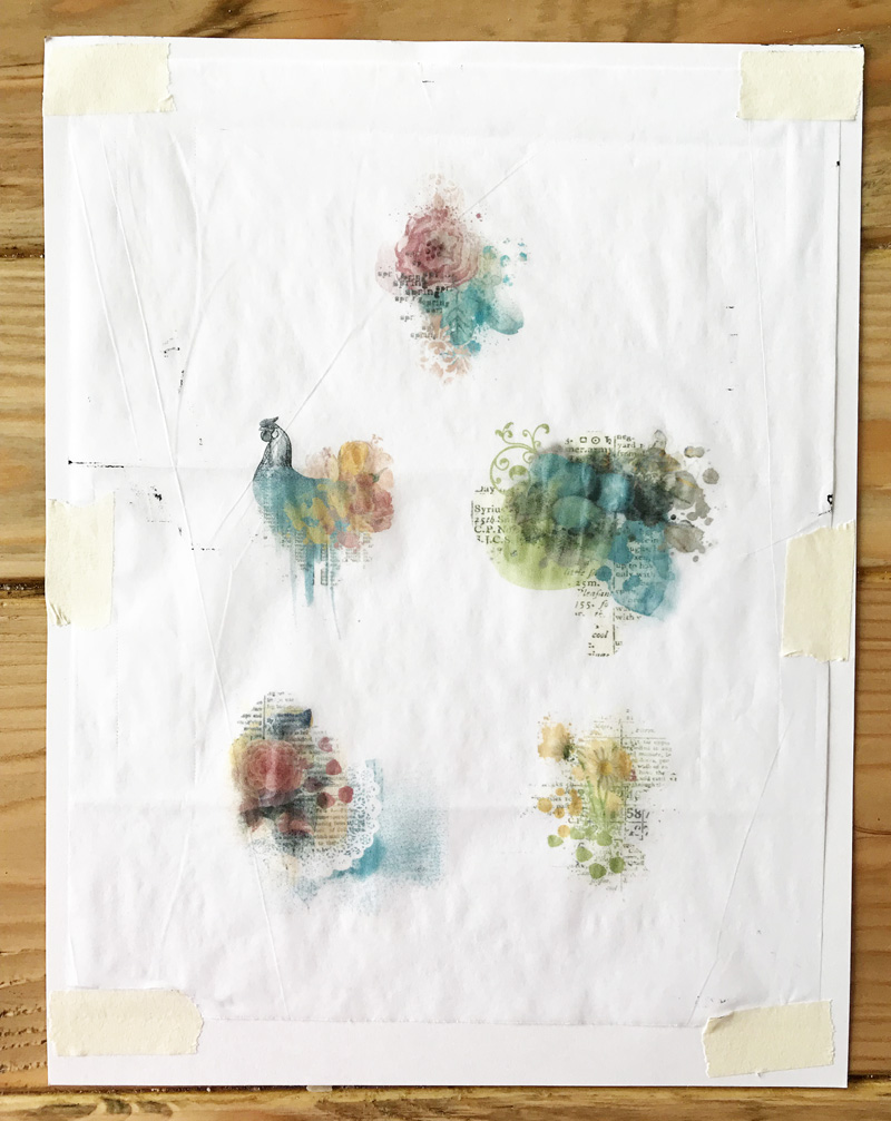
Here’s a look at my tissue paper after I’d sent it through the printer, with the painty elements printed onto it…

You’ll note that I had a little ink spray on my page, but it didn’t matter because I knew I’d be cutting all of that away.

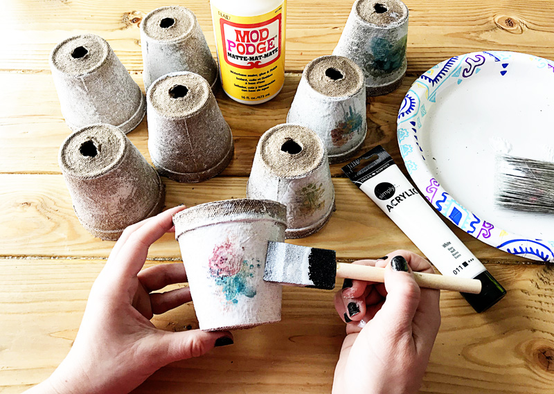
3. The next step is to paint the peat pots. The white acrylic paint will help hide the edges of the tissue paper. I just used a big paint brush and criss-crossed a pretty thick layer all over the pots, leaving some of the brown color showing.

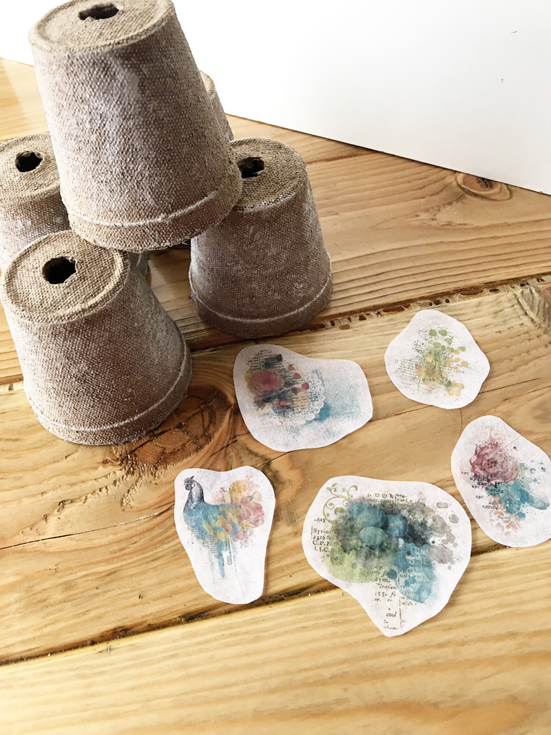
4. Next, cut the images out of the tissue paper. Nothing precise, just follow the basic shape of the image…

5. After that, we’ll Mod Podge the tissue paper images onto the peat pots with a foam brush. Once the tissue paper is wet, it will rip easily… so make sure you brush carefully.

That’s it! So easy, right?

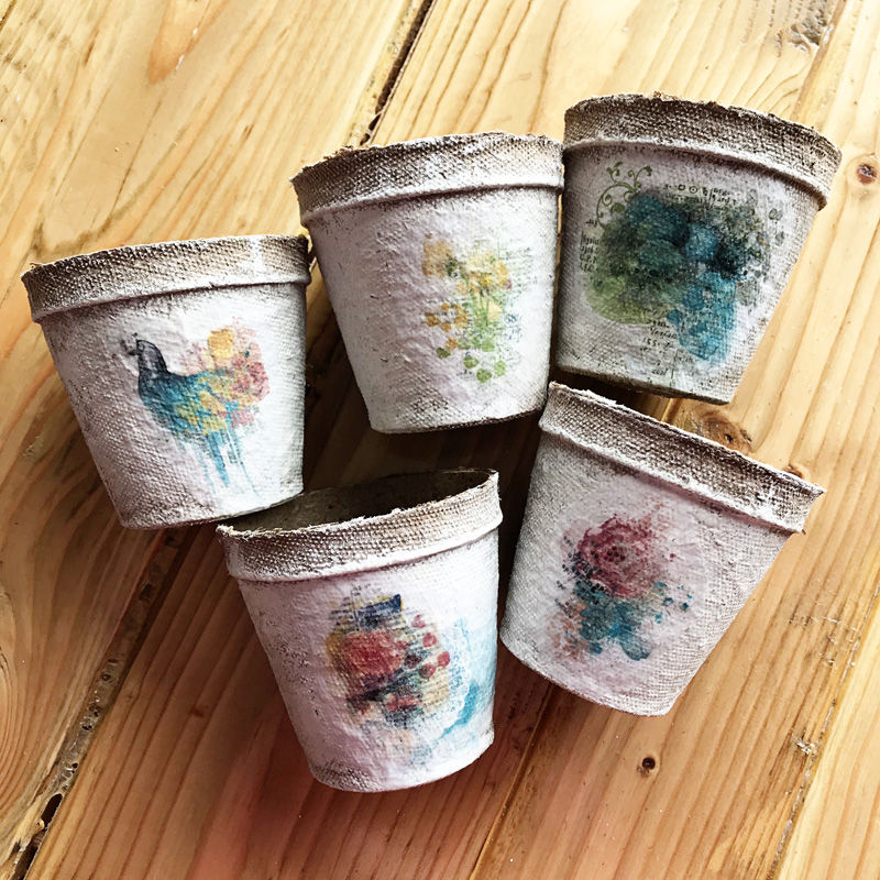
Here’s a look at the final project. The Mod Podge finish makes them shiny and so pretty…

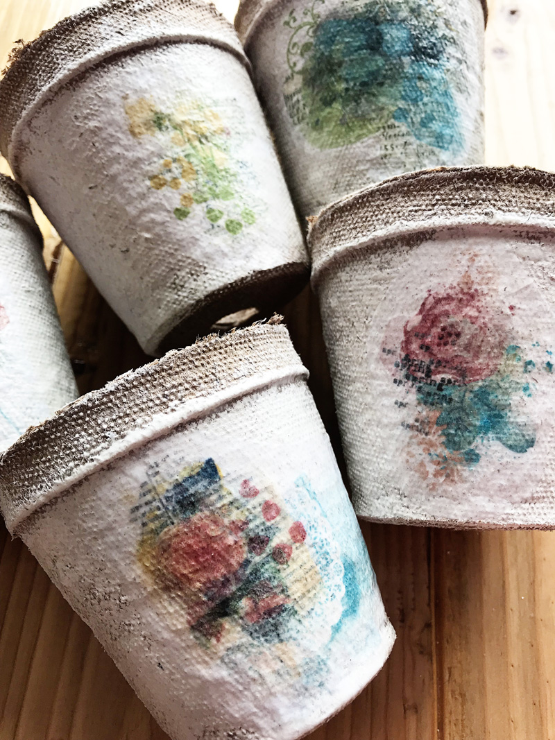
Another look…

These peat pots took me less than an hour to make, and they will make a perfect addition to my spring decor. I think I’m going to fill mine with some fake nests and eggs. 🙂

I hope you’ll give this project a try!


Kate About the Author  Kate is on the hybrid team here at The Digital Press. She lives on the Utah/Colorado border with her husband, 5 kids, 10 chickens, a dog named Gracie, and a cat named Kit. She’s a city-born girl who found she’s really a country girl at heart. She can be found outside, barefoot, and probably in her garden.
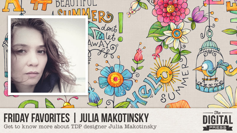
Friday Favorites | Julia Makotinsky

Hello everyone, and welcome to another edition of our designer feature series here on The Digital Press blog in 2019 — Friday Favorites! This year, we are learning a bit more about each of our fantastic designers by having them share some of their favorite things with us each week (so much fun!).

This week, the spotlight is on the awesomely-talented Julia Makotinsky ! This is actually Julia’s 3rd feature here on the blog (you can find her most recent feature article from June 2018 HERE… and/or her Foodie Friday article from February 2018 HERE w/ yummy food ideas/recipes).

This time around, in order to learn even more about Julia, we asked her to share one (or more) of her favorite things with us… and this is what she had to say…


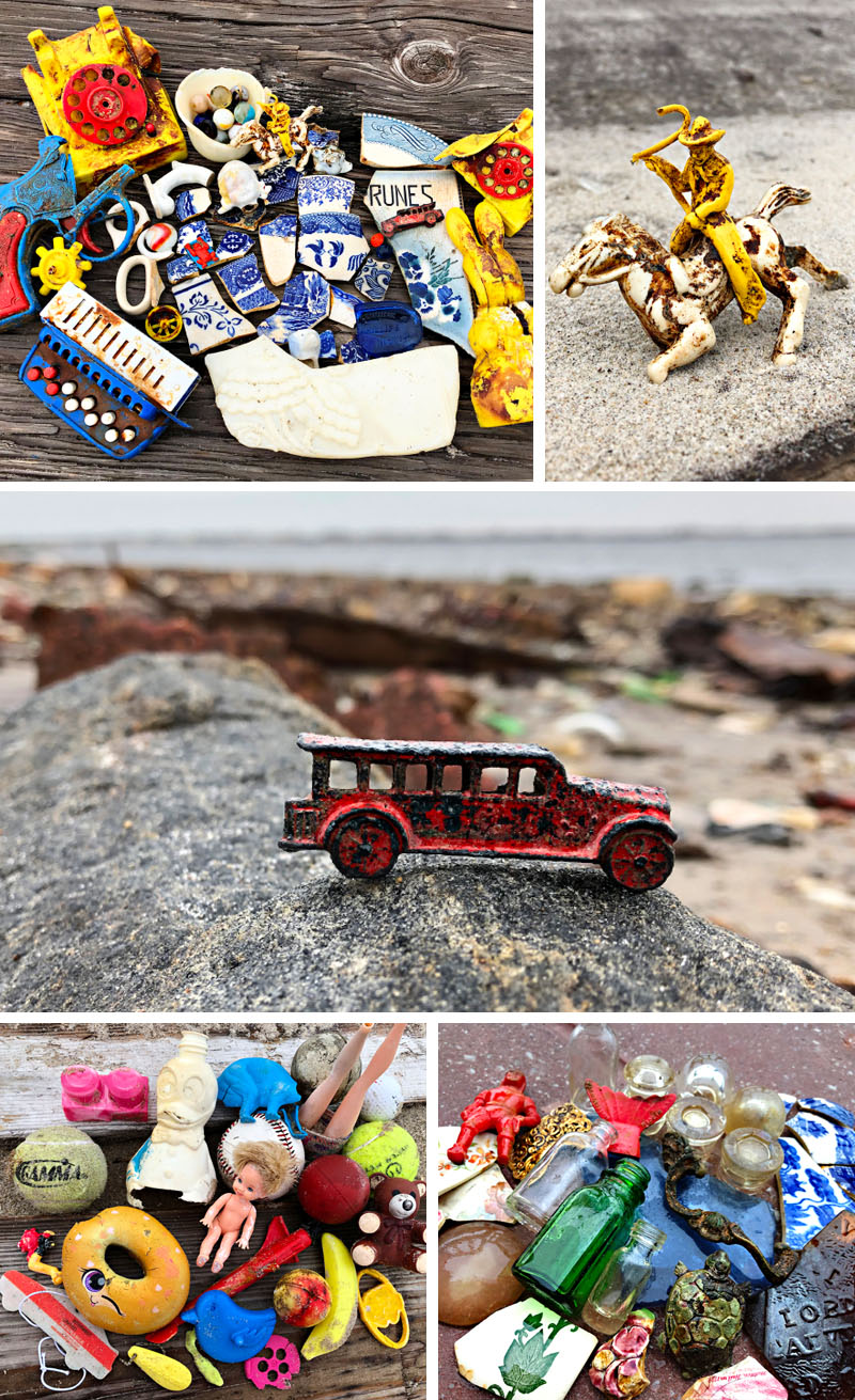
“When my family and I came to the US, we found our new home in New York. It’s been over 20 years now and I love seeing the ocean from my windows first thing in the morning. There is something magical and calming about the ocean and I never get tired of it. I’ve been walking the same beach all these years and only lately discovered such thing as “beach combing”. I always loved looking for things on the beach, but lately it has become an obsession.

I also discovered a new beach nearby, which is a true treasure hunter paradise. It’s an abandoned place which holds various household items from the 40s, 50s, and 60s. If I ever get sad or lost for ideas, I go to that beach to just get lost in the search for history, bits of pottery, toys… while listening to the waves crush against the shoreline.

Here are just some of my finds…

…and being a designer, I always look for pieces of pottery to get some pattern design ideas from for my papers, or color combinations, and just have fun exploring. I always thought I was the only crazy person looking for stuff to find on the beach, but as it turns out IT’S A THING! called “beachcombing” — who knew? 🙂 …and there are others who do the same exact thing. Makes me wonder if any of our followers have the same hobby as I do? And if not, I just hope you’ll find this little fact about me interesting to read!”


Isn’t that so fun?! Kind of amazing… the history that can be found just laying around on a beach somewhere… 🙂

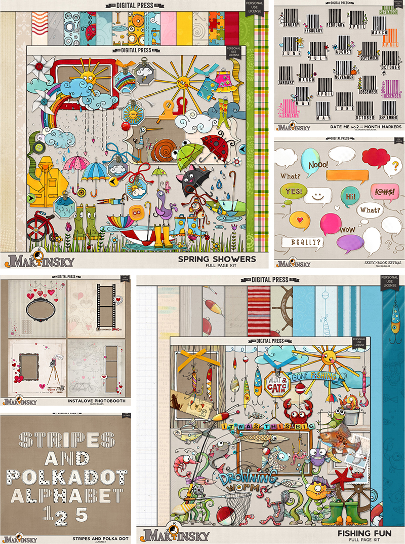
For those of you who aren’t already as familiar with Julia’s design work, she creates the most amazing doodles and fanciful elements.  Her work is fun and quirky and so easy to play with!  Julia has so many different products too!

Here is a sampling of some of the items you’ll find in Julia’s shop here at The Digital Press

And to give you just a glimpse of how versatile her products are, and show you many of the fun ways they can be used… here’s a look at just a few of my favorite projects from the gallery at TDP, which is always full of beauties from Julia’s shop

Aren’t those layouts super inspiring?!

Hopefully, today’s Friday Favorites article has given you even more insight into Julia’s persona and creative style (and again, if you want to know even more about her — scroll up and use the links to her previous features here on TDP’s blog, where’s there’s lots of good stuff!).

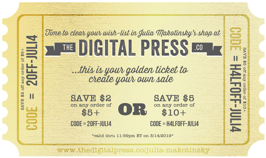
And the best news of all?! …during Julia’s upcoming feature week here at The Digital Press, you can enjoy the chance to score an amazing deal in her shop if you use the following coupon code when purchasing her digital goodies (this code/sale will be valid through 11:59pm ET on Thurs 3/14). Don’t miss it!


[ if you have trouble seeing the coupon image, above, the codes are as follows: “save $2 off any purchase of $5+” by using code = 2OFF-JULI4 . . . or “save $5 off any purchase of $10+” by using code = H4LFOFF-JULI4 ]


Robin

About the author  Robin is a member of the creative team here at The Digital Press. A wife of 26 years and a mom of 4 crazy children (3 in college and 1 still at home), she says that her life occurs mostly in the car as she transports said crazy kids to their many, many homeschool activities. When not driving, Robin loves to make her family cringe by pulling out her camera again (and again, and again…).

Tutorial Tuesday | Creating a Pop Art Effect

Hi everyone, and welcome to another edition of our Tutorial Tuesday series here on The Digital Press blog! Today I’m going to show you how to create a pop art effect with your photos — either for fun, or as a way of using your imperfect photos in a creative way.

We all know that life sometimes gets in the way of the perfect photo. Sometimes that one blurry photo is the only one you have of a wonderful event, and the memory deserves to be scrapped even if the photo is less-than-perfect! I have found that applying a pop art effect is a great way to use those imperfect photos in a fun way.

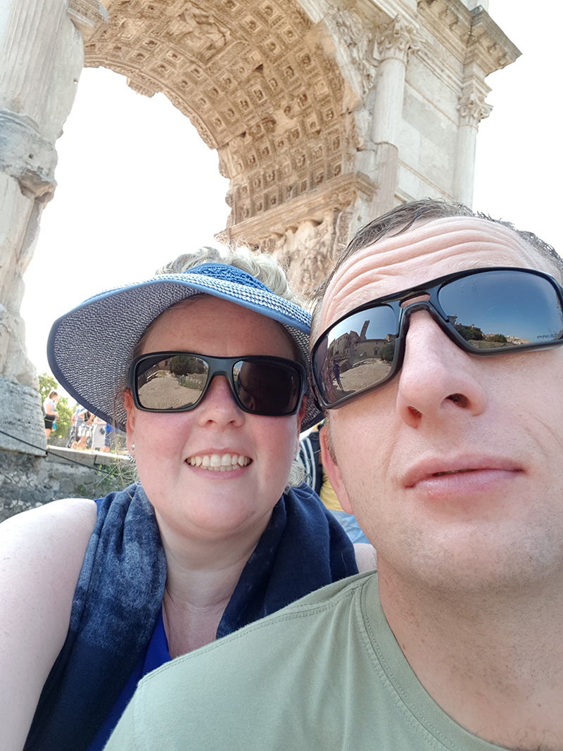
For instance, here’s a photo that I want to use from our recent trip to Rome…

You’ll see that I’m all hot and bothered in this photo, and that’s not exactly the type of photo I want to record forever in the pages of my album! So… I decided to give the photo the pop art treatment, instead.

The process might seem a little complicated, but trust me, it’s worth the trouble! Let’s get started.

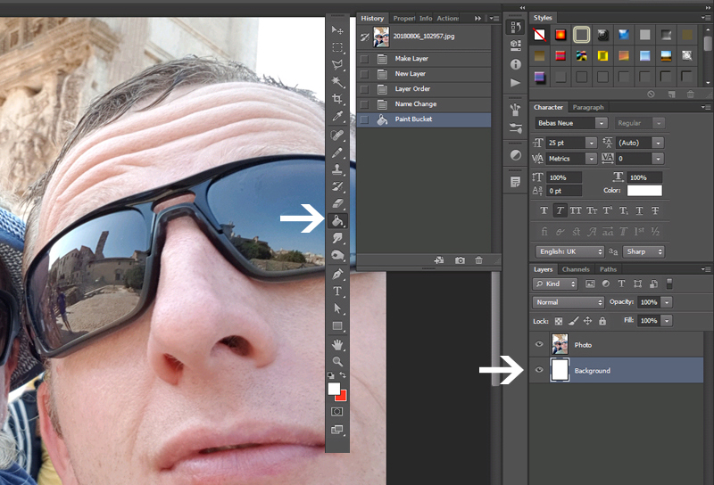
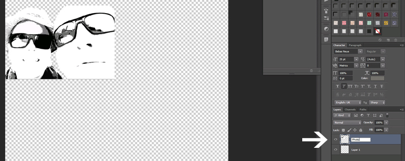
Step 1: Select your photo and open it in your photo editing software. I use Photoshop CS5, so depending on your own software, it might look a bit different for you (hopefully similar enough, though!). In the Layers Palette, double click on the “Background” layer to unlock it… and rename it to “Photo” or something suitable.

Step 2: Create a new layer underneath your Photo and rename that layer “Background”.

Step 3: Select the Paint bucket tool (G) and fill your Background layer with white.

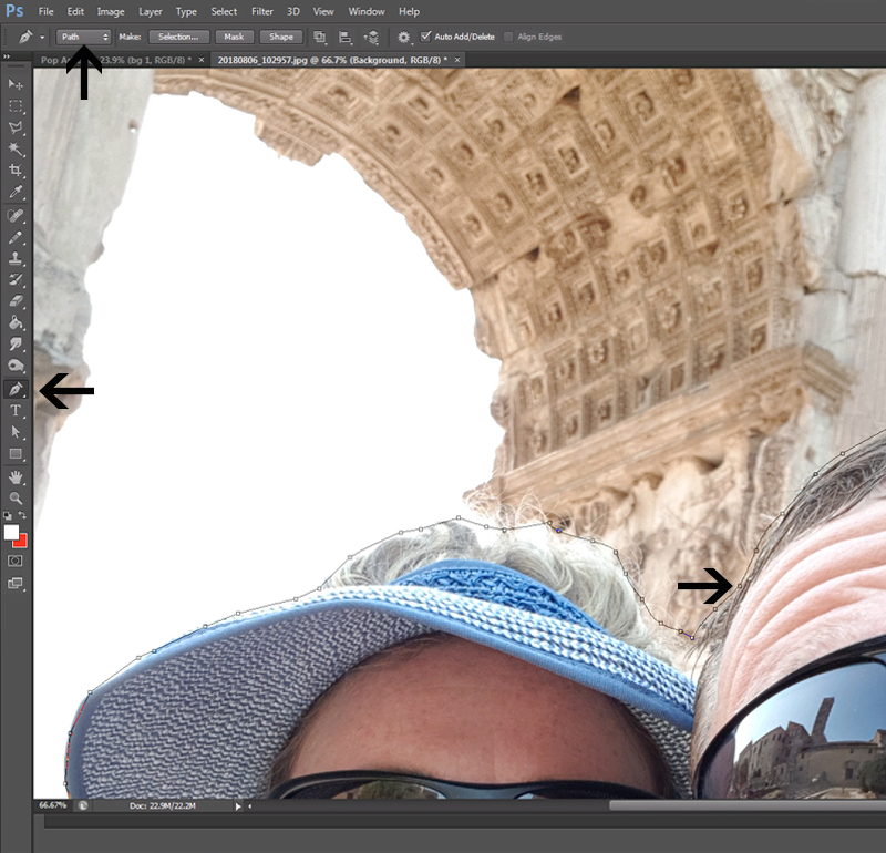
Step 4: Now we want to remove the unwanted parts of the photo. Select the Pen tool (P), making sure that it’s set to “Path”. Continue to create a selection around the part of your photo that you do want to use.

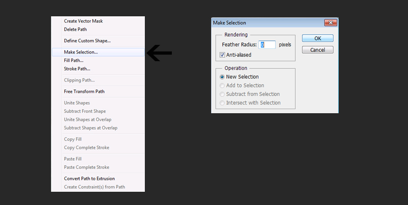
Step 5: After creating a closed path, right click on the photo and select “Make Selection” from the pop-up menu. Enter “0” as Feather Radius on the next menu.

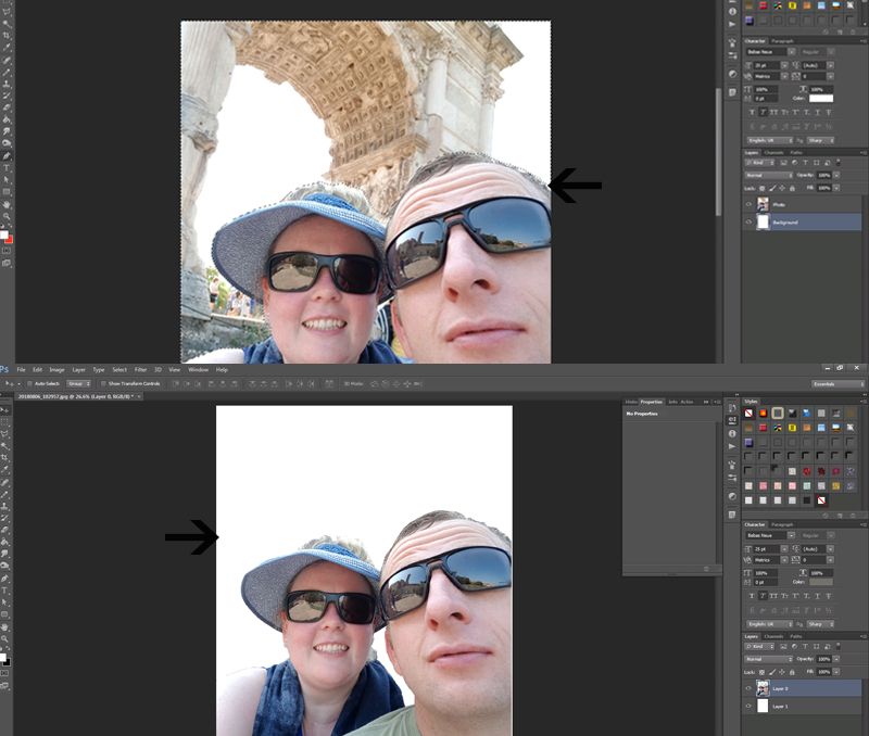
Step 6: Invert the selection (Shift-Ctrl-I) and press Delete.  You now have your photo subject on a white background.

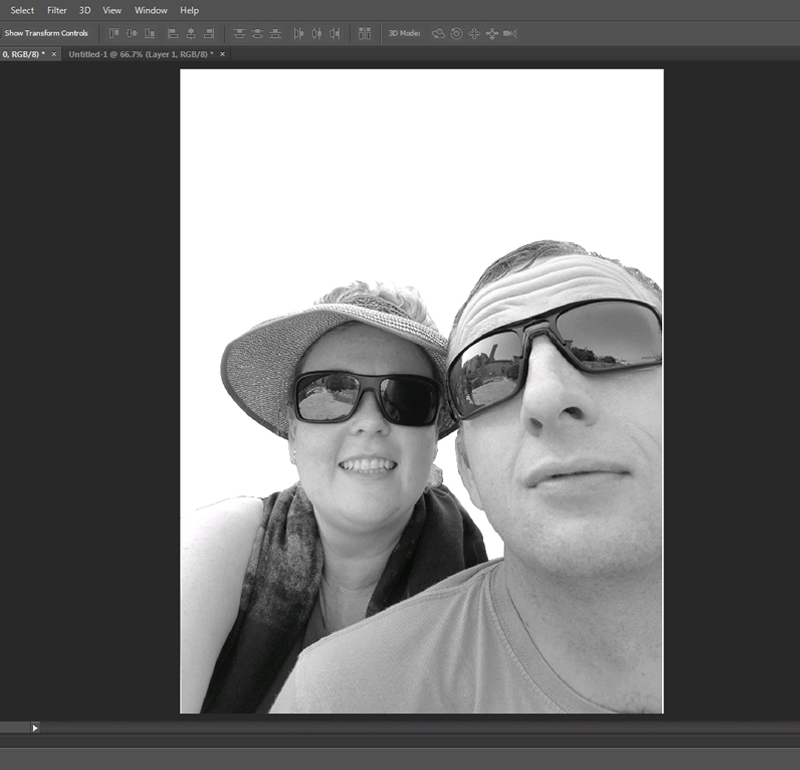
Step 7: Desaturate your photo (Shift-Ctrl-U).

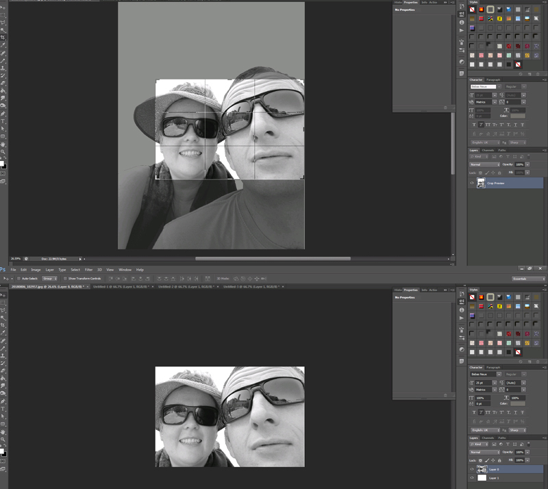
Step 8: Select the Crop tool (C) and crop your photo to make it visually appealing.

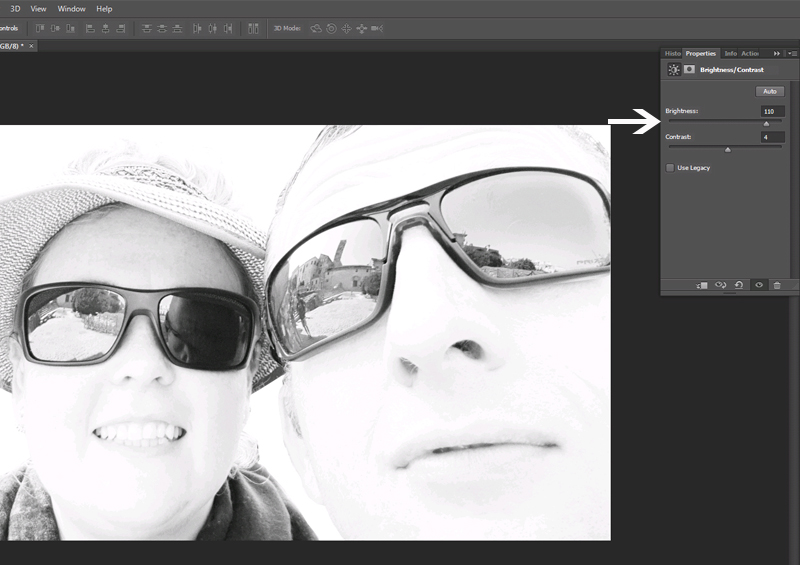
Step 9: Go to Image > Adjustments > Brightness/Contrast and adjust the sliders until your photo has pronounced lines (and the imperfections are balanced out!). Merge the adjustment layer with your Photo layer.

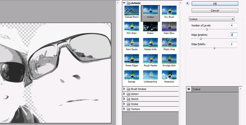
Step 10: Go to Filter > Artistic > Cut-out and apply the filter to your Photo, with settings more or less like mine in the image. If your Artistic filters aren’t showing up in Photoshop, a quick Google search will yield a video that explains how to enable these filters.

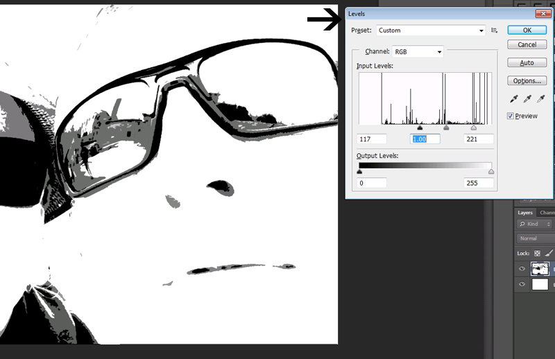
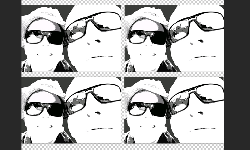
Step 11: Go to Layer > New Adjustment Layer > Levels and adjust the sliders until you are left with only black, white and 2 or 3 shades of grey in your photo layer.

Step 12: Apply a Cut-out filter again (see step 10), this time changing only the “Edge Simplicity” setting to 4.

Step 13: Now is a good time to save this project! Then open a new project – I used a 12 x 12 inch canvas to get a feel for the size of the photo on a scrapbook layout. I named the new canvas Pop Art – this is where the magic is going to happen!

Step 14: Drag only your Photo layer to the new canvas, and rename the layer “Photo”.

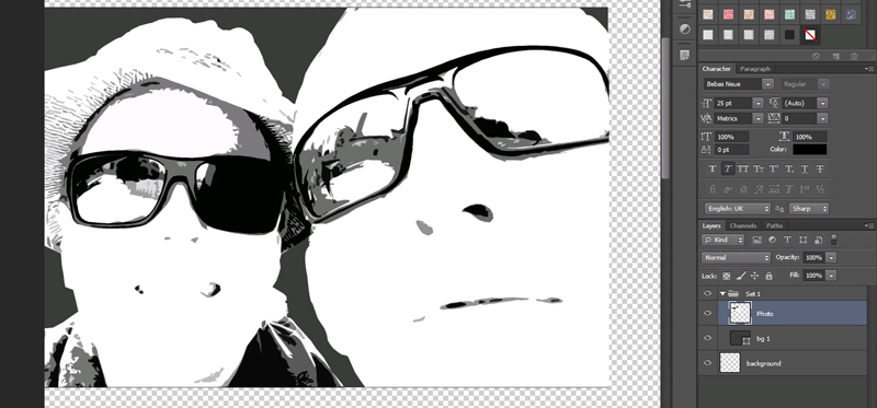
Step 15: Put the Photo layer into a Group (Ctrl-G) in the layers palette, and rename the group “Set 1”.

Step 16: Create a new layer in the group, underneath your Photo layer, and rename to bg 1 (this will be your photo’s background).

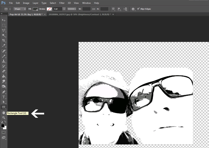
Step 17: Select the Shape tool (U), making sure the rectangle shape is active.

Step 18: With the “bg 1” layer selected, create a rectangle underneath your photo, with the same size as your photo.

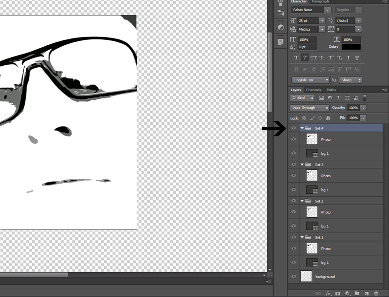
Step 19: Now duplicate your Set 1 group 3 times, so that you have 4 groups.

Step 20: Spread the groups evenly on your canvas.

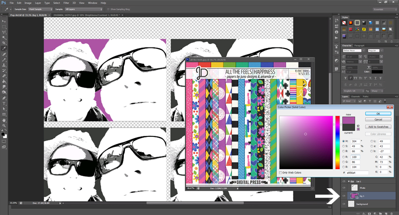
Step 21: Open your inspiration colour scheme – I wanted to use the kit All the Feels | Happiness by Juno Designs and Amanda Yi for my layout, so I decided to use those colours in my photos too.

Double click on the thumbnail of the background layer in Set 1 to open the Colour picker and fill the rectangle with your chosen colour.

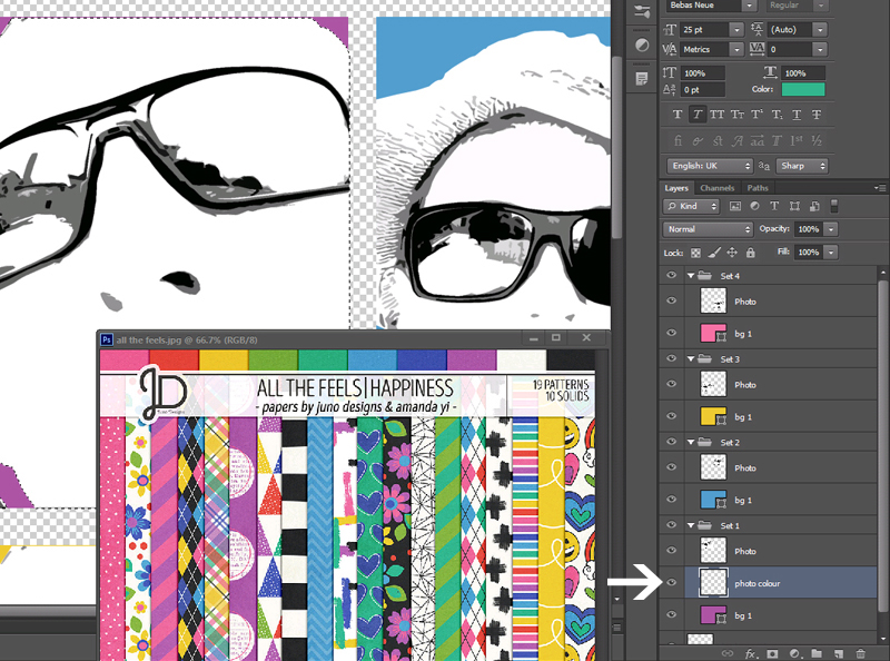
Step 22: Create a new layer between the Photo layer and the background layer, and rename the layer to “Photo Colour”.

Step 23: Choose a colour for your photo by using the Eyedropper tool (I).

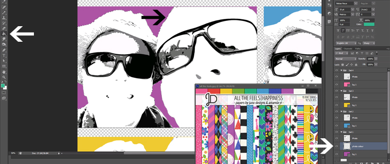
Hold Ctrl and click on the thumbnail image of your Photo layer (in the layers palette) to select the area in your photo. Make sure the Photo Colour layer is selected, and fill the selection with your chosen photo colour using the Paint bucket tool (G).

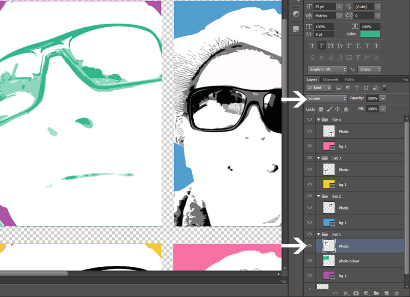
Step 24: Select the Photo layer, and change the blending mode to “Screen”.

Step 25: Repeat steps 21 to 24 for the other 3 sets too.

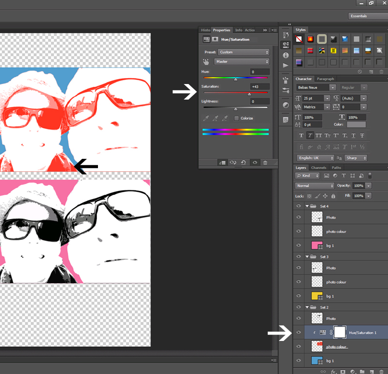
Step 26: You can increase the Saturation on your Photo Colour layer if you want to. Do this by going to Layer > New Adjustment Layer > Hue / Saturation and adjusting the sliders.

Step 27: You can now drag the Photo groups to any layout you want to make, and enjoy your fun pop art photos!

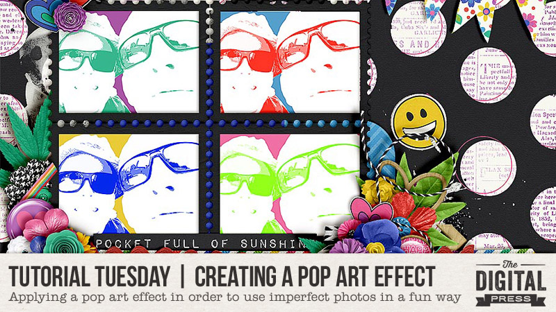
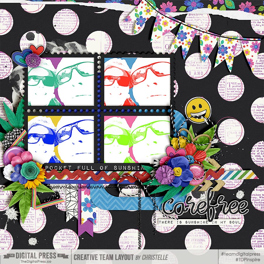
 Here is the layout I created with my improved photos:

As you can see, the pop art effect really adds a fun element to the page, and I don’t have to feel embarrassed about scrapping with such a bad photo! 🙂

I hope you all enjoy creating the pop art effect… and please don’t be scared to use bright colours!


ABOUT THE AUTHOR  Christelle is a creative team member at The Digital Press, happily creating for all of the talented designers. She’s originally from South Africa, and has recently relocated to the UK with her husband. She loves scrapping her 3 lovely step-children and 4 beautiful nieces and all of their (mis)adventures. If she could, she’d travel all the time, but for now she makes do with traveling as often as possible. Her other hobbies include machine embroidery and sewing, as well as reading soppy romance!

Friday Favorites | Laura Passage

Hello everyone, and welcome to the first edition of our all-new round of designer features on The Digital Press blog in 2019 — Friday Favorites! This year, we’re going to learn a bit more about each of our fantastic designers by having them share some of their favorite things with us each week, and we think you’re going to have so much fun following along with this new series!

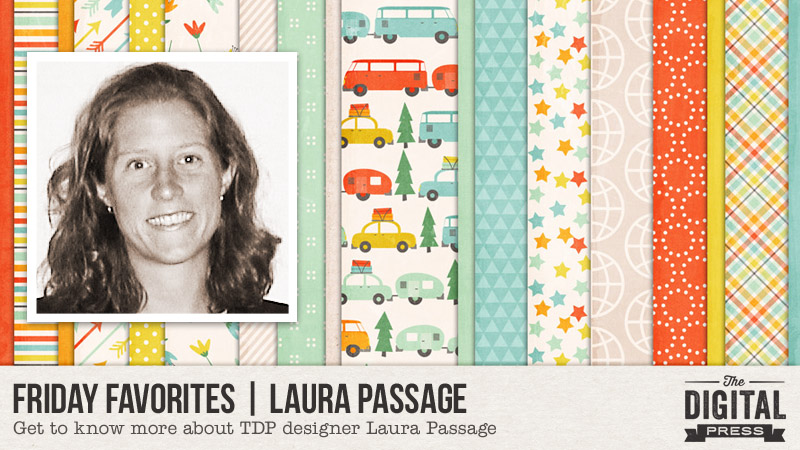
This week, the spotlight is on the super-talented and creative designer (and our very own TDP chief) Laura Passage! This is actually Laura’s fifth feature here on the blog (you can find her previous features from July 2016 HERE… from July 2017 HERE (including a look at her crafty workspace!)… her Foodie Friday article from February 2018 HERE w/ yummy food ideas/recipes… and her most recent feature from July 2018 HERE).

This time around, in order to learn even more about Laura, we asked her to share one (or more) of her favorite things with us… and she did not disappoint! This tip of hers is going to be sooooo useful to all of us who struggle with our obsessive love of fonts (and those of us who might just have waaaay too many fonts installed on our computers, and can therefore never find the one we’re looking for when we need it?!)…

The following video gives us a quick tour of one of Laura’s favorite things — her font organizer software! 🙂 ENJOY!


**NOTE** if you are viewing this in Firefox and have trouble w/ the video… please try another browser. Firefox has known glitches with video, whereas Chrome, IE, and Safari all seem to be working fine.

Isn’t that tip just the best thing ever?! 🙂


For those of you who aren’t already as familiar with Laura’s design work… it has a distinctly paper-ish style and feel, mimicking traditional paper scrapbooking products (likely because she also designs products for the paper industry — for companies such as Echo Park Paper Company, Carta Bella Paper Company — and also for the app-based version of Becky Higgins’ Project Life product line). She tends to create colorful, fun products that often have cute or hilarious puns or jokes included in the word art/cards; whatever the theme, her kits are always full of surprises and fun to work with.

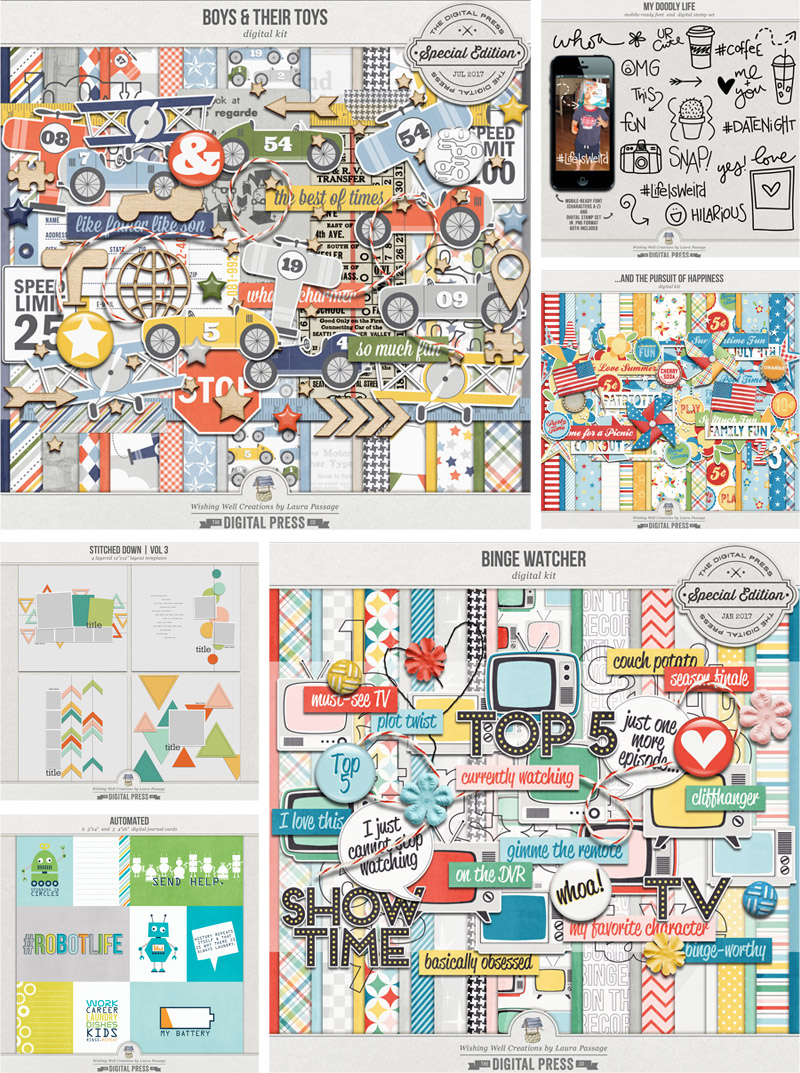
Here is a sampling of some of the items you’ll find in Laura’s shop here at The Digital Press

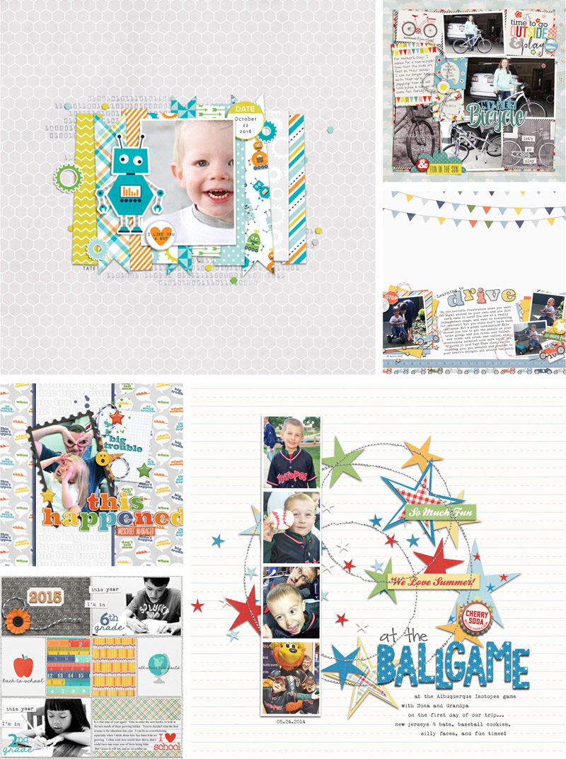
And to give you just a glimpse of how versatile her products are, and show you many of the fun ways they can be used… here’s a look at just a few of my favorite projects from the gallery at TDP, which is always full of beauties from Laura’s shop…

Aren’t those all so great?!

Hopefully, today’s Friday Favorites article has given you even more insight into Laura’s persona and creative style (and again, if you want to know even more about her — scroll up and use the links to her previous features here on TDP’s blog, where’s there’s lots of good stuff!).

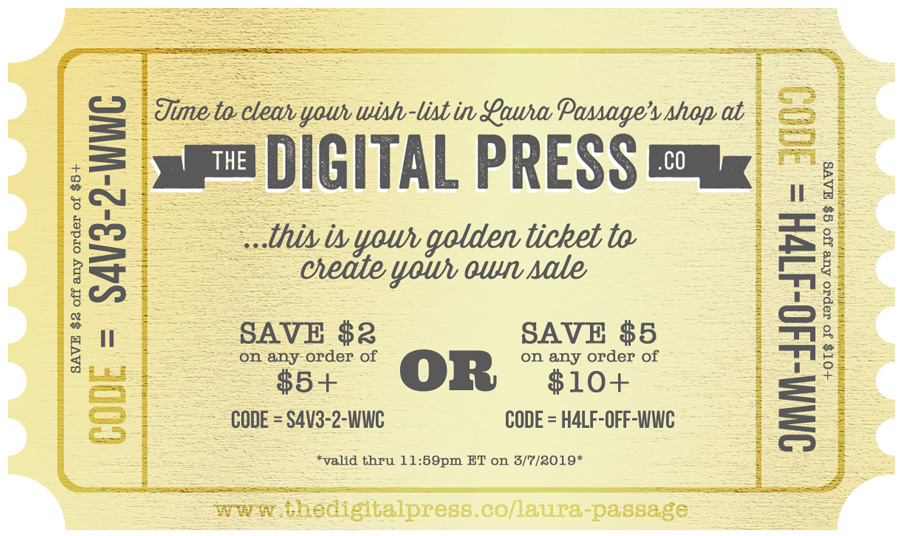
And the best news of all?! …during Laura’s upcoming feature week here at The Digital Press, you can enjoy the chance to score an amazing deal in her shop if you use the following coupon code when purchasing her digital goodies (this code/sale will be valid through 11:59pm ET on Thurs 3/7). Don’t miss it!


[ if you have trouble seeing the coupon image, above, the codes are as follows: “save $2 off any purchase of $5+” by using code = S4V3-2-WWC . . . or “save $5 off any purchase of $10+” by using code = H4LF-OFF-WWC ]


JanAbout the Author  Jan is a high school teacher, wife, mom, and grandma who spends most every little bit of free time she gets documenting her family’s memories through digital scrapbooking. She is a summertime sunshine and beach lover who gets her energy from being outdoors. She is currently looking forward to retirement and a beach chair with her name on it and someone bringing her fruity drinks on command!

Tutorial Tuesday | Using Themed Kits Creatively

Hello, and welcome to another edition of our Tutorial Tuesday series here on The Digital Press blog! Today I’m here to to share a valuable tip to help you see the boundless possibilities of using themed kits for non-themed or (totally unrelated-themed) layouts or projects. It’s a great way to stretch your stash further!

Have you ever seen a themed kit in the store and thought, “Gee, that’s gorgeous… but how would I use it for [insert holiday, event, special occasion] when that’s not something I celebrate or have photos for?”

Think outside the box and RE-PURPOSE items!

Yes, really, it’s that simple! “Re-purpose” can mean everything from simply leaving the item as-is and just using it in a different way — to actually re-coloring, modifying, or editing the original design (and if doing the latter, always remember to credit the designer when sharing your layouts or projects, noting that some elements may have been modified).

It’s always helpful, as you look at kits in the store, to keep the following strategies in mind:

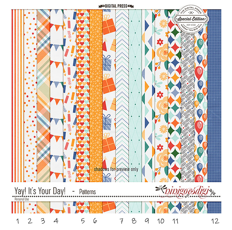
  • There are probably going to be patterned papers in the kit, and maybe some solids, too. Solids, of course, are versatile and can be used repeatedly — but what about the patterns? Look them over and see what you might be able to use for something else. Here’s an example of papers from a birthday-themed kit (Yay, It’s Your Day by ninigoesdigi). I could easily use 12 of the 16 papers here on just about any layout, so this is a great option for me…

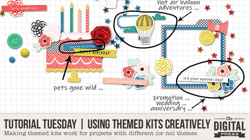
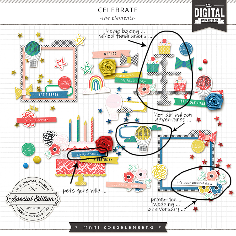
  • Treat elements the same way. Using another birthday-themed example (Celebrate | The Elements by Mari Koegelenberg), you can see that there are several elements in this preview that would work across many layouts or projects — the stars, brads, photo frames, and flowers, for example. However, even some of the not-so-obvious items can be used elsewhere, too, as I’ve detailed on the following image…

  • If the color palette isn’t exactly what you’d like, think about re-coloring options (check out this previous blog post for a few easy how-to steps on re-coloring elements).
  • Lastly, look at items that, with a small modification or two, would be perfect for your needs. Masking and rearranging items works really well with word art and word strips (hint, I modified a word strip on my page). Here’s a quick how-to on word art (I’m using Photoshop CC)…

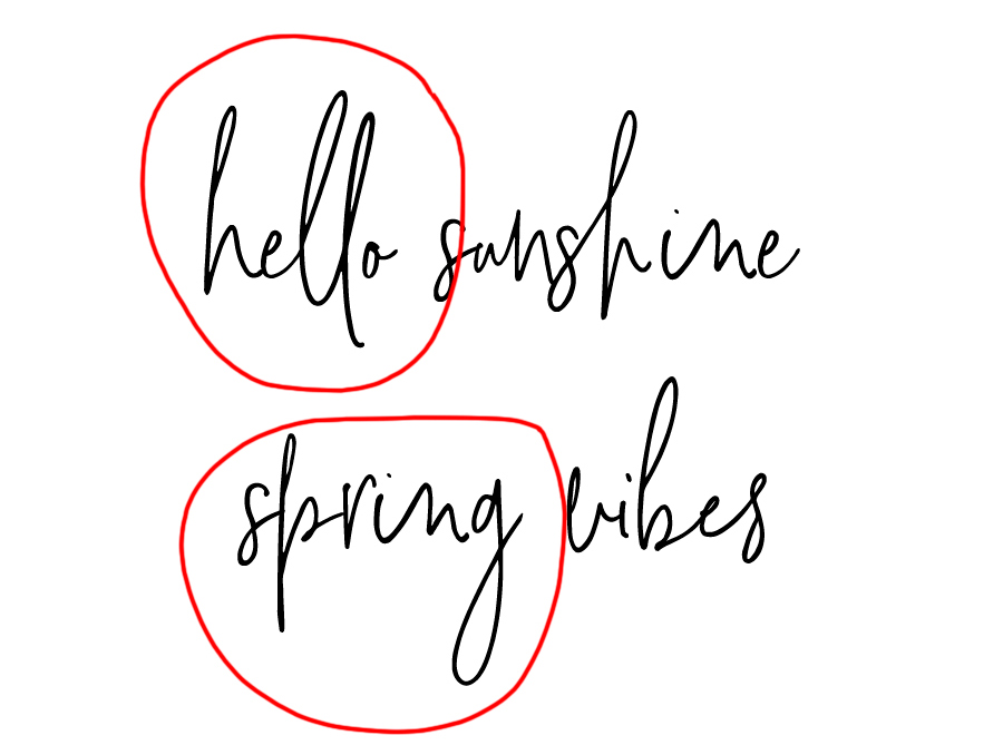
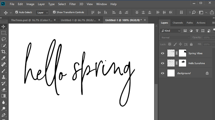
Let’s say I wanted to combine the “hello sunshine” and “spring vibes” wordart from Rachel Etrog’s April Documented kit to create my own that says “hello spring”…

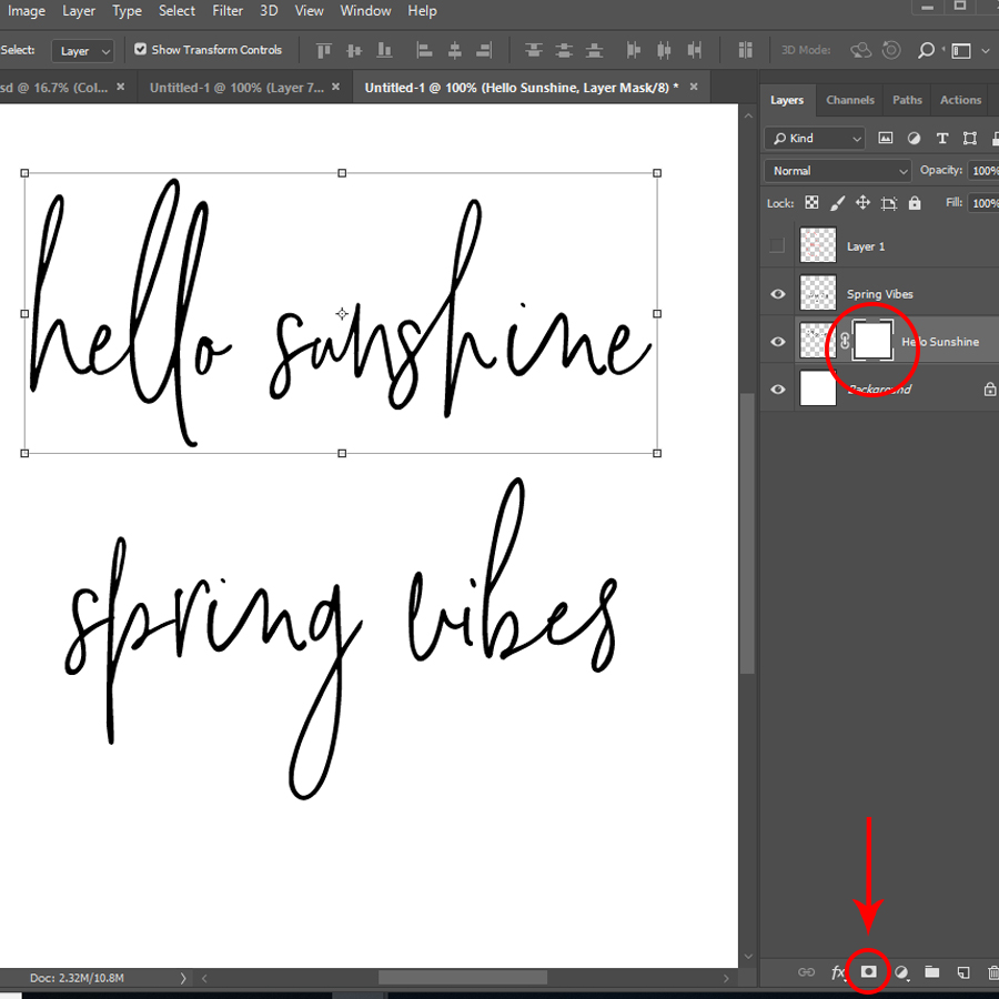
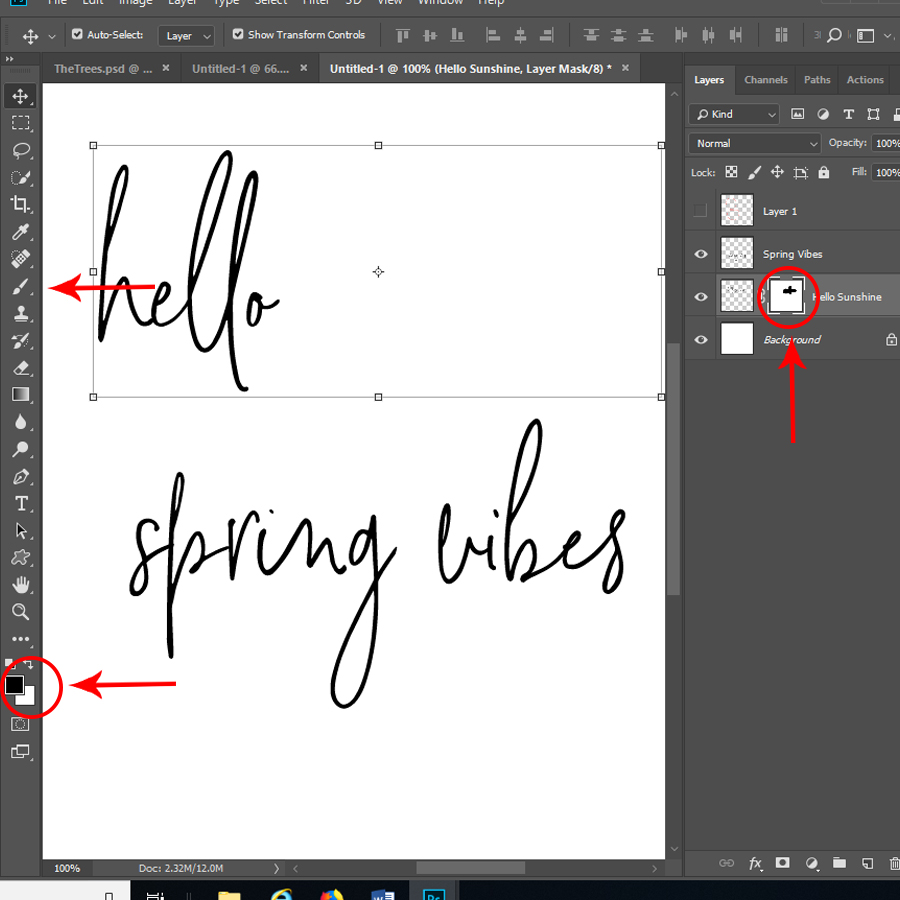
I’d start by applying a mask to the “hello sunshine” wordart…

Making sure the mask is selected in my layer (just click on the white square to be sure), and with black as my foreground color, use a large brush to ‘paint’ over or mask the word “sunshine”. A quick reminder with masks: black conceals, white reveals. If you accidentally hide too much, just flip your brush color over to white and reveal the word art again…

Repeat the process with “spring vibes”, and then move the two pieces of word art together to create something new…

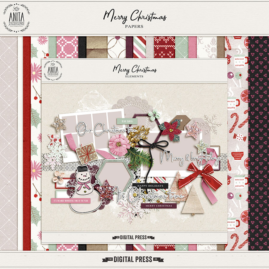
As an example of how re-purposing can work, I took a winter/Christmas-themed kit (Merry Christmas by Anita Designs), shown below, and used it to document a walk around the local botanical gardens in the middle of summer. Here’s a look at the themed kit I used…

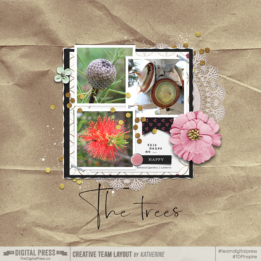
I selected papers and elements that were generic in nature, and also made a few edits to the word strip and word art elements. Here’s my result, creating a summer-themed layout using a Christmas-themed kit…

Taking an out-of-the-box approach to your kit selections can open the door to so many new opportunities that you might have otherwise just ignored. Why not give this a go and see what re-purposing papers and elements can do to expand your digi-stash!


About the Author Kat Hansen is a creative team member here at The Digital Press. Recently returning home to Australia, Kat is transitioning back into life “down under.” She’s currently using her creative time as a way to reconnect with her home town, often spending afternoons with her camera, just wandering about. Vacation memories feature pretty heavily in Kat’s scrapbooking pages, as well as her health and fitness journey. She’s looking to do more “all about me” (AAM) pages in 2019. Kat has quite the sense of humor (she “blames” her father for this), which she incorporates into her journaling and memory-keeping.