Category: Tutorials

Hybrid How-To | Using Watercolors On Layouts

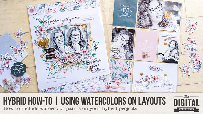
Hi everyone, and welcome to another edition of our Hybrid How-To series here on The Digital Press blog!  Today, I’m here to show you how to create a physical layout using watercolors (using fun paint that you can make to perfectly match your digital kit).

If you’ve followed my posts here on the blog in the past, you know that I love working with paper and physical elements — and especially stamps. I also love to use watercolors on my scrapbook pages! Sometimes, I even scan my paints and turn them into digital printables. It’s so much fun, and I can match my paints with my digital stash and  stretch my crafty budget that much more.

The first thing I’ll tell you when it comes to using paint on your layouts… don’t be afraid! Trust me, it’s easy, fun, and even relaxing! Think of it like this: we’re not going to make a painting to go into a gallery… we only want to make pretty stuff for our own layouts!  🙂

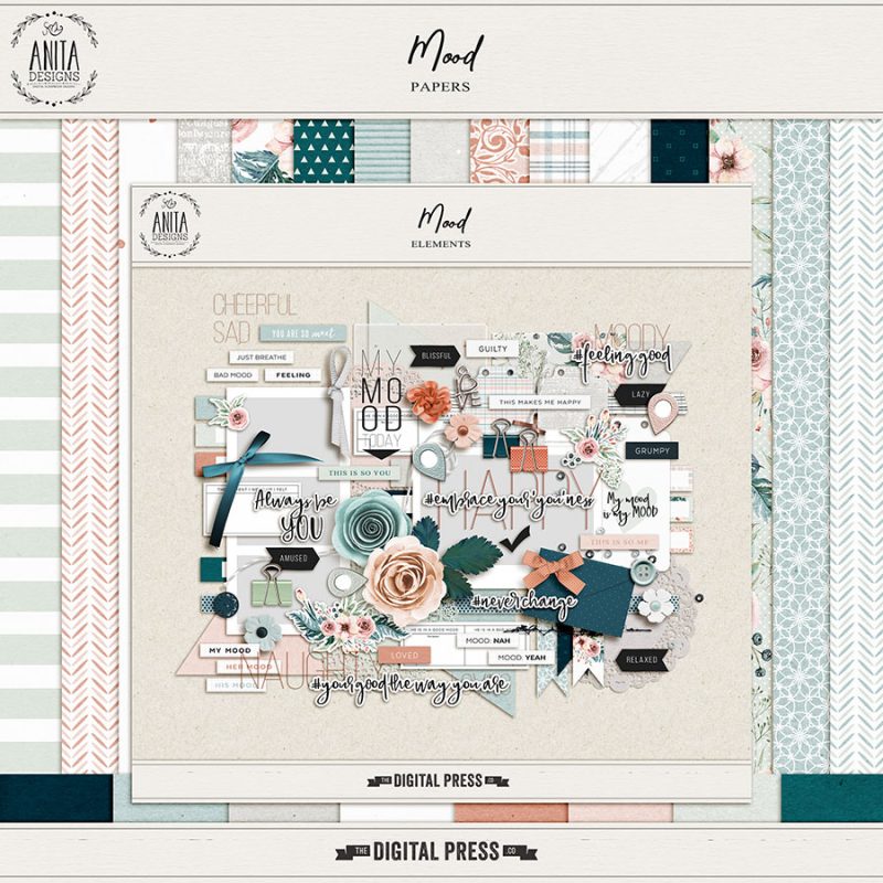
For my project today, I will be using the digital collection Mood by Anita Designs…

When I first saw the gorgeous watercolor florals in this beautiful collection, I knew I wanted to paint something to match them. Then, I started thinking about painting some leaves below the printed florals. For my project, I actually didn’t make a previous digital version in Photoshop (which, sometimes, I do). This time, I simply chose my favorite elements, cards, and papers and then printed all of them, as shown in the image below…
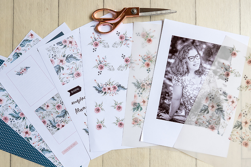
I also printed some florals and cards onto vellum paper (see it on the right, above). Look how beautiful and soft they turned out! 🙂

When choosing these items and printing them out, I actually knew that I might not use all of the items… but it is not a problem. Now I have some pretties ready to use in my memory planner, which I love to play with as well!

After I printed all these goodies, I had some fun relaxing and fussy-cutting them, while planning out my spread. You’ll see below that I made a spread with a traditional scrapbook page and a pocket page.

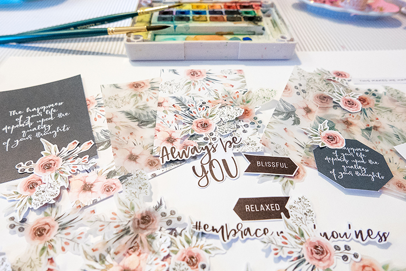
Finally, after cutting it all out… here is the gorgeous stuff that I had in hand, ready to play with…
With all of these items in hand, I started thinking about my color palette… and then I grabbed my sketchbook and began testing some different greens…
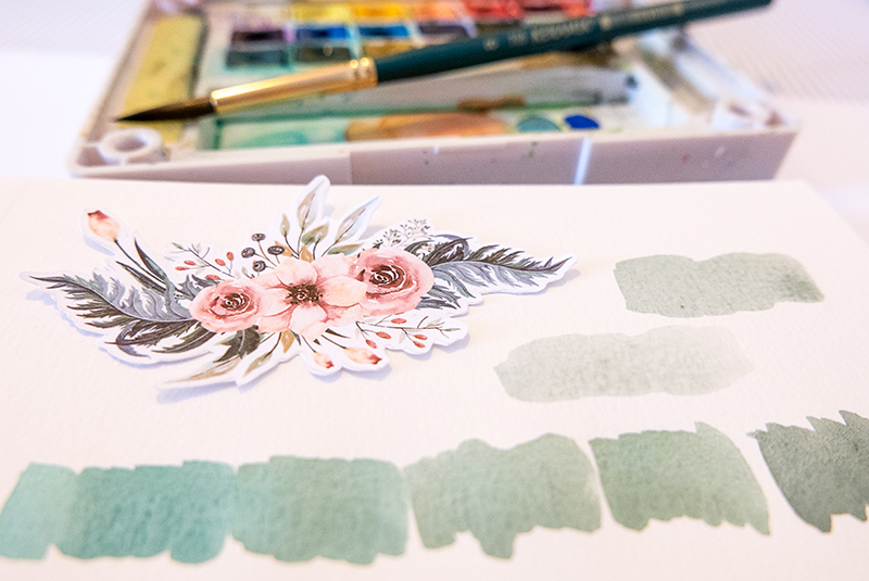
After choose my color scheme, I painted some samples on my sketchbook, just to know how I’d like to arrange my leaves…
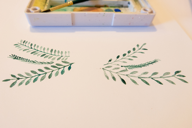
Here’s a look at my painted leaves underneath one of the pretty sticker elements from the digital kit I worked with…
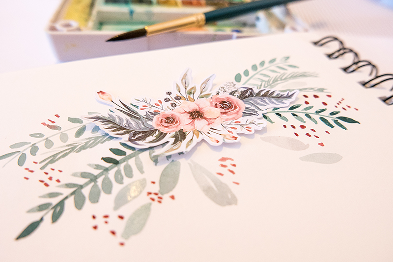
When I was satisfied with my paint, I grabbed my white cardstock paper and arranged my photos and mats… just to make sure where to paint my leaves…
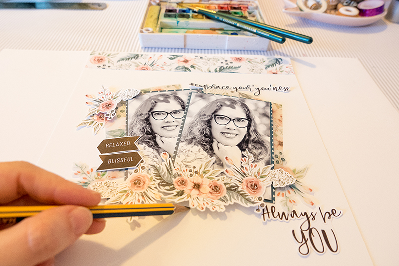
I made a mark on the middle of my page and just painted some leaves, branches, and berries… very similar to what I had done before in my sketchbook while practicing…
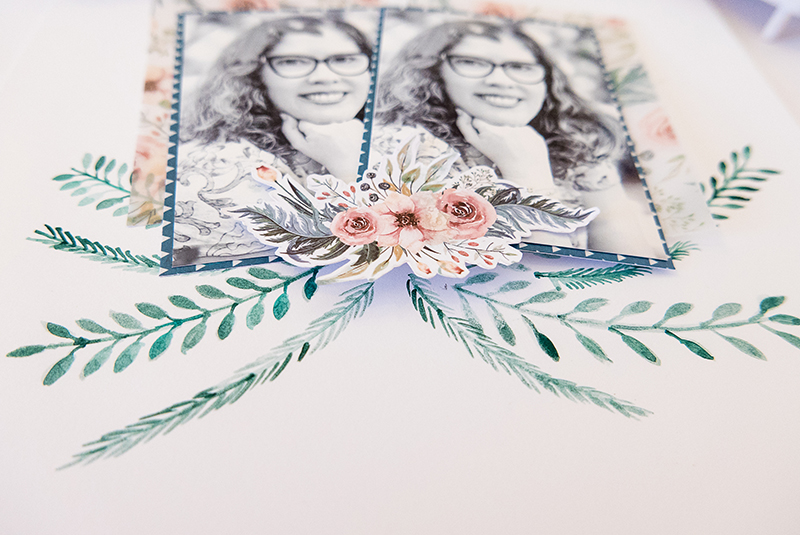
Here is a look at my 2-page spread after I had finished my paint and placed some floral stickers, word art pieces, and some other word bits in a simple design with the patterned paper as a border…
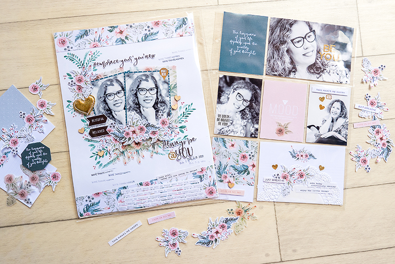
Then, after placing my photos and elements, you’ll see that I decided to paint some more leaves onto the upper left corner, in order to give more balance to my design.

I also used the vellum cards as the mats for my photos, and also placed some vellum florals as the first layer of my clusters.

Here’s a close-up view of a few different areas of the project…
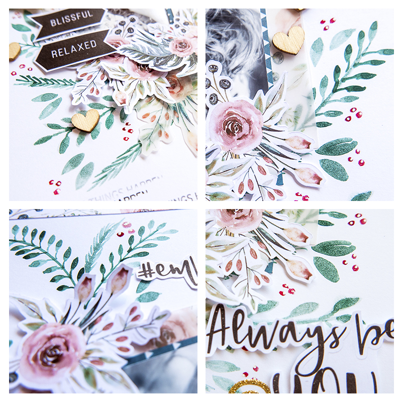
Finally, to finish things off, I added some stamps, some wood veneers, and some gold stickers along with a gorgeous big gold heart.

I like to print my journaling and cut it into strips because I’m not a big fan of my handwriting directly on the page (and sometimes I ruin my work by making a big mess!). 🙂 Here’s a look…
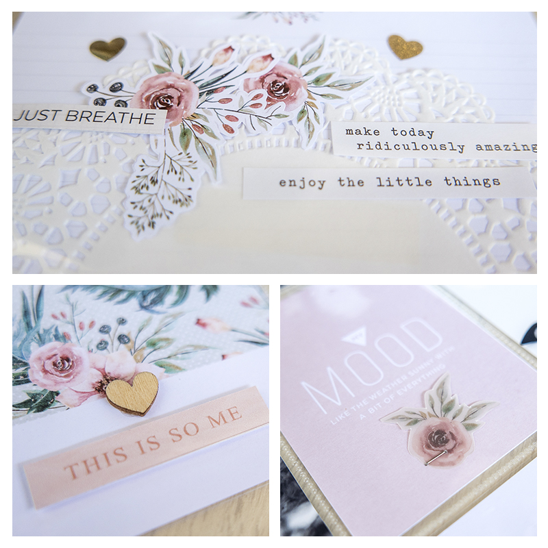
As you know if you’ve followed me here on the blog, I love to add texture to my work… so I added a delicate doily, more wood veneer, glitter sitckers, and word stickers.

Finally, I think the “cherry on top” is a vellum floral which I just stapled on my soft pink card. I really loved how this spread turned out!

If you’d like to give this a try, too, don’t forget that you can earn challenge points at TDP! Come visit the CROSSWORD SECTION in The Digital Press forum, and you’ll find this month’s Hybrid Challenge thread (for each month’s Hybrid Challenge at TDP, you get to choose one of the month’s”Hybrid How-To” tutorial posts from here on the blog and make your own version). If you choose to give today’s project a try… all you have to do is make a hybrid page using some digital elements and papers and add some watercolor paint, as shown above (it doesn’t have to be leaves, though; you can paint what you want — whether circles, hearts, background washes — whatever your imagination comes up with!). You’ll see how fun it is! Give it a shot, and share your final results with us! We can’t wait to see what you come up with.

Have a great weekend you guys, and happy scrapping!


PERFIL TDPAbout the Author  Andrea Albuquerque is part of the Hybrid Creative Team here at Digital Press. Andrea has been a scrapper since 2010 and a photographer since 2012. Although she adores the flexibility and creativity of digital, she can’t resist playing with paper, paint, and embellishments… so hybrid scrapping is the perfect medium for her! She lives in Brazil with her hubby.

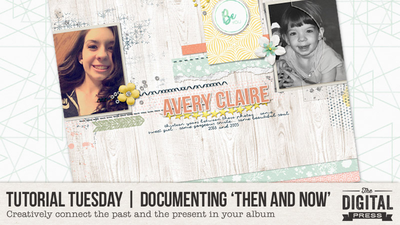
Tutorial Tuesday | Documenting ‘Then and Now’

Hello everyone, and welcome to another edition of our Tutorial Tuesday series here on The Digital Press blog! Today we are going to talk about scrapbooking ‘Then and Now’ pages. I have used this technique many times in the past… but was recently prompted to think about it again when my teenage step-daughter posted a stunning selfie on Instagram. I just stared at this beautiful young lady, and I couldn’t stop thinking about the cute little girl that walked into my life ten years ago. In that moment, I knew I had to create a layout comparing and contrasting the past and present.

There are several approaches to creating a ‘Then and Now’-themed layout, but I want to start with a few tips…

  1. Make Your Comparison Clear — When creating a layout that compares and contrasts, it’s important that the viewer clearly understands what is being compared.  For example, scrapping your photos at a distinctly different size can immediately convey that there is a comparison being made.  If you would rather keep the photos the same size, it helps to make sure the subject in the frame is also the same size.  You could use one black and white photo, and one colored.  Finally, you can clearly split your layout into two distinct sections to show the comparison.
  2. Embrace Your Photos — When using a technique such as this, you may hesitate to use older photos that may not be the best quality. Use them! The quality doesn’t matter as much as the connection you are making, and the memory you are documenting.
  3. Be Open-Minded About the Scope — The photos you are using do not have to be years apart. It could be that the photos are only weeks apart (or even yesterday/today — think: kids getting braces off their teeth, etc.)… but as long as the story is clear, the comparison can be easily made.

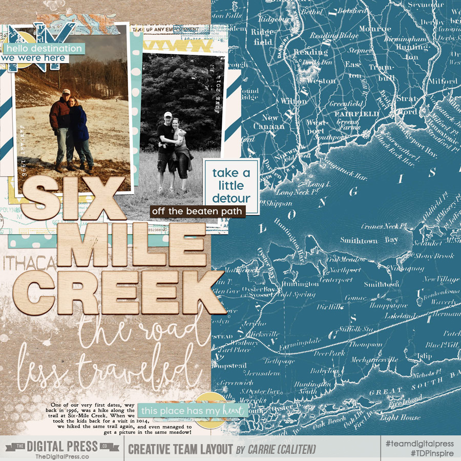
To begin giving you some examples and eye candy… we’ll begin with one of The Digital Press’s talented creative team members, Carrie, who created this lovely layout that clearly conveys the comparison of two people in the same spot, many years apart.  She did this by using a colored photo and a black and white photo… keeping the subjects the same size… and using journaling to tell her story. Take a look…

[ credits: Wanderlust Collection by Little Lamm Paper Co. and Then and Now | Photo Masks by Anita Designs ]

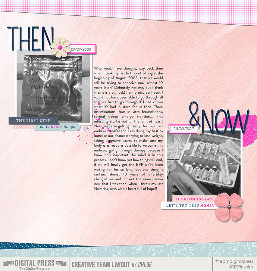
This next layout, created by TDP creative team member Chloe, uses both photos and journaling to show the connection between her ‘Then and Now’ comparison. This is a beautiful layout that clearly shows the journey that she has been on. In this instance, the journaling tells her story, and the photos show the time gap…

[ credits: Fresh Starts Papers and Elements by k. becca and Straight Up Alpha by Dawn by Design ]

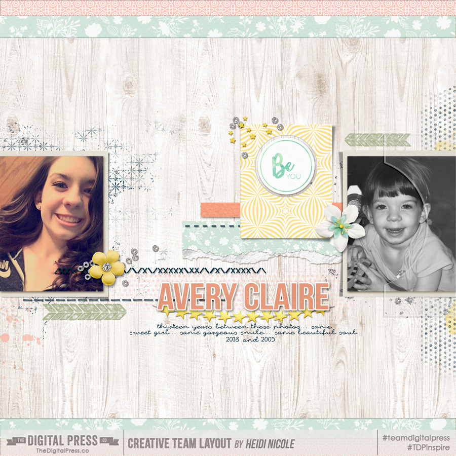
Finally, here’s a look at my own layout — based on the comparison and memory I described up above, about my step-daughter Avery and a look at her present-day self as compared to the little girl I first met a decade ago…

[ credits: Quick Scraps Vol. 09 Templates and Shine by Anita Designs ]

Now that you’ve seen a few visual examples and have (hopefully!) been inspired to create a page like this of your own… I wanted to share a few ideas about approaches you can take when documenting these types of comparison memories.

Focus on current changes — This approach would be used when comparing, for example, the first day and last day of a school year.  It’s best used when there hasn’t been a lot of time that has passed between photos.  It’s contrasting your child, loved one, or pet when there hasn’t been significant physical changes, but there has been maturing or changes that are unseen.  You would definitely want journaling on your layout to tell the story, because in this approach, it’s often not as evident in the photos.

Focus on similarities or differences — This is a really fun approach, and to explain what I mean, I’m going to use an example.  I would use this approach if I wanted to compare and contrast a photo of myself at the age of seventeen, to a photo of my child at the same age.  Your journaling could talk about your likes and dislikes, or similarities and differences.  You could have a lot of fun with this by displaying the differences in your music playlists, favorite foods, hobbies, and I could go on and on…

Focus on the journey — This approach is probably the most commonly used.  I adapted this approach when creating this layout of Avery.  There are many years between the photos, and it’s quite evident that I’m comparing the two.  You can use journaling in this approach, but you could also forego the journaling, and just have the photos and a title.  It’s all about the journey between the photos in this approach.


My hope is, after learning about the schools of thought surrounding this type of layout, and seeing it in action, you are inspired to try it out. It’s truly fun, and the possibilities are endless when it comes to topics. Start with surveying your photos… and I bet you will find a myriad of photos that are rich with possible connections between yesterday and today!


HeidiAbout the Author  Heidi Nicole is happily married to an amazing man, a step mama to 2 wonderful kiddos, and mama to 3 sweet and sassy furbabies. She’s a radiation therapist by day, and creator of pretty things by night (she’s pretty confident that she’s hit superhero status, but refuses to wear a cape). She loves cats and huskies, coffee, audio books, “Friends” reruns, St. Louis Blues hockey, cooking, baking, and traveling. Oh, and wine… she really likes wine. She lives a normal and happy life, and enjoys all the absolutely extraordinary people she gets to share it with on a daily basis!
Tutorial Tuesday | Documenting Your Work

Happy Tuesday! I’m so excited to be here on The Digital Press blog today for this week’s Tutorial Tuesday. I thought we’d focus on documenting our job/work when we create scrapbook pages to memorialize our lives.

We all do some sort of work in our lives… whether it’s paid employment, raising children, managing our homes, volunteering in our communities, taking care of family members, or even growing a garden. In many ways, the work we do is central to our daily lives and to our identity as a whole. I think getting stories about our work into our scrapbooks is a great way for other people to get a closer look at what makes us who we are. It gives our family and friends more insight (and respect) for all that we do that they never suspected. Additionally, it’s a great way to document important aspects of our daily lives that we’ll want to be able to look back on and remember in the years to come.

There are so many ways to document your work… but I thought I’d share a few different ideas to help get you started. And, don’t forget, you can document ANY kind of work — paid or unpaid, outside or inside of the home, or any other arrangement that work consists of in your life!

Ideas to get you started…

  1. Create a scrapbook project that provides an overview of the many different jobs (or types of work) you’ve had over your lifetime.
  2. Scrapbook about the ‘details’ of your work — what you do, your title, your boss/coworkers/employees, details about your daily schedule or routines, your commute (or lack of a commute), where you do your work, and more.  You can even include details such as your pay (or lack of pay), where you go to lunch when at work, or how you’ve grown in your job (raises, promotions, etc).
  3.  Create a scrapbook page that shows ‘a day in the life’ of you and your work.
  4.  Tell the story of how important work is in your life.
  5. Create a page that tells what you love about your work — what’s working and what brings you joy.
  6. Tell the story of the not so great things about your work — what challenges you, what you wish you could change.
  7. Scrapbook about the work you do at home — such as your approach to housework, outlining the work no one realizes you do, and/or what you love or hate about the work you do at home.
  8. Scrapbook a page about a specific project, accomplishment, or task.

I have many different jobs in my own life — I work full-time as a Project Manager, I am a creative team member here at The Digital Press, I am a wife and mother who helps maintain our home and family life, I am a book blogger, and I am a book-related bullet journaler. These are all different examples of work and its place in my life. And I’m working hard to ensure that each aspect of work is represented in my scrapbooks.

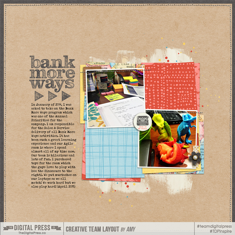
Here is an example layout that I created that tell the story about one of my job-related tasks as a Project Manager…

bankmoreways

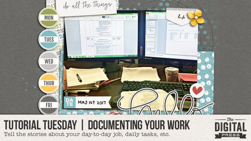
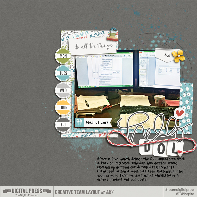
…and here’s another example layout I created, which also documents the work I do each day in order to help me remember in the future how I spent my days…

Hello-DOL_OV800


I hope this post helps you begin incorporating your job/work/daily tasks into your scrapbook pages. I think that this is a great way to ensure that all of our life experiences are captured in our scrapbooks. Happy scrapping!


Amy

About the Author  Amy lives in Richmond, Virginia with her husband of  17 years and their 12 year old boy/girl twins. Their 21-year-old daughter is currently in graduate school at Clemson! Amy has been scrapbooking since the early 1990s but discovered digital scrapbooking in 2005 when her twins were born and has primarily scrapped digitally since that time. She is passionate about telling her family’s stories and documenting their life together! Amy is a huge reader (mostly literary fiction), and is a pop culture junkie! She also LOVES all things beauty & makeup!

Hybrid How-To | Valentine Notebooks

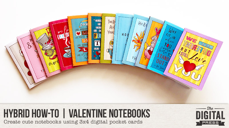
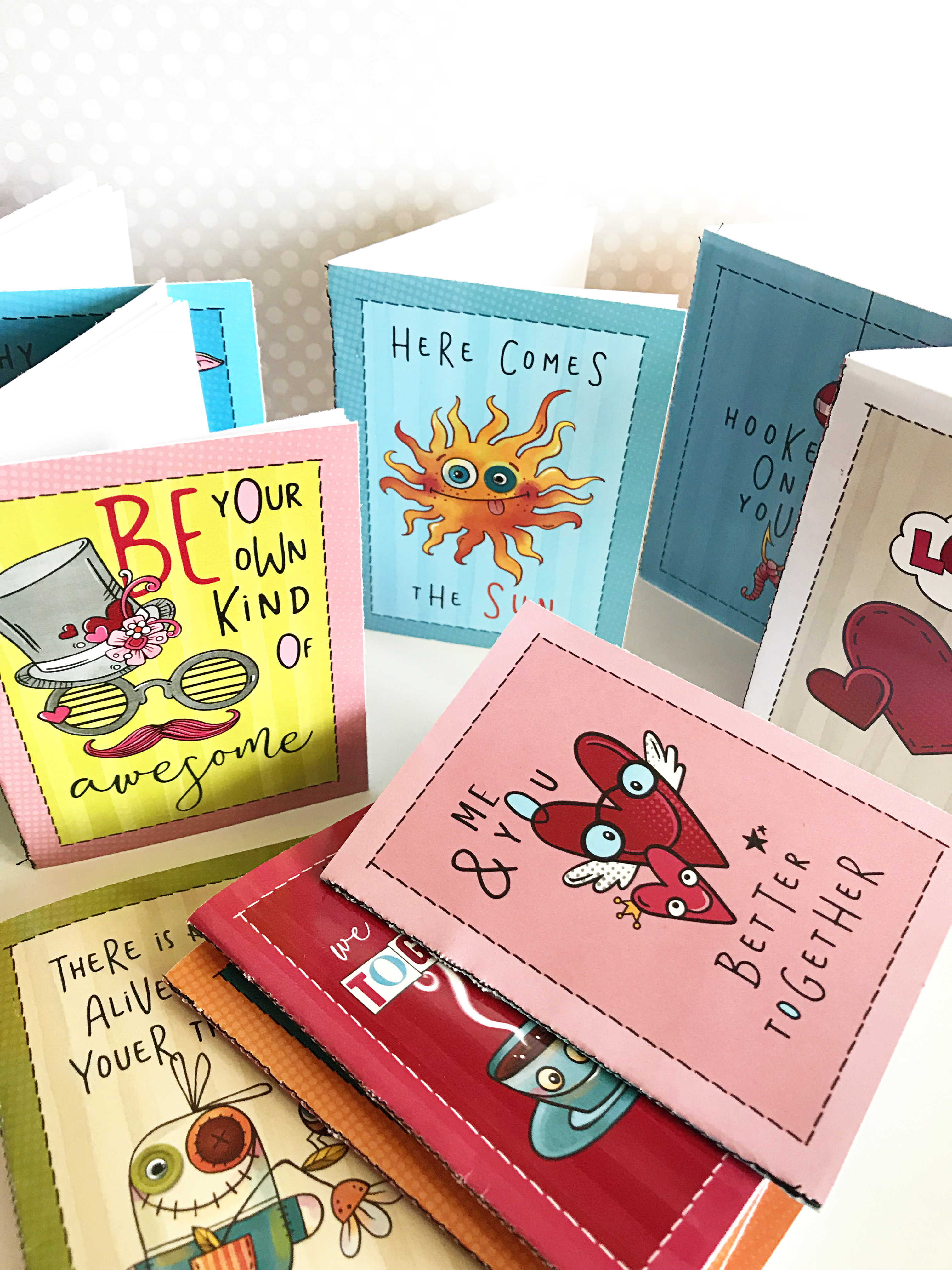
Valentine’s Day is coming up and I have these cute hybrid notebooks to share with you. They’re super easy to put together – no cutting machine needed! They’d make great gifts for a classroom full of kids.

Supplies

  • Digital journaling cards of your choice. I used Life Stuff | 3×4 Cards by Julia Makotinsky.
  • Photo editing program like Photoshop or Photoshop Elements
  • Cardstock or Photo Paper < for more vibrant color
  • Plain copy paper for inside pages
  • Scissors OR paper cutter
  • Sewing machine OR stapler

Instructions

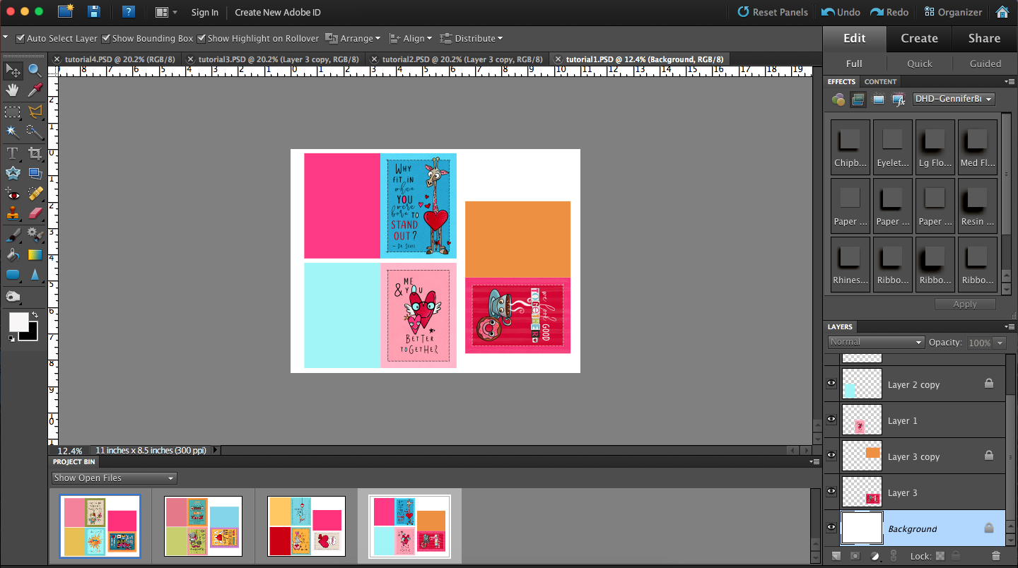
1. Get those cards ready to print! I wanted the back to be a fun color to match the cover. I dragged the cards onto a new canvas in Photoshop Elements, duplicated it and filled it with a coordinating color. Make sure the front of the cover is on the right side and the back is on the left.

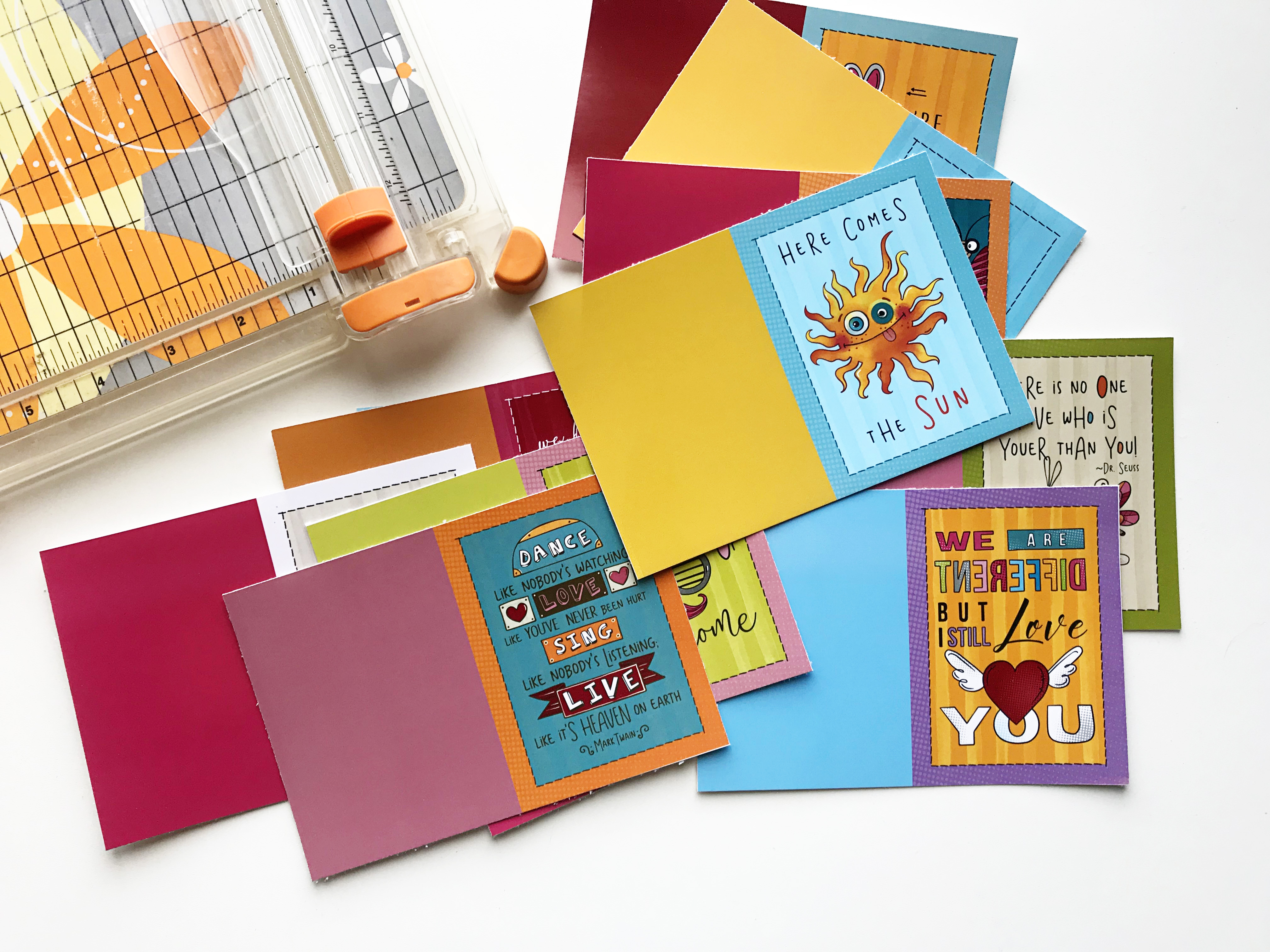
2. Print covers and cut them out.

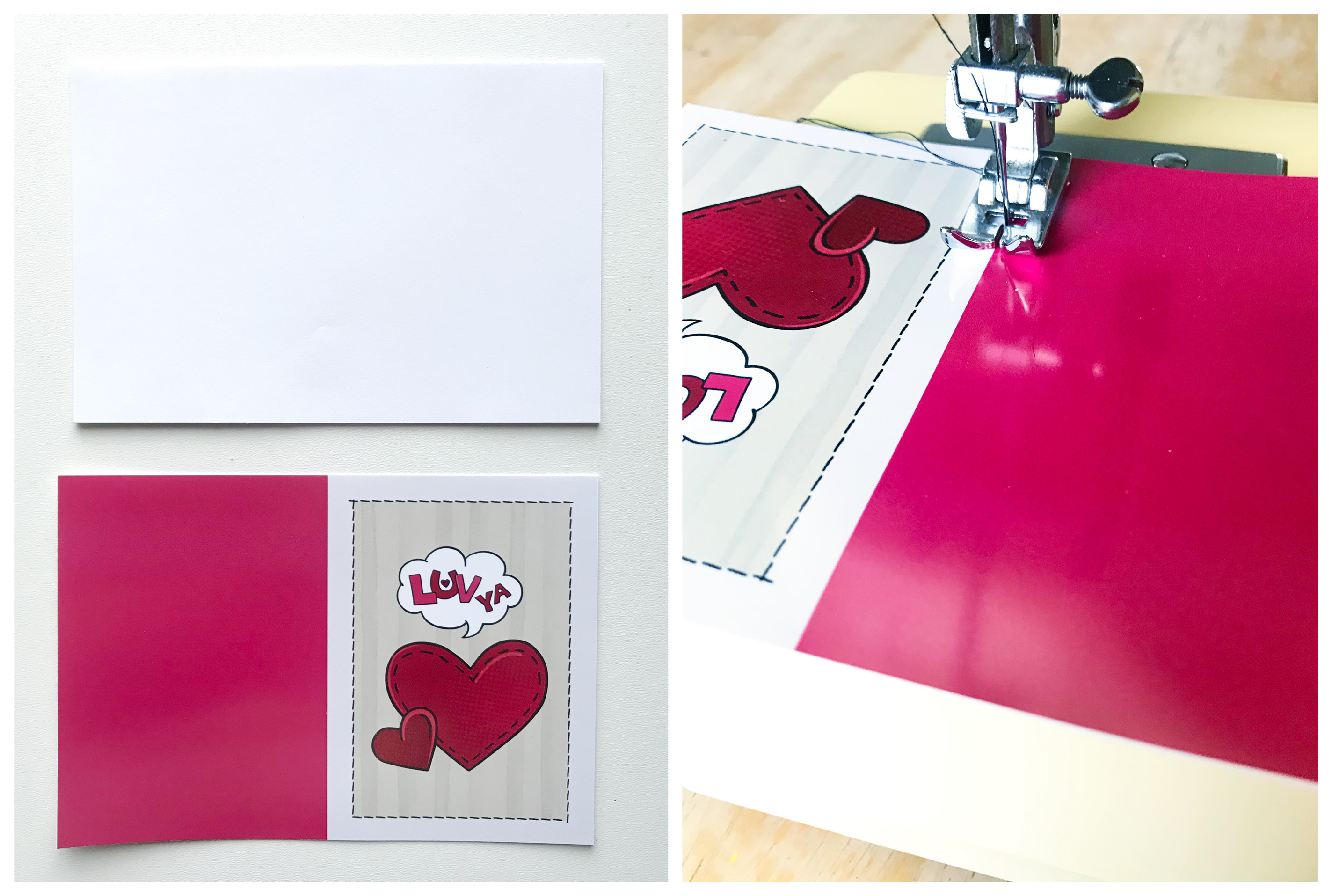
3. I cut my plain copy paper to just smaller than the covers, centered them inside the covers, and then sewed down the middle of them. You could just as easily staple the books together – three staples down the middle. Fold the books in half.

I loved putting these together. Using journaling cards makes this a quick and simple project, and of course what kid doesn’t love a blank notebook! It’s sure to be a hit.


Kate About the Author  Kate is on the hybrid team here at The Digital Press. She lives on the Utah/Colorado border with her husband, 5 kids, 10 chickens, and a dog named Gracie. She’s a city-born girl who found she’s really a country girl at heart. She can be found outside, barefoot, and probably in her garden.
Tutorial Tuesday | Streamline & Scrap an Entire Year Fast!


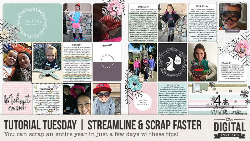
Hello everyone, and welcome to another edition of our Tutorial Tuesday series here on The Digital Press blog! Today I am here to show you my plan for getting an entire year’s worth of photos and memories scrapped — and fast (!) — using a pocket page-style system of scrapping.

I have been documenting our everyday memories using weekly pocket pages for years now, and yet recently I have found myself a little behind. Well, actually a lot behind! I have not scrapped a single week for 2017! I do have the photos (and some notes for the journaling), but I still need to actually create the weekly scrapbook pages. All 52 of them!

Therefore, I knew needed a plan in order to get an entire year of everyday memories scrapped. I needed it to be fast… and I needed it to be easy.

I think that starting a big project like this is always the hardest part. It can feel so overwhelming,,, which is normal when taking on such a daunting task… but it doesn’t have to be paralyzing. If you simplify the entire process, it can actually be really easy and go really quickly!

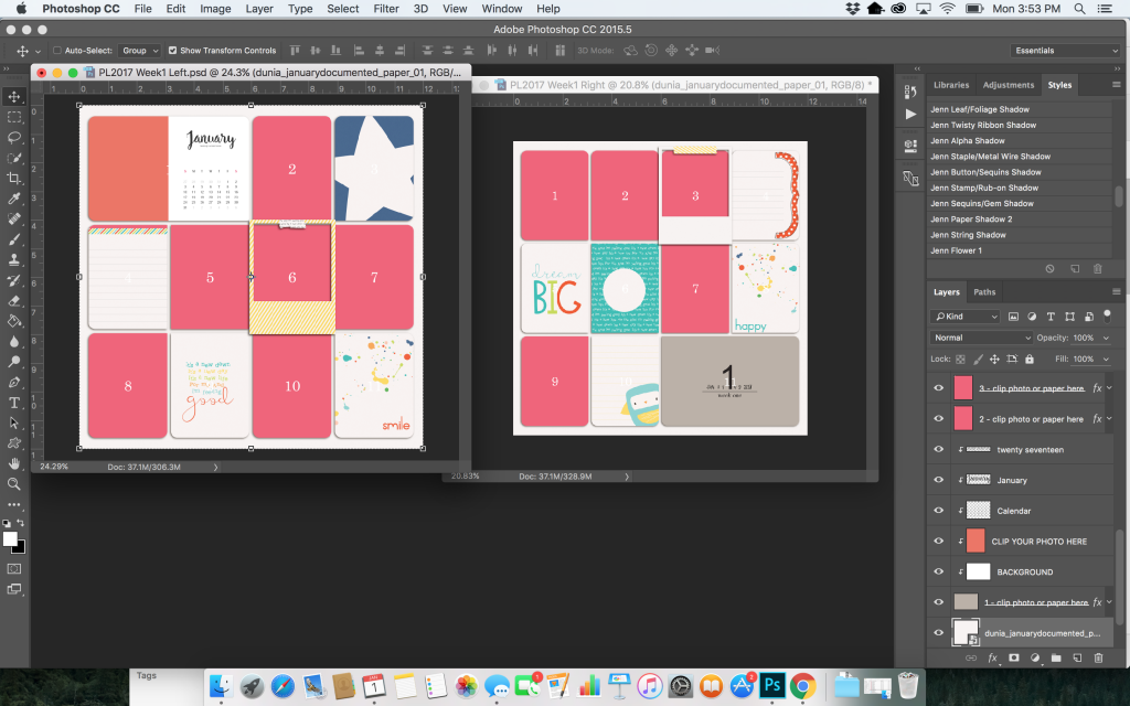
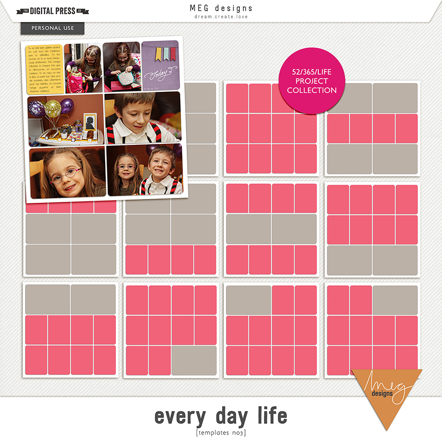
For me, the first step was to choose a template pack/design that I could use for the entire year. I chose Every Day Life | Templates No3 by MEG Designs…

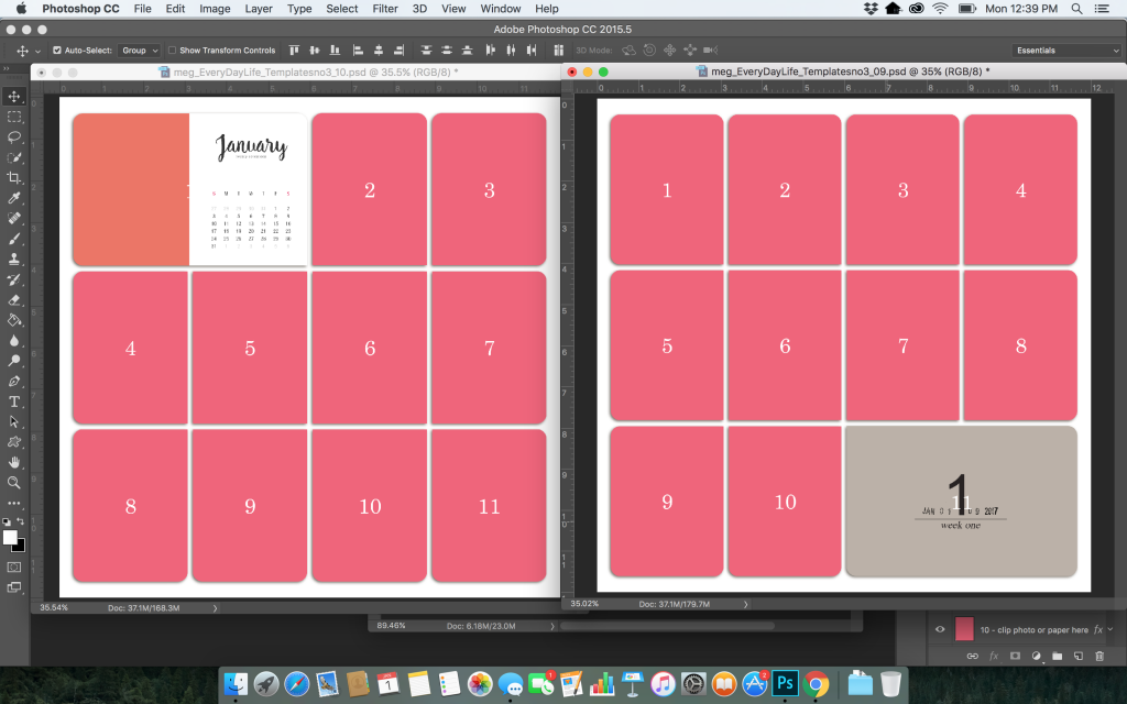
More specifically… I decided to really simplify things by choosing the same templates to use for the entire project (thus cutting out the time/etc. it takes to choose a template for each new page/2-page spread). I chose template 10 for all of my left side pages… and template 9 for all of my right sides.

Similarly, I knew it would speed things up if I chose a calendar card to use at the beginning of each month on the left side (in the upper left-hand pocket).
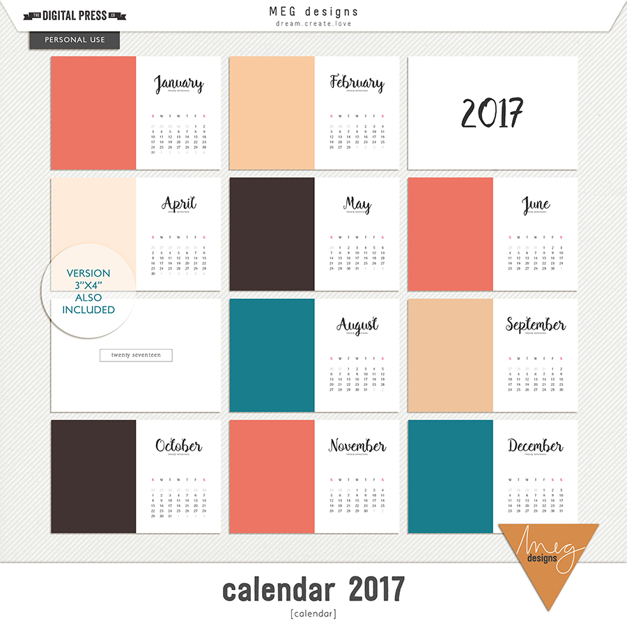
For this, I chose Calendar 2017 — also by MEG Designs…

Then, as soon as I had a chunk of time (1-2 hours) available to scrap, I did the following:

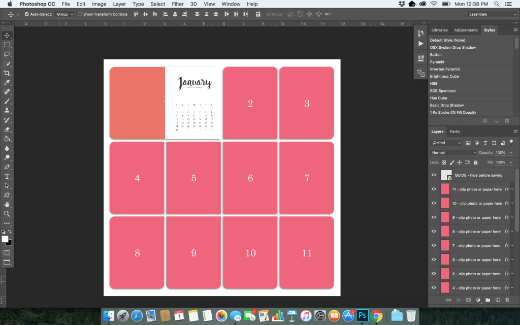
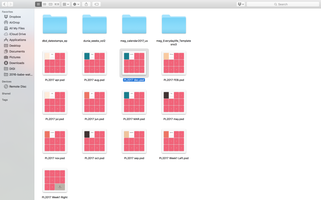
(1) I inserted a calendar card for every month and saved the PSD file into my 2017 folder on my desktop…

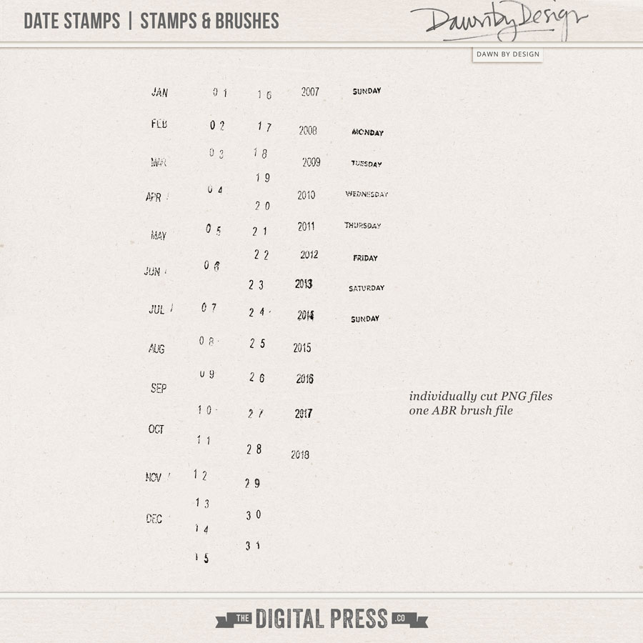
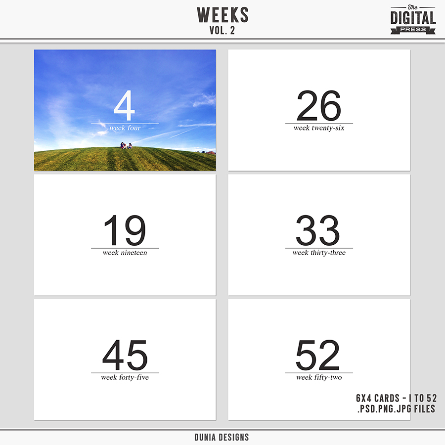
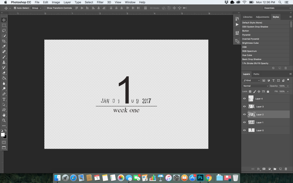
(2) Then, I chose (a) date stamps and (b) weekly cards to use throughout my album… with the idea that these items (combined with the monthly cards I’d already chosen, above) would create a simple and consistent look throughout the entire year/album. For the date stamp, I chose Date Stamps | Stamps & Brushes by Dawn by Design… and for the weekly cards, I used Weeks Volume 2 by MEG Designs…

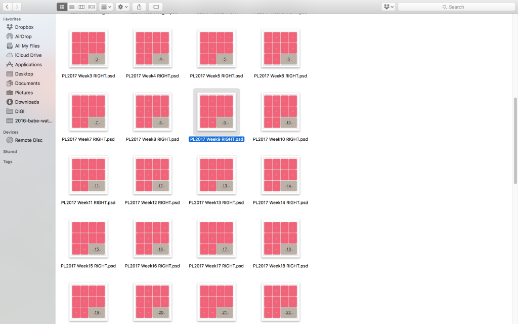
Then, I re-opened each of the layout files I created in Step 1, above, and I inserted each of the weekly cards and the date stamps into the right side of all 52 weeks (see next image, below). This did take some time… but I binge-watched Netflix while doing it, and got it done! 🙂


(3) Once I had all 52 of my templates started and saved in my folder, as detailed above, I started working on January. My plan was to set aside a chunk of time to complete 1 month at a time. In theory, that would mean that in just 12 “chunks” …I would have a completed 2017 album!

For me, the fun part is always choosing what digital kit to use! I am typically an embellishment-loving scrapper — meaning I like to add all kinds of chunky embellishments and layers on my layouts. But I knew that if I was going to get 2017 completed, I would have to keep my layout spreads simple. With that in mind, I decided that in addition to the cards and date stamps already discussed above, my plan would be to use: (a) plain backgrounds, (b) journal cards, and (c) minimal embellishments.

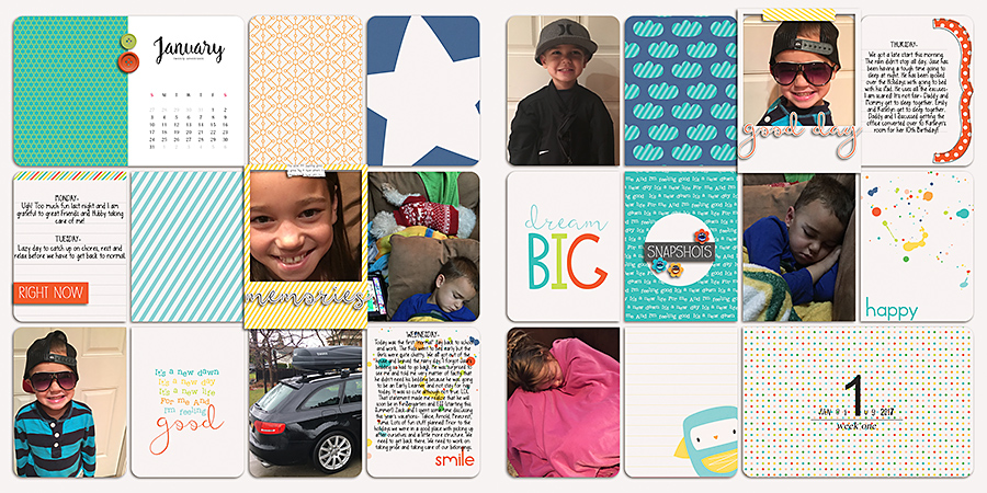
Here’s a look at how I began “filling in” my templates with journal cards. For the first week, I chose to use the January Documented Cards by Dunia Designs…

*PRO TIP*
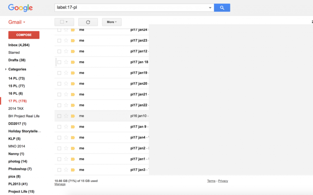
Even though I didn’t keep up with the actual scrapbooking of my weekly spreads in 2017, I did keep up with my daily journaling. I simply sent myself an email every morning with a recap of the day before — along with random memories like the silly things the kids said or did, and/or any other special moments. Then, I filed these in a folder in my gmail account. Easy, right?!

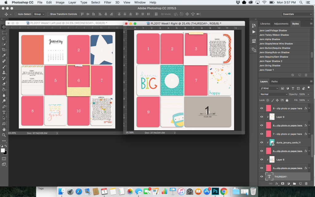
Using these notes in the “emails to myself,” I copied and pasted some journaling onto my cards/layouts…

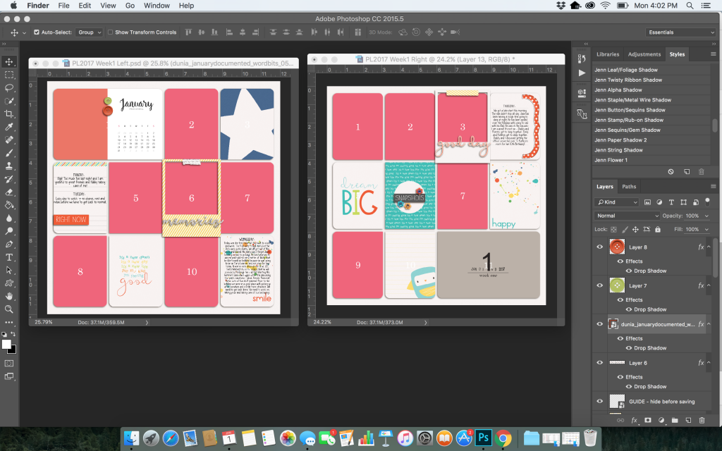
Then, I added my minimal embellishments…

And finally, I added my photos (which I keep organized in SmugMug throughout the year, as I take them)…

After completing my first week’s spread… I repeated this process to finish out the rest of the month of January 2017.

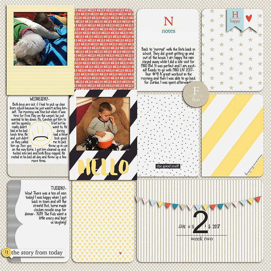
As I worked my way through the month, it turned out that I didn’t have too many photos for Week 2, so I created a single page. There are lots of other types of pages that I can put in place of the “missing side” (some ideas I like are: a “Currently” page, a “Current Events” page, a “Travel Bucket List” page, and/or a list of “Resolutions”).

Here’s what my single-page Week 2 layout looked like, once finished (using the Hello January Bundle by Dunia Designs)…

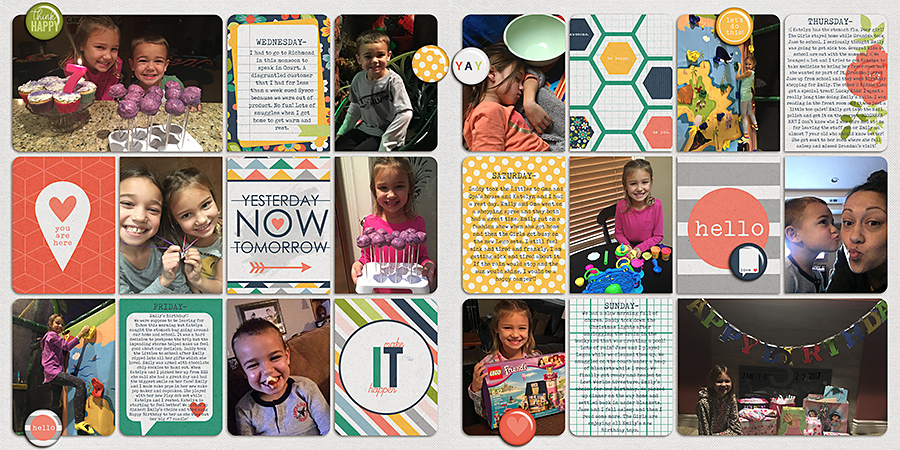
After that, I created my Week 3 spread (using products designed by one of TDP’s guest designers in January 2018; no longer available at TDP)…


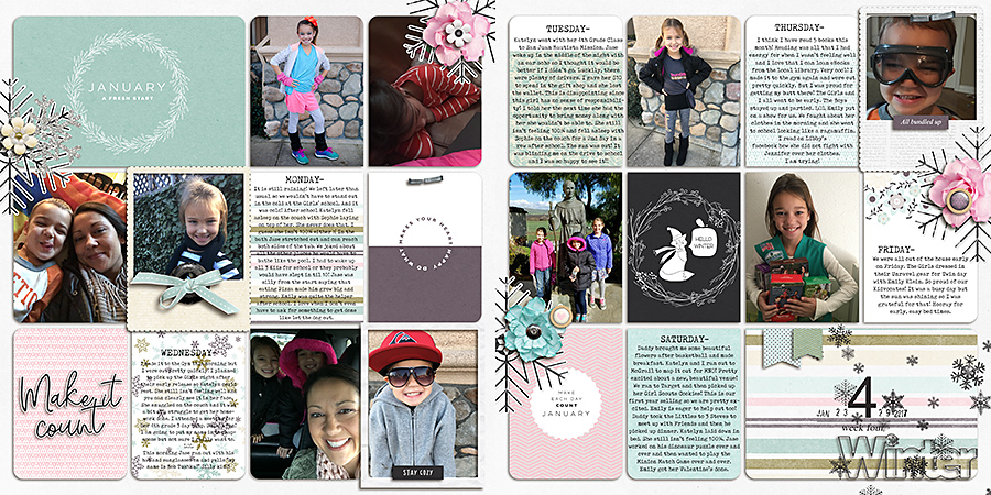
And finally… a look at my Week 4 spread for January 2017 (using the Make it count: January 2018 | Collection by Anita Designs)…

(4) Once each page was finished, I saved my files in 3 places:
1. External Hard Drive
2. Smugmug
3. Blurb (that way, my files will already be uploaded when it comes time to print!)

(5) And now… I just need to do this 11 more times and I will have a finished 2017 album! 🙂

But truly, it was really quick (and easy!) to get an entire month’s worth of photos from a year ago scrapped and recorded in just a couple of hours. Streamlining the process (with the monthly cards, weekly cards, and date stamps) really sped things up. Using my emailed notes from last year was a life-saver, as well!

So now… go give this a try! If you’re feeling behind and you have a mountain of memories to document, give this system/process a go! You’ll be happily surprised at how much you can get done in a really short time if you “automate” the page composition and the decision making.


About the Author  Krista Lund is a mom of 3, married to her high school sweetheart and living in the San Francisco Bay Area. Some of her favorite things are brownies, chips ‘n’ dip, taking pictures, and documenting her family’s story.

Tutorial Tuesday | Using Color Casts on Photos

Hello everyone! Today I am going to talk about something that we probably don’t see many examples of in the scrapbooking galleries. Have you seen photos with colours that match more closely with other design elements on the page or are colour blocked to give a more graphic feel and wondered how it is done? So, let’s drive straight in.

Colour casts are something that we should be very careful about. They may not work for all kinds of photos and layouts. Of course, there are many ways to do it but I will be highlighting two distinct approaches today.

1. All over photo colour cast to harmonise the layout

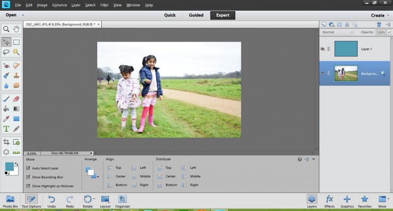
This is my original photo that I will play around with.

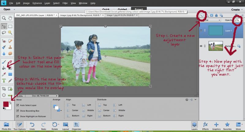
After usual edits, I decided to overlay a slight blue green tinge. The steps followed are shown in the image below.

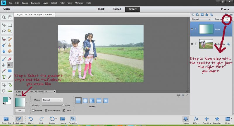
Using a solid overlay is the easiest way of adding a cast or a tint. However, if you don’t like all of your photo to be tinted you could very easily use the gradient tool to create a more subtle or dramatic (as the case may be) effect.

As you can see, I have used a gradient so that there is minimal tint on the girls and more on the background.

Once you are comfortable with these basic steps, you can practically play with different blending modes and select the one that suits your photo/layout the most. A couple of other options shown below:

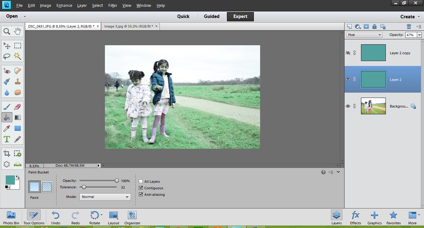
Hue blending mode 47%

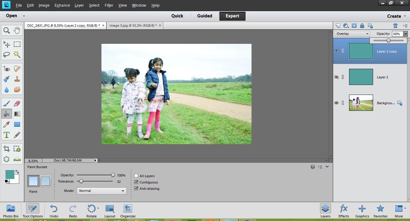
Overlay blending mode 50%

2. Overlay a block of colour on photos – partially/in patterns

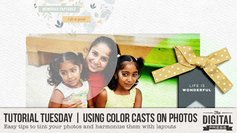
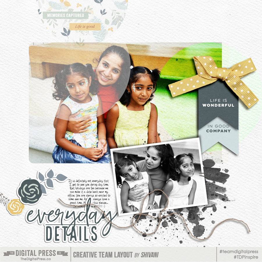
The colour casts can also be used selectively – for example if used in conjunction with geometric shapes, the effect could be quite graphic. Here is one of the layouts I created to demonstrate this.

So that’s it, some quick ways to add colour casts. Hope you have found this useful. Please share any layouts you make using these techniques in the comments below.

Till next time then, happy scrapping!


Profile pic avatar small

About the Author Shivani Sohal is a donner of many alter-egos. A finance professional by day in busy London, she morphs into a seemingly normal mum of two in the evenings and weekends. She is constantly found with her fingers in too many pies and juggling the metaphorical balls. That is living on the edge for her; aided by the two ankle biters and a darling hubby who define the warm and mushy for her. She is ferociously dedicated to memory keeping — almost immune to any nay-sayers (or equally-disruptive crying children or annoying house fires!); keeping her head down and forging ahead at all times.