Category: Tutorials

Tutorial Tuesday | Removing Objects From Photos

Hello, and welcome to this week’s edition of our Tutorial Tuesday series here on The Digital Press blog!

This week, I’m going to cover two different ways to use Photoshop (and/or many other photo editing software programs) to remove unwanted objects from the backgrounds of your photos. I find myself using this process a lot when I know I have a great photo — you know, everyone’s eyes are open, everyone is smiling — but there’s something in the background that ruins it a little bit. That’s all easily fixed with one of these two methods!

Both methods ultimately do the same thing: Photoshop samples from the surrounding area to “guess” what would be behind the object you’re removing. I find I use both methods in succession, because each one has its pros and cons.

Method 1: Using the Content Aware Feature

Step 1: Open your image in Photoshop

Step 2: Using the pen tool, draw a path around the part of the photo that you want to remove. You don’t have to be super exact here, but still get it as close as you can. You’ll want to draw the path a little way out from the edge of the item you’re deleting, but not too close to any other foreground object nearby. You can see in this screenshot how close I’m getting…
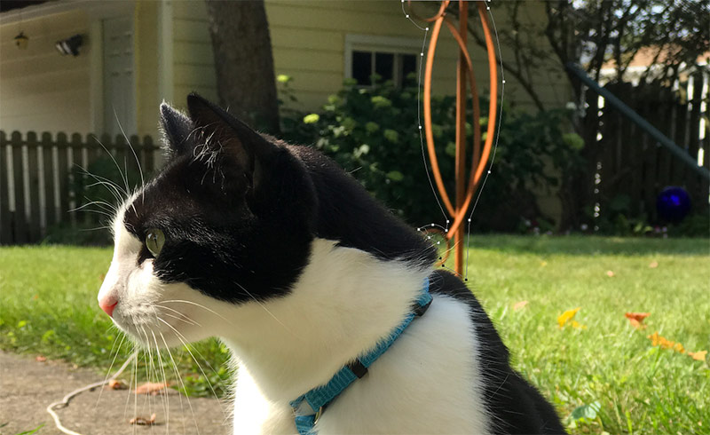
Step 3: Make sure you’ve got a path drawn all the way around the object, and make sure to connect the ends. Then, right-click anywhere inside the path and choose “Make Selection.” In the pop-up window, choose “0” for the “Feather Radius” and leave all the other options as the defaults, as shown here…
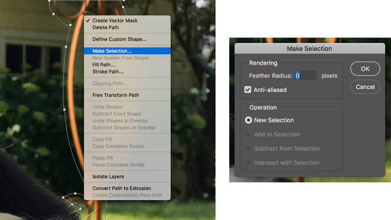
Step 4: Now you should have an active selection around the object you want to remove… so it’s time for the magic to happen! Choose “Fill” from the Edit menu. In the dialog box, make sure the Opacity is set to 100% and leave all the other options as the default…
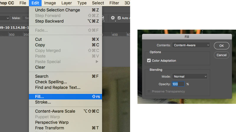
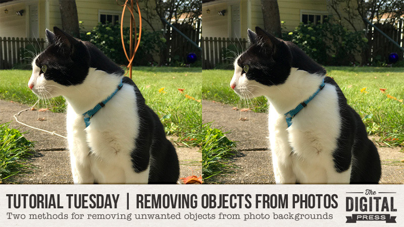
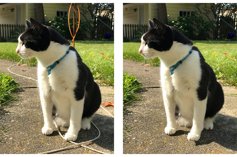
And voila! Your object disappears and Photoshop smartly fills in the space using samples from the surrounding area. Take a look below; on the left side, you can see what the image looked like before… and on the right, you can see I’ve taken out the metal structure and the leash…
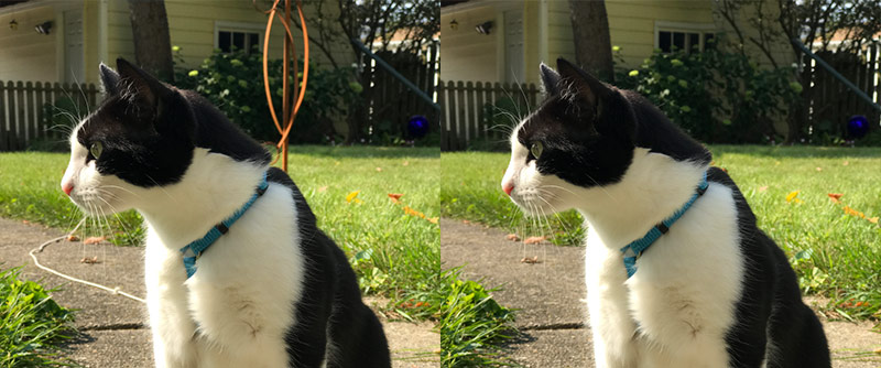
It’s important to note that there will occasionally be a couple of places that need to be “cleaned up” where Content Aware doesn’t do a perfect job. For example, the cat’s paws didn’t come out quite right after I removed the leash from the background, using the method above. I’ll use Method 2 to fix this up…

Method 2: The Clone Stamp Tool

Step 1: From the toolbar, choose the Clone Stamp tool. It looks like this —> Screen Shot 2017-09-26 at 7.57.00 PM

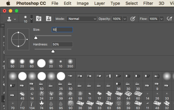
From the options panel, choose a brush size that is appropriate for the area you’re fixing. If you’re removing a larger item, you can choose a larger brush. If you’re fixing up an edge, I like to use a 10 or 20 pixel brush. I like to set the hardness to about 50% so you end up with a blended edge and not a stark and obvious contrast…
Step 2: Holding down the ALT key (PC) or the OPTION key (Mac), click in an area of the photo from which you want to sample the replacement. You will see a little crosshairs circle icon to know that you’ve got it right. I usually try to choose a part of the image that has some amount of random texture or grain so that it still looks natural.
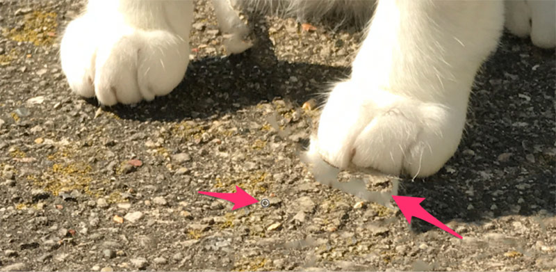
Step 3: Next, release the click and “paint” in the area you want to replace. Photoshop will copy the image from where you set the anchor… and then paint into the area you’re fixing with the other part of the photo…
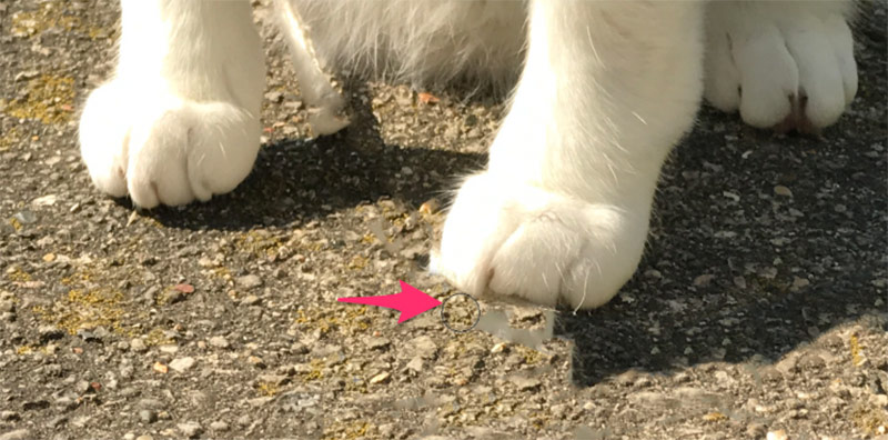
Result: With a little practice and variation of brushes, you can see the result…
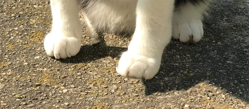
Here’s a look the complete “before and after” of this image, after using both methods. You can tell what a big difference it makes!
Hopefully these two techniques will help you fix up your photos more easily. Happy editing!


ShannonAbout the Author  Shannon has been completely addicted to digiscrapping since she began in early 2016 (though she’s been a scrapper since 2000). Her early morning ritual of a few quiet hours of scrapping while sipping a chai tea is her favorite part of each day. She is also the owner of a web design company, and when she’s not at the computer designing websites or digiscrap layouts, she’s probably hiking one of the local mountains in her hometown of Phoenix, Arizona. She is an avid reader and loves to travel to foreign countries.

Tutorial Tuesday | Sharing Layouts in the Forum

Hi Scrappers, and welcome to another edition of our Tutorial Tuesday series here on The Digital Press blog!

With Digital Scrapbooking Day (DSD) just around the corner, I am looking forward to seeing a lot of amazing layouts shared in our DSD forum posts! So, this seems like a perfect time to review how to share layouts — linking them up from the TDP gallery into posts within the forums. It’s really very simple, once you do it a few times!

Follow these steps and you’ll be a layout-sharing expert…

  1. Locate the layout that you would like to share in the gallery.
  2. Click on the layout.
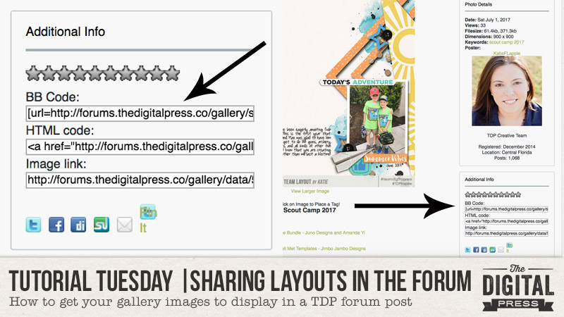
  3. To the lower-right (below your layout) and you will see a box that says “Additional Info” (see header image example, above).
  4. In that “Additional Info” box, locate the BB Code and copy it (on a PC… click-highlight + Ctrl-C; on a Mac it will be Command-C).
  5. Go to the forum and find the entry box where you would like to add the layout.
  6. Add any text that you would like to appear before the layout in your post.
  7. Paste in the BB Code.
  8. Add any additional text that you would like to have appear below your layout
  9. Click “Preview” to check your post to make sure it looks just right.
  10. Click “Post Reply” once you are happy with your post.
  11. Admire the amazing job you just did sharing your layout in the forums! 🙂

See? I told you it was simple! That’s seriously all there is to it.

I hope that this quick tutorial will inspire you to share a lot of layouts in the forum (it comes in especially handy to participate in our monthly challenge system, etc.)!

Now — we invite you to come get more involved in The Digital Press’s forum! A great place to start is in our RAVE REVIEWS thread; each month, we have a thread in which we share layouts that inspire us. Anyone is welcome to post on that thread, so head over there now to practice sharing a layout in the forums! You can find the RAVE REVIEWS thread in the ADVICE COLUMNS section of our forum.


About the Author  Katie is a member of the creative team here at The Digital Press. She lives in Central Florida with her husband and their four sweet but crazy boys. When she’s not dodging Nerf bullets or trying to dig out from under the never-ending pile of laundry, she enjoys photography, cooking, going to Disney World with her family, and, of course, digital scrapbooking.

Tutorial Tuesday | Custom-Shaped Text Boxes

Hello, and welcome to another edition of our Tutorial Tuesday series here on The Digital Pres blog!

A little while back, we showed you a technique for writing text around the outside of a shape (like a circle, etc.) — and today, we thought it would be fun to follow that up by showing you how to write text inside (instead of around the perimeter of) any shape!

I imagine that most of the time when you add journaling to your page, it is in the shape of a rectangle or a square… but sometimes it can be fun to use something different. There are all sorts of shapes you can use… circles, hearts, arrows, and even letters or numbers!

For the purposes of this tutorial, I am using Photoshop CS5.1 — but the steps should be similar for other versions, as well.


First, I will show you how to use one of the default shapes that you will most likely have in Photoshop already.

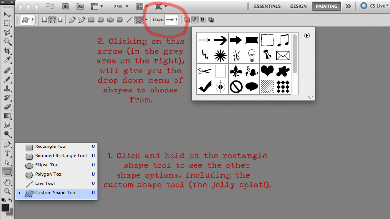
In your toolbar, select the shape tool. When you first open up photoshop, this tool is usually displayed as a rectangle — but when you click and hold the rectangle some other options will also appear, including the “custom shape tool” (which looks to me like a splat of jelly! – see below). With your “custom shape tool” selected, you can then choose another shape. On my machine, the toolbar for this is at the top of my workspace, and looks like this…

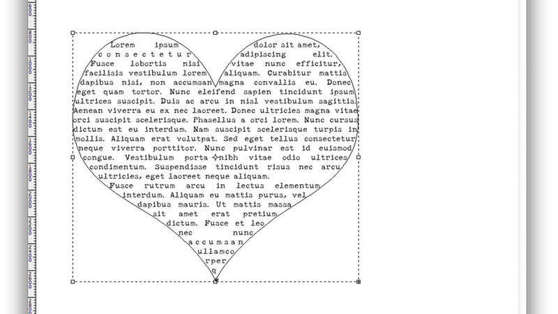
When I click on the arrow, a drop-down menu of standard shapes appears. I have chosen a heart (by clicking on the heart on that drop down menu), but you can choose any shape you like from that menu.

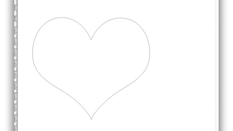
With the heart shape selected, I move my cursor onto my page, and then press SHIFT and hold down the LEFT button on my mouse, and drag it until I have the right size heart for my text/page.

Once I have defined size and shape, I can go back to my toolbar and select the TEXT tool, and then click inside the new shape I have created. The cursor looks like an “I” with a dotted circle around it. That means I am ready to type, and my text will fill the shape of the heart, like this…

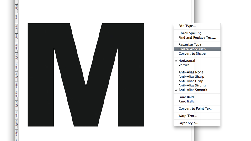
I decided to play around with this a little more, and decided to use a letter as the shape for my text (a giant M, for my son Matthew). To do this, I first used the TEXT tool to write a giant M on my page. I chose a chunky but simple font for my M, so that the shape wouldn’t be too fussy to fill with text.

So, with my giant letter M, and the type tool selected, I hovered over the letter and RIGHT clicked to choose the CREATE WORK PATH option from the pop-up menu.

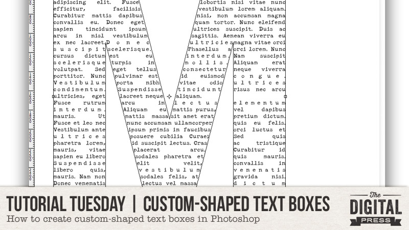
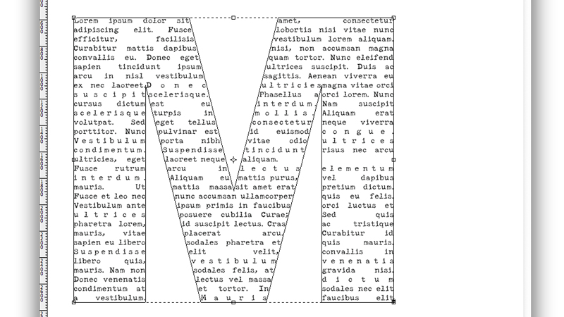
Now, when I go over to the layer menu (on the right of my workspace), and click on the eye icon, so “hide” the text layer, I am left with just the outline of the M, rather than the solid black M. I can then put my cursor back into my M text box and the cursor looks like an I with a dotted circle around it, and I can then write my text inside the M shape box. Like this:

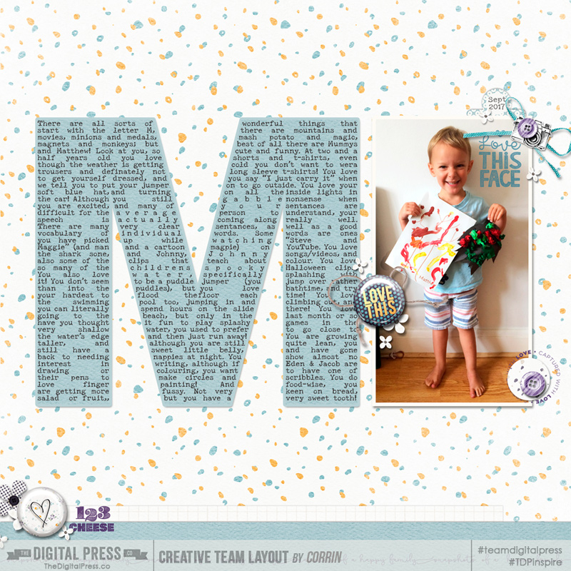
I filled my M with all the things that I want to remember about my son at this age, and here is how it looks on my completed page:

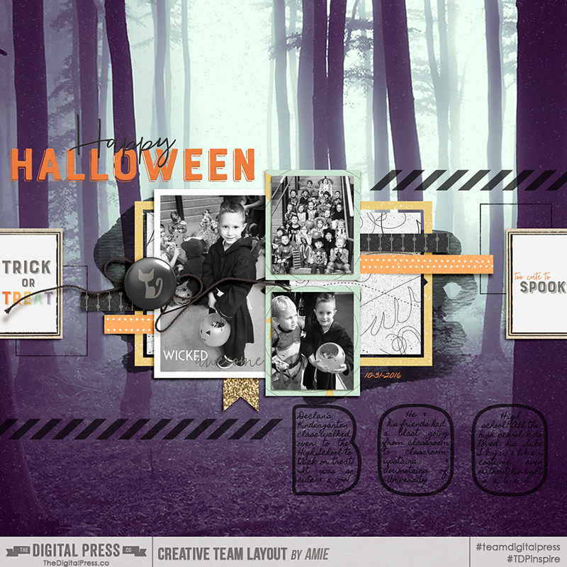
You can have all sorts of fun using different shapes, letters, numbers, and even words as text boxes. One of our creative team members, Amie, made a fun Halloween page using this technique and wrote her journaling inside the word “BOO” — such a cute idea!

I hope today’s tutorial might give you a new option for the formatting of your journaling — something fun and a little different!


CorrinAbout the Author  Corrin is a member of the creative team here at The Digital Press. She is a fan of the Big Bang Theory and a lover of cozy pajamas. She lives in the breezy South of England with her husband and 4 crazy kids, who regularly discover & plunder her secret chocolate stashes! She is still trying to get the house straight after moving nearly 3 years ago. Who knows… maybe this will be the year she reaches the bottom of the laundry pile!
Hybrid How-To | Custom Canning Labels

Hello everyone! Kate here, bringing you another edition of our Hybrid How-To series on The Digital Press blog!

Today I want to show you how easy it is to make custom labels for all of your jars. 🙂 August and September are canning months where I live. I mostly can tomatoes (I have 48 tomato plants this year!), but I love doing relishes and pickled vegetables as well. It really helps stretch the budget for our big family.

Supplies

  • digital scrapbooking kit of your choice (I used Homemade by Anita Designs)
  • cardstock OR printable sticker paper
  • cutting machine or scissors
  • hot glue (if not using printable sticker paper)

Instructions

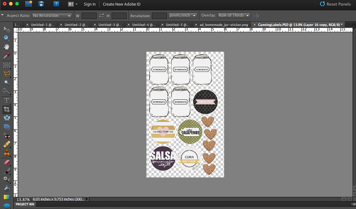
First, you’ll design your labels in a photo-editing program like Photoshop (PS) or Photoshop Elements (PSE). For regular-mouth jars, start with a 2″ circle as a template. If you’re just doing the labels (not the extra decorative tags), I recommend sticker paper. It’s so easy to copy the design for however many jars you have and fill the page with your labels, with no other adhesive necessary.

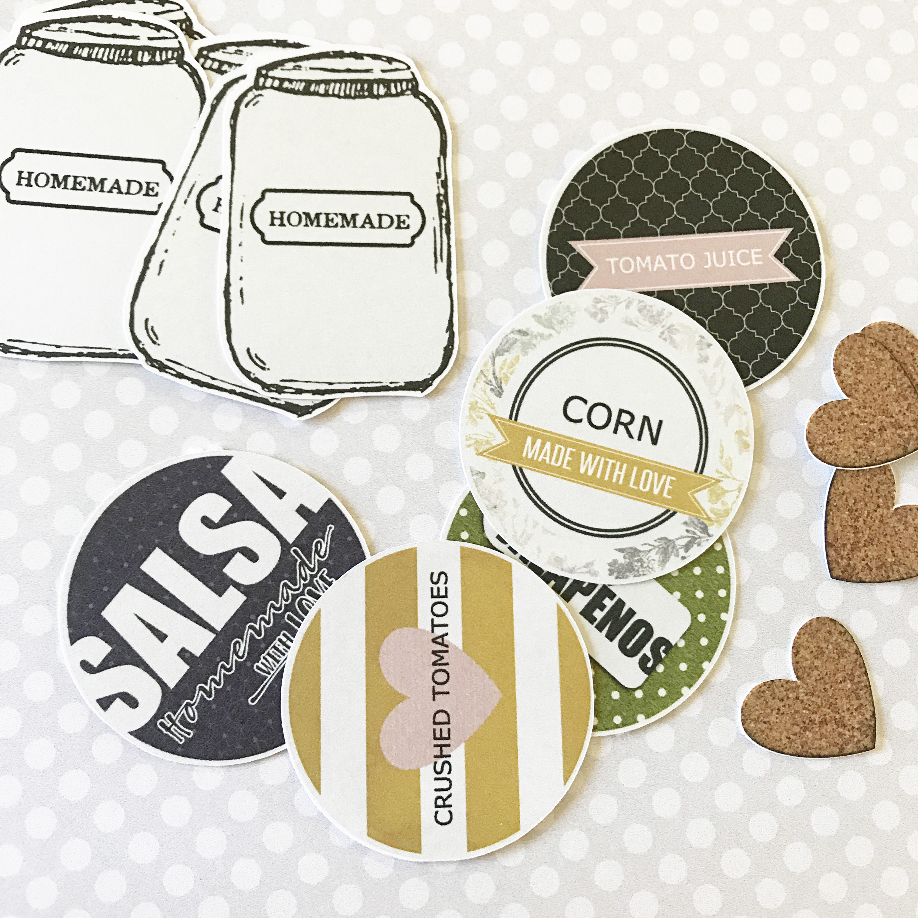
Next, you’ll print and cut your labels…

After that, you simply need to adhere the labels to your jars (and/or create hang-tags to tie onto jars with string, etc.). If you’re not using sticker paper — I have found hot glue to be the best choice for adhering the labels straight to the lid.

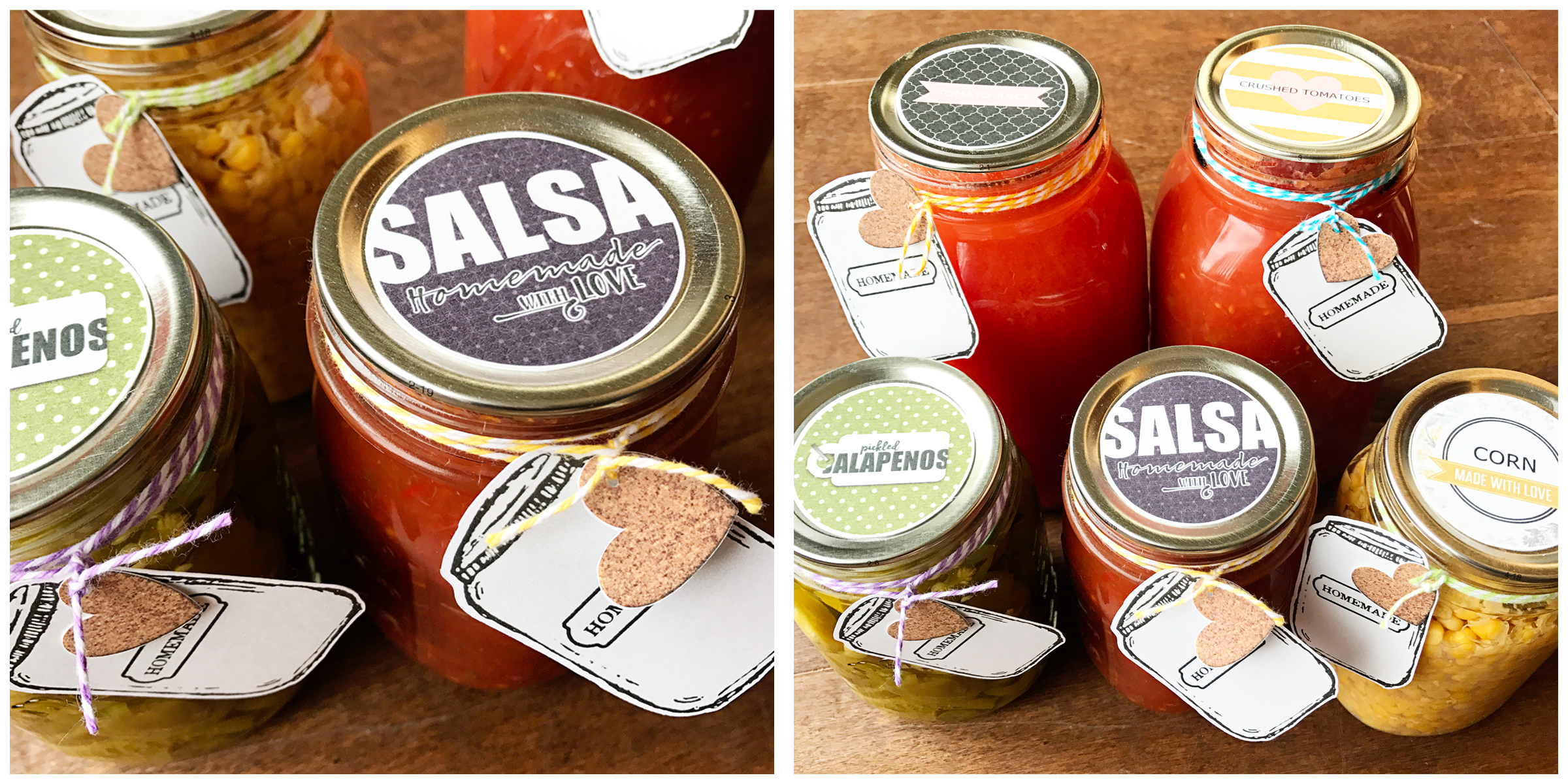
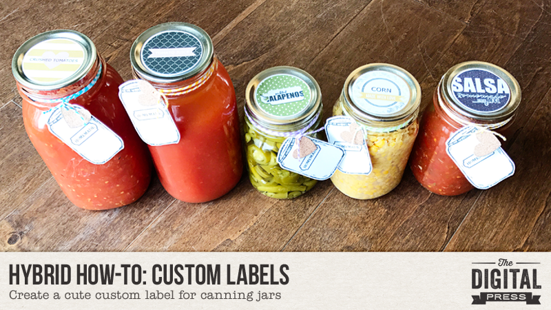
Here’s a look at a finished batch of my jars with labels…

Aren’t those cute? And so easy!

I hope you’ll give these a try! If you’re interested in earning points in The Digital Press’s challenge system (good toward earning everything from discounts to free kits!)… come to the forum and jump into this month’s hybrid challenge!


Kate About the Author  Kate is on the hybrid team here at The Digital Press. She lives on the Utah/Colorado border with her husband, 5 kids, 10 chickens, and a dog named Gracie. She’s a city-born girl who found she’s really a country girl at heart. She can be found outside, barefoot, and probably in her garden.
Tutorial Tuesday | The “Little Planet” Effect

Hi everyone! I’m happy to present another edition of our Tutorial Tuesday series here on The Digital Press blog! This week, we will learn how to create a “little planet” with our pictures — also known as a “polar panorama.”

I’ll go through the process of doing this in Photoshop (PS), but there’s probably a similar procedure in other photo editing software programs, as well.

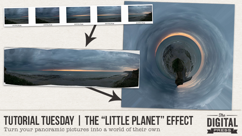
The first step is to create or find a panorama, ideally one that is 360 degrees. If you take the pictures yourself, try to stay constant in all your pictures — or in other words, stay at the same spot, use the same settings and same focal length (don’t zoom in or out), and stay level (have the horizon horizontal and about at the same place in your pictures). It’s easier to do with a tripod, but not mandatory. My example pictures, below, were taken in a handheld fashion.

Here are the images I used to create my panorama…

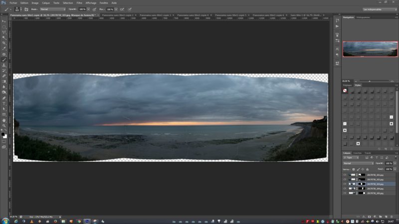
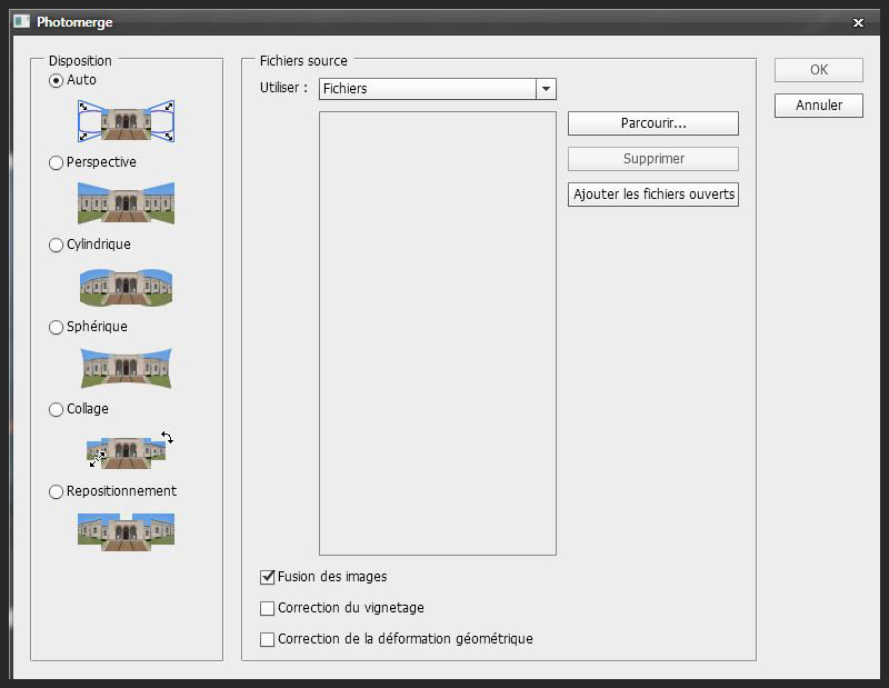
To create the panorama in Photoshop, try using the “photomerge” feature — which can do it automatically. This feature is located in File > Automate > Photomerge. You can either browse through your files, or use images that are already open. Here’s a look…

Here’s the result of the photomerge process for my example photos. As you can see, it’s pretty good as-is! I just had a little spot to correct (the water/sky line wasn’t properly aligned), but it was easy to do because each picture is on its own layer with masks (i.e. independent from the others).

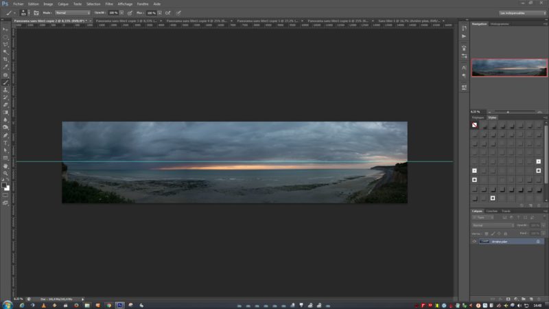
Next, I cropped the image to get a long rectangle. Because my photos were about 180 degrees and not a full 360 degree panorama, I made sure to try and align the left and right sides of the pictures. Those will get “connected” when we create the circle (below), so I wanted to make my job easier by making sure that the cliffs are cropped at about the same height…

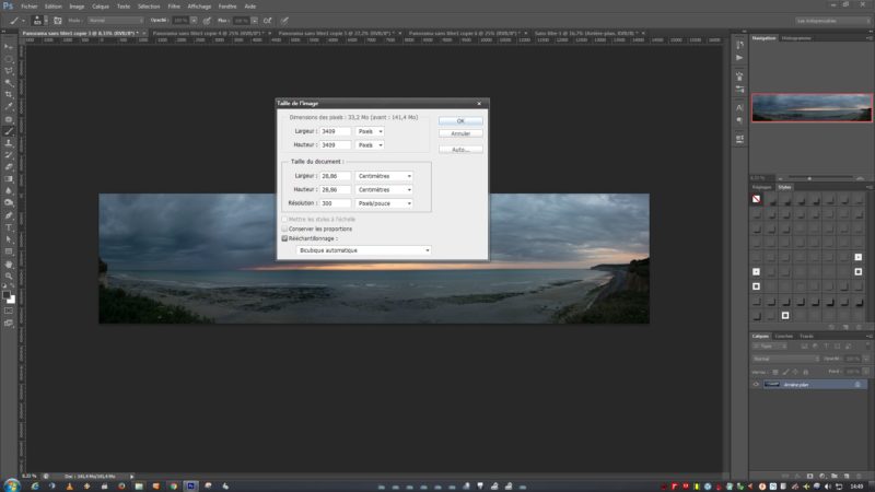
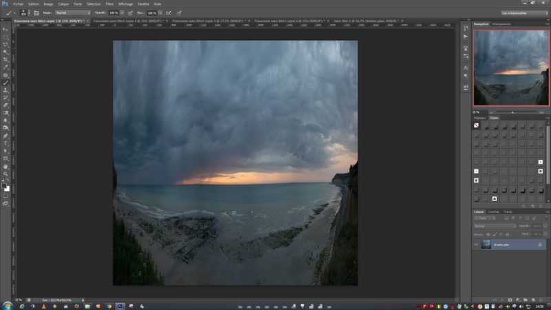
Now we finally start the real “little planet” effect. First, shrink the photo to create a square image. I know, I know, we should never distort an image… but this is actually a case in which you don’t want to respect the original proportions. Use the Image > Image size from the menu… or else use the Alt+Ctrl+I  keystroke function. Unlock the proportions, and then type the same number in the width as in the height.

Here’s the result of that last step (it looks super weird right now, but it’ll get better, I promise!)…

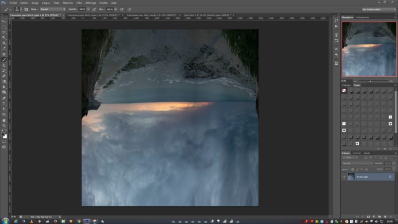
Next, turn the image upside down by using Image > Rotate > 180 degrees (and now it looks even weirder)…

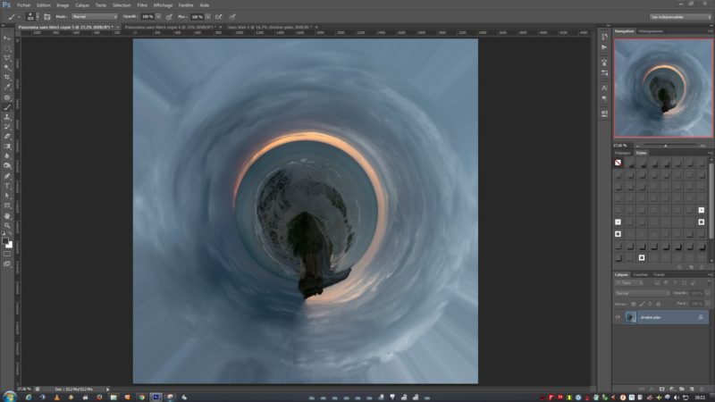
Next, you’ll create your “little planet” by using Filter > Distort > Polar Coordinates. Make sure the “Rectangle to Polar” box is checked, and then click OK.

And… tada(!), your little planet is born!

You can now edit the junction and blend the two sides of the image together. This is why I cropped a few pixels away to help match the sides, I just had to use the “patch” tool and it was easily done. I also chose to turn the photo upside down again (with the Rotate > 180 degrees tool) because it made more sense to me, but it’s optional.

And you’re done!

I think this special edit can produce really unique images, perfect to represent how your world revolves around someone, or how somewhere is the center of the world for you, etc.

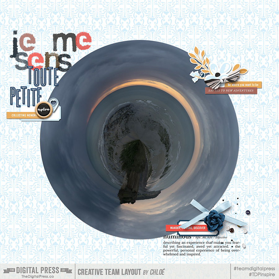
With my example. I wanted to scrap about how little I feel in front of the sea… how magnificient this view is(!)… etc. I used Jaunt by Sahin Designs and the Lanky and Stamped alphabets by Dawn by Designs to create the following scrapbook page…


I hope you’ll give this fun technique a try! You could also experiment with a person in the frame? I haven’t done it yet, but it’s on my photography “to-try” list. Don’t hesitate to ask any questions you have (in the comments, below), and I’ll do my best to help!


ChloéAbout the author  Chloé is in charge of PR and communication for her small town by day, is a digiscrapper “by night,” and a photographer whenever the light is beautiful. She lives with her man and fur-babies in a small town of Alsace (in the northeast of France), where she loves to read, watch good TV shows (TWD being her absolute favorite), and just hang out with her friends — no matter if they are close by, online, or away in her Swiss hometown. She recently became quite obsessed with Bullet Journaling, FLyLady and Zero Waste.

Tutorial Tuesday | Creating a Cut-Out

Hello, and welcome to another edition of our Tutorial Tuesday series on The Digital Press blog!

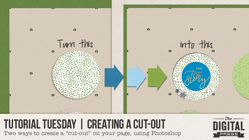
I have recently been playing with cut-out shapes on my digital pages, and I’ve really been enjoying the new layer of depth it can add to the pages. There are two different ways to create a “cut-out” look… and I will talk you through them each today!

For the purposes of this tutorial, I am using Photoshop CS5.1 — but the process should be similar for many other versions of Photoshop, as well.

METHOD #1

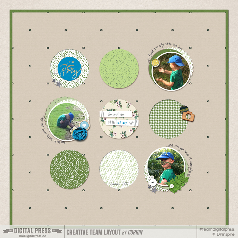
The first method works if you already have a journal card or shape on your page that you want to make appear as though it’s been cut out. For example, I used a template from Sahin Designs that uses a lot of circles (see below), and I wanted to make some of them appear to be cut out, rather than having all of them layered on top of the background paper.

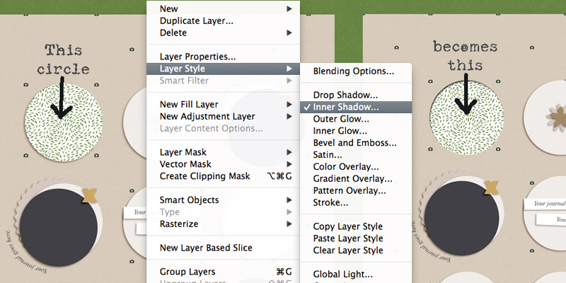
So, looking at the top-left circle, I (a) clipped my paper to the circle, and then (b) with the circle layer (NOT my clipped paper layer) selected, I used the “Inner Shadow” (rather than the “Drop Shadow”) from the shadow menu. You can find this option by going to your menu and selecting LAYER –> LAYER STYLE –> INNER SHADOW.

After you’ve changed the shadow to an “Inner Shadow,” all you have to do is adjust the depth, angle, and size of the shadow as you wish.

*NOTE* If your shape already has a shadow applied, like this particular circle on my template did, then you will need to de-select that shadow style before you select the new inner shadow. I am sure you knew that already, but it is possible I forgot to do that once or twice, and ended up with something that looked a little odd!

Then I repeated that same shadow style on a few other circles (one on each row), and here is the end result… 🙂

METHOD #2

The second method will actually cut a hole out of your backgound paper, but it is also very simple to do.

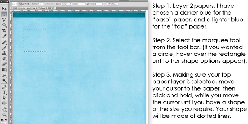
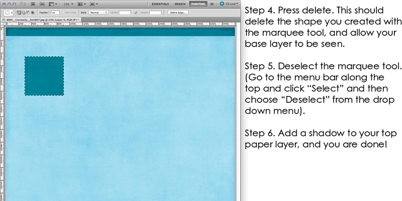
Here are a couple of screenshots of my process, along with the steps I used listed along the right-hand side…


tut4

See how easy? And it’s such a fun effect, that adds some variation to a digital page!

I hope you will find these easy tips to follow, and that you will have fun creating cut outs on your pages too!


CorrinAbout the Author  Corrin is a member of the creative team here at The Digital Press. She is a fan of the Big Bang Theory and a lover of cozy pajamas. She lives in the breezy South of England with her husband and 4 crazy kids, who regularly discover & plunder her secret chocolate stashes! She is still trying to get the house straight after moving 3 years ago. Who knows… maybe this will be the year she reaches the bottom of the laundry pile!