Category: Tutorials

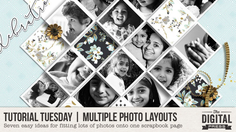
Tutorial Tuesday | Multiple Photo Layouts

TutorialTuesday-MultiplePhotoLayouts

Hello everyone, and welcome to yet another edition of our Tutorial Tuesday series here on The Digital Press blog! Today, I am going to share a few very simple (yet quite useful!) tips for fitting multiple photos onto a layout.

If you’re like me, one of the most difficult parts of scrapbooking is choosing photos with which to scrap. I suffer from ‘separation’ and ‘abandonment’ anxiety when it comes to discarding some of the photos that don’t make the ‘cut’. 🙂

Whilst good selection may be essential for effective storytelling, I often find that I am trying to fit more photos onto my pages — especially when there is a back-story to those photos. Therefore, I went back through my gallery to see how I’ve solved this issue in the past, and to compile a list of some useful tips and tricks I could share with you. And believe it or not, I found there actually is a method to my madness, when I scrap! LOL

So without further ado… the following are my thoughts on “how to work multiple photos into your layouts”…


1. Make pocket pages

The first obvious approach is to make a pocket style page. The beauty of this scrapping style is that the canvas is neatly divided into spots that you can then fill with your photos, journaling, papers, embellishments or a combination of all of these. Here is an example from one of my favourite pages.

In-your-own-world-copy-for-web

Credits:Beats Journalers by Creashens, Template is Duo 10 Go anywhere by LBVD Designs, Blue skies ahead alpha and papers by River Rose Designs

There is also an awesome tutorial about pocket scrapping and how to go about it if you are new to it :).

It becomes even more effortless if you can find pocket style templates that work for you. One doesn’t need to be a Project Life scrapper or even a Pocket scrapper to dabble in this style. The key is to have fun and adapt these to suit your own style and needs. Here at the Press we have an amazing selection of these. Check them out here.
2. Use unusual photo spots
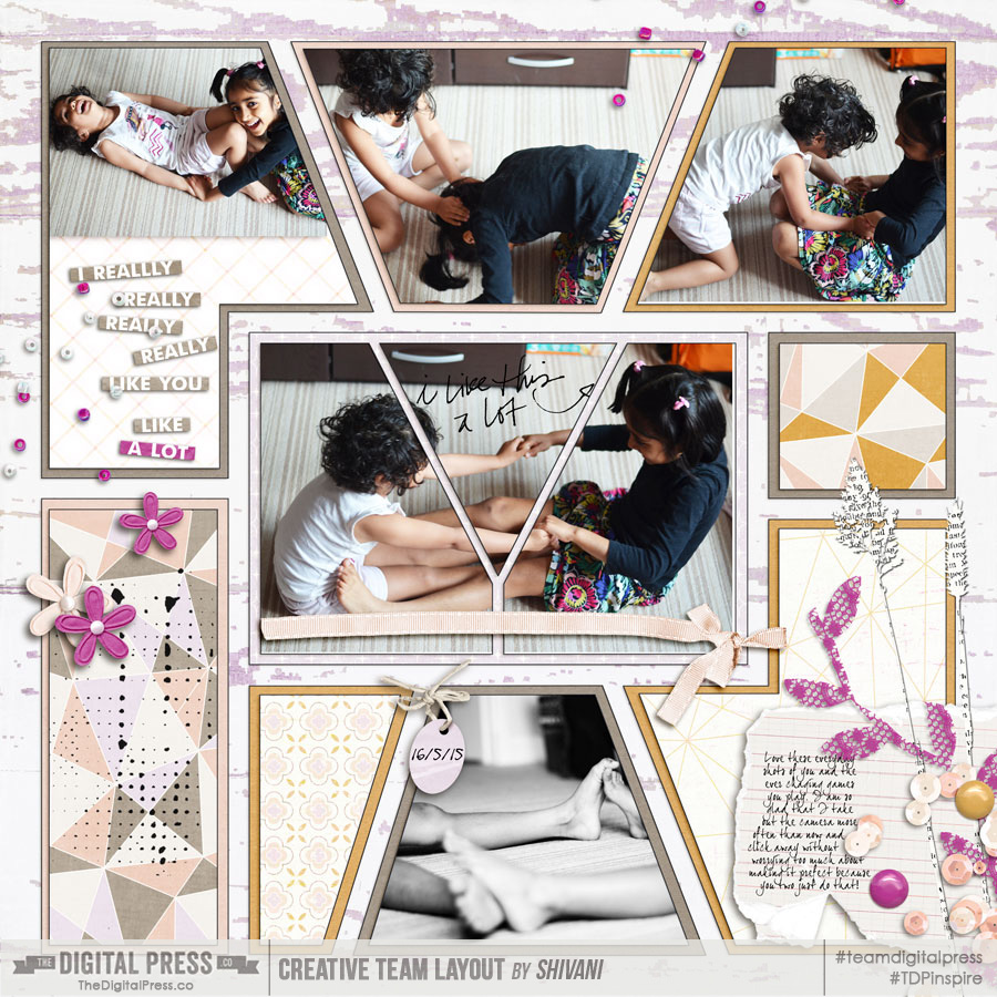
Here are some examples to do this. In this first layout I have clipped photos to photo spots in the template but also layered with patterned papers. The various shapes were a good way to show different crops on multiple photos I had of my girls ‘rowing the boat’.
Really-Like-you-copy-for-web
 Credits:  Drawing blanks template by Sandy Pie Creations, A lot by Creashens

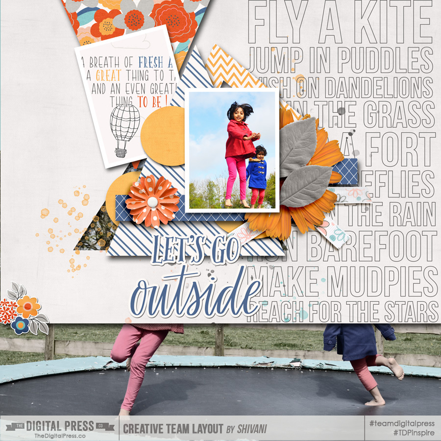
In the next one, whilst there was just one photo spot in the template, I wanted to show a long shot of where the kids were. I adjusted the template to insert a big photo in the background.

Lets-go-outside-copy-for-web
Credits: Everything from April shop collab – Fresh Air

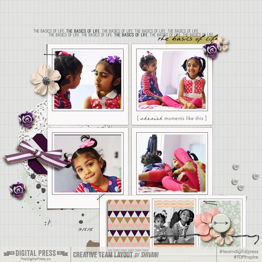
In this final example I have literally added more photo spots. Simple and effective 🙂 Varying the photos between black and white and colour also adds a great deal of interest to the page.


Moments-like-thesecopy-for-web
 Credits: To remember album, This is everyday wordart, Time stood still all by Sabrina’s Creations
3. Clip photos to other shapes
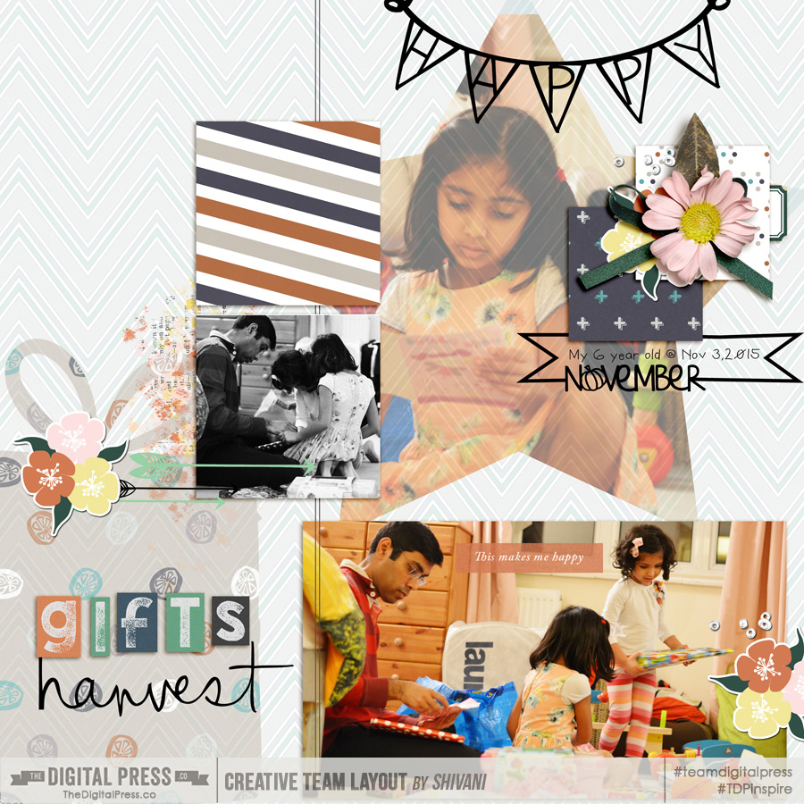
Photos don’t always have to be rectangular or square in shape. It is great fun to use some different shapes to add a varied flavour to your style. In this example below, I have slipped one of the photos to a watermark star shape – probably not meant to be used as such but worked for me!
Geet-Birthday-Gifts-copy-for-web
 Credits: 31 days of December by Meg designs, Thanksgiving by Rachel Hodge,Plus Side by Sahin Designs
4. Create a background of photos
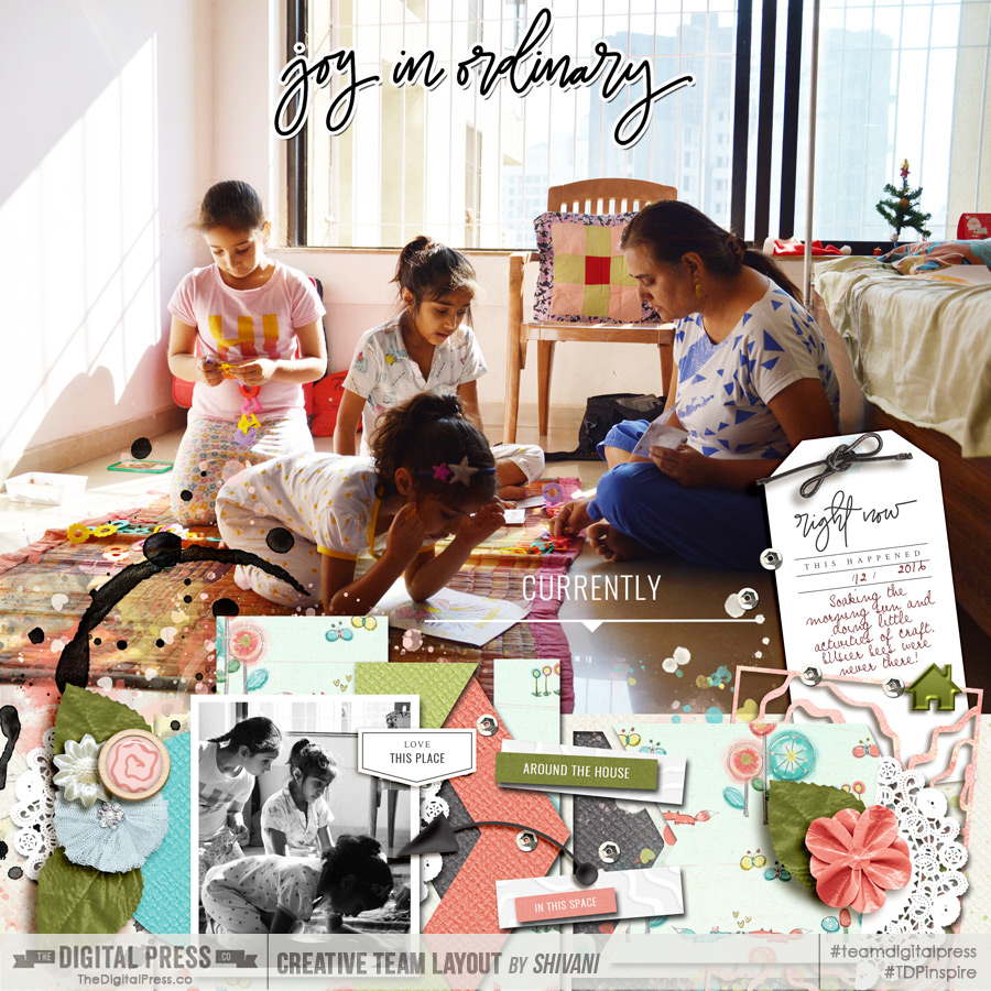
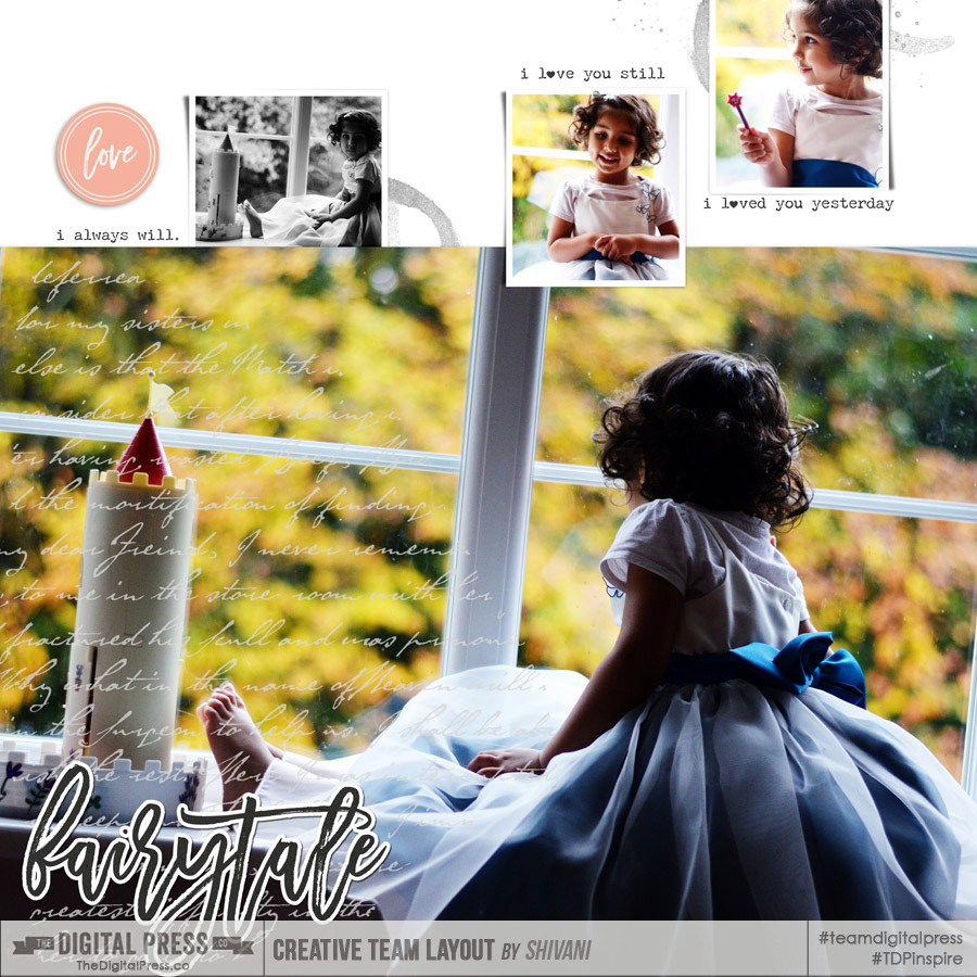
This is my favourite go to method. Especially when I have nice pictures to show off. Putting that pivotal picture in the background not only creates a great canvas for the layout but also sets the context and lets you be more creative and experimental with the other photos. Here are some examples.

Joy-in-the-ordinary-copy-for-web

Credits:Tranquil by Sahin Designs, Chinese Whispers template by Jimbo Jambo designs, Found papers by Creashens

LP-copy-for-web

  Credits:Forever by Little Lamm and Co, Family Love templates by Sabrina’s Creations
5.Change the crop to tell a different story (a.k.a. working with multiple similar shots)
So what happens when you have great photos but they look quite like one another? Fear not, there are a few ways to approach this, as well.

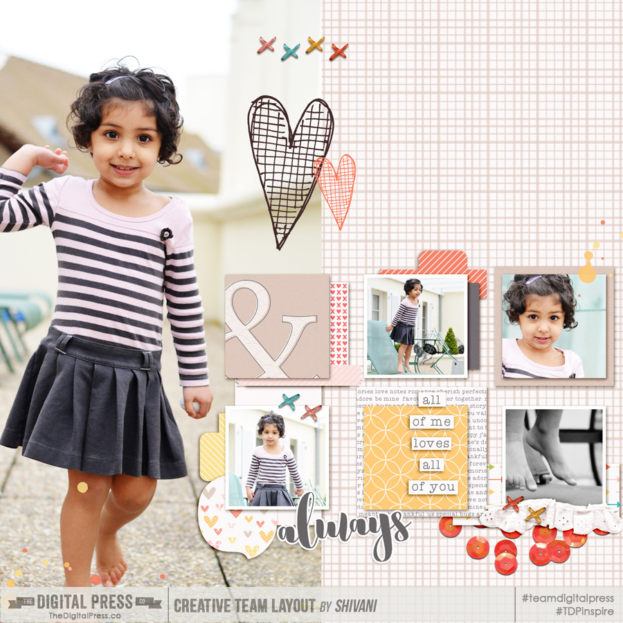
In the following examples, I have simply used different crops of similar shots – some in colour and some in black and white. I also used full length big photo on the left hand side.
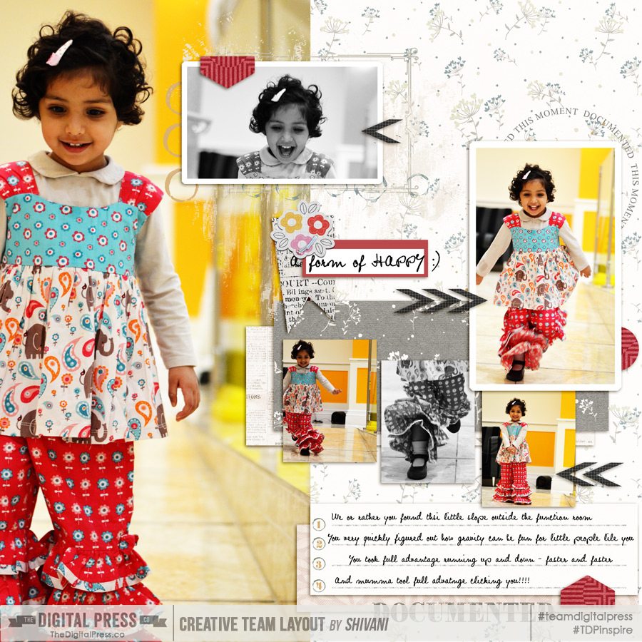
All-of--me-loves-all-of-you-copy-for-web Credits: Hello February by Dunia Designs, Choices template by Meg Designs
Trisha-running-pg1copy-for-web Credits: Documented papers and templates by Anita Designs, Love is in the air elements by Mommyish and Mari K
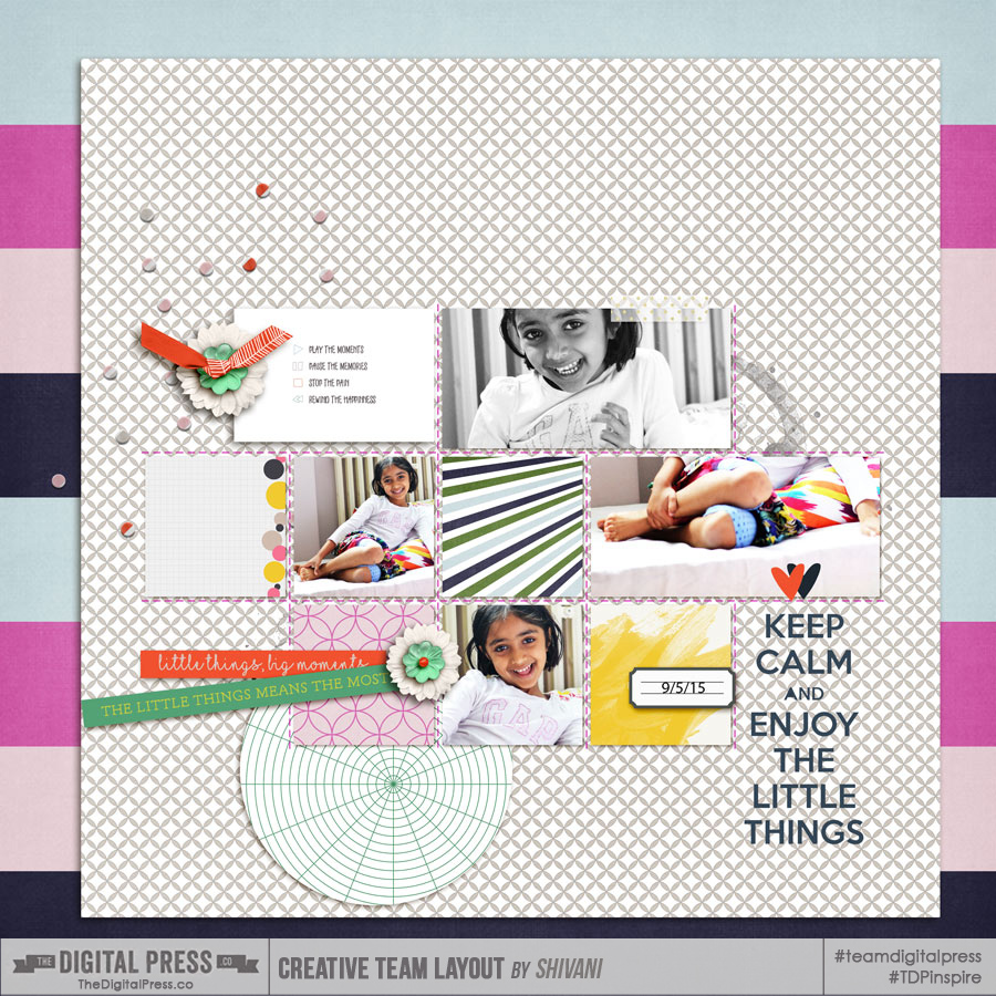
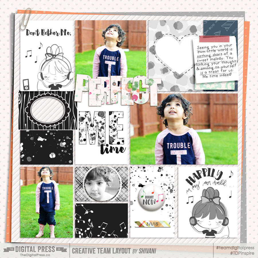
something kinda wonderful
 Credits:Clean and Simple templates 24 by Sabrina’s Creations Also used by Meg Designs: Its the Little Things, Spring Song papers, Recharged JCs, Melliflous JCs
6. Use templates
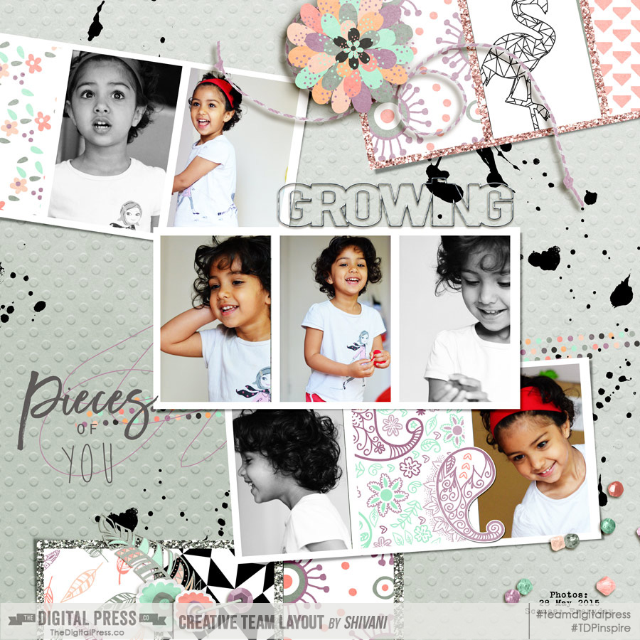
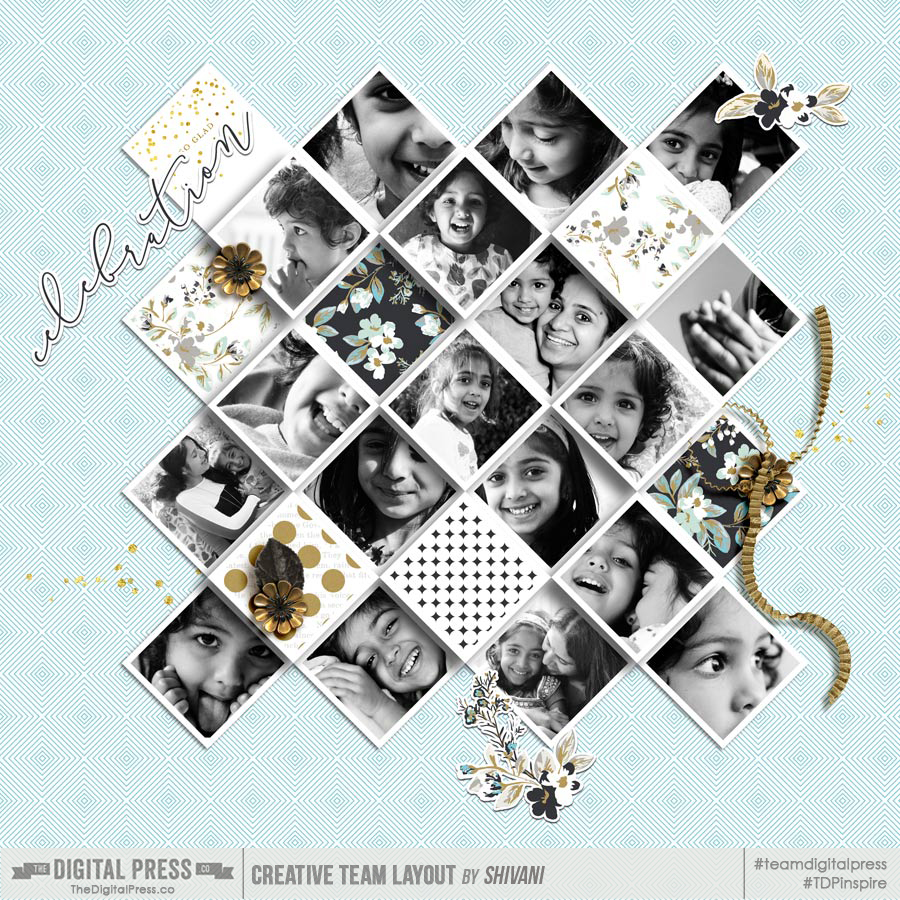
As mentioned before templates are a great booster.Using the right template can get you to a great start! There are many interesting multi-photo templates available here at the Press. See some examples for yourself.
 Piece-of-you-copy-for-web
 Credits:Scraptime vol 9 templates and Awakening Bundle by France M Designs
layout 1
Credits: May 2016 Templates and Grad bundle by Sahin Designs
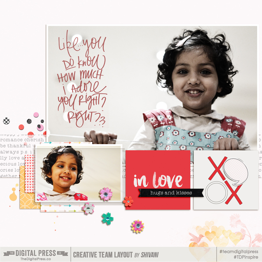
7. Use templates, but don’t be afraid to change them up
Whilst templates can be great for a great start, feel free to play around with them to accommodate your photos – e.g. creating more spots if required or altering their position, shape and sizes.

If you look at the following layout and the template I have used as a starter, it is only but a small proportion of my overall design. In other words the template is hardly recognisable but I still had a great start using it and take it further from there.

Trisha-love-you-copy-for-web
 Credits:XO Cards by Dunia Designs, Hey love stamp sheet by Karla Dudley, Love is in the air elements by Mari Koegelenberg, Hello February elements by Dunia Designs and Cynosure templates by Meg Designs


So that’s it! …seven (7) easy ways to approach scrapping when you have lots of photos you need to include on a single page. I hope you find these ideas to be useful! Meanwhile, if you have ideas of your own for solving the “fitting multiple photos onto one layout” issue… I would love to see your own hacks! I’m always looking for more ideas. Please feel free to share them in the comments below.

Until next time… stay creative! Ciao!


Profile pic avatar small

About the Author Shivani Sohal is a donner of many alter-egos. A finance professional by day in busy London, she morphs into a seemingly normal mum of two in the evenings and weekends. She is constantly found with her fingers in too many pies and juggling the metaphorical balls. That is living on the edge for her; aided by the two ankle biters and a darling hubby who define the warm and mushy for her. She is ferociously dedicated to memory keeping — almost immune to any nay-sayers (or equally-disruptive crying children or annoying house fires!); keeping her head down and forging ahead at all times.

 

Hybrid How-To | Mother’s Day Mini-Album

.

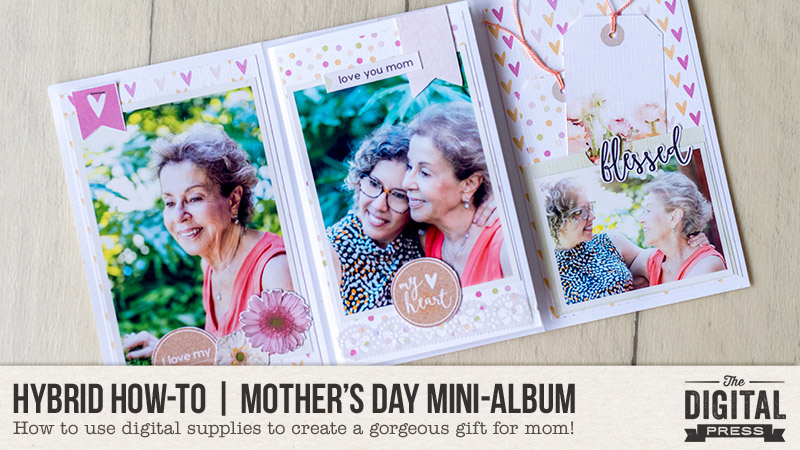
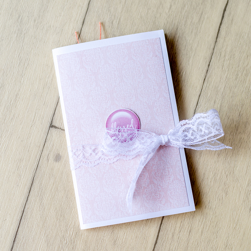
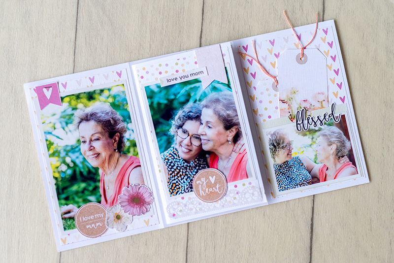
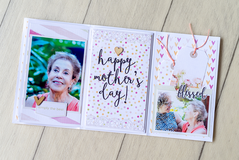
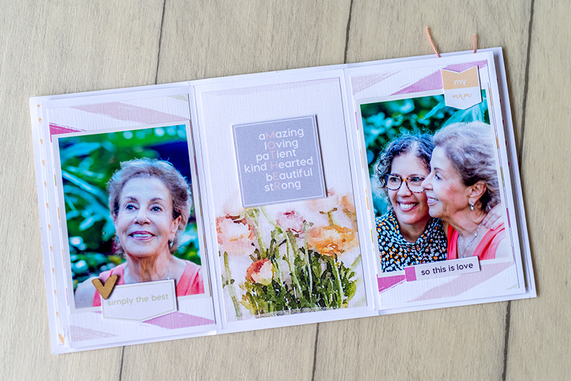
Hello everyone! It’s Saturday, and therefore time for another edition of our Hybrid How-To series here on The Digital Press blog! Today I’m going to show you how make a beautiful mini-album as a gift for Mother’s Day.

Supplies Needed:

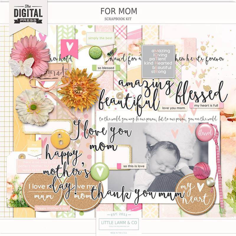
  • digital kit of your choice (I used For Mom By Little Lamm & Co)
  • white cardstock paper
  • any physical supplies/embelishments from your stash (I used only wood veneers and washi tape)

Instructions:

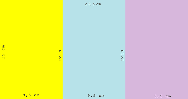
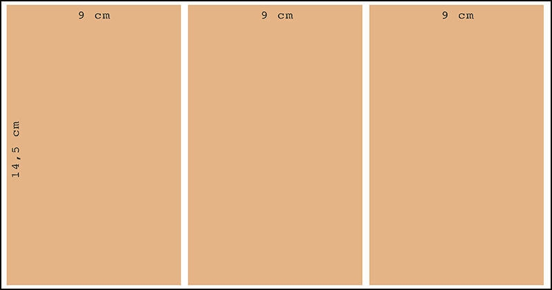
First, you will need two pieces of white cardstock, sized/formatted like the images below…


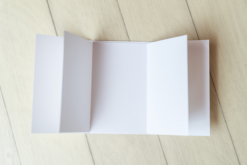
Next, after cutting the papers, you will need to score and fold them as shown below (to ensure they look like the format of the images just above this)…

You’ll want to glue the middle section (shown above) of the top paper to the same area of the bottom paper. This will create a thicker center section, along with multiple pages on each side that fold inward.

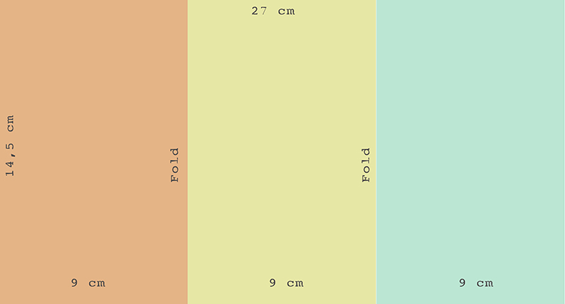
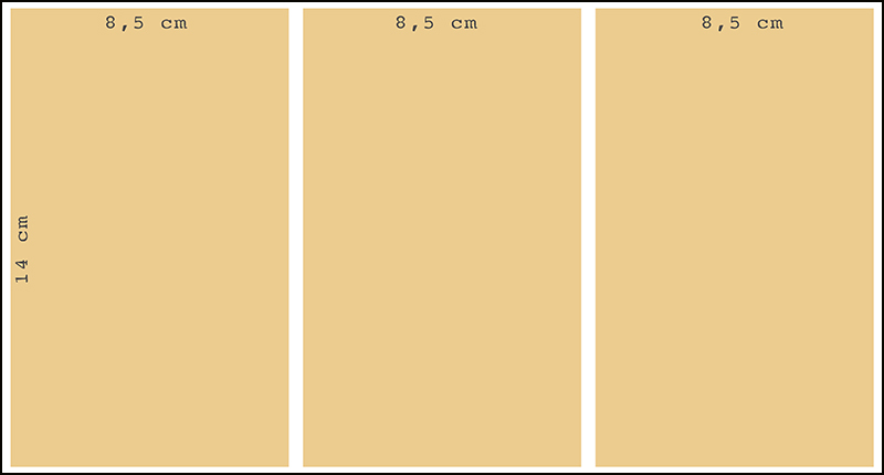
Next, it’s time to assemble and decorate the album. I chose digital patterned papers that I wanted to use in my mini-album, printed them, and then cut them to look like the images below…

*NOTE* These patterned papers, when printed, are a little bit smaller than the white cardstock sections, to enable us to glue them down on each section, as shown in the following image (below).

Glue your patterned papers down as a base on each section, and then decorate with photos, printed digital embellishments, and physical supplies!


Decorating your album is the most fun part of the process. Enjoy it!

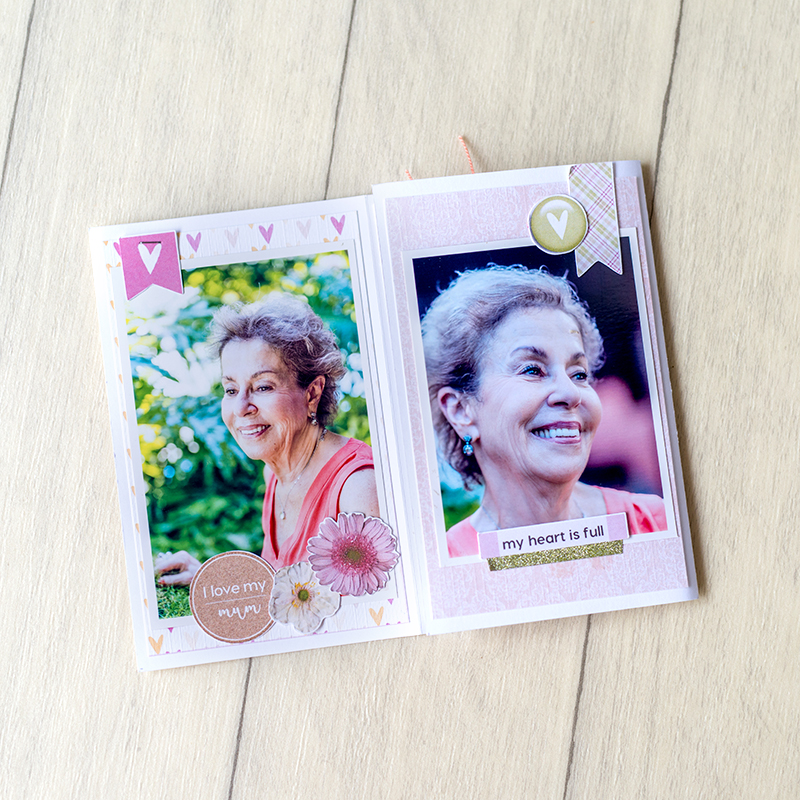
Here’s a look at my album as I added photos and embellishments and it took shape…

I think this is a beautiful way to honor our mothers, isn’t it? And a beautiful and delicate gift. 🙂

If you’d like to give this a try, too, don’t forget that you can earn challenge points at TDP! Come visit the CROSSWORD SECTION in The Digital Press forum, and you’ll find this month’s Hybrid Challenge thread (*NOTE* for each month’s Hybrid Challenge at TDP, you get to choose one of the two (2) “Hybrid How-To” tutorial posts from here on the blog for that month, and then you get to make your own version of that chosen project). If you choose to give today’s project a try… all you have to do is make a mini-album like mine using some digital elements and papers. Give it a shot, and share your final results with us! We can’t wait to see what you come up with.

Have a great weekend, you guys… and happy scrapping!


AndreaAbout the Author  Andrea Albuquerque is part of the Hybrid Creative Team here at Digital Press. Andrea has been a scrapper since 2010 and a photographer since 2012. Although she adores the flexibility and creativity of digital, she can’t resist playing with paper, paint, and embellishments… so hybrid scrapping is the perfect medium for her! She lives in Brazil with her hubby.
Tutorial Tuesday | Getting Kids to Smile at the Camera

Ever wish you had a few tricks up your sleeve for getting kids to smile at the camera? I’m here today to help!

It’s often hard to get natural smiles from kids… and let’s face it, simply saying “cheese” often leads to the some of the cheesiest of smiles. So what to do?

I’m the first to admit that bribery goes a long way, but the last thing we really need is blurry photos due to a sugar high and smiles covered in chocolate. Right? So… instead, here are a few tips that will help you get some natural smiles.

  1. Chit Chat — I have found that some kids are shy or nervous about making sure they smile, just like the practiced at home, which can look fake or forced. If I just randomly bring my camera down and start chatting about school or what they ate for breakfast or who their favorite super hero is, I can get them talking and they’ll smile without thinking about it and then the don’t even notice when I bring my camera back up and start snapping away.
  2. Catch them off guard — On occasion, I will say something out of the blue that kids aren’t expecting or make it seem that I’m trying to get a cute smile out of one of the children and end up getting great smiles out of everyone because it lightens the mood and takes the focus off of having to force a smile. This helps to get great natural smiles.
  3. Distraction — Distraction works really well when kids aren’t cooperating at all. My favorite technique is to ask them to make a silly face or a tiger face and I make faces too. The kids get distracted and start laughing or smiling on their own.
  4. A little humor — My son always makes a funny face when I go to take his photo. Always. He always looks constipated, but as soon as I say the word, he can’t help laughing hysterically. Of course, I’d never say that to a client, but other jokes work great. For example, if a kid is picking his nose, I ask if he has some tasty cheese-boogars that he can share.
  5. It is what it is — Many of my clients want picture perfect smiles, but I’m more of a lifestyle type person myself. I absolutely love photos where my kids aren’t smiling, whether is a posed shot or just a quick capture. I’m drawn more to eyes than mouths, so I’d rather avoid squinting eyes from big smiles. Sometimes kids just are who they are and I strive to capture them in the moment. If I don’t get smiles, it’s no biggie… I get a lot of great shots anyways.

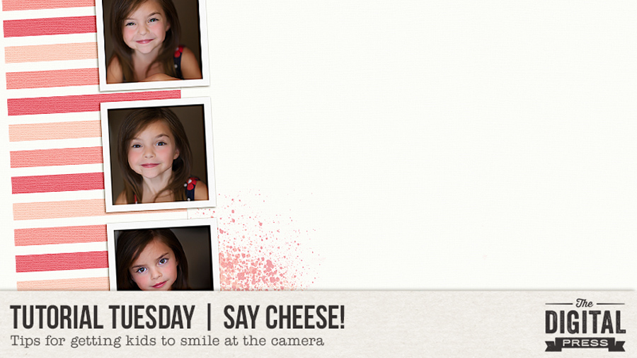
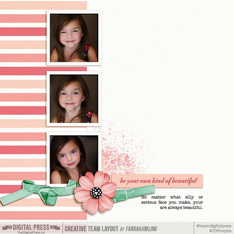
Want some examples of these tricks in action? Here is a layout I created using a few photos of the silly faces my daughter makes…

Next time you are photographing kids and find that you’re struggling to get a natural smile from your subject… give a few of these tips a try, and see if they don’t help you capture a fantastic shot or two!


FarrahAbout the Author  Farrah Jobling is a member of the creative team here at The Digital Press. She lives in Denver with her amazing family — Mike, Nicholas (9), Claire (7), Hope (2 yr old puppy) & Kringle (9 mo old bunny). She works from home as a photographer and enjoys scrapping her personal photos.

Save

Tutorial Tuesday | Creating Keyword Sets in Lightroom

I love using Lightroom. When I first began using it, it was solely for the purpose of photo editing; I do almost all of my photo editing in Lightroom. After playing around in the program for a while, though, I started using it for keywording (a.k.a. tagging) my photos for organizational purposes — and eventually I also began using it to tag my digital scrapbooking supplies. The more I use Lightroom, the more I love it. Keywording in Lightroom is quick and easy… and helpful! …and that’s what I am here to share with you today.

For a long time, I did all of my keywording simply by typing in the keywords I wanted to use (saving to the file’s metadata)… and/or by clicking on the keywords that showed up in the “Recent Keywords” set. One day, however, for whatever reason… I noticed there were up and down arrows immediately to right of the “Recent Keywords” set. Hmmm. Why had I never noticed that before? Nested under “Recent Keywords” was a option to save and edit a keyword set. Finding that option was a great time-saver for me. Keywording is definitely not one of my favorite tasks, but I consider it a necessary part of my scrapbooking/photo-editing process and I welcome any and all shortcuts I find to speed up the process. I bet you will too!

So, before I show you how to create a keyword set, in case you haven’t been using Lightroom for keywording I first want to give you a quick how-to for basic keywording:

  • When you’re in the Library Panel press CMD/CTRL+K to access the Keywording Panel.
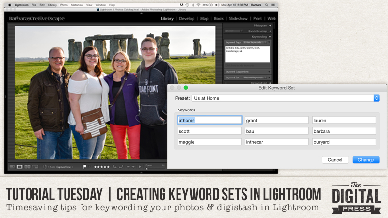
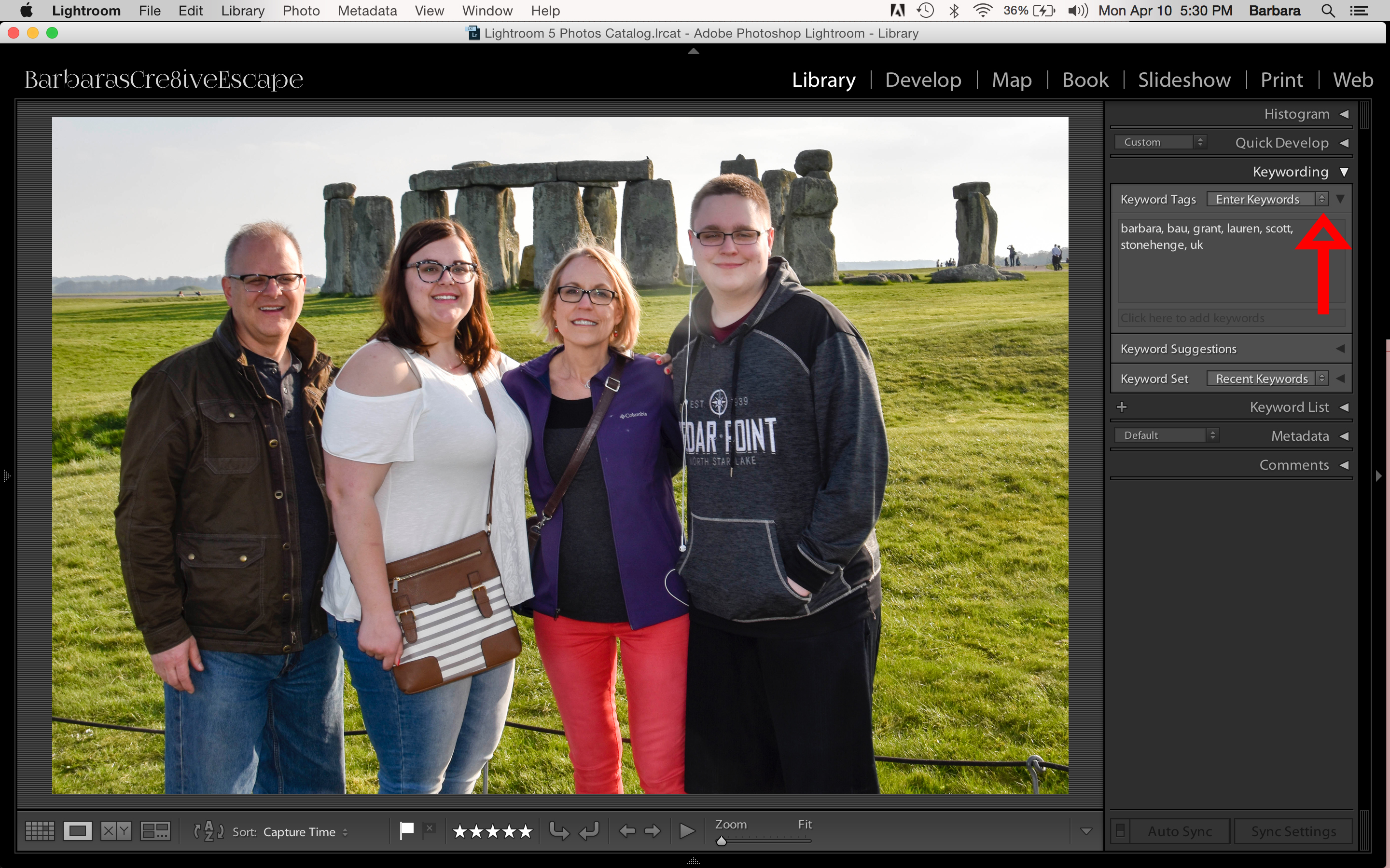
  • From there you just type in the keywords you want added to the metadata of your photo. *NOTE* You can add multiple keywords to a photo, simply by separating the keywords with a comma. For my example, I used the keywords “Barbara, BAU, Grant, Lauren, Scott, Stonehenge, UK” because these are the words I will most likely use to search for this photo at some point.


As I mentioned above, I find that creating Keyword Sets is a big timesaver. I’ve got a couple of standard keyword sets that I use. Some standard sets I find useful are for different sets of family members. I like to tag all the individual family members in my photos so I can quickly access photos of individual people. Yes, that is very detailed and perhaps more detailed than some people would want to go with their keywording… but the process actually goes quickly, and it saves me so much time down the road when I’m looking for photos.

I have three basic sets that I use all the time:

  1. “Us At Home” is a set of keywords I use all the time for my core family (my husband, kids, dog and at home keywords)
  2. “May Family” is a set of keywords of the names of people on my side of the family.
  3. “Unzen Family” is a set of keywords of the names of people on my husband’s side of the family.


From there, I’ll create keyword sets for individual holidays and events, vacations, etc. — any keywords that I feel I’ll use over and over for a particular set of photos. I’ll save these keywords to a temporary (or permanent) keyword set. It saves me time and speeds up my keywording process.

So, now you probably want to know how to create a Keyword Set. This is the very simple process:

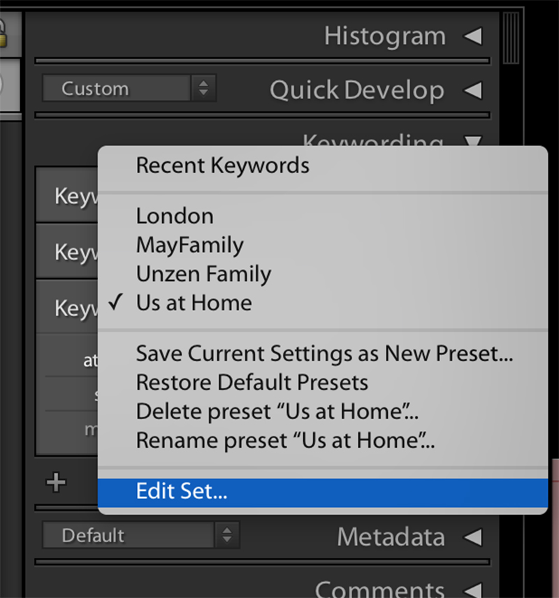
  • Click on the little up/down arrows to the right of “Recent Keywords”
  • Click on “Edit Set”
  • Type in the keywords you want included in the set (each set can hold 9 keywords). Hit Tab to move from box to box.
  • When you’ve entered in the 9 keywords you want included in the set click on the down arrow next to Preset and choose “Save Current Settings as New Preset”
  • Type in a name for your preset


That’s it! So easy, right?

And the benefit is that after doing this, when you’re keywording images at a later point in time you can choose between using your “Recent Keywords” and any of the other Keyword Sets you’ve created. Such a time-saver! Give it a try. I hope you find that creating and using Keyword Sets in Lightroom speeds up your keywording/tagging process, as well.

If you’ve got any questions, feel free to ask them in the comments of this post and I’ll get back to you. Also … if you’ve got any Lightroom shortcuts of your own that you’d like to share with us, feel free to share them with us in the comments, as well!


Barbara UnzenAbout the Author:  Barbara Unzen is a member of the creative team here at The Digital Press. She’s a mom to two teenage kids, a 19 year old son and a 17 year old daughter. In her free time she loves to digi scrap, take photos and hang out with her family.
Hybrid How-To | Custom Watercolor Tags

Hello everyone! It’s Saturday, and time for another edition of Hybrid How-To… and today I’m going to show you how to use digital stamps to create customized tags (and/or other projects).

Supplies Needed

  • Digital stamps (I used stamps from Speechies and Love This by Rachel Hodge, and also This Life March Stamps from the Juno Designs shop)
  • Digital Kit (I used In Living Colour by KimB Designs)
  • Watercolor paints or distress inks
  • Laser printer
  • Optional — Minc foiling machine

Instructions

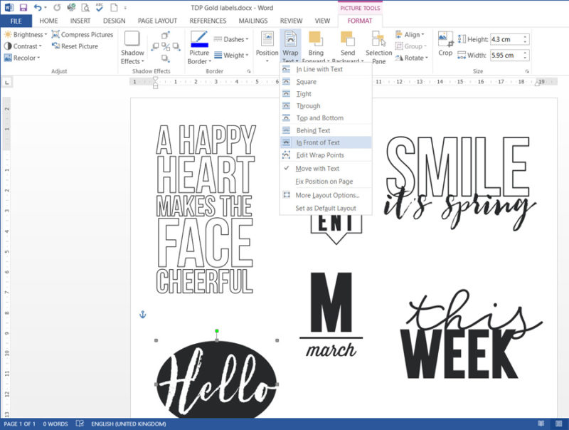
I used Microsoft Word to create my project… but of course you can use just about any word processing or image editing software. You will need to arrange your elements (stamps, etc.) on the page in a way that is conducive to printing. Don’t forget to leave some white space around each element (and around the outer edge of the page as a margin).

*TIP*  In Word, I set the ‘Wrap Text’ option to ‘In Front of Text’ so as to be able to easily move the elements around on the page.

If  you have access to a laser printer, then you can print your document before painting. However, if you only have an inkjet printer, you must decorate your page first before printing or your images will run.

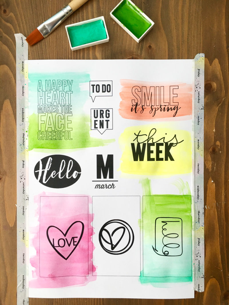
Once you have your stamps printed… you can let your creativity run wild! Use watercolor paints (or similarly-styled inks) to create unique backgrounds. Here’s a look at what I did…


*TIP* Use washi tape or masking tape to secure your page to a board or desk. This will help the paper stay flat (rather than curling).

Color your tags as you wish — use ombre effects, splotches, etc. — it’s up to you. I even left a few of my images blank so that I could color them in after I had cut out the pieces.

When you’ve finished, carefully remove the tape and allow to dry. It’s a good idea to place a heavy book on top to keep the paper flat.

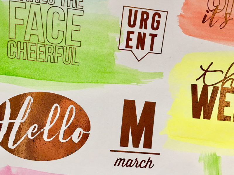
OPTIONAL EXTRA STEP — Because I used a laser printer, I could add foil to my pieces using a Minc machine. To do this, you place the foil on top of the paper and feed it through the machine. The foil reacts with the toner… which melts and grabs the foil. Foil is available in a rainbow of colour and adds a real luxury to your pieces. Check this out…

Finally, you will cut out your pieces (adding extra color or ink as you wish). You can die cut or use a cutting machine to get really creative if you wish.

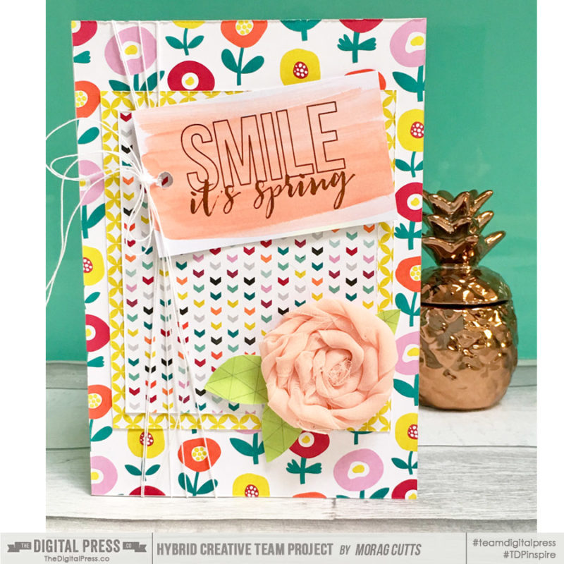
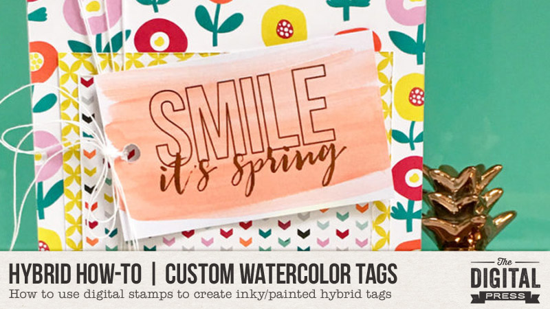
Here, you can see that I created a card with one of my tags…

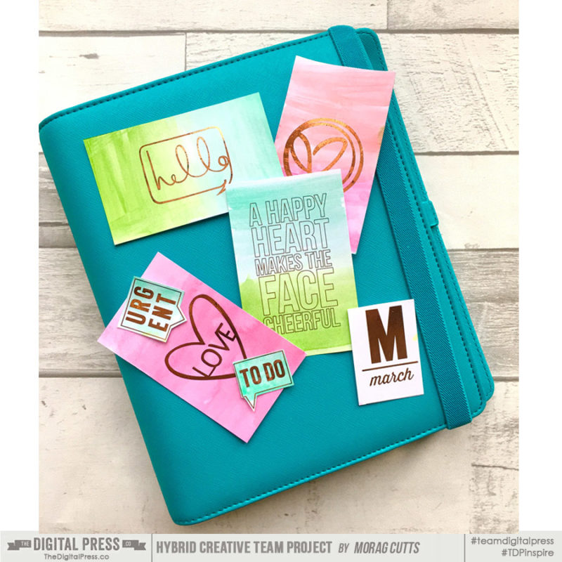
You can also add them to scrapbook pages, pocket scrapping projects, or even planner pages! Here’s a look at a few pieces I thought could work well in a memory planner…

Isn’t this easy and fun? Now you can create something unique with your digital stamps, and hold the end-product in your hands!

Want to give this project a try? You can earn challenge points towards the April 2017 challenges here at The Digital Press if you share your finished projects with us. Check out our monthly challenge information in the CROSSWORD SECTION of the forum.


MoragAbout the Author  Morag Cutts is part of the Hybrid Creative Team here at Digital Press. Morag has been an avid scrapper and photographer for ten years.  Although she adores the flexibility and creativity of digital, Morag can’t resist playing with paper and embellishments – so hybrid scrapping is the perfect medium for her!  Morag lives in the UK with her hubby, two kids and recently adopted puppy.
 

Tutorial Tuesday | Scraplifting Yourself

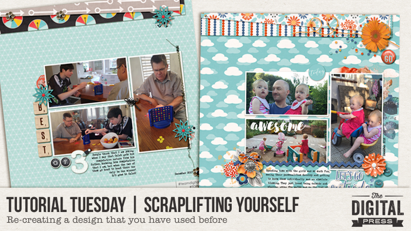
Welcome to another installment of our Tutorial Tuesday series here on The Digital Press blog! Today, I am here to advocate for a simple technique that will help you create more scrapbook pages (and faster, and more easily!) — scraplifting yourself.

I would like to use this post to encourage you to be gentle on yourself and not feel as though every layout you create has to be a masterpiece… while also helping you to avoid feeling as though creating layouts leaves you feeling drained. It’s a hobby and it should be fun, right?

Let’s be honest… life is busy, and there are so many things that have to be done all the time. Often we find that by the time we sit down at the computer to take advantage of a few moments of crafty “me time,” our creative energy seems to have dissipated.

How to solve this?

You can always turn to your tried-and-true sources for inspiration. I love The Digital Press Gallery; Pinterest is another fun source of ideas (as is Instagram, as people are posting their scrapbooking creations there more and more often all the time nowadays!). Sometimes, though, I find that I use up all of my scrapping time just looking at other people’s layouts without doing anything with my own photos and getting any of my stories told. Oops! This ends up leaving me feeling despondent and uncreative.

An easy fix for me is to choose the photos I want to scrapbook, and then look at my own arsenal of previous layouts… with the goal being to re-create one that uses the same number of photos, along w/ a new/different kit or collection. I just clip (Ctrl-G) the new papers and photos over the existing ones, and swap out the embellishments with new items from the kit I am working with the second time around.

For example, let’s take this layout that I created for TDP’s 3-for-3 challenge in March 2017…

Characteristics of This Layout:

  • 3 photos
  • 3 different patterned papers
  • visual triangle of clusters
  • engaging title
  • complimentary colours of red and blue
  • right-aligned journaling

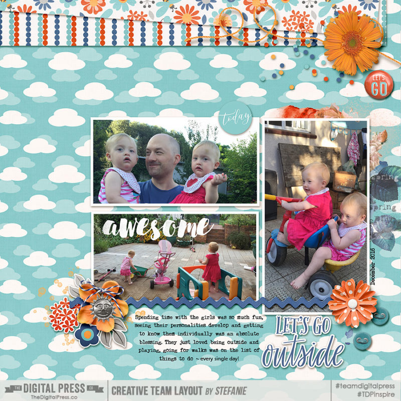
I still love this layout, and so for the next layout I had just 30 minutes to create and I started with 3 photos of my grandnieces playing outside of the holiday house we shared in December.

I kept the placement of just about everything exactly the same –the photos, papers and journaling — and I changed up the date, etc. Instead of creating a new title, I used a pre-designed piece of word art from the newest TDP Designer Collaboration “Fresh Air“. I still have foundation layers of paint and a scatter. Three points of orange, with a fourth embellishment spot that is tone-on-tone blue to break boundaries and add a different shaped element for interest. I added shadows as I went along… and in 30 minutes, it was finished and ready to be printed!

Here’s a look…

Again, Characteristics of This Layout:

  • 3 photos
  • 3 patterned papers
  • visual triangle of orange
  • wordart title
  • complimentary colours of blue and orange
  • centered journaling

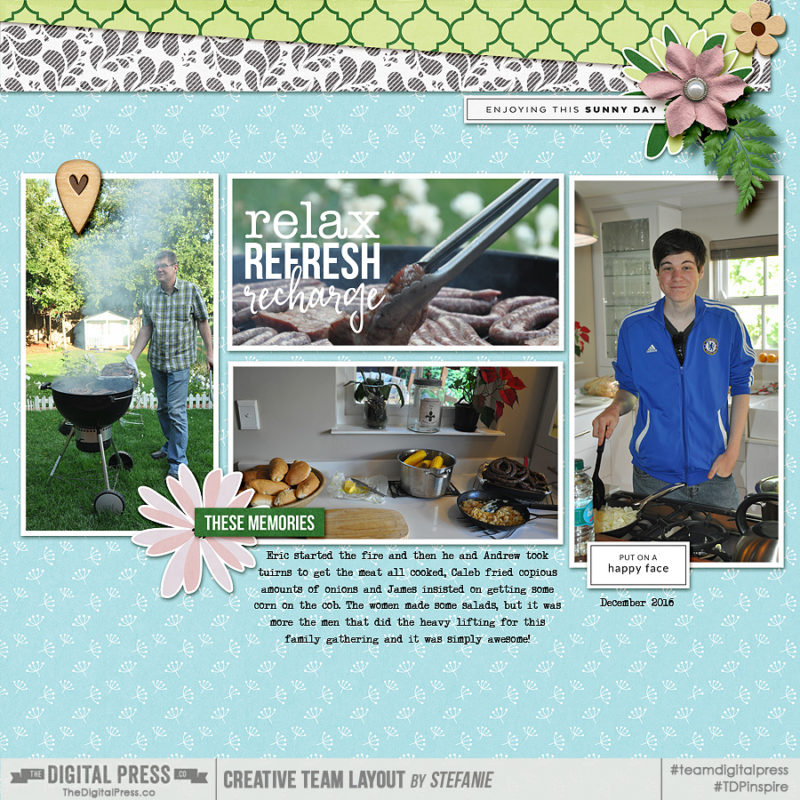
I decided to use this page’s composition one more time. For this last layout, we had a family BBQ on the day before we left Johannesburg and I wanted to highlight the men’s role in cooking and that the women had a relaxed off duty kind of day. 🙂

For this newest page, I wanted to include a 4th photo of my hubby grilling the meat… so I nudged the photos to the right and squeezed him in there. You can see more similarities with the second layout than the first, including white piece of word art layered over the photo, and centered journaling. Of course, these layouts look strikingly similar — but you could also mix things up by turning the design 90 degrees, or by flipping the paper layers found at the top to the bottom of the page, instead (or changing up the font, etc.). I went for speed over creativity, though, and as these layouts will be separated within the family album of 2016 with different opposing layouts I can almost bet that no one will even notice that they’re almost the same…

Characteristics of This Third Layout:

  • 4 photos
  • 3 patterned papers
  • diagonal/asymmetrical points of pink
  • Blue, green and pink
  • wordart title and sub-titles
  • centered journaling

What do you think? Do you have 30 minutes to spare, in which you want to complete a brand-new layout in just that short time? This technique will help you do so! Just turn to a tried-and-true layout design that you already love… open that PSD or TIF file… remove the papers and embellishments… and start again!

If you give this a try, I’d love to see your results! Feel free to load your layouts to The Digital Press Gallery, and you can even link us up to the original layout in your credits/description if you want to.


 About the Author  Stefanie is a member of the creative team here at The Digital Press Co. She is a mom of three older children, all living in Cape Town, South Africa, with her hubby of 29 years and their two cats. In her free time she loves digital scrapbooking, dabbling in photography and reading.