Category: Tutorials

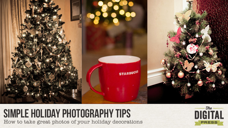
12 Days of December – Day 8 – Simple Holiday Photography Tips

decblog

The holiday season is full of color, scents, and lights. The Christmas season is one of my favorite times to photograph my home. I have learned over the years that some of the memories start to fade, especially the ones involving seemingly inconsequential things like your decorations.

Over the years, we have had many different Christmas trees, ornaments, garland, etc. I wish I had photographed them years ago… as it would be fun to look at what was trendy during previous years, what things I really liked at the time, and what those memories evoked (such as getting a kiss under the mistletoe, or my early morning coffee in a Christmas mug as I enjoyed a quiet moment before the kids came barreling into the room, etc.). So many of my old photos were of my family, or of what gifts we gave or received, or of our family pet. In some photos, you could glimpse bits of the decorations — the tree in the background, or the lights around the window, etc. — but they were never prominent in my photos. These last few years, however, I have made a point of photographing our holiday decor because seeing it really does evoke memories at a later date!
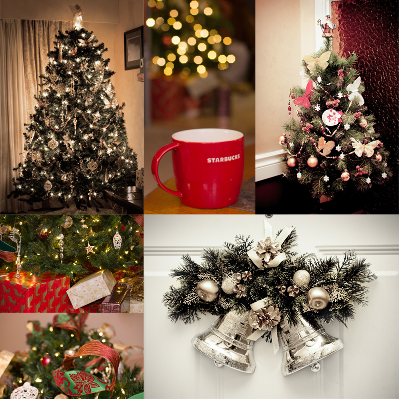
day8_decor


About Lighting

Lighting plays a big role in the look of your image. Decide what lighting best suits the mood of your photo. Indoor light bulbs generally are a warmer temperature such as with tungsten lights… but nowadays, more and more lights are being made with a cooler color temperature such as the fluorescent/daylight balanced bulbs. To keep it simple, when looking for light bulbs, remember that the higher the number (5000 K), the cooler the color temperature so the output is more of a blue, cooler tone. Conversely, a low number (2800 K) it will be a warmer, more yellowish hue. Neither light is better than the other; they are just a different color temperature on the Kelvin scale and will produce a cooler or warmer tone in your photo.

You may not always have a choice of what color temperature the lighting is in the room you are shooting… so instead, you may be able to adjust the color temperature in your photo editing software. I use Lightroom, and it is very easy to tweak the temperature. If I am shooting during the day, I leave the lights off and open the windows and doors to let in some natural light. If I am shooting later in the day, however, then I will need some help with lighting… so I turn on a few lights or use a speedlite. Most of my lights are daylight-balanced, but the temperature varies with different manufacturers. If I am utilizing lights in the room I am shooting, I try to shoot with that light either behind me, bounced off the ceiling (speedlite), or off to the side.  If there is limited light available, a flashlight or video light will also work in a pinch. I keep a couple handy for photographing food or small items.

Other Tips and Ideas

  • Photograph with some wide shots, taking in a lot of detail around the room. Don’t worry if the room is cluttered — if there is a coffee cup or beer can on the side table, or toys are scattered around the floor, because these all tell the story of that moment and of what was happening in that room.
  • Photograph with some close-ups, as well… capturing some of the details of your ornaments, cards, food, etc. Try varying your position…up, below, sideways…as not only do they each provide a different view, but also can vary the lighting which also provides a different look. I’m a big fan of shooting upwards or downwards (as in my sample image of the ribbon) which eliminates whatever else would be in the framing, had I shot it straight on.
  • If there are Christmas lights in your shot, adjust the aperture if possible (depending on the camera you use) to achieve different looks. For instance — open up the aperture to a low number (such as 1.8), which will blur the lights (as in two of my sample photos). Conversely, close down the aperture to a higher number (such as 14) to produce a starburst effect (as in the upper left sample photo).
  • Use a tripod, if available. If you are opening up the aperture (F-Stop) then I recommend using a tripod to keep the camera steady as it takes longer for the light to pass through and capture the image, so you want your camera to be steady. Alternatively, you can place your camera on a flat surface to minimize movement, and, even better, use a timer. The steadier the camera, the less chance of blurring your image.
  • Staging a shot can be fun, utilizing something as a backdrop. Don’t throw away old blankets, pillowcases, cloth napkins, etc… keep them for this kind of staging. I go to garage sales and pick up these types of cloth items really cheap — usually for under a buck.  Another great find is cloth placemats (or any material that isn’t shiny, which can cause glare in your shot). I found some small bamboo woven mats last year which I use to position small items on top of — such as 1-2 cookies. As a paper scrapbooker years ago, I collected a lot of paper, which also makes a great backdrop for small items.

I hope that I have inspired you to grab your camera and photograph your holiday decor so you’ll have those photos to look back on and remember for years to come. Enjoy the holiday season and keep that camera handy!


RaeAbout the Author  Rae is part of the creative team at The Digital Press and has been a scrapbooker and photographer for many years. She lives on the west coast with her hubby and her labradoodle, Taz. She’s addicted to chocolate, TV shows, and books!

12 Days of December – Day 5 – Christmas Bottle Tags

header-blog2PS

I love the holiday season! It’s a great time to share gifts with friends and family. Today I’m here to show you a simple way to dress up a gift with bottle tags! I plan on making quite a few of these tags this month to add to my neighbor gifts this year — things such as bottles of sparkling cider or hand soap. To make mine, I used elements from both the All Spruced Up Kit and and All Spruced Up Journal Cards by KimB Designs…

All Spruced Up Kit by KimB Designs

All Spruced Up Journal Cards by KimB Designs

Supply list:

  • Digital kit of choice
  • 1.5 inch circle punch
  • Scissors
  • Glue dots
  • Hand soap / sparkling cider (or other bottled gift)
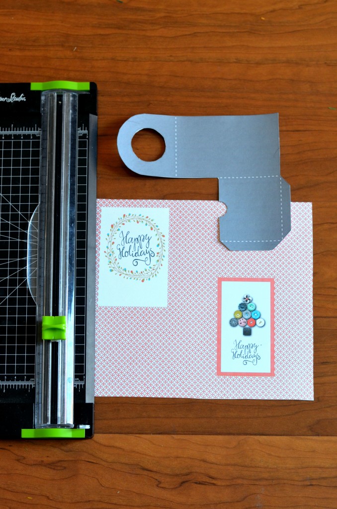
  • Optional: digital template for a bottle label tag pocket (or you can approximate yours using the following image as a guide)

tag

To begin, I started with a canvas sized at 11″ x 8-1/2″. I  used the Christmas tree element cards and word brushes from the All Spruced Up Kit.

template

If you choose to freehand a simplified template and don’t use a cutting machine… measure a rectangle 9″ x 3″, and then make a scored fold line at 2.75″ from the top. You can leave a square edge or round the edges.

Now, for those of you who are using a template similar to mine (shown above)… I loaded the template image into my digital program. I centered the Christmas tree and word art inside my transparent 9″ x 3″ template, and then I designed the image on the front of the tag as 2.5″ x 6″.  If you choose to add the pocket card on the back, you will need to create a journal card  2.5″x 6″ to slip inside. It will be the same dimensions as the image on the front of the tag.

As you can see on my image above, the right side is the front of the tag. On the left is the card for the back. In the photo, my template is on the side you will straighten the template to fit over the Happy Holidays image.  Once you have your page ready, you can print it on card stock from home or send it off to your local printer. Trace the template and cut it out by hand, or use your cutting machine. Punch a hole with a 1.5″ circle punch (or freehand it with scissors like I did). Score the dotted lines and fold, and then secure the back of the pocket with glue dots.

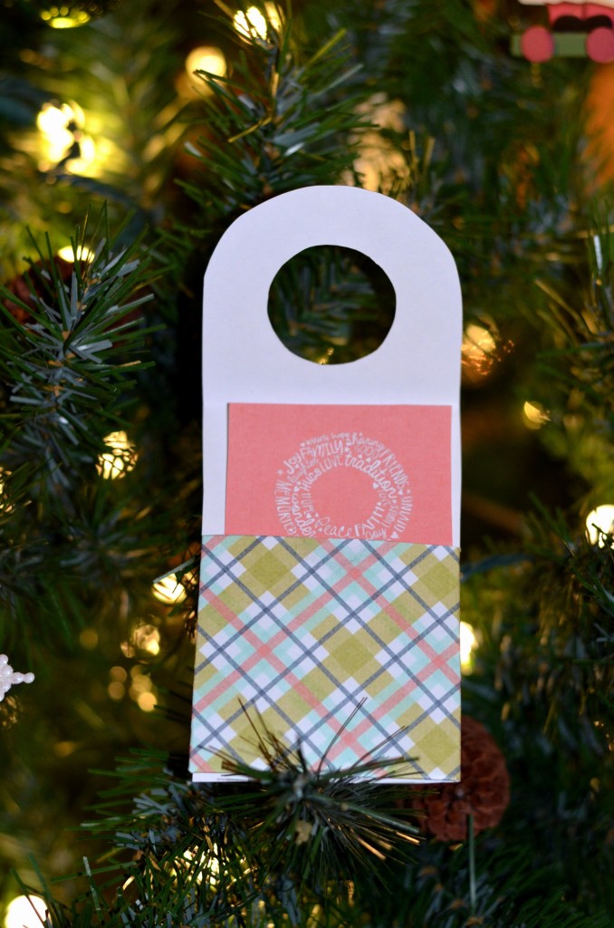
KimB back

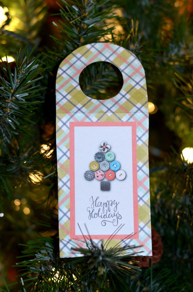
I have included the front and back view of my completed bottle tag with the hole punched. Scored edges and pocket tag are shown on the back.

front

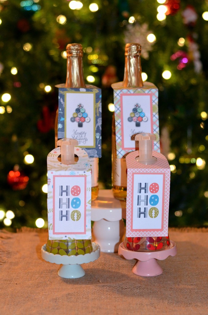
Here’s a look at the bottle gift tags attached to apple cider and hand soap… ready for gift giving!

KimB bottles

So simple to create… and you now have a personalized gift for friends and neighbors.  Join us in the forum for a fun challenge!

Merry Christmas and happy gifting!


TerresaAbout the Author Terresa is a mother to 5 beautiful children. She loves capturing memories with her digital camera and then creating a visual family memory book to be enjoyed and treasured. She also loves to design and create personalized items for her home and children. Other interests are crafting and gardening, and you will often find her enjoying the outdoors and soaking in the beauty of nature.

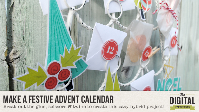
12 Days of December – Day 1 – Make a Festive Advent Calendar

Make a Festive Advent Calendar

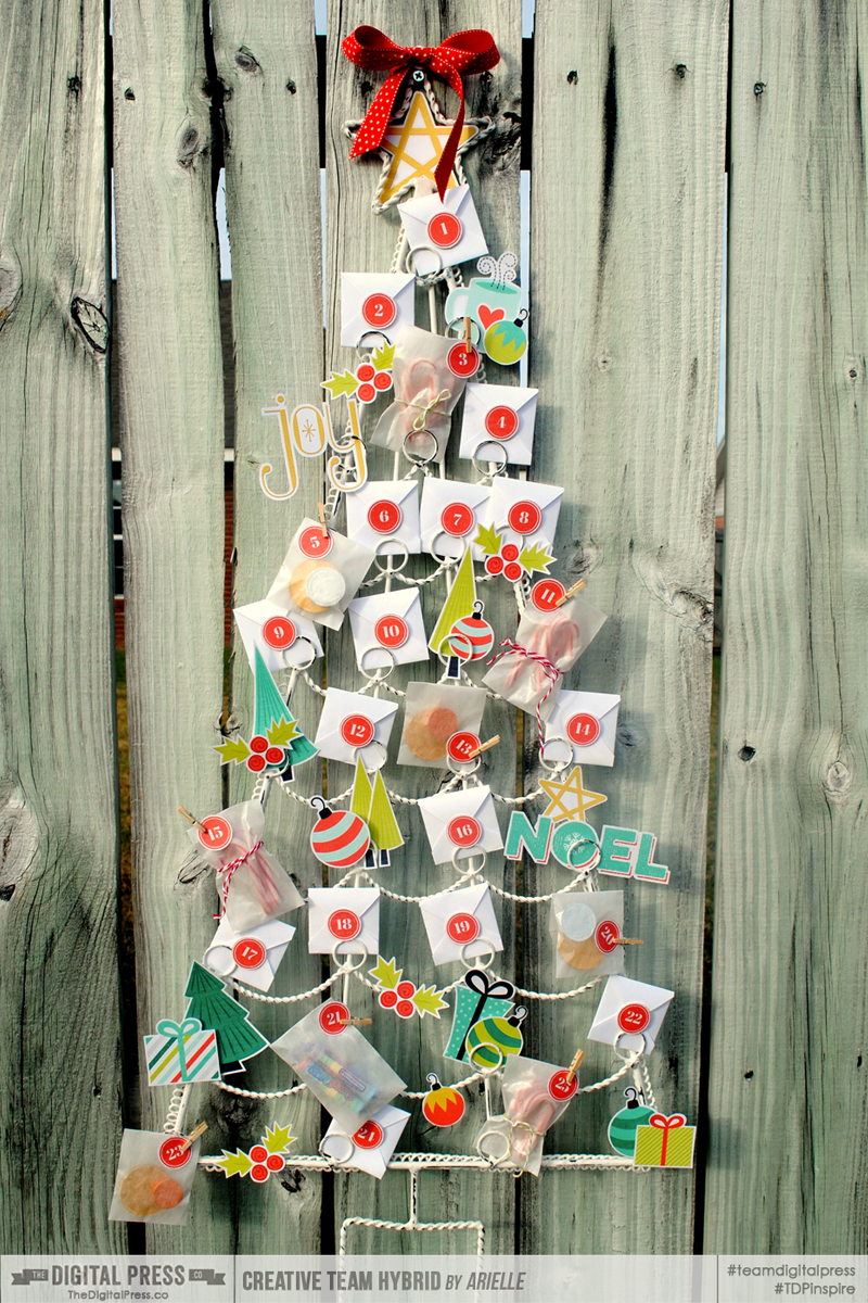
I love everything about Christmas, especially traditions. For the last few years, I have dreamed of having an advent calendar for my family as a new tradition… but what a seemingly-HUGE undertaking! I like quick crafting (another reason I love digital scrapping!), and taking on such a project has always daunted me. When I saw this gorgeous digital kit, however — Season of Joy, by Scotty Girl Designs — and this fun Whitewash Christmas Tree Cardholder from World Market, I knew I had to make it happen this year!

Make a Festive Advent Calendar

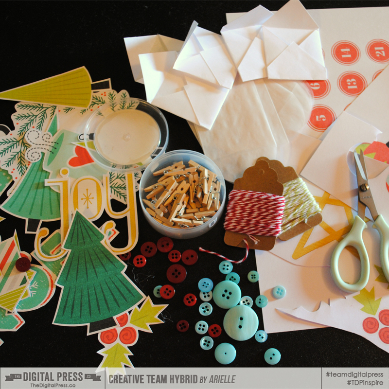
First, gather some crafty supplies —

  • Digital kit of your choice (I used Season of Joy, by Scotty Girl Designs )
  • Thin cardstock & plain bond white paper
  • Adhesives (I used dimensional glue dots & an ATG gun)
  • Scissors & paper trimmer
  • Other embellishments such as twine, ribbon, buttons, and mini clothespins (I ended up not using the buttons, which is crazy — because I usually put buttons on EVERYTHING!)
  • Cardholder, or other frame to the calendar elements

Make a Festive Advent Calendar

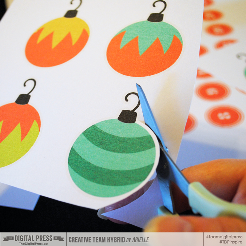
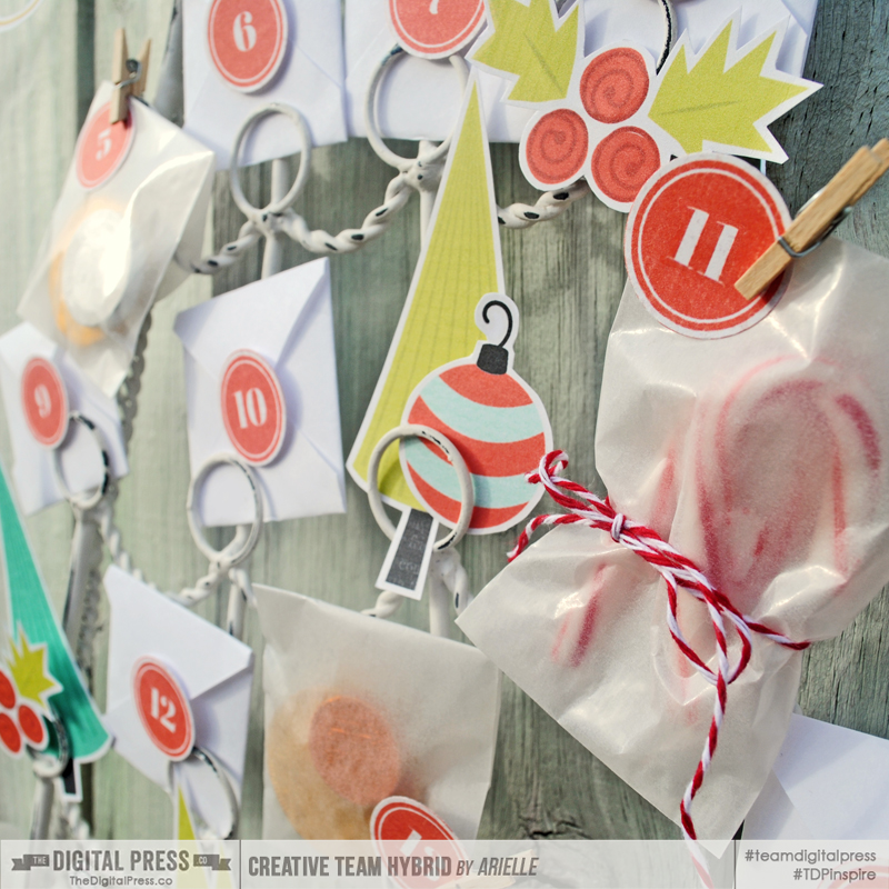
I started the project by taking a photo of the tree cardholder and then enlarging it to 100% in Photoshop, so that I could measure/resize the elements and decide on their placement. I quickly figured that my little envelopes needed to measure 2″ square, and then I was able to fill in the gaps with elements from the kit, and size them appropriately. The numbered circles are from one of the patterned papers in the kit – I sized them to 1″ inch so that I could quickly use a 1″ punch to punch them all out. Once that was squared away, I set up 8.5″x 11″ documents of what I needed, printed them, then trimmed out all the pieces.

Make a Festive Advent Calendar

I loved how all the elements in this kit have a white border – I could just make it out once they were printed, and used them as guides as I trimmed them.

Make a Festive Advent Calendar

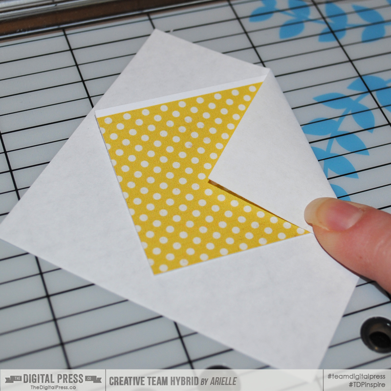
For the little envelopes, I cut plain white paper to 3.25″ square. I used a 2″ inch template of thick cardstock to fold my envelopes. I lined the corners up on the grid of my trimmer, to make it easier to center my template, and taped the bottom flaps down as I went. Then I tucked a little note into each, directing us on something to do for that day (you can find awesome lists on Pinterest to get ideas for your own notes!).

Make a Festive Advent Calendar

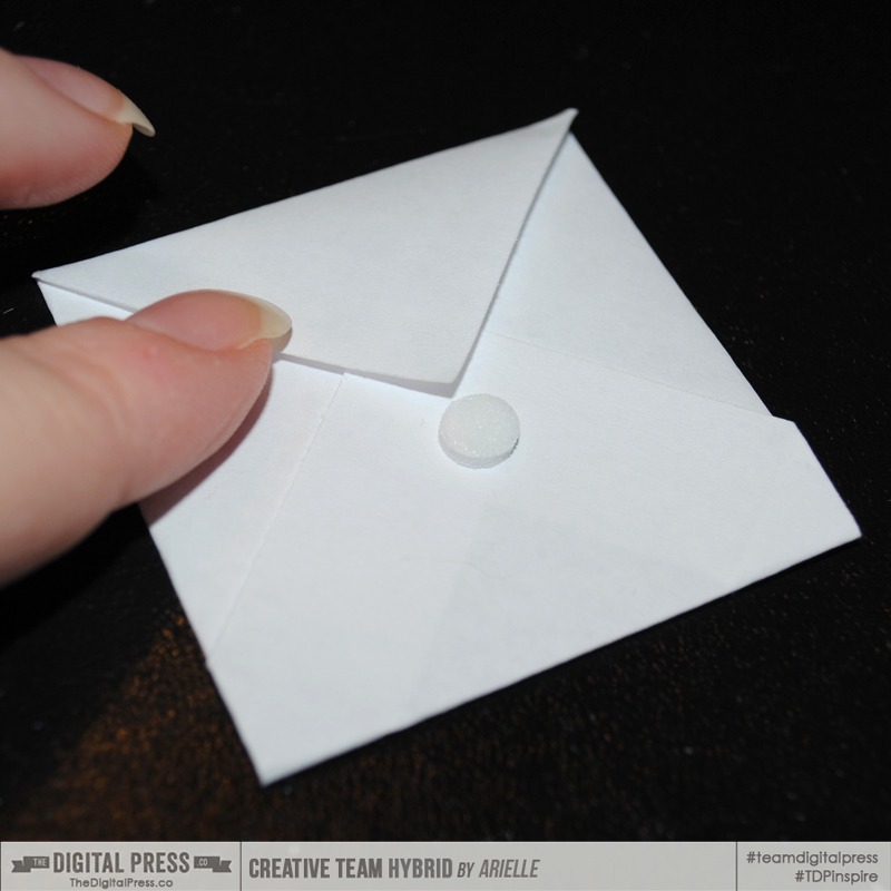
To make the envelopes easier to open, I placed a dimensional glue dot directly under the flap. Later, I adhered the numbered circles onto them, which helped to keep the envelope sealed… but still let it open to easily remove the notes.

Make a Festive Advent Calendar

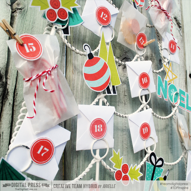
I also used mini glassine envelopes and filled those with little treats (I only did nine treats, as I didn’t want the calendar to be all about the candy!).

After you have everything trimmed and ready to go, I suggest putting all the envelopes in place on the frame and then sticking on the numbered circles; that way, you’re not shuffling through them to try to find what goes where. Finally, all of the open spots are now ready for the magic touch — the adorable elements!

ahg_hybridadvent7

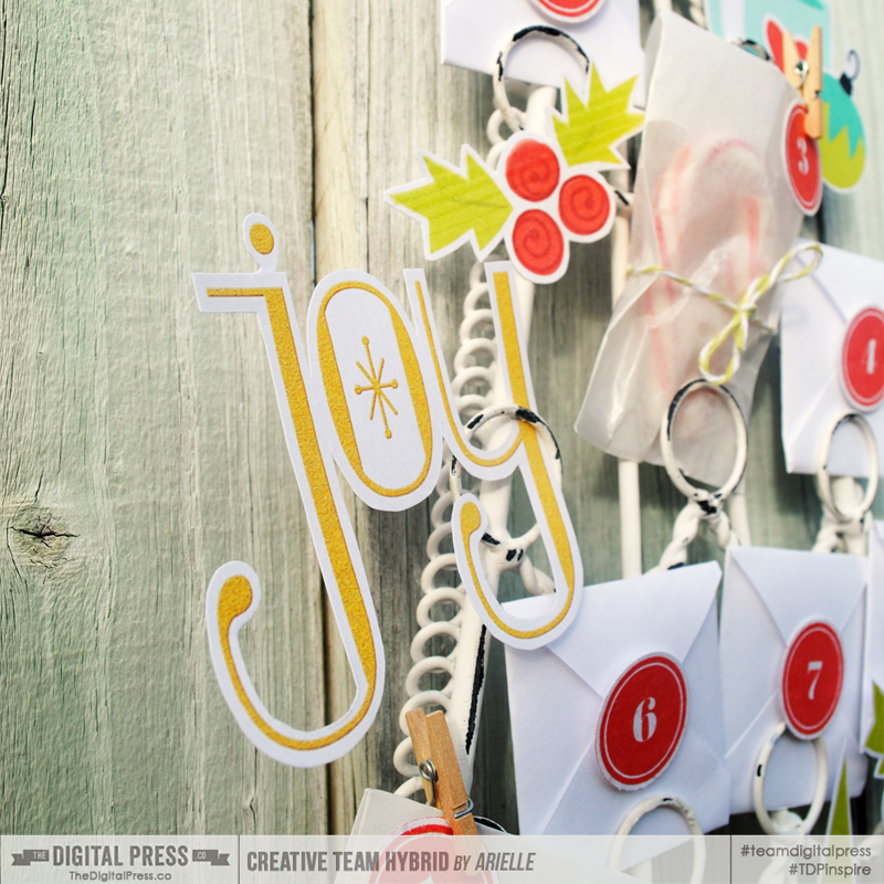
I didn’t want anything adhered TOO permanently, so I mostly tucked elements in or pinned them to the frame with mini clothespins. You could always use twine or ornament hooks, as well.  I am so excited to have something I can customize each year!

Make a Festive Advent Calendar

You can make your calendar as simple or detailed as you like. This one took me about 5 hours total – which is a bit lengthy for me [wink!] –but the finished product made it worth it! I am so excited to be starting this tradtion with my family!

We would LOVE to see your hybrid holiday decor – please share it with us over in the hybrid gallery and our Facebook page. And be sure to come back tomorrow to see the second post in our 12 Days of December series!


Arielle H Gordon About the author  Arielle H Gordon is a wife and mom of two crazy kiddos, ages 5-1/2 & 7. She moved around (a lot!) before returning to settle down in her hometown of Enterprise, Alabama, to marry her sweetheart and start her family. She is an avid crafter — digital, hybrid and otherwise! She LOVES Jesus, family time, camping, gardening, reading cozy mysteries, hot tea, popcorn, and anything on the BBC! This time of year, you’ll find her glued to the Hallmark channel watching every single Christmas movie — even if she’s seen them 5 times each!
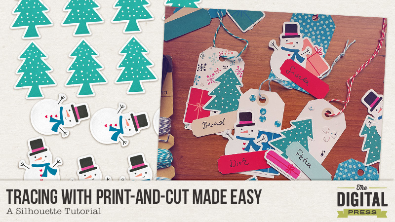
Tracing with Print-and-Cut Made Easy – A Silhouette Tutorial


Did you ever struggle with the Trace tool in your Silhouette software? I did and sometimes I just failed, especially with white edges. I played with filters as hard as I could but still didn’t get it to work.

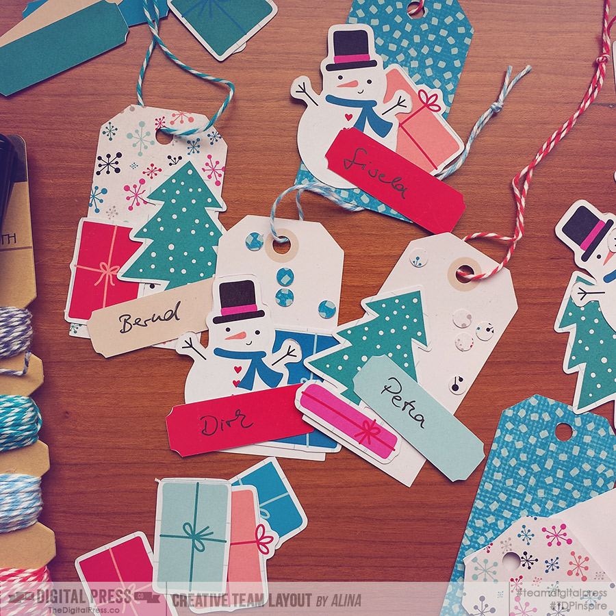
The last time I was using my Cameo, I saw that the sticker sheets in Let’s Plan: December by Mommyish and Mari Koegelenberg had an additional black mask. I wondered if that would make anything better. So I used them. And suddenly tracing was easy breezy! And the cuts came out perfectly. Most perfect cuts ever, to be honest. I was hooked and created several sheets for Print-and-Cut and they were all traced fast and cut with precision, even on the edges.


Click on the image to see what I used.


I thought the easiest way to show you how to create a black mask and to use it for tracing was a video tutorial and here I go!


I hope you learned something new for your Silhouette fun and it made your day like my day was made while Printing and Cutting those tags!

If you have any further questions, go ahead and post them in the comments, I will do what I can to answer them.

Have a great time and take care!


AlinaAbout the Author: Alina enjoys sitting in front of her large computer screens too much. Apart from that she loves walking her dog and watching sunsets while being amazed of life in general. She is married to her best friend. Tries to manage the needs of her two cats and her dog and badly fails when they all want their cuddle time at once. Everything else is scrapping, taking photos and currently crafting. Having said that, she needs a bigger craft room.


Tutorial Tuesday: Add a “zing” to your photos

blogtemplate

Hello everyone! Hope you are recovering well from the DSD celebrations and looking forward to some quiet time now? Well, I certainly am. Its seems like I have been working in overdrive trying to get so much done this past couple of weeks that I must have had my auto-pilot on!

One of my favourite things to do when I feel like I’m scrapping in the same old style is to look around and spot any new techniques other people may have been using. I also look back at my old layouts and style. One of the things that I noticed was how I used to extract a lot of photos either fully or partially and try and add some effect to them.

As a reminder and a refresher for me (bonus!) as well, I decided to share one of my favorite effects with you – the pixelated photo (i.e. creating an effect that will seem like your photo is breaking up). There are many advantages to it – I like to do this with really candid or animated shots so it helps to add even more movement and energy to the expression. Don’t know what I am talking about?… Here’s the what and how.

My steps are all on Photoshop Elements  but should be easily reproducible on Photoshop.

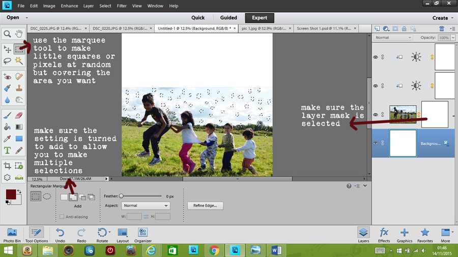
Select a photo you want to work with. These kinds of effect work better with large photos but you can try with smaller formats as well. I selected my photo, placed it on the canvas and processed it a bit (brightness, contrast – the usual). I then added a layer mask (very important to preserve the original image and ensure there aren’t any OOPS moments!).Then selecting this layer mask and using  the rectangle marquee tool, I started to draw out various square and rectangular sizes and shapes. You will need to make sure the “add” option is ON within the marquee tool options to allow you to make multiple selections at the same time. I continued to pepper the entire photo with these.

Screen-Shot-1

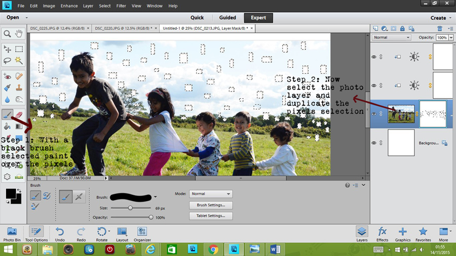
Next we want these selections erased but non-destructively. So I selected a black brush and painted over the selection. We are still working with the layer mask so make sure this is selected.

Now to reveal the actual pixels from the photo, select the photo layer (you should see that the marquee selections are still showing – blinking lines) and duplicate the photo. This will duplicate just those little bits.

Screen-Shot-2

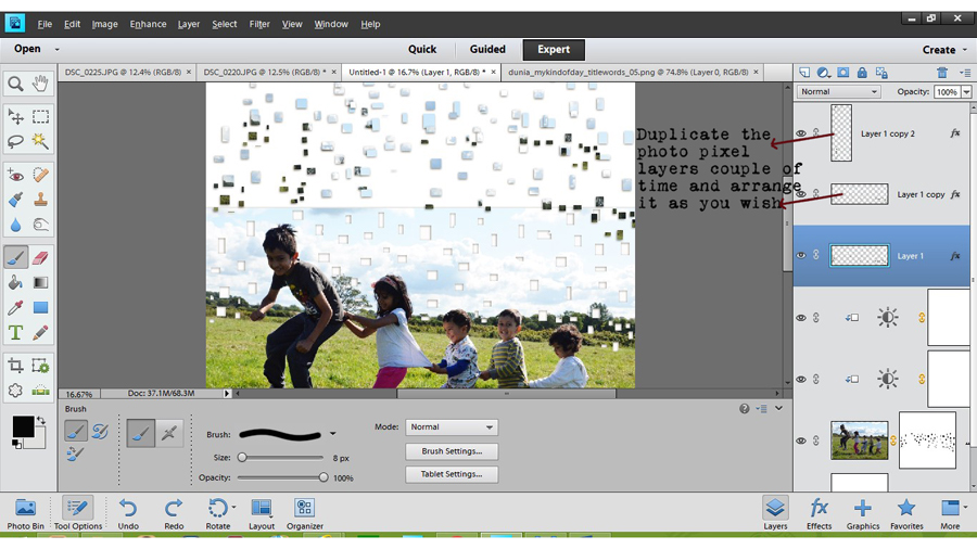
Now move this layer to the top most on your canvas and duplicate it couple of times. Start to position these various layers on the space above and beyond the photo. You can rotate, resize and delete or cut and paste the pixels as you feel. Overall it should give the effect of pixels flowing away from the photo.

Screen-Shot-3

Add embellishments and journaling and voila you have a transformed and eye-catching photo!

Final-LayoutCredits: My kind of day kit by Dunia (our guest designer this month)

There are numerous other possibilities with this technique. I tried another one with a big Title. Here I have used a feather shaped element to select pieces and break them away from the alpha.For added effect, I have also included the actual feather elements in the flowing away shapes.

Let-them-take-flight-copy-for-webCredits: In fine feather alpha by Kim Broadbent, Elements from Blink by Little Lamm and Co.

Hope you liked this effect and found the tutorial useful. Please share any layouts you create using this or any other modification and I would love to see your interpretation.

That’s it from me then. Till next time…


Profile pic avatar small

About the author: Shivani Sohal is a donner of many alter-egos. A finance professional by day in busy London, she morphs into a seemingly normal mum of two in the evenings and weekends. She is constantly found with her fingers in too many pies and juggling the metaphorical balls. That is living on the edge for her; aided by the two ankle biters and a darling hubby who define the warm and mushy for her. She is ferociously dedicated to memory keeping – almost immune to any nay-sayers (or equally disruptive crying children or annoying house fires!!!);keeping her head down and forging ahead at all times.

Harmony Between the Lines: Journaling on Lined Journal Cards

Harmony Between the Lines

I love to journal.

I don’t always share it with my posted layouts because it is often quite personal, but I love the added significance it adds to a page.  However, I have this NEED to make my entire page flow, or mesh together in some way that is at least apparent to me (because I know there are times when it is not apparent to anyone else, he he).    The hardest part of journaling for me is working what I want to say into the composition of a page so that it looks like it belongs.  It drives me NUTS when I can’t make it work.

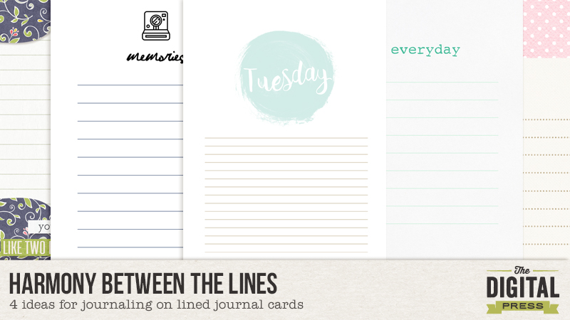
I find that pocket scrapping helps with this in that it is quite easy to set aside a certain space for your journaling without taking away from the overall appeal of the page.  And, to make it easier, in pocket scrapping you can find loads of cute cards with the journal lines all marked out for you.  I love those lined journal cards but I used to have a hard time getting my journaling text to line up with those lines.  Obviously that is no big deal, but it really bothered me, so I researched and have collected some techniques for altering either my text or the cards so I can use those journal lines without creating too much distraction for my ever so slightly OCD brain.

(I work in Photoshop CS6, so any explanations I have come from that, but most of what I share should be possible in other programs as well.)

1. Change your line spacing.

The first method I try when wanting to use a lined journal card is to simply adjust the line spacing of my text.

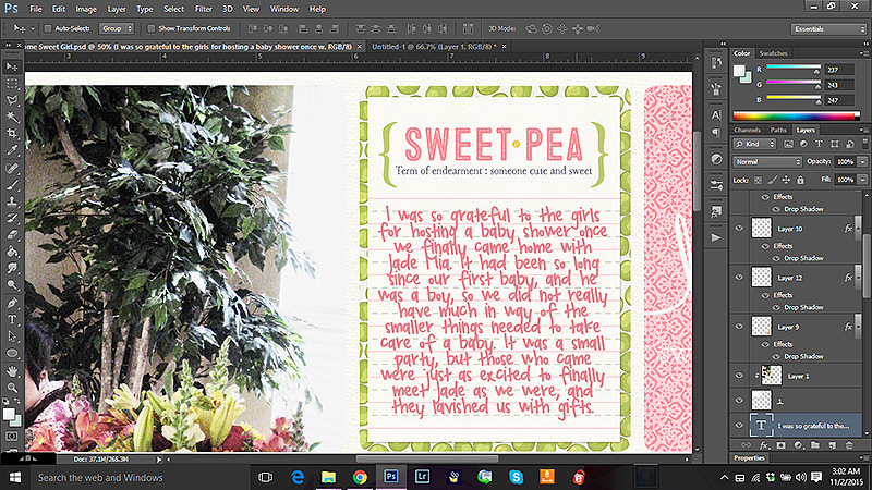
To do this I first type out my journaling and get the wording just the way I want it to be. I also go ahead and choose what font I want to use as different fonts tend to be different sizes.   Go ahead and do a spell check as well, because if you are like me some of those words are wrong and correcting them might change the lines up later.  I usually end up with something looking like this:

Harmony Between the Lines

See how the typed text does not line up with the lines on the journal cards?

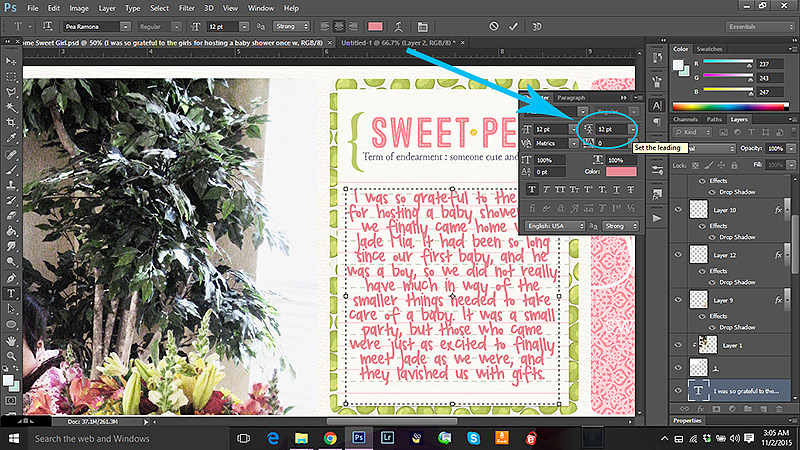
Now, with your type tool select the text you want to adjust until it is ALL highlighted.  Then, to make it easier to see, type ctrl+h (this hides the highlight but keeps your text selected so you can work with it).  Now go into your text formatting tool box and find the line spacing menu (mine says “select leading” when I hover over it).

Harmony Between the Lines

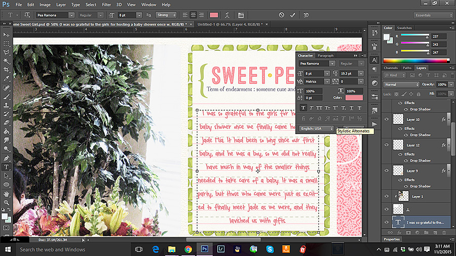
Play around with this a bit and see how it effects the placement of your text.  Now in all honesty, I find that the rounded numbers the provide just don’t work most of the time, but you can type numbers in to the little text box so you can use and numbers in between, including decimal places.

For instance here I found that 19.3 worked the best for this particular card and font combination.

Harmony Between the Lines

However, note that my text now goes off the card, so I want to adjust the text size until it all shows up. Like this. Adjusting the size might change your line spacing a little, but not much.  You can adjust your spacing a bit more once you get the text the right size for the card.

Harmony Between the Lines

So here is a look at my finished page.

Harmony Between The Lines

(credits: template by Karla Dudley: Pocket Pals 12×12 BundleHello Sweet Pea: Collection by Kim B)

Most of the time this is the method I go with, but sometimes I can’t get this to work the way I want, or maybe I want to change things up a bit.  Here is a quick look at a few other ways to play with lined journal cards.

2. Move the lines.

One way to adjust the journal card is simply to move the lines.  This is most easily done on a journal card that has either a white background, or a background color that is easy to reproduce.  If there is a lot of texture or pattern involved this method can get tricky fast, and I don’t recommend it unless you have loads of time and patience.  But on a simple white journal card, it is easy-peasy.

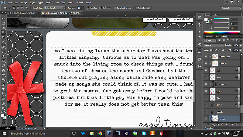
I usually start by typing out my text on a layer over the card.  I arrange it the way I want with spacing and size.  Then I select the journal card layer and with my magic wand tool I select the line that I want to move. Make sure to have the “contiguous” option marked in your tool bar when using the magic wand tool – otherwise you will select EVERYTHING on that layer that is the same color as your line – including all the other lines.  Here you can see I have selected just the line I wanted – I know it is selected because it has the marching ants around it (it shows up as dashes in the screen capture on the top line in the image below).

Harmony Between the Lines

Now, with my arrow tool, I can grab that line and move it around as I like.  I repeated these steps with all the lines until I had them right where they needed to be. You might notice that sometimes the line you moved leaves a hole in the card.  That is easily remedied.  I simply create a layer directly under the card and copy the background color of the card onto that layer, so any holes are no longer noticeable.  Later I merge these layers if I want.

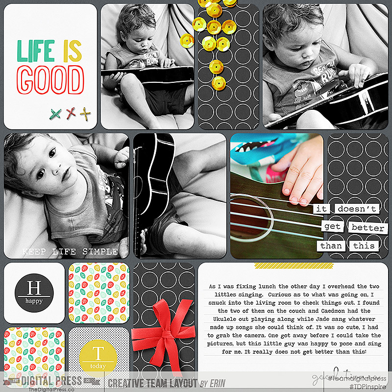
I did not have a lot of moving to do for this particular card, but there were two extra lines I wanted to get rid of, so I moved them to merge with nearby lines, and widened out the spaces just a bit.

Here is a look at my finished layoutHarmony Between the Lines

(credits: Template by Mommyish : Templates Trio 5; Dunia Designs Life is Good Paper, Elements, and Cards )

3. Erase part of the card.

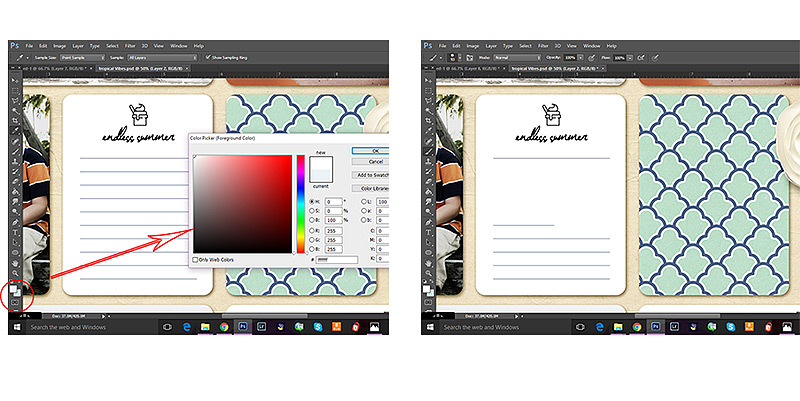
A similar method would be simply to erase some of the lines.  I find this method most useful when the amount of journaling I have is not proportional to the journaling lines provided, especially if I have a lot to say, and only a few lines to use.  In those cases it is just not possible to fit my journaling into the lined space provided without making it too small to see. The same is true if I have just a wee bit to say, but the card allows for much more room, leaving far too many blank lines for my liking. Usually I know before I start typing that I am going to need to change the card, so I go right to the card layer and with my color picker I choose the background color of the card I am working on. (Again this is most easily done with a simple easily reproducible color, though you are more than welcome to give it a go on a more complicated pattern or texture.)

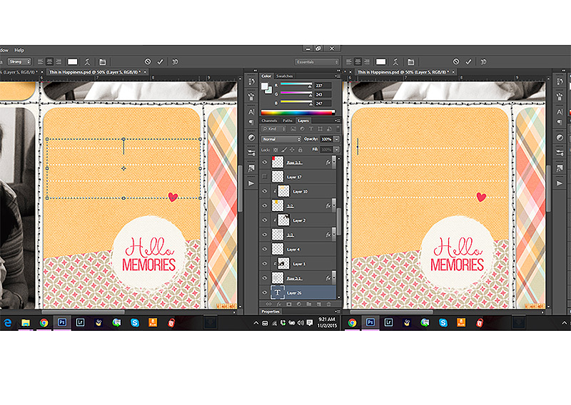
Harmony Between the LinesI then select my paintbrush tool, make sure I have a diameter size that fits with the space I am working on and I carefully paint the background color over some or all of the lines.  In this case I decided to leave the top and bottom lines to serve as a semi-border for my journaling.
Harmony Between the Lines-103

(credits: Template by Sabrina’s Creations Document Life Template Set 1 ; Sahin Designs Joyful Noises and Summer Wrap Up Pocket Cards )

4. Type line by line.

And finally my last method is probably the most simple, and yet I use it the least.

Simply type line by line.

This method is the easiest method to use if your card background is highly patterned or textured, or you just don’t want to take a lot of time matching colors.

In Photoshop you can either choose to use a text box, or type line by line depending on how you click your mouse when using the text tool.  If you click and drag, you create a text bow with clearly defined and easily changed parameters.  If you simply click, a text line will appear that goes on and on until you tell it to move down by pressing enter. Below is a screen shot of what each one looks like, the one on the left being the text box created by clicking and dragging, the one on the right is the text line created by simply clicking.Harmony Between the LinesTo type line by line you simply click on the first line, type your text, then deselect your text tool, re-select it and move on to the next line.  In fact, many people prefer this method.  I tend to avoid it because I find it rather tedious, especially when I have a lot of lines to type.  There are times, however, specifically when I only have a few lines to type, like a date, a place name, or a simple explanation, where I do use this method successfully.  It is especially useful on cards with really wonky journaling lines (which I LOVE) or when I want to be able to manipulate each line individually.
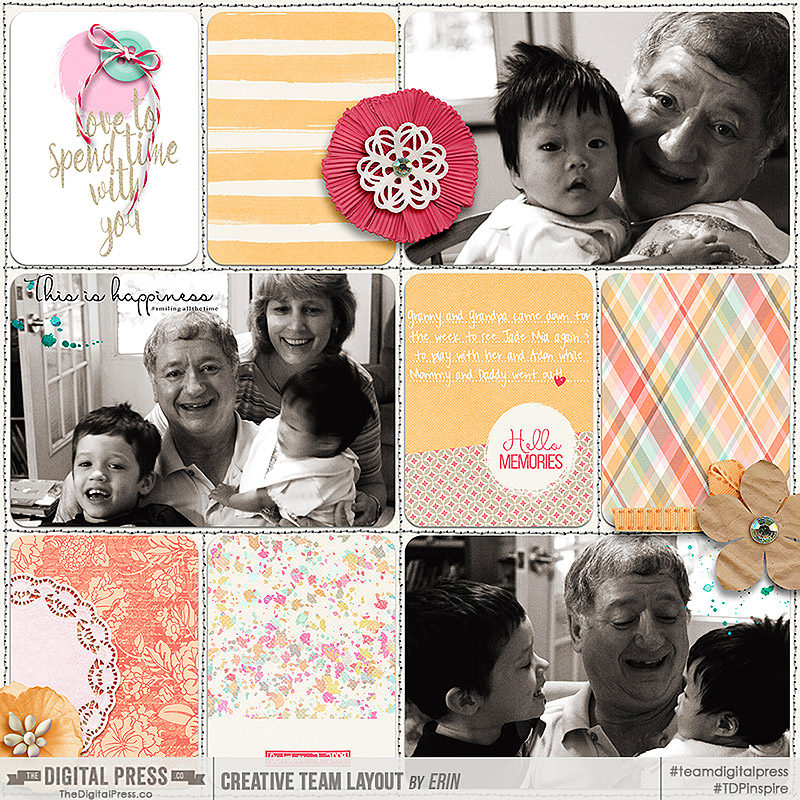
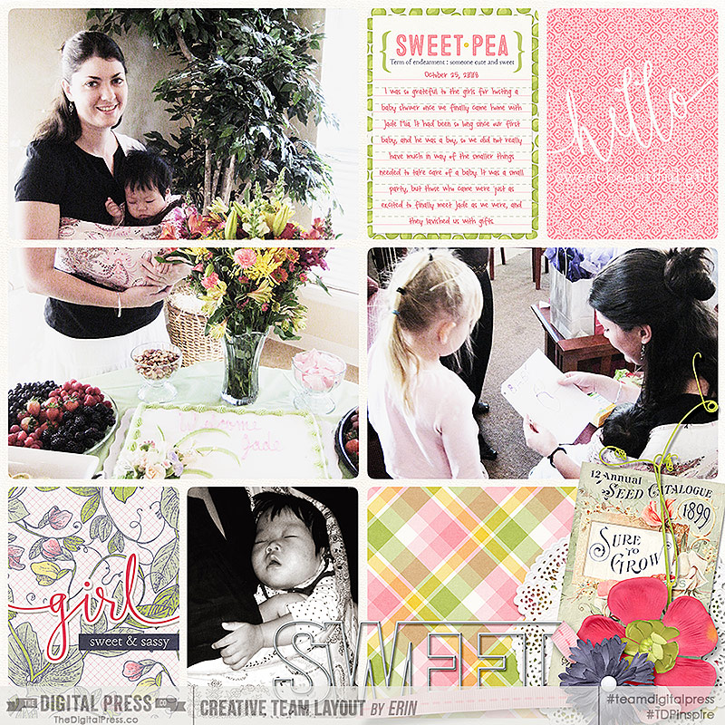
For example, on this page I used this method to type on the colored and textured journal card in the center row.  I just loved the bright happy colors and how well they brought out the smiles in these pictures from years ago.

Harmony Between the Lines

(credits: template by Laura Passage: Project Twenty Fifteen Templates Vol.2Anita Designs The Best of Times Kit and Journal Cards and Days of the Week Journaling Cards)

So there you have it.  Four ways to use those lined journaling cards to help mesh your journaling into your layout so they become one work of art.  I know there are loads of other ways to do the things I shared above, and there are also many other ideas for using those cards, so feel free to let me know in the comments if you have any more methods or ideas you want to share.  I would love to hear from you.

Happy Scrapping!


Erin 1

About the Author: Erin is a work from home mom of three living in Thailand. She loves playing with her kids and anything artsy. She can often be found knee deep in toys with paint on her face. She is slowly learning the meaning of living an authentic life, and enjoying every minute of the adventure.