Category: Tutorials

Tutorial: Simple Hybrid Mini-Albums

DonnaEspiritu-TheDigitalPress-Hybrid-IGMini-tut-06

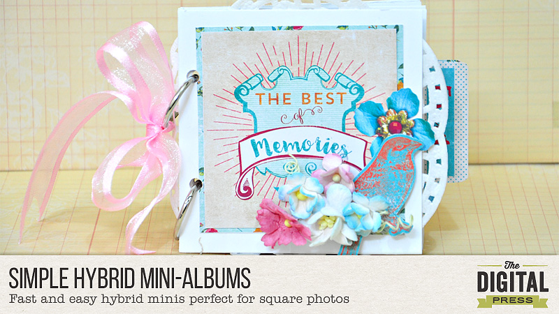
Hello everyone. Donna here to share a simple and cute mini-album with step-by-step tutorial.

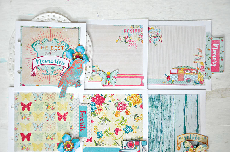
Since Instagram became famous, I noticed most of my photos were cropped in square, ready for IG posting. So, for today, I want to share with you a couple of mini-albums to use for square pictures.

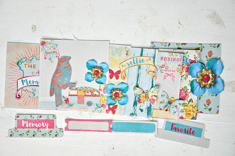
1. First step is to print and cut your chose digital papers/elements to use. Papers size: 4×4 inches, resized to 8×8/6×6. Elements were resized as well.

DonnaEspiritu-TheDigitalPress-Hybrid-IGMini-tut-01

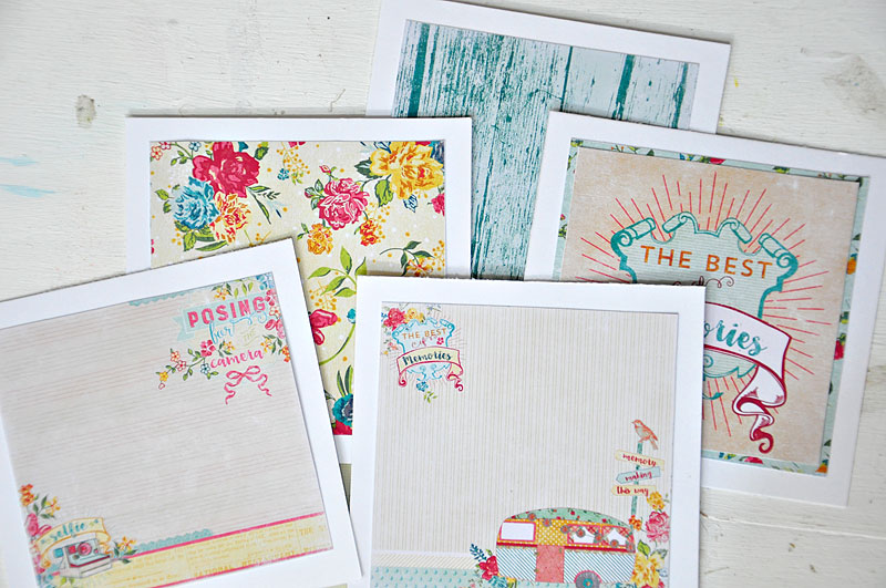
2. Adhere papers to cardstock. Approximately, cardstock is 4.5 x 4.5 inches.

DonnaEspiritu-TheDigitalPress-Hybrid-IGMini-tut-02

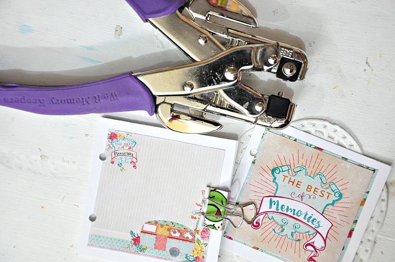
3. Punch two holes as seen in the image. I used my Crop-a-dile to punch several layers simultaneously. I also used a doily on the first page/cover.

DonnaEspiritu-TheDigitalPress-Hybrid-IGMini-tut-03

4. Adhere everything as seen in the image. use foam dots/tapes on some of the embellishments for dimension.

DonnaEspiritu-TheDigitalPress-Hybrid-IGMini-tut-04

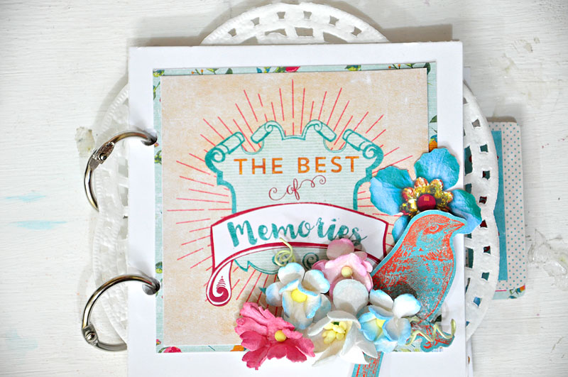
5. I just added some flowers from my stash to decorate the front page/cover.

DonnaEspiritu-TheDigitalPress-Hybrid-IGMini-tut-05

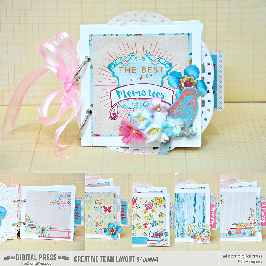
This is how it looks like with a pink sheer ribbon tied to one of the metal rings. I used Danielle Engebretson’s REMINISCENT papers and elements

DonnaEspiritu-TheDigitalPress-Hybrid-IGMini-tut-07


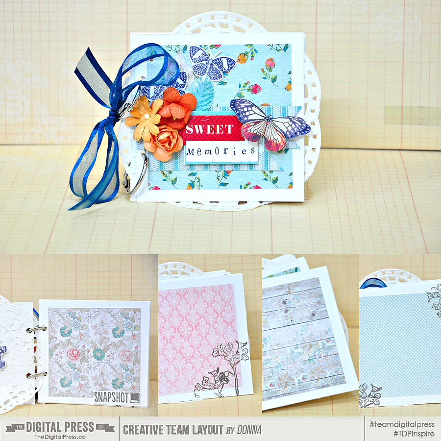
I also created another one with fewer pages, using YESTERDAY ONCE MORE papers and elements. I just added some stickers, alpha stickers, flowers, stamps and sheer ribbon from my stash.

DonnaEspiritu-TheDigitalPress-Hybrid-IGMini-tut-08


That’s it! I hope you liked my project and tutorial. Thanks for dropping by, happy crafting!

Donna


About the author: Donna Espiritu is a mom to a little girl who just turned 10 months and wife to a very supportive husband. She is currently living in the Kingdom of Saudi Arabia with them. When she is not scrapbooking, she likes to read books/e-books (sci-fi/romantic/time-travel) or watching old episodes of some of her favorite TV shows.

Six Steps to Speedy Scrapping


Honestly, I am the slowest scrapper. I love the process of scrapping. Really, I do. I will play with different papers, placements and format of my title (alpha, fonts or stamps?) and will even switch out my photos as I try all those amazing filters in my Lightroom library. It is nothing for me to spend an hour on a one-photo 12×12 layout…..and double or triple that time for a pocket page spread.

But, this Summer I’ve had to speed up my scrapping. My kids are home and want attention, there is lots of outside fun to be had and I just haven’t had much time to sit at the computer. Here are the six steps I’ve been using to speed up my scrapping, but still make the process fun for me AND make a page that I want to print for my album!

  1. Scraplift Myself  – I gotta admit, when I first did this it seemed like cheating. But I loved my layout and figured why not? If not my layout, I head to my crazy huge Pinterest board where I have hundreds of amazing paper and digital layouts pinned. I can usually find something that I think will work in a couple minutes and then I am on my way to creating my page. But if something doesn’t pop out, I try #2.
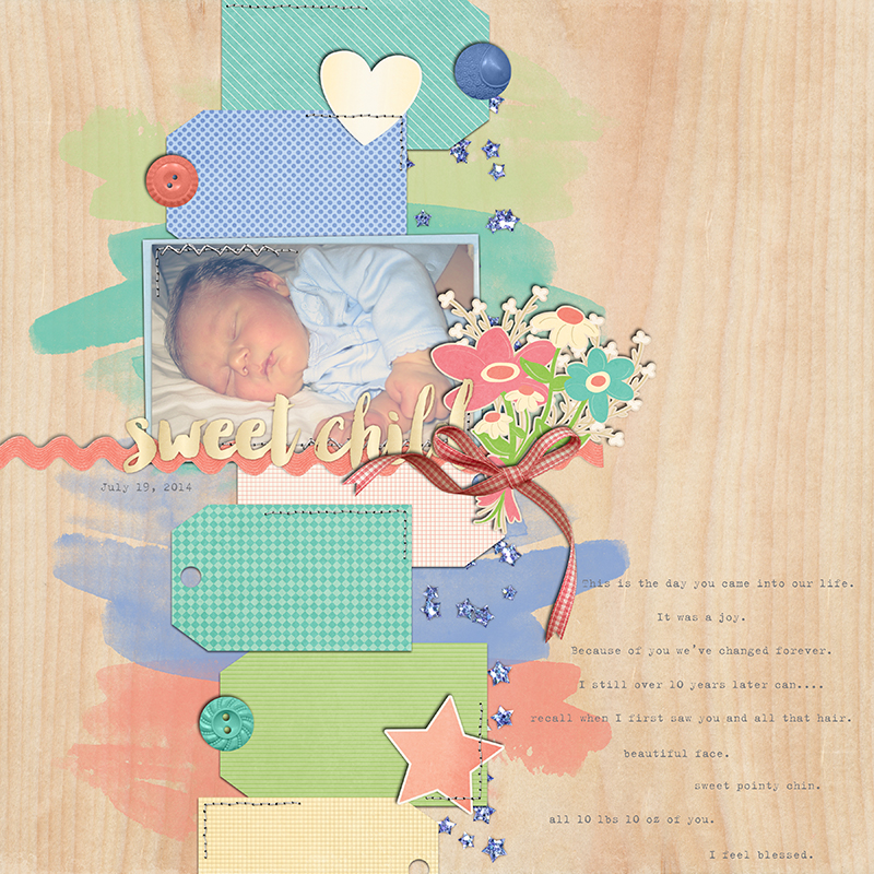
  2. Grid Layout  – Ok, most people would assume I would say use a template. Frankly, for me they aren’t quick. Templates gives you limitless options for clipping all the amazing papers in a kit to various blocks, shapes, mattes and for me this would take more time. What does work for me is to quickly build a grid-type horizontal or vertical layout. Using either clipped paper blocks or filling a “square” with a flower or flair and then adding a 3×4 journaling or title card. I love that I can get the most out of a kit this way, but I don’t have to worry about all those pesky design principles that 10 years of scrapping have ingrained in me (visual weight and direction, rule of thirds, focal point, alignment, etc.).
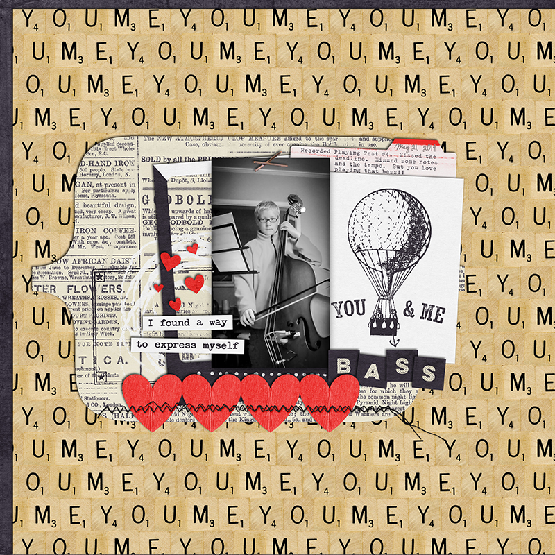
  3. B&W Photo – When I have a kit I love and I know what photo I want to use and I want to do it quick, I make my photos B&W. It makes it so much quicker to scrap. I don’t do this that often (as I prefer color!!), but I love the contrast with my other album pages and end up loving the effect. Plus, then I don’t have to “worry” about using that orange paper that I LOVE with my son wearing his purple soccer shirt.
  4. Group Dump the Elements on the Page – I normally pick and choose my elements carefully…but when I have less than half and hour to scrap, I’ll select 10-15 elements and just drag them en masse right on my layout. It’s almost like a puzzle trying to place them in just the “perfect” spot. A lot of times I’ve found an element that I didn’t think I would EVER use that works perfectly once I see it on my layout!!
  5. Word Art for Title – Next to the photos, titles are my biggest time-sucker. I love playing with fonts (and rasterizing/clipping papers) and alphas. There is some great word art out there and will work perfectly for your layout. I do still subscribe to the principle that every layout needs a title…..but, it doesn’t have to be a big, bold statement….a little word strip could work great.
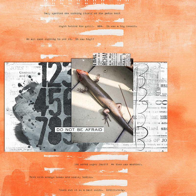
  6. Journal Poetry-Style – This is my term for journal in quick, short sentences right on my layout background, almost like a list. I don’t have to find the right size and color of a journaling block that will fit my journaling or spend time crafting just the right words. This way I can jot down my thoughts and space it how I want. I also like how it adds to the flow of the page.

Here are some layouts in my TDP gallery where I used my Speedy Scrapping Steps above.

Six Steps to Speedy Scrapping


Six Steps to Speedy Scrapping


Six Steps to Speedy Scrapping


avatar100x100About the Author:  JennV is a lover of history and art (luckily she lives 5 miles outside of Washington, DC) and an accountant by training.  She currently stays home with her two boys and is pursuing a career in photography, when she is not busy volunteering for every school and county initiative!!


Taking Photos of Your Hybrid Projects

blog


As a hybrid and paper scrapper, one of the questions I am asked most often is how I take pictures of my projects. It has taken me a good portion of my scrapping life to finally get the process streamlined and to a point that I am happy with it. To save you all the lengthy process of trial and error, I have a few tips that might help you. Today, my layout I’m working with is made using Little Lamm and Co.’s It’s My Party

Natural Light

Obviously, natural light will be your greatest ally when photographing your projects. You do not want direct sunlight because of the harsh tones and glare, but if you are able to find a place within your home with the most natural, indirect sunlight, you’ll be well on your way to good photos. I recently moved from my dungeon-dark old house to a house bursting with natural light (at least by contrast), so photographing my projects has become infinitely easier. In the library/computer room, I have set a chair just underneath the window for taking my photos.
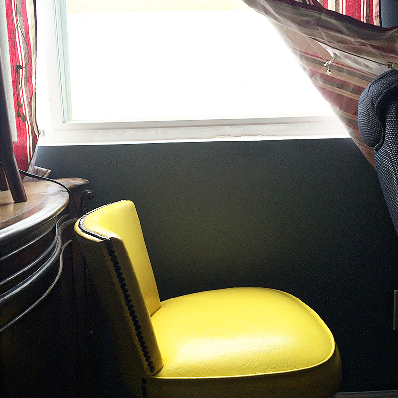
 

Taking Photos of Your Hybrid Projects


White Foam-Core Board

One of my secret weapons is a white foam-core board like you can find in the school presentation section at craft stores and office supply stores. They cost approximately $3 and last as long as you can keep them white. I place the board on top of the chair and then lay my project on top. I find that this allows the natural light to reflect off of the crisp white board without any weird color casts. Plus, if I need to adjust the temperature of the photo in post-processing, I have a true white neutral I can select for automatic temperature correction.
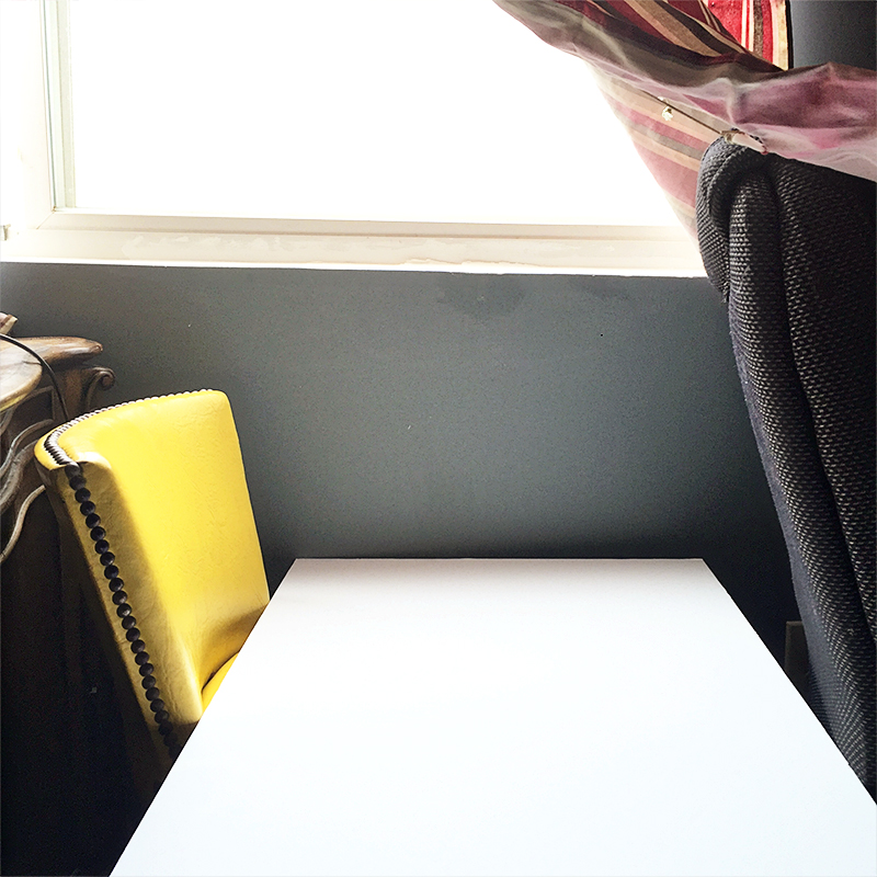
 

Taking Photos of Your Hybrid Projects


On occasion, I use an additional white board on the opposite side of my light source. So for me, it goes window, white board laying down with project on top, white board standing up against the edge of the bottom white board, and then me as the photographer. If I find I am not getting enough light on my project, I use the standing white board to bounce the light back on to my project.

Page Protectors

If I am photographing a pocket page, I take my cards out of the page protectors and lay them directly on top. This way, I still get the look and feel of the page protectors themselves without any of the glare of the plastic sleeves.
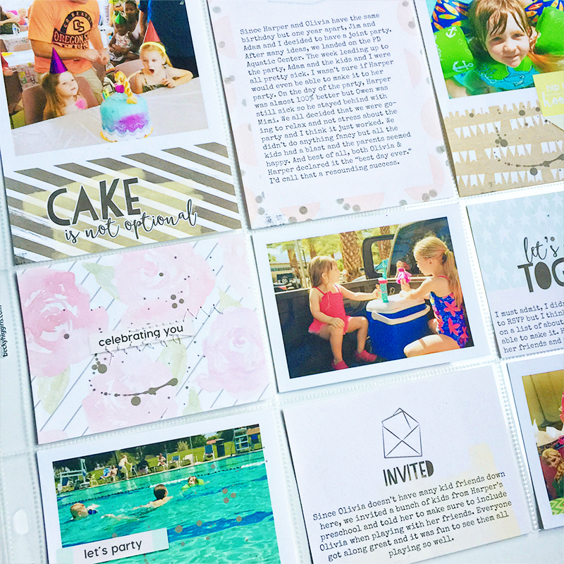
Taking Photos of Your Hybrid Projects


Camera

I do not use my DSLR for taking photos and this is probably mostly due to laziness, but also because I have found that my iPhone 6 Plus camera works perfectly. When photographing 12×12 layouts or pocket pages, I set my iPhone to the square setting. If the coloring still seems a little dark, tap on the screen until the sun icon pops up. Then slide your finger up while this icon is on the screen to bump up the brightness. Conversely, you can swipe your finger down if you want it to be darker.

Position

When photographing my projects, I try to stand directly above the project with my camera. I try to make the camera completely parallel with the project so there are no weird angles or distortion with the photo. I usually end up taking about 5-10 photos just to make sure I get one that will work. Then I’ll take a few closeups if I’ll be doing a blog post. I typically keep the camera on the square setting when taking closeups, but that is just personal preference.

Processing

I have used both my computer and my phone for post-processing the photos. On my iPhone, I use the app PicTapGo. My go-to filters for project photos are Brightside (increases brightness), Auto Color, Crispity (sharpness), Cool it Down (I use only if I deem the photo to have too much of a yellow overtone), and Sweet Tooth or Sugar Rush (depending on the colors of my project) to increase the saturation. The fun thing about PicTapGo is that all of these filters are on a sliding scale. I hardly ever use any filter at its full strength, so it’s just a matter of playing around with the levels until you find what looks best. However, once you discover a combination of all these filters that works best for your lighting situation, you can save the recipe within the app and apply it to all future photos with the click of a button. For computer processing, I use the RadLab add on for Photoshop (it’s also compatible with PSE). RadLab is made by the same people who make PicTapGo so my method is very much the same. I bump up the brightness, decrease the warmth, and increase the sharpness, contrast, and saturation.

Ottlite

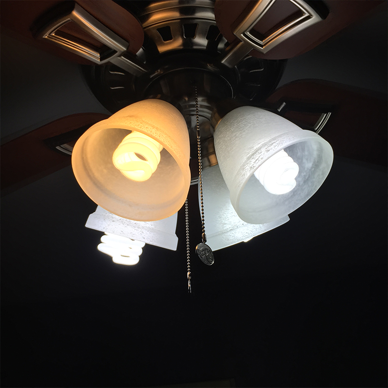
I mentioned before that my previous house had next to no natural light. Additionally, I am usually a late-night, last-minute type of scrapper so sometimes my photos have to be taken when there’s no natural light. Typical lightbulbs have a very yellow color cast and even with post-processing, I cannot make my photos look right. I discovered Ottlite, which is a brand of light bulbs and lamps that is supposed to be the closest to natural light you can get from an artificial light source. I have a desktop Ottlite Lamp that I scrap with and have attempted to use for the purpose of nighttime photos, but it is not quite bright enough. Ott lamps themselves can be quite costly, even with the use of a coupon but they also offer light bulbs that you can use with your own light fixtures. I went to my local big box craft store and bought three Ottlite bulbs for my ceiling fan. I waited for a sale and got all three bulbs for under $25.
Taking Photos of Your Hybrid Projects


As you can see, the Ott bulbs  give off much less yellow light compared to a traditional bulb. My husband jokes that it looks like an operating room when these bulbs are in use, but I find it provides the right color and brightness of light needed for my photos.

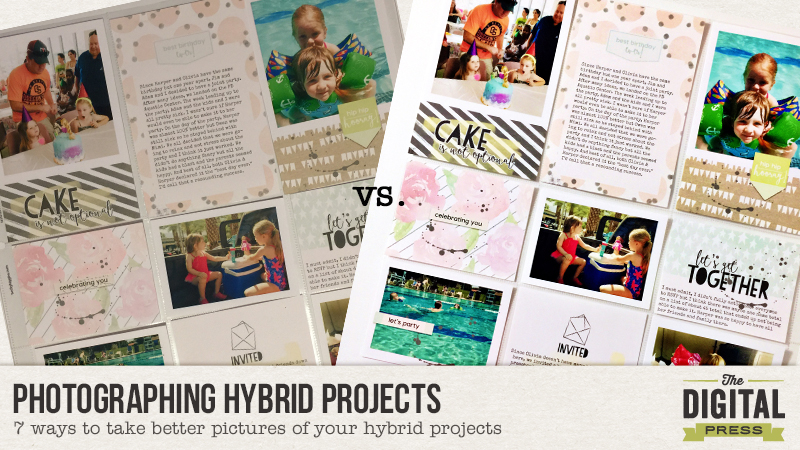
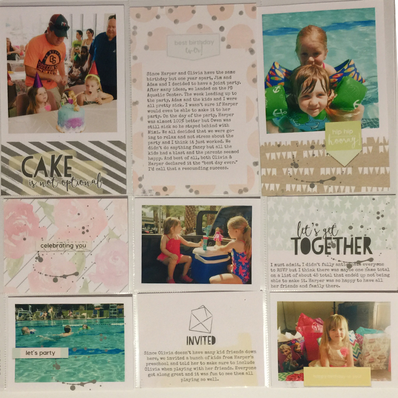
Here is a photo of my layout taken under regular light and without using any of the tips mentioned above:
Taking Photos of Your Hybrid Projects


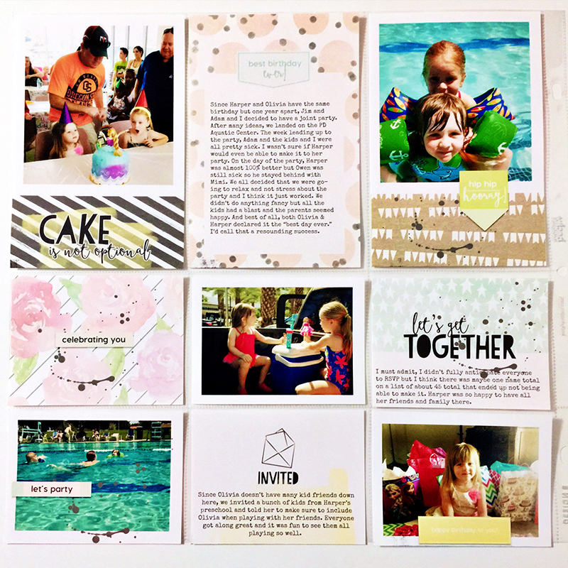
And here is the photo of the same layout following all the tips shared above:
Taking Photos of Your Hybrid Projects


I am by no means a professional photographer but this is the process that works for me. If you have any tips to add, please share in the comments. I would love to hear your tried and true methods.


Brenda

About the Author: Brenda Smith is a mother of two littles and wife located in Southern California. When she is not scrapbooking, you can find her working full-time, trying to finish up her college degree with online classes, or sleeping because there are never enough hours in the day. Hybrid scrapping satisfies her addiction to technology and her addiction to paper and glue.


Tutorial: Hybrid Paper Poms

blogtemplate_8-10-15

.

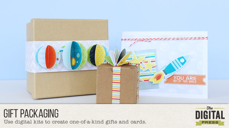
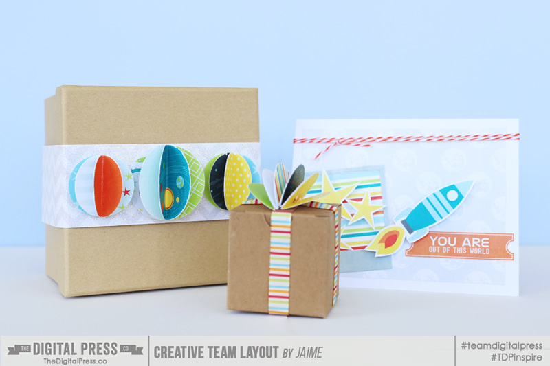
I love creative gift packaging. I truly believe presentation of a gift makes a big difference. One of my favorite things to add as gift toppers are these little paper poms. Aren’t they cute? Plus, I love making them with digital supplies, because then I can just print out the paper I need. For these projects, I used papers and elements from the new One Kit Two Ways: Out Of This World | Kit by Laura Passage.

.

11

.

Here’s a tutorial on how to make these cute gift toppers. They’re really simple!


1

.

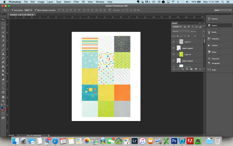
First, create a blank 8.5″ x 11″ document in Photoshop (or you can do 12″ x 12″ if you have a wide-format printer). Create squares that are about the size you want your poms to be. I used 2″ x 2″ squares because I was using a 2″ circle punch to make my poms. Clip your patterned paper to the squares to create a page of patterned paper squares as shown above.


2

.

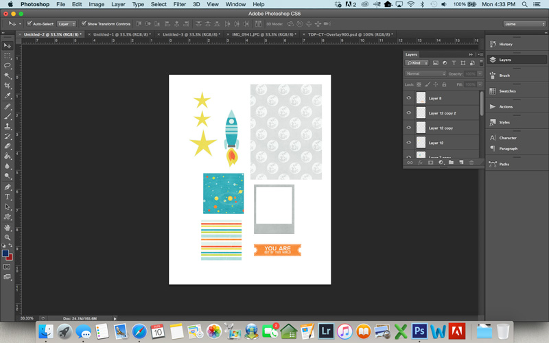
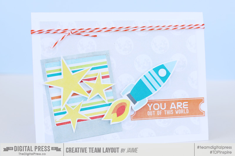
I figured while I was crafting, I’d make a coordinating card to go with my gift. To do that, I just pulled the pieces I wanted to use onto an 8.5″ x 11″ document in Photoshop and sized them to what I wanted for the card and printed the whole sheet. If you have a Silhouette cutting machine, you can print and have the machine cut out the pieces. My Silhouette was not handy, and these weren’t super intricate cuts, so I just cut them out by hand.


3

.

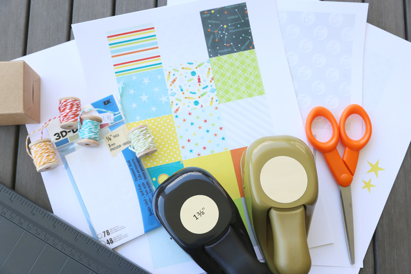
Gather your supplies. For the paper poms, you’ll need a circle punch and some adhesive, and that’s it!


4

.

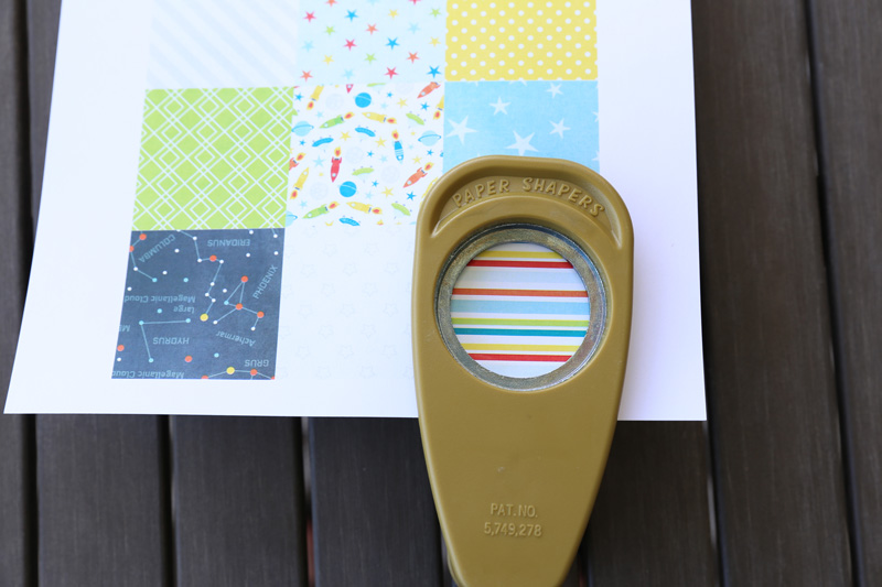
To punch your circles, it is easiest if you hold the paper punch upside down, then you can see how the pattern lines up. Go ahead and punch your circles. You’ll need 5 circles for each paper pom. It’s really fun to mix colors and patterns on these, but you can also do them all in the same pattern/color.


5

.

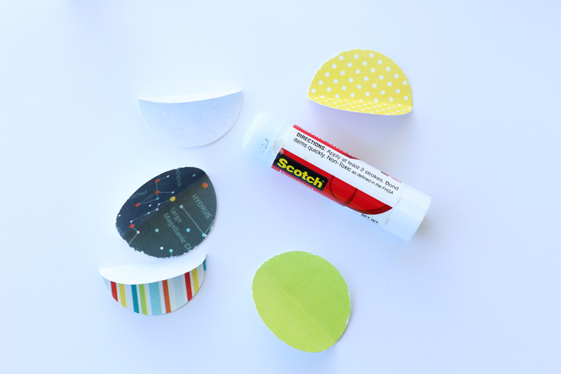
Once your circles are punched, fold each of them in half, and use your adhesive to glue the circles together (I just use a standard glue stick for these… works great). I put glue on half of a circle and glue it to the half of a different circle … just make sure you’re gluing the back sides together, not the patterned sides. 🙂


7

.

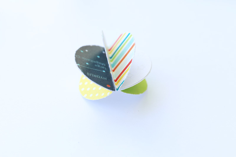
You should have something like this (above) when you’re done gluing. At this point, you can just glue the pom onto a package (or card or tag), or you can go one step further and punch a hole in the pom to thread ribbon through.


8

.

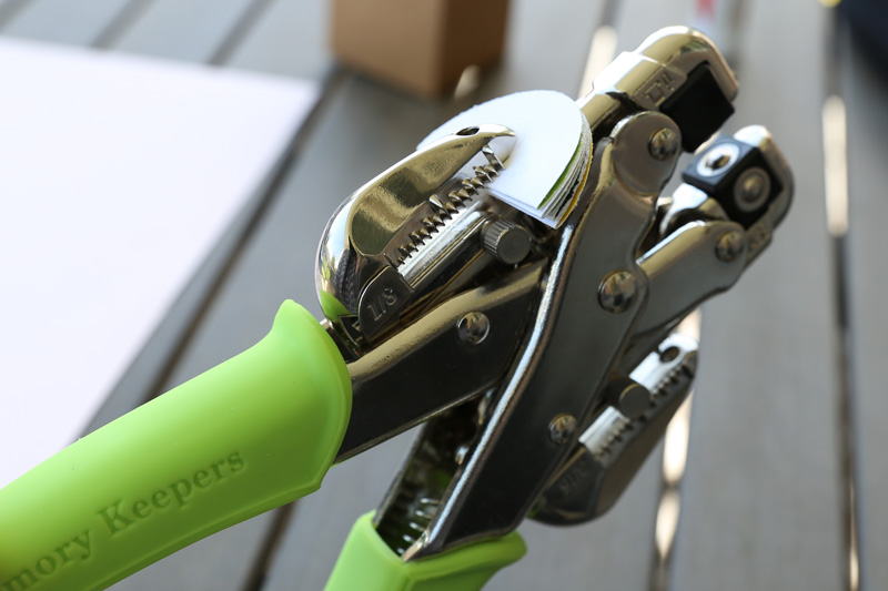
To punch a hole, fold all the circles together to create one thick half circle. I use the hole punch on my Crop-a-Dile because it will punch through that many layers. If you don’t have one of these, you may just have to punch one layer at a time.


9

.

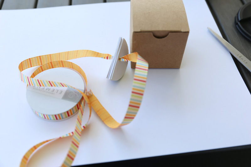
Thread your ribbon or string through the pom.


10

.

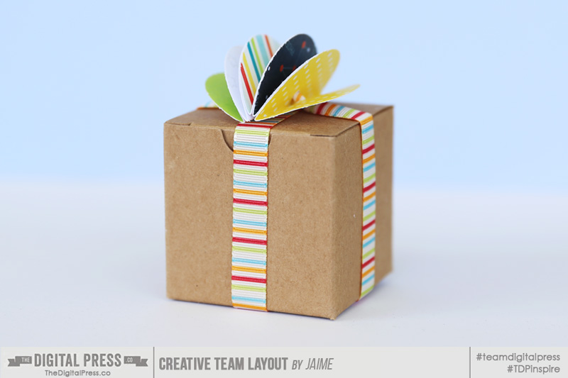
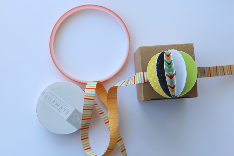
Place the pom on top of your package and wrap the ribbon around it, puffing out the pom at the same time. Adhere the ends of your ribbon together on the bottom of the box. I use that red adhesive in the picture (called Terrifically Tacky Tape) to adhere my ribbon ends together because it is really sticky and does a good job of holding the ribbon together.


11

.

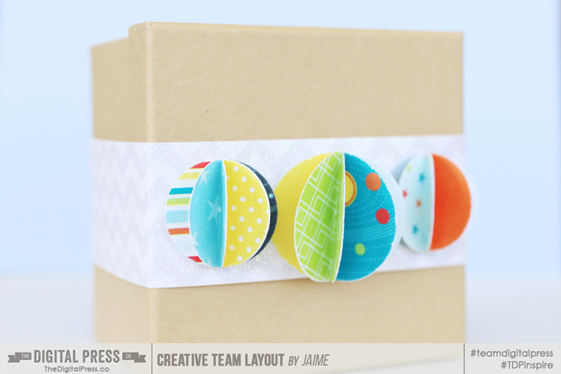
See how cute it is? It just adds a little something extra.


12a

.

Here’s another one where instead of punching holes in the poms, I just glued them on. I also used two different sizes of circle punches to get the different sized poms.


13

.

Here’s the card I made using the pieces of I printed out. I love it when my cards coordinate with the gift I’m giving.


final-project

.

Wouldn’t that be a fun little gift to receive?


JaimeAbout the Author: Jaime is a member of the creative team here at The Digital Press. She is a stay-at-home mom to 4 boys and 1 girl. When she’s not chauffeuring, volunteering at school, or helping with play costumes, she likes to digitally record her family’s memories, improve her photography skills, and read (there’s always a stack of books on her nightstand).

Hybrid How-To | Back To School


I can’t believe it!  It’s that time of year again… Back To School.  Some are wrapping up their summer vacations and some are already in school, but soon we will all be needing to set those alarms and start getting up early — and it will be time to meet new teachers! Every parent loves this time of the year, and every kid hates it… well, most!

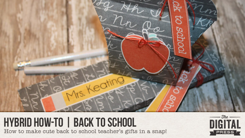
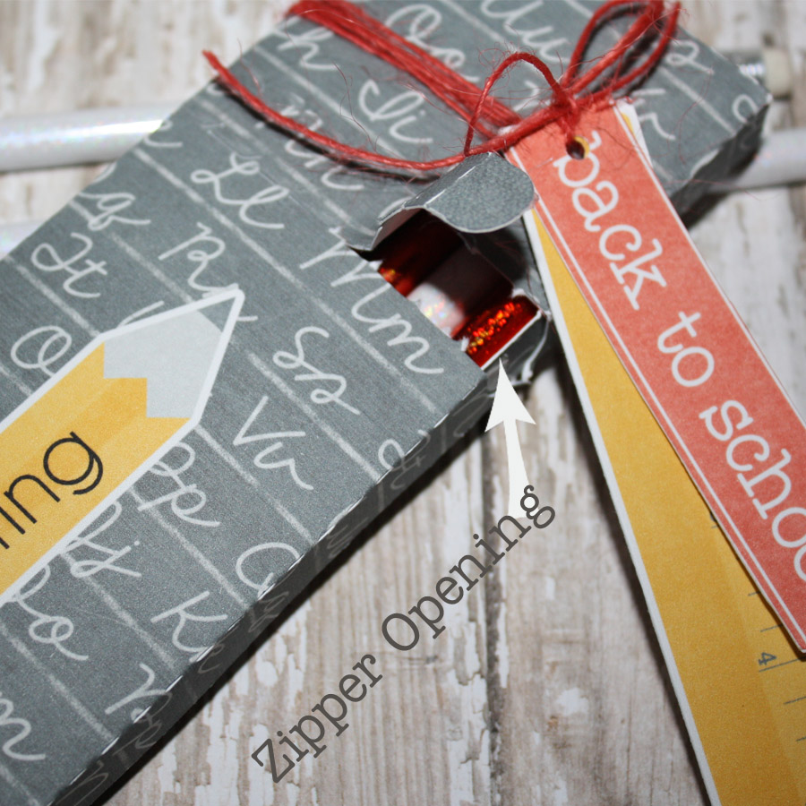
It’s always fun to bring your new teacher a special gift when you meet them. This post details a couple of fun and really easy teacher gifts. My favorite tool in my craft room is my Silhouette Cameo. It’s perfect for using digital kits to create to your heart’s content. I used the print and cut feature to create the following back to school teacher gifts.


HYBRID: BACK TO SCHOOL


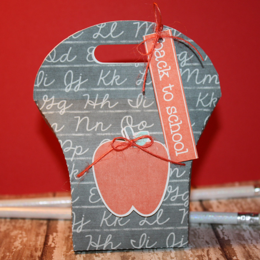
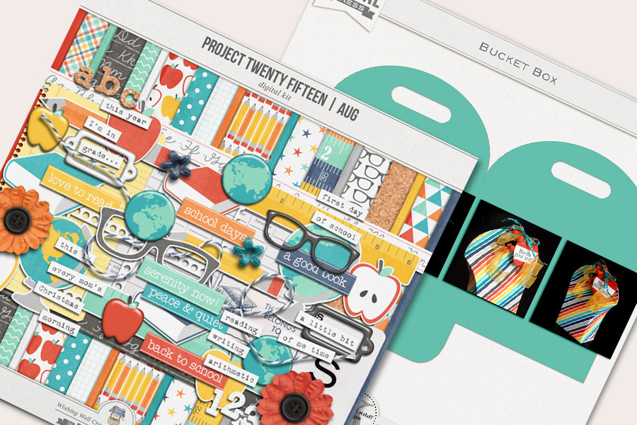
For these projects I used the Project Twenty Fifteen | August Kit by Laura Passage, and the Bucket Box template by Kelleigh Ratzlaff Designs. I also used my Silhouette Cameo and the SSDE v3 to design a pencil box.


HYBRID: BACK TO SCHOOL


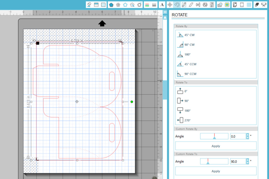
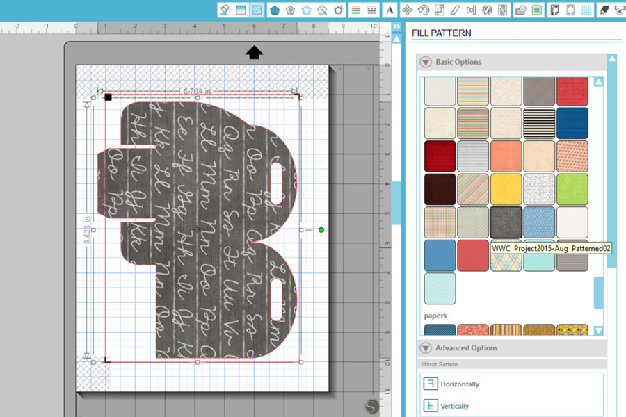
First, you will open your cut file. Once open, highlight the whole are and make it a compound path (OBJECT/MAKE COMPOUND PATH). This is done to make the file go from a solid image to one in which you can see all of the cut lines.


HYBRID: BACK TO SCHOOL

.

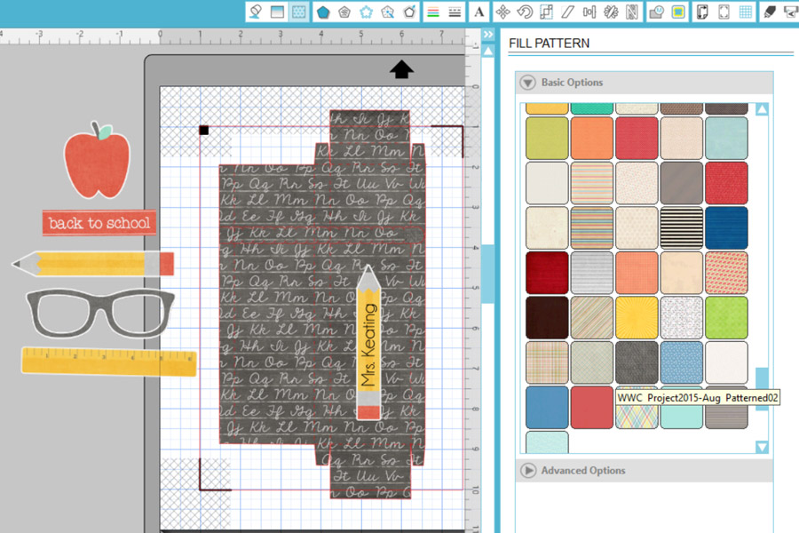
Next, fill the image with a paper of your choice (I used one from the Project Twenty Fifteen | August Kit).

.

HYBRID: BACK TO SCHOOL


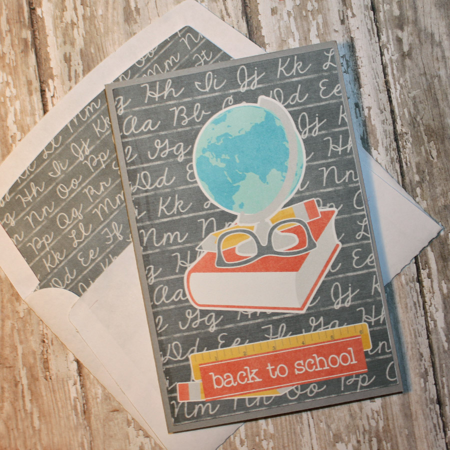
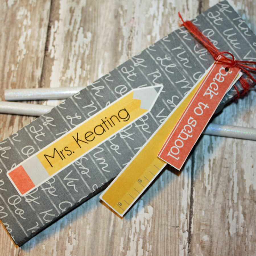
Do the same for the pencil box. I added a pencil from the elements found in the Project Twenty Fifteen | August Kit. I put the teacher’s name on the pencil. I also used more of the elements to create a card for the teacher. Once you’ve done these things and you have everything looking the way you want it, all you have to do is send it to the printer and then through your cutting machine. That’s it!

As you can see in some of the following images, you can also print and cut some of the individual elements you’ll find in digital kits, and attach them to your creations (or hang them from a piece of string or ribbon, etc.).


HYBRID: BACK TO SCHOOL

HYBRID: BACK TO SCHOOL

HYBRID: BACK TO SCHOOL


HYBRID: BACK TO SCHOOL

I hope that I have inspired you to create! I love sharing what I do with you. If you ever have questions, feel free to leave me a message.

It’s never too late… go and make those teachers something special.


About the Author  TanyaTanya is a part of the Hybrid team here at The Digital Press.  She has been hybrid crafting for at least 10 years now.  She loves creating and sharing those creations with you. Her all-time favorite tool is her Silhouette Cameo. She says with the Cameo the sky is the limit. Tanya has been married for 26 years and has two sons: Chris, 23 and Chance, 19. She also enjoys crocheting, photography and woodworking.

Pin It!

Pin it! Banner

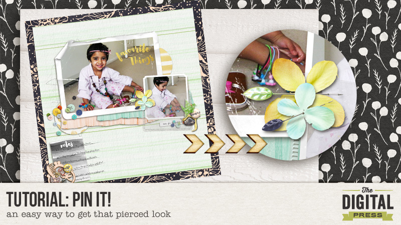
Hello everyone! I can’t believe its August already. We are well and truly into the second half of the year!!! Time is certainly flying by for me, hopefully that is always a good indicator! We have an exciting month here at The Digital Press with Pennysavers products  and the theme being “explore”. In that spirit, I wanted to share an easy way to achieve a pierced look on paper. I am always exploring new ways to make my layouts seem more realistic and fasteners are a big part of how I do that. I simply can’t seem to leave things hanging on my layouts!!!

By way of disclaimer, I have stumbled upon this by trial and error so there may be indeed be a more effective way of doing this! I have used Photoshop Elements to demonstrate the steps but it should be fairly easy for Photoshop users to replicate this in their program.So here goes…

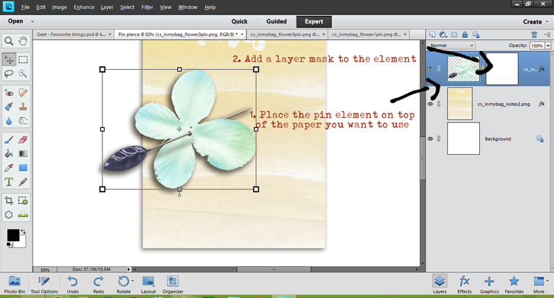
Step 1: Select the elements – the pin and the layer you want pierced. This layer could be paper, cloth or even plastic pockets. In this case I have selected a Journaling card and a flower pin from Creashen’s kit “in my bag”. First I will place the pin on top of the paper. Next I will add a layer mask to the element layer.

Step 1
Step 1

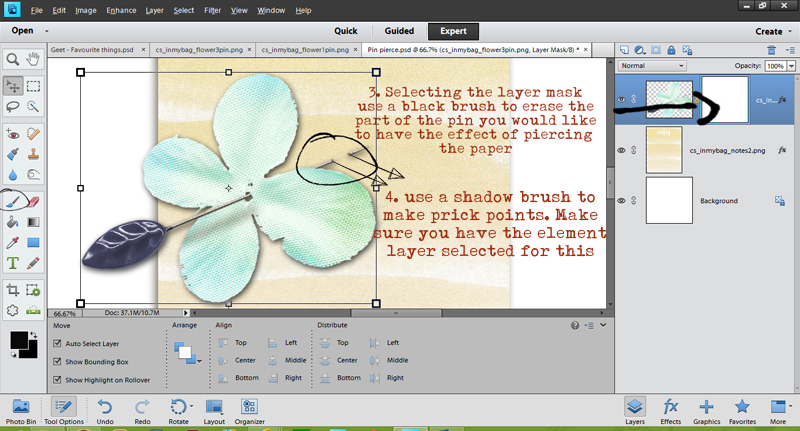
Step 2:  Now with the layer mask selected (shown by the bounding lines), choose a black brush and begin to erase that portion of the pin that you would like to be behind the paper. Once you are happy with your selection, choose a dark shade of drop shadow brush and with the element selected now, brush over little dots where the pin pierces the paper going in and coming out.

Step 2
Step 2

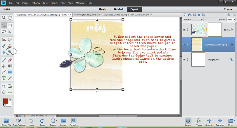
Step 3: Now you can see we are getting there but not quite. If you think about it, the portion where the pin is behind the paper should be slightly raised. We can easily create that effect using the dodge and burn tools. First select the burn tool and a colour you are happy with, brush over in a straight line between the two prick points. You should have the paper layer selected for this. Follow it up by selecting the dodge tool and brushing a lighter shade effect on either side of the “burned” line. TIP: to make straight lines, press and hold the shift key.

Step 3
Step 3

Voila!!! You can see how this is looking much more realistic now! Here’s a closer look.

Final look
Final look

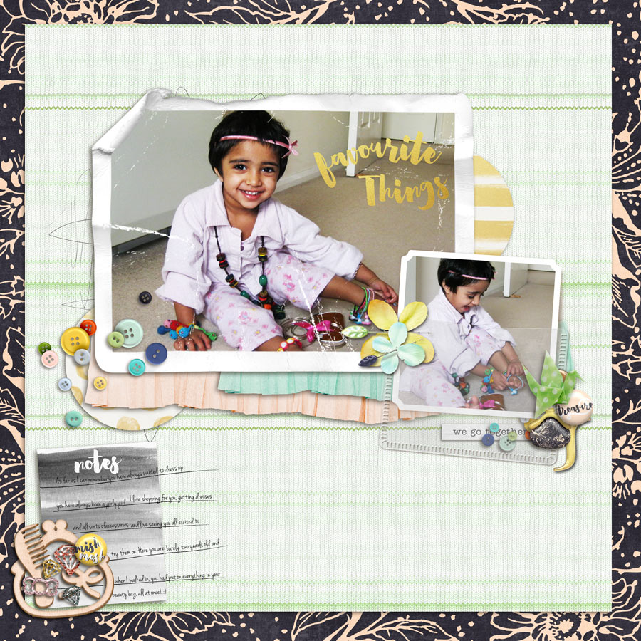
And here’s the final layout in which I have used this technique.

Final Layout
Final Layout

Credits: Creashen’s In My Bag.
Hope you found this useful. Please don’t forget to share your layouts where you use it or if you have another method of doing the same, I’d love to hear about it! Till next time…


Profile pic avatar small

About the author: Shivani Sohal is a donner of many alter-egos. A finance professional by day in busy London, she morphs into a seemingly normal mum of two in the evenings and weekends. She is constantly found with her fingers in too many pies and juggling the metaphorical balls. That is living on the edge for her; aided by the two ankle biters and a darling hubby who define the warm and mushy for her. She is ferociously dedicated to memory keeping – almost immune to any nay-sayers (or equally disruptive crying children or annoying house fires!!!);keeping her head down and forging ahead at all times.