Category: Tutorials

Out-of-bounds Effects

20150609_Tutorial_Out-of-bounds

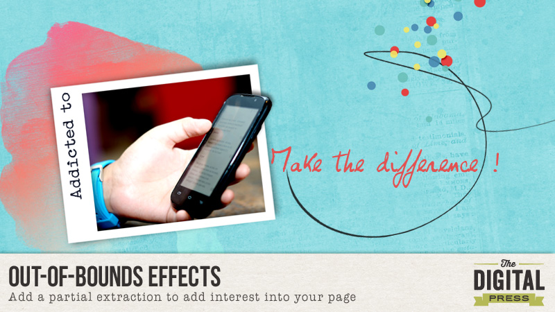
Hi everyone, it’s Tuesday! Time to share some tips … Digital is digital, however we can liven up our page by giving it a kind of natural look. To help us to add more interest, let’s make a partial extraction of our photo. You can follow me step by step – I made a page just to show you my very simple way to do this.

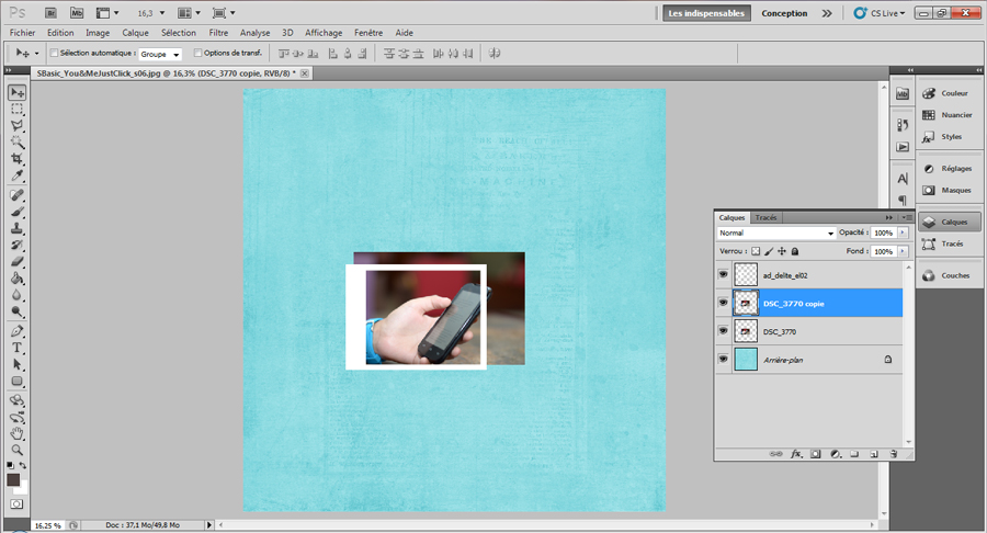
Let’s begin with a simple framed photo. Put part of your photo out of the frame with the steps below:

  • Duplicate this first photo. If you want to put an effect on your photo, please do this before proceeding. Now we have two photos.

step-2


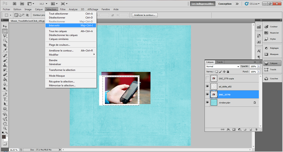
  • Hide the duplicated layer. Then crop the first photo to fit into the frame using the selection marquee, then invert it by going to the menu bar and selecting Select, Invert and hitting your delete button.

step-3


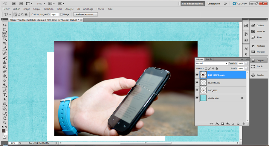
  • Then select the duplicated layer. With the polygonal lasso tool, crop the part of the photo you want to be on and out of frame. Invert the selection and delete the remaining part of the photo.

step-5


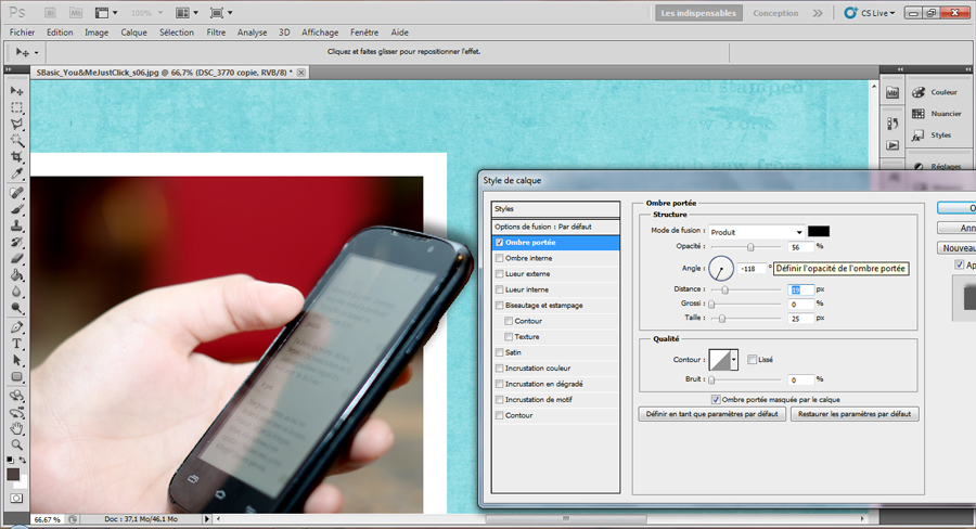
  • Put a shadow on the cropped photo to get natural shadow effect. You may have to tweak the shadow so it does not show on top of the original photo.

step-6


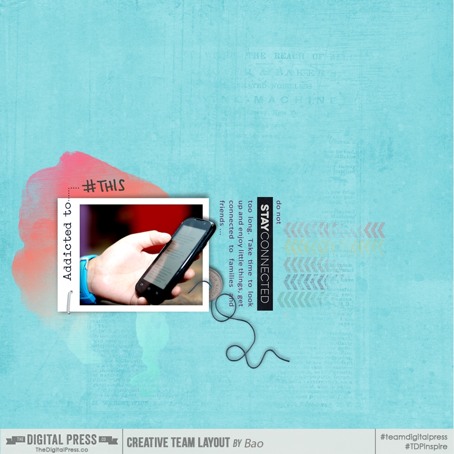
  • Complete the page with everything you want : journaling, elements, brushes and so on. Mine is like this at the end :

Final_withExtract


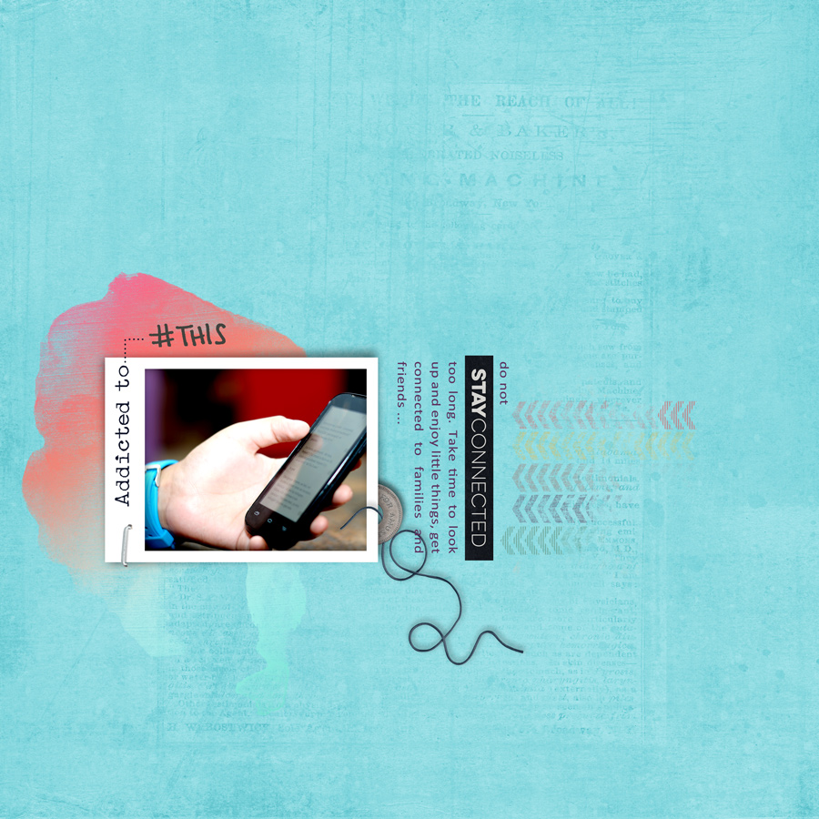
To show you the difference, my page would have been like this without adding in the out-of-bounds effect with partial extraction 😉 Not the same effect definitely.

Final_noExtract


Bao About the Author : Bao is a Creative Team member at The Digital Press. She has been a digiscrapper for about ten years now.  She joined The Digital Press in March and enjoys being active on the site. Her style tends to be clean & simple. Most of the the time she scraps her family’s photos. She loves, however, to scrap other subjects such as flowers, nature, the environment, foods … She says hello to all of you from her big island named Madagascar, and feel blessed to live there.

Creating a Heart Halo

It’s Tutorial Tuesday! If you’re anything like me, you like to recreate techniques you see on other layouts. I’m a sucker for paper layouts and saw a lot of them lately that included heart halos in some fashion. If it’s either cutouts or paper pieces, I love them all.


Creating a Heart Halo


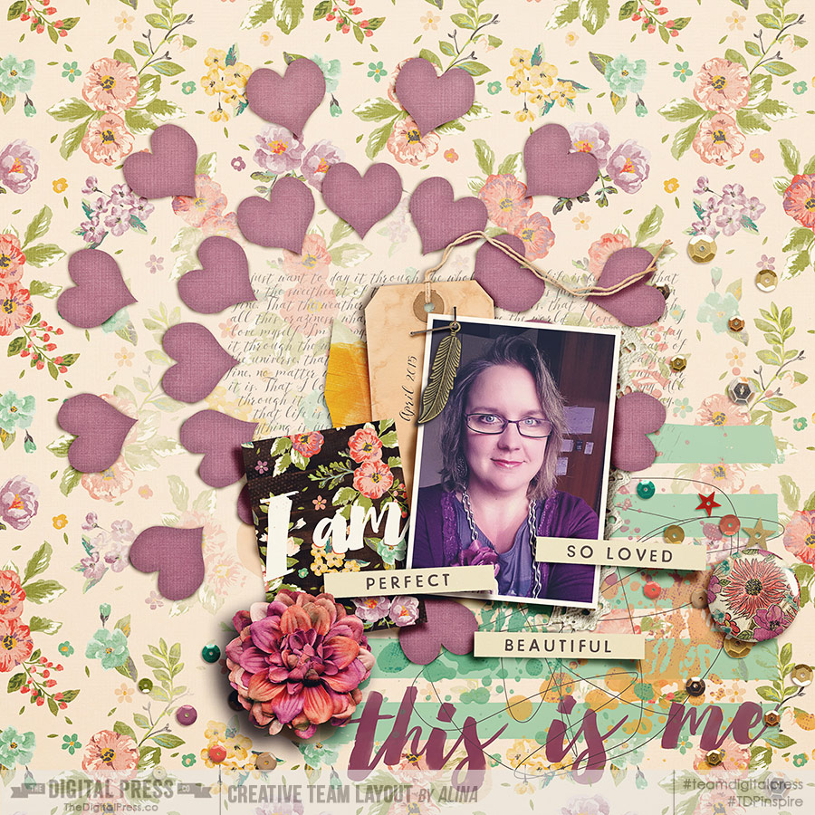
My first layout with heart halos came out pretty, at least in my world.

Creating a Heart Halo
The image is linked to the gallery for the credits.

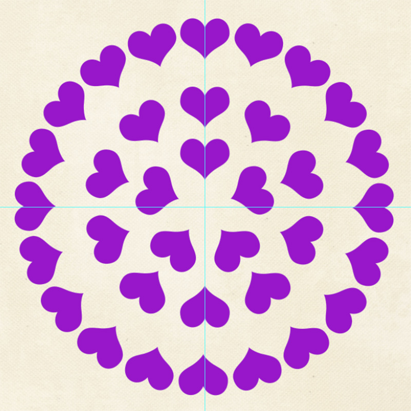
I hope now you know what I mean by heart halo. It’s a circle of hearts. With their bottom pointing to the center of the circle. I’m going to scraplift myself to show you how I did it.

  • Prep your canvas first, in my case it’s 3600×3600 px and get a solid paper in or leave your solid background.
  • The first thing you want to do is creating a virtual middle of your heart halo. I did this with two guides, one vertical, one horizontal. Click on View → New Guide and type in half of the width of your canvas (6 inch or 1800 px for me). Do that again and check the other orientation the second time.

Next you draw a shape.

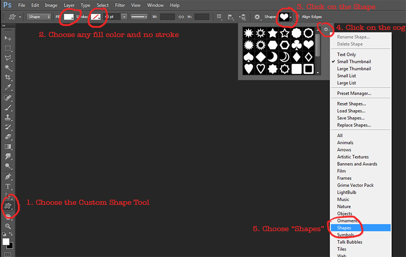
  • Click and hold the Shape tool, choose the Custom Shape tool. Click on a fill color that is different enough from your background, no stroke.
  • In the Shape window, click on the little cog and on Shapes. Now load the „Shape“ collection. When you are asked to save before, you of course can. If you only used PS shapes this far, there is not much to save.
  • In the „Shape“ collection you will find the heart. Click on it to make it active.


Creating a Heart Halo


  • Now click and drag on your canvas and when you feel you got the shape like you want it, release the click and go back to your move tool (shortcut v).
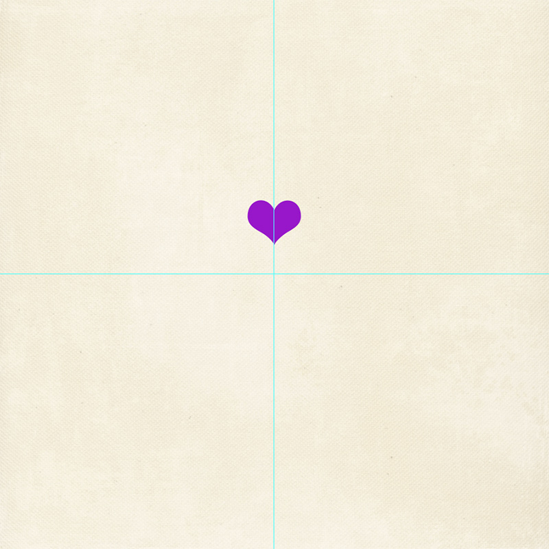
  • Align the vertical center of your heart with the vertical guide a little above the crossing of the guides. Do this manually with your move tool active. There is no need to make it 100% exact. It should look something like this:


Creating a Heart Halo


The Math

Before you proceed, make a decision on how many hearts you want in your halo circle. In my first example both inner and outer circle have 12 hearts. This is the easiest to recreate, because you don’t have to do any math. I will show you later why.

I show you now how to do the math anyway, because in the upcoming layout, I will use 5 hearts in the inner circle. I will try to make it as easy as I can, even for the math challenged. One round of a circle has 360 degrees. If you want to evenly distribute your hearts around your circle (what I’m doing here), you have to divide the 360 degrees by the amount of hearts you want to have in your circle. In my example with 5 hearts in one circle: 360 degrees : 5 hearts =72 degrees. Math can be so beautiful when you combine it with hearts! So every heart will be 72 degrees apart from the next heart when you are having 5 hearts in your circle.

  • With that in mind, we continue with our aligned heart. Copy it (ctrl/cmd+j)
  • Click on one corner to make the Transform tool active
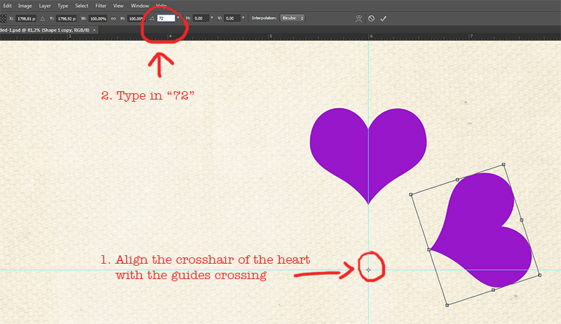
  • You see that little crosshair in the middle of the heart. Pull that one to the point where the two guides meet. It’s good to be as close as you can but don’t worry about placing it 100% correctly.
  • In the details for the tool you see that little degrees sign. Type 72 into it. Press Enter two times.

Before you pressed Enter two times it should look like this:


Creating a Heart Halo


You’ve now got two hearts and they are 72 degrees apart. Isn’t that romantic? Well, but you want more hearts. You can now proceed slowly by copying the second heart, align the crosshair and type in 72 into the degrees, or you can do it faster by doing more math.

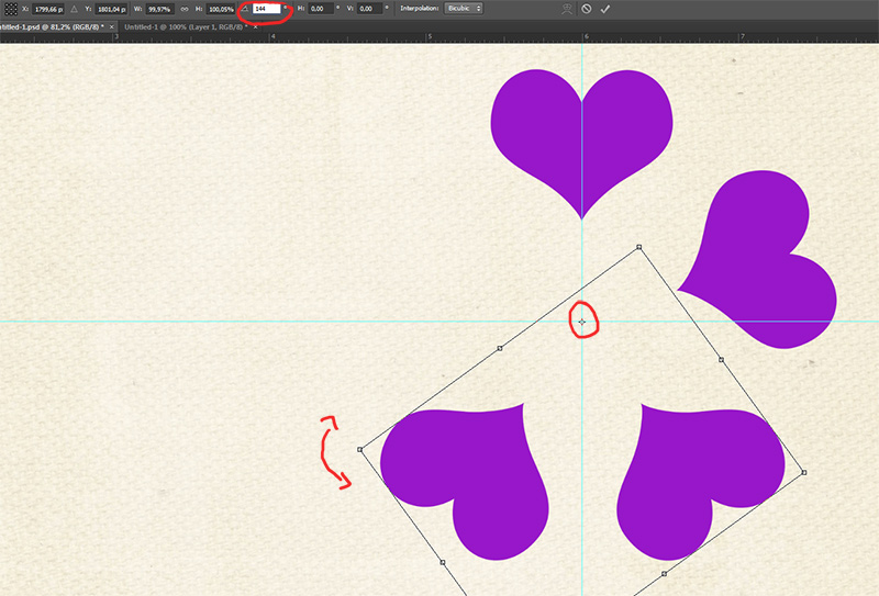
  • Copy the first two hearts, have both copies active
  • Align the crosshair of the two of them with the guide crossing
  • Type 144 into the degrees (72 x 2=144)
  • Press Enter two times


Creating a Heart Halo


  • Now make the 5th and  completing heart.

In my upcoming layout I created two more halos concentring (is that a word?) my first halo. The middle circle has 10 hearts which are 36 degrees apart from each other (360 : 10), the outer circle has 20 hearts, 18 degrees (360 : 20) apart. You can see in this picture, that I didn’t work very exact. The lowest heart is not 100% aligned with the guide. It doesn’t matter though as you can see in the following layout.


Creating a Heart Halo


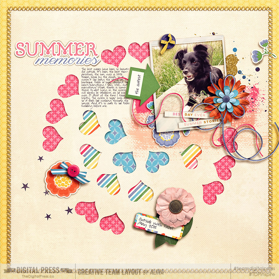
You can leave all hearts single as they are (*sob*) or you can group them or merge them to your liking. I merged every circle into a single layer for my layout and used the hearts to make cutouts. I also randomly erased a heart (*cry*). So that’s what I came up with:


Creating a Heart Halo
The image is linked to the gallery for the credits.

And I tried something else: I made several small heart circles and blended most of them into the background for an art jounaling layout.


Creating a Heart Halo
The image is linked to the gallery for the credits.

My second and third layout above have a multiple of 5 hearts (1 x 5, 2 x 5, 4 x 5). If you want to use a multiple of 2 hearts in a circle (like 2 x 2 = 4 hearts or 6 x 2 = 12 hearts like me in my first layout), you don’t have to type in the degrees and don’t have to do any math. PS has a standard feature that makes it easy for you. When you copied your first heart and aligned the crosshair, hold shift and click/drag one transformation corner to turn the heart around. The heart will move in 15 degrees increments around your circle until you let go of the corner. This way you can create up to 24 hearts in your halo (360:15), depending on which increments you use.

Of course you can use any shape you want for making halos. This is not limited to hearts.
If you have any question, feel free to ask in the comments. Also if you see a technique that you want me to explain, I will do what I can to recreate it for you and prepare a tutorial for you! Let me know what you like to see in the comments, too! Have fun creating!


AlinaAbout the Author: Alina enjoys sitting in front of her large computer screens too much. Apart from that she loves walking her dog and watching sunsets while being amazed of life in general. She is married to her best friend. Tries to manage the needs of her two cats and her dog and badly fails when they all want their cuddle time at once. Everything else is scrapping, taking photos and currently crafting. Having said that, she needs a bigger craft room.


Tips to Easily Recolor Elements


TipsToEasilyRecolorElements


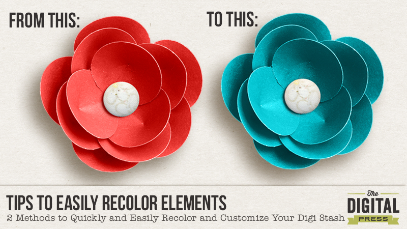
With Photoshop, there are lots of way to recolor and customize your digital stash. I thought I’d share with you two of my favorite ways to recolor in Photoshop:


#1  Using a Color Overlay Style


#2  Using a Fill/Adjustment Layer


NOTE: There are lots of different ways to recolor items. These are just two of my “go-to” methods.


#1  HOW TO: Recolor Using a Color Overlay Style


When I’m recoloring an item with just one color (i.e. a single colored flat item like a brush), I like to use a color overlay style. For my example I’ll use a PNG word art from Digital Design Essentials Live Colorfully Word Art. Here are the steps I use:


1.  Make sure the item you want to recolor is the active layer in the layers panel.


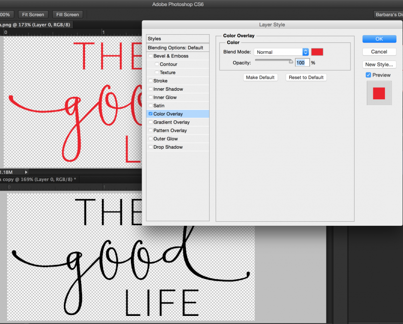
2.  Click on the fx button in the layers panel and choose Color Overlay. (Another option is to go to Layer > Layer Style > Color Overlay)


3.  Click on the color box and select the color you want to use as a replacement. You can sample a color from your layout, choose one of the foreground or background colors, or choose a color from the color wheel.


TipsToEasilyRecolorElements (ColorOverlay)2


4.  The default blend mode is set to Normal. If the item you are recoloring is completely flat you can leave the Normal blend mode and your element will be recolored. If your item is more dimensional (i.e., a flower or button), change the blend mode from “Normal” to “Color” and your recolored element will retain the depth and color variations of the original item.


#2  HOW TO: Recolor Using a Fill/Adjustment Layer


When I’m recoloring a dimensional item (an item with shading or more than one color) I like to recolor using a fill/adjustment layer. Here are the steps I use:


1. Make sure the element you want to recolor is active in the Layers Panel


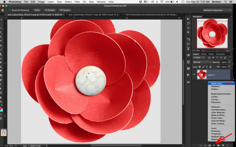
2. Click the New Fill or Adjustment Layer icon (it looks like a half white/half grey circle) and choose Solid Color. Your new layer will be filled with the foreground color. (Another option is to go to Layer > New Fill Layer > Solid Color) Don’t worry, you will just see a layer of solid color, you won’t be able to see the element you’re recoloring until the next step.


TipsToEasilyRecolorSolidColor2


3. Clip the new fill layer to the element you want to recolor by pressing OPT+Click (Alt+Click on a PC) on the line between the two layers. (Another option is to right click on your new color fill layer and choose Create Clipping Mask.)


4. Change the Blend Mode to “Color”.


NOTE: Since you used an adjustment layer you can go back and change your replacement color or the blend mode at any time.


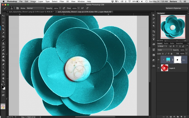
For my example I’m using a flower from Amanda Yi Designs’ Enjoy Today Mini No. 2 kit. You can see that the entire flower is a shade of red but the fabric button in the center is a cream color. I want to recolor the paper petals of the flower, but I want the center of the flower to remain the cream color. I will accomplish this using the layer mask that was created when I created the new fill/adjustment layer. To do that, just add the following steps:


5. Make sure that the layer mask is active by clicking on the layer mask. You will see a white bounding box around the mask.


6. Choose a soft round brush (Hotkey b activates the brush tool) set to 100% opacity. (NOTE: Depending on the shape of what you are masking out, a hard round brush may be more appropriate.)


7. Set your foreground color to black. (Hotkey d) Resize the brush to fit to the area you are masking out. In my case it’s the center of the flower.


8. Paint over the area you want to mask out (return to the original color).


TipsToEasilyRecolor-Masking


Voila, that’s’ it! You’ve now got a recolored flower and the center stayed the same color!


Like I mentioned, as with all things in Photoshop there are lots of different ways to recolor items. These are just two of my favorite go-to methods. If you’ve got another tried and true recoloring method you use and that you’d like to share with us, please share that in the comments!


Barbara
Barbara


About the Author:  Barbara is a member of the creative team here at The Digital Press. She lives with her husband, two teenage kids and their fluffy dog, although as she types this she realizes her son is moving away to college in less 3 months and she won’t be able to say she lives with her 2 kids for much longer. EEK! In her free time she loves to digi scrap, take photos and hang out with her family.

Realistic Washi Tape

header


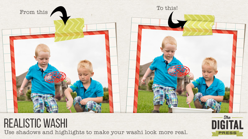
Washi tape is probably one of my very favorite elements to scrap with. I love it both in real life and in digital form. In this tutorial, I’m going to show you how to use shadows and highlights to make your washi tape look a bit more realistic on your layouts. I’m going to use this layout below. I have everything finished on it, and the washi placed. The only thing left to do is add shadows to the washi tape. You can see here that it just looks a little flat with no realistic dimension.


1


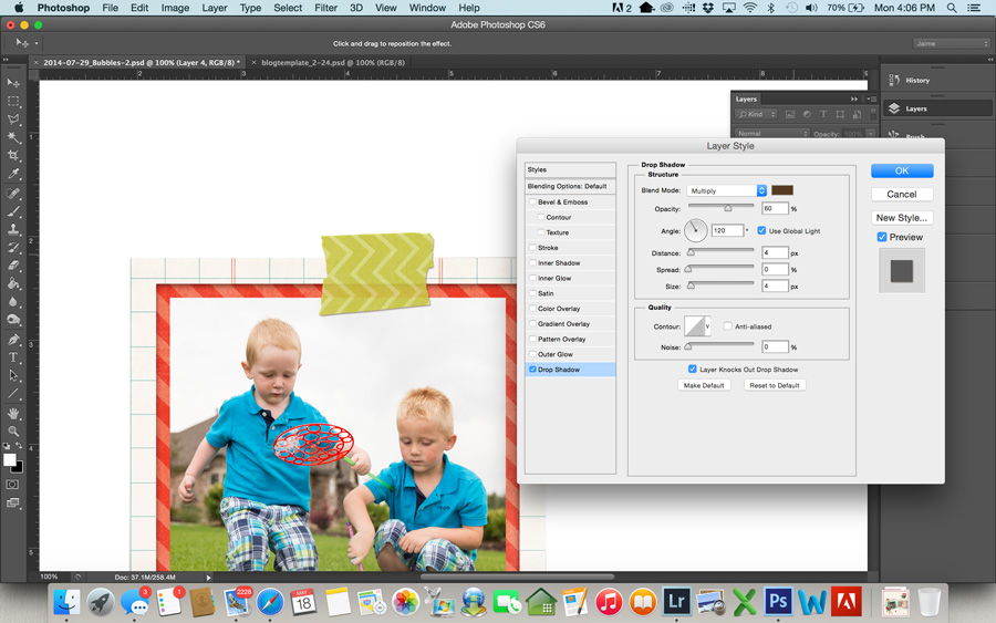
  • First, add a basic drop shadow to the washi tape. The settings below are what I used, but use whatever suits your preference. I typically prefer a small shadow on washi tape, because if you look at a piece of real washi tape on paper, it doesn’t come off of the paper much. There’s not a lot of shadow there.

2


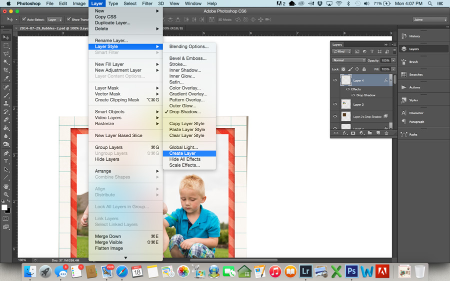
  • Now, we’re going to put this shadow on its own layer. To do this, go to Layer>Layer Style>Create Layer. This will put the drop shadow on its own layer below the washi tape.

3


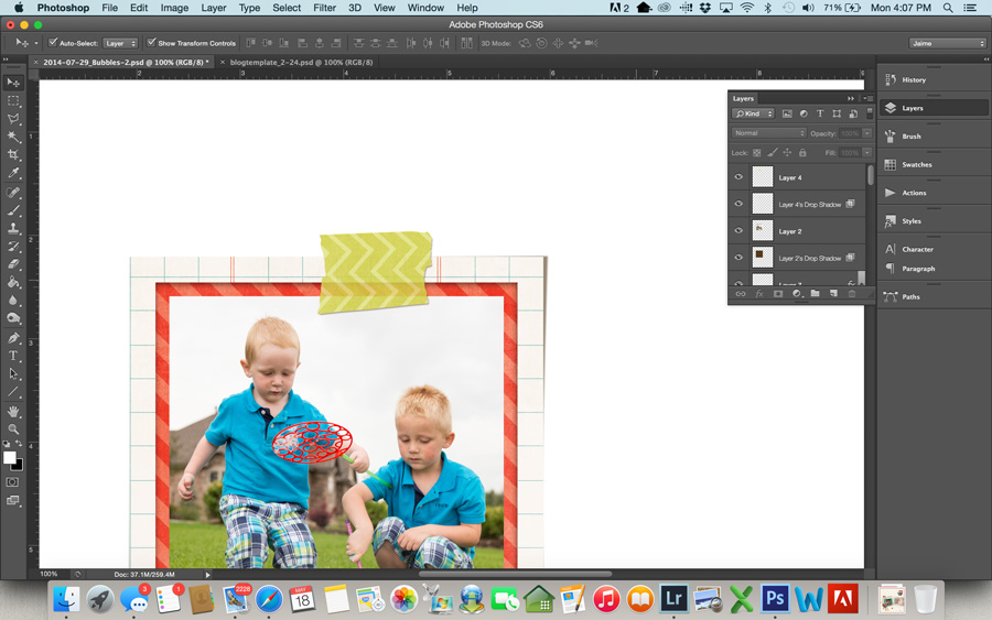
  • Even this shadow makes the washi look better than it did, but the shadow darkened the washi tape. I like to preserve the transparency of the tape. To do this, load a selection of your washi tape layer by using Command-click (or Control-click for Windows) on the tape layer in the layers palette. This should give you marching ants around your tape. Now click on the shadow layer in the layers palette, and hit delete (make sure you are on the shadow layer before hitting delete… this is important). This will delete the shadow that sits directly beneath your tape and bring back the transparency of the tape. (You can use a layer mask if you’d rather not permanently delete it, but I never have wished I had it back, so I just go ahead and delete.)

4


  • Command-d (or Control-d on Windows) will deselect the tape.

5

I think this looks good, and you can stop here if you like. I have left my tape with a basic shadow like this sometimes when I am trying to save time and get a page done. If you want to take it one step further to make the washi tape really look like it’s stuck on your page, follow the steps below.

  • First, you need to select the item the tape is holding down. In my layout, it’s the framed photo of my boys. Command-click that layer in the layers palette to load a selection.
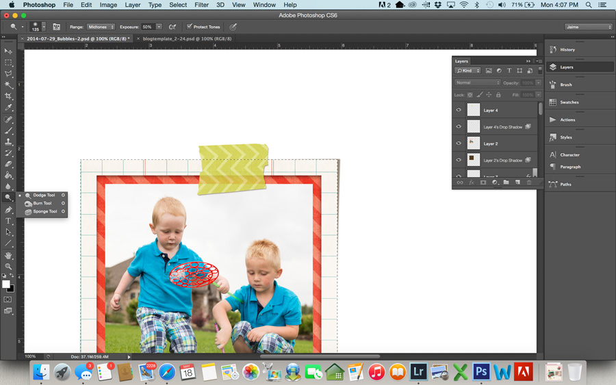
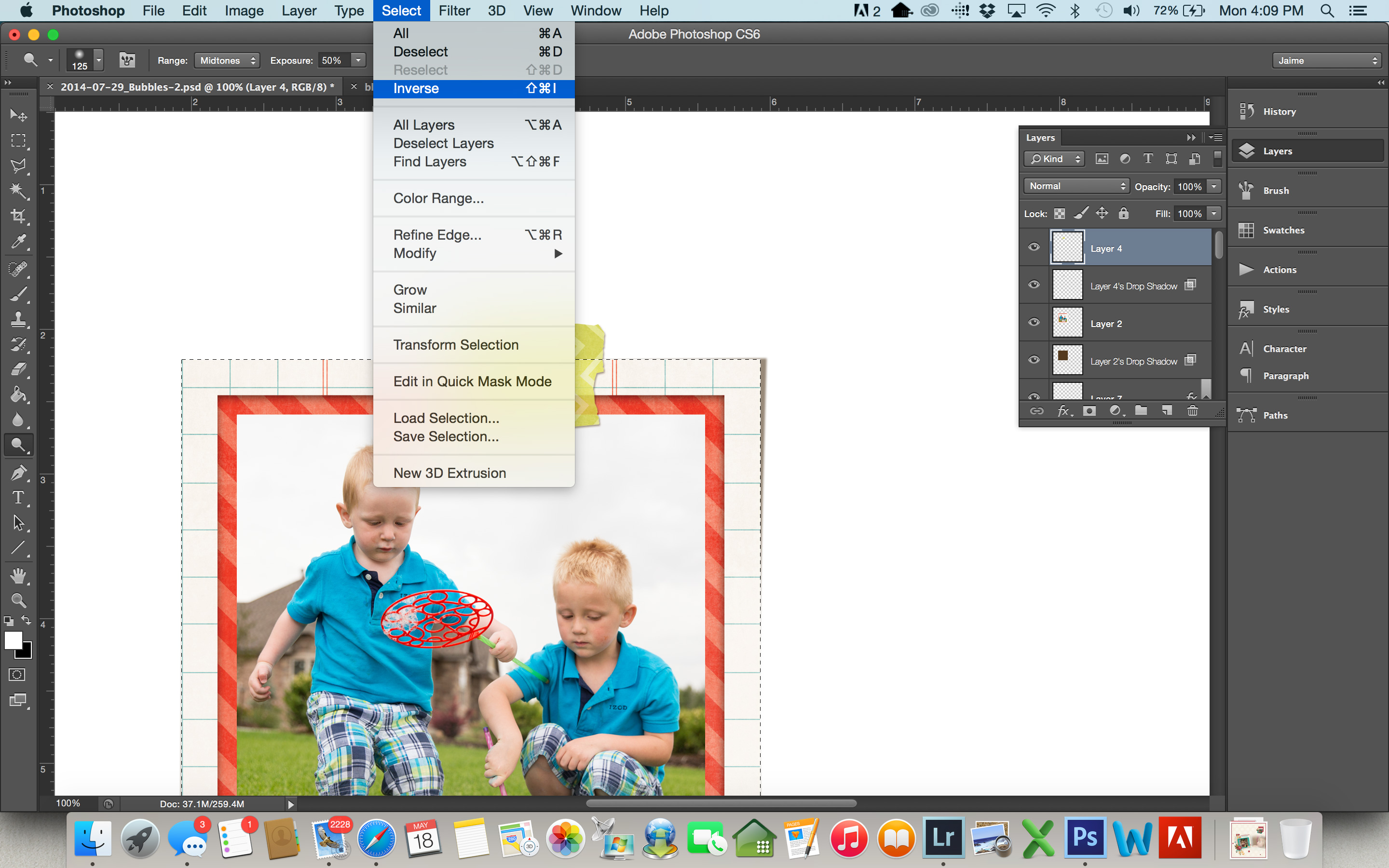
  • Next, select the dodge tool from your tool bar. At the top of your screen, you want a soft brush that’s big enough to brush over the bottom part of the tape covering the photo. For this particular page, I used a brush size of 125. Set your range to Midtones and the Exposure to around 50%. You may need to play around with this exposure depending on the specific tape and how dark or light it is. Most of the time 50% works pretty well.
  • Make sure your washi tape layer is selected in the layers palette on the right, and brush over the tape 2-3 times. This highlights the part of the tape that is “stuck” to the photo.

6


  • If you think about pressing a piece of tape over a photo in real life, it’s going to leave a little crease where photo meets the background page. In this next step, we’ll create this look digitally.
  • Your frame selection should still be loaded (meaning you have marching ants around your frame). If it’s not, select it again. But now we want the tape that outside of the frame area, so we’re going to select the inverse of what is currently selected. To do this, go to Select>Inverse. It won’t look any different, but now everything except the frame is selected.

8


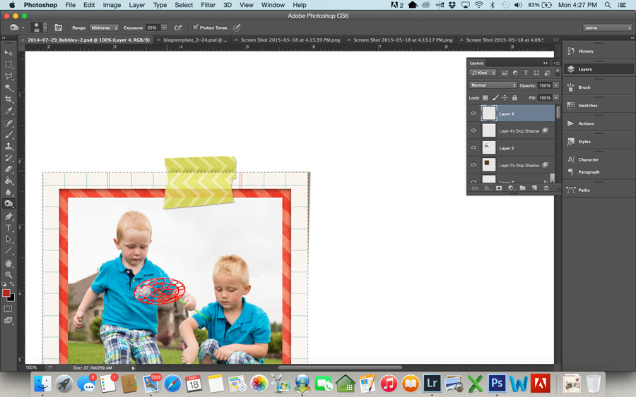
  • We’re going to use the Burn tool to add some shadows to the top part of the tape where it is “sticking” to the page. Select the burn tool from the toolbar.
  • This time you want a pretty small brush… just big enough to shadow the tape right at the edge of the photo. I used a brush of size 35, and for this particular tape I set my exposure to 25%. If the shadow isn’t as dark as you like, you may want to change this to 50%. Use the burn tool on your washi a few times along the edge of your selection, until the shadow is as dark as you want it.

9


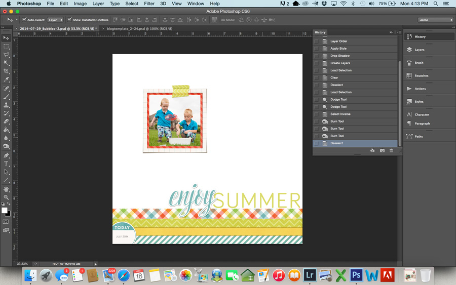
  • Command-D to get rid of your selection, and you can see the end result.

10


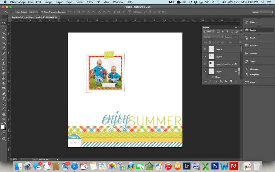
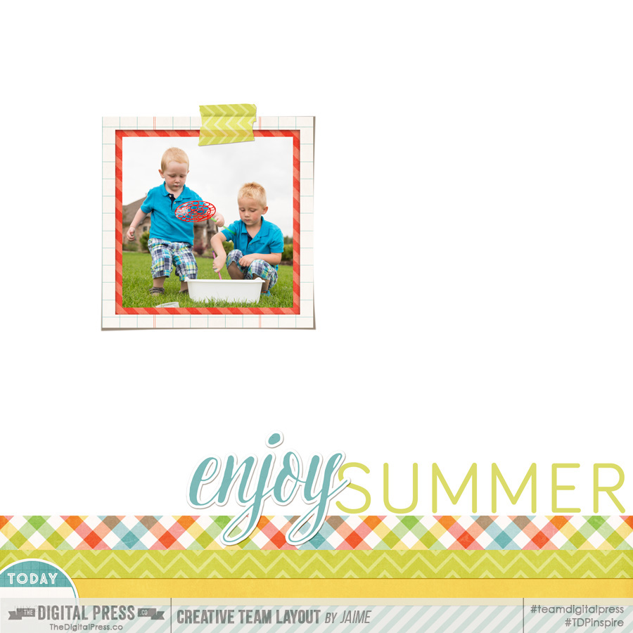
Here’s a look at the final layout:

Layout using Summer Bucket List by Amanda Yi Designs and Wishing Well Creations


JaimeAbout the Author: Jaime is a member of the creative team here at The Digital Press. She is a stay-at-home mom to 4 boys and 1 girl. When she’s not chauffeuring, volunteering at school, or helping with play costumes, she likes to digitally record her family’s memories, improve her photography skills, and read (there’s always a stack of books on her nightstand).

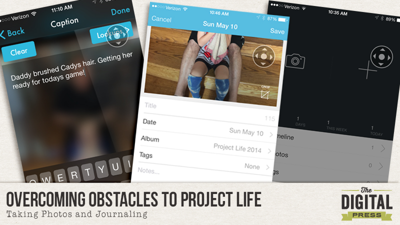
Overcoming Obstacles to Project Life: Taking Photos and Journaling

OOPL_Photos


“I want to do (or continue with) Project Life®  but…”


If you’ve ever said either of these phrases to yourself, then this series is for you. (And don’t tell anyone, but this series is for me too!)


Project Life® or the more generic, Pocket Scrapping, is a way of scrapbooking that is supposed to simplify the process of documenting the everyday moments that make up your beautifully imperfect, perfect life. However, so many people feel it is too difficult to start or maintain. Huh?! That is the antithesis of why it was created! So, when I was thinking of what to write about, I asked myself how I can help others overcome their hurdles to starting or sticking with Pocket Scrapping. And this series was born. So let’s start from the beginning.


In order to document the everyday, one of two things must happen first: you must take photos of your everyday life and/or, you must journal about your everyday life. Ideally, you would do both. To some that is a lot of work. And to most there doesn’t seem to be enough excitement to warrant documentation. And that’s ok! It’s not about documenting an exciting life. It’s about documenting YOUR life. And believe me, to your family, that is exciting enough!


So, I’d like to offer a few of the more popular methods for taking photos and journaling everyday.


The No Frills Way

The best camera is the one you have with you. You’ve heard it said over and over again. And it really is true. And let’s face it, today’s phone cameras really are pretty good. So if your phone is the only camera you have, go ahead and snap some photos with it. Then do yourself a favor and delete some of them. My iPhone 6+ has an incredible burst feature, but do I really need 20 identical pictures of my daughter picking a flower? Take the photos, view them and then delete them. Right away. And if you can’t get to it right away, do it while you are waiting to pick your child up from school, while in the checkout lane at the supermarket or while at the doctor. Find your down time and use it.


Of course, you can also use your big girl (boy) camera — your dSLR. Same rules apply. Take at least one photo every day and delete your duplicates. If you don’t do this in camera, I will be talking about doing this using your computer next month when we talk about getting your photos off your phone and camera and onto the computer.


Once you take a photo, you may want to jot a note about it. Unfortunately, the iPhone does not allow for this without the use of a third party app. After much research, I finally found one called Photogene 4 which allows you to very easily modify the IPTC data on your iPhone’s photo. The IPTC data is where you can add a caption to your photo. So even if you never scrap the photo, the story is always attached to it. (Bonus: Photogene 4 is also a pretty good photo editor as well.)


Once you open a photo to use in Photogene 4, in order to edit the IPTC metadata, you need to click on the second icon to the right of the wrench.
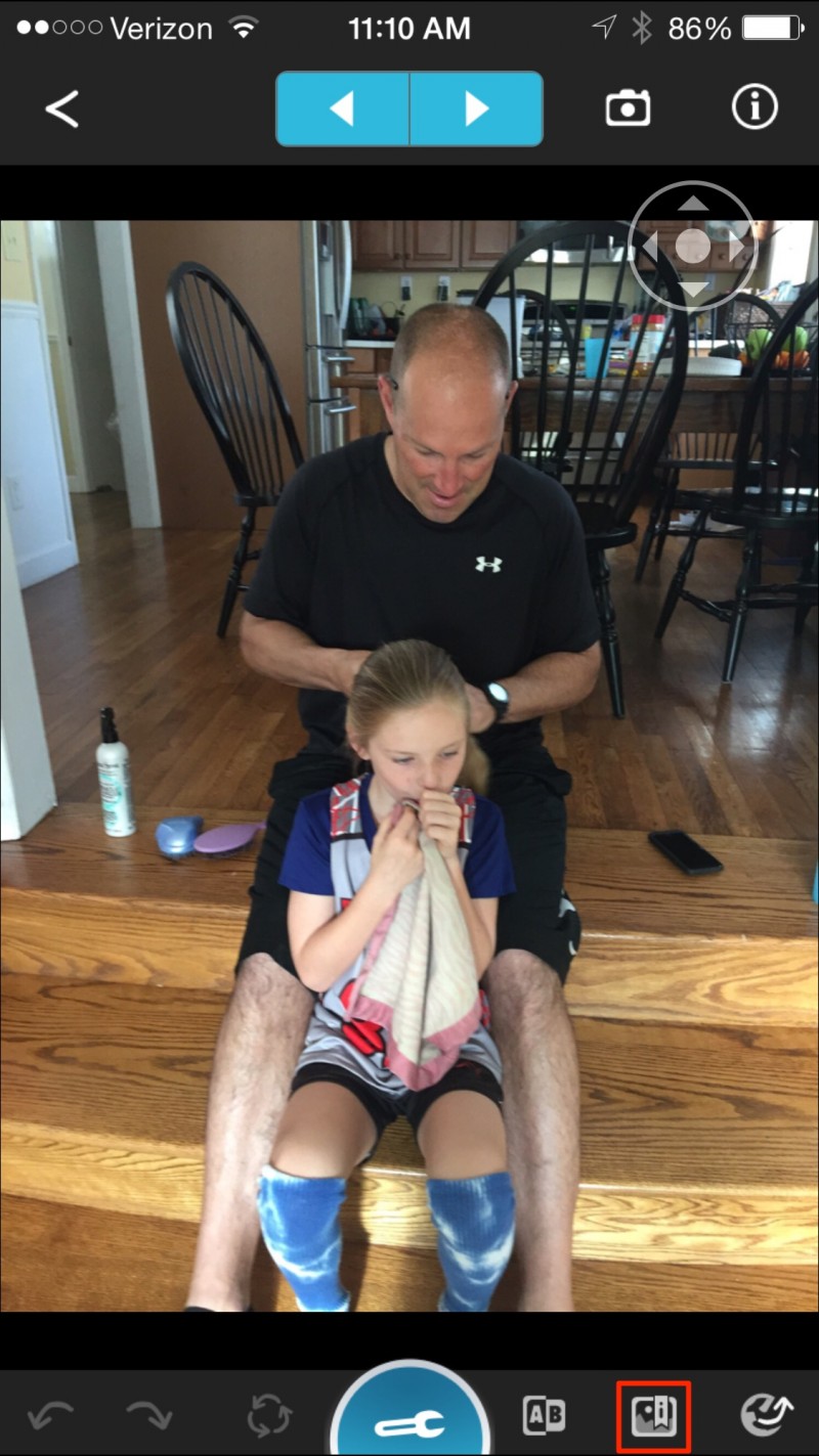
 

2015-05-11_11_10_14 copy

Then you can click on the tab that says, IPTC.
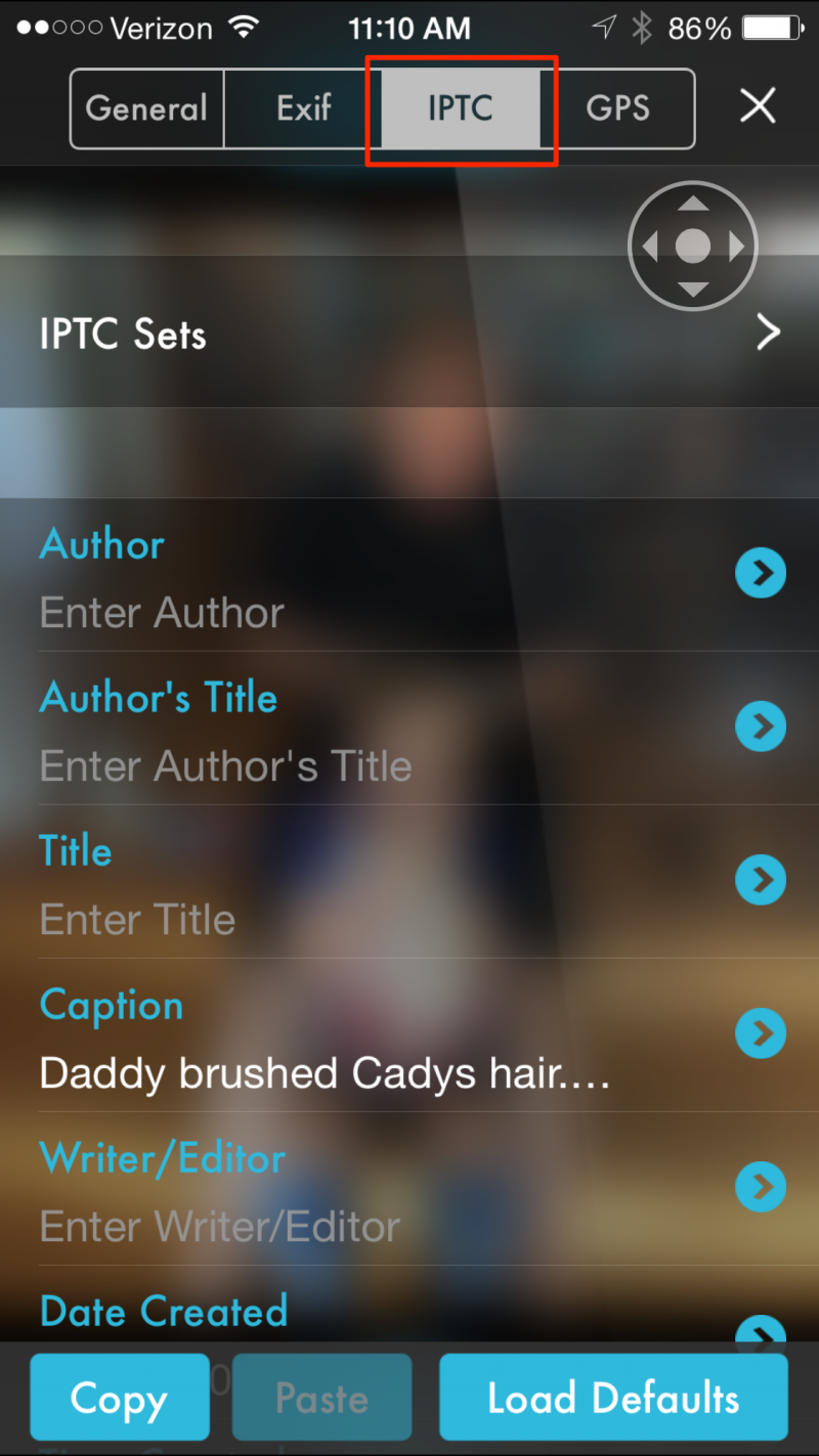
 

2015-05-11_11_10_24


And then you can type in your photo’s story.
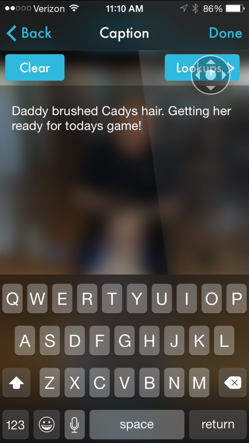
 

2015-05-11_11_10_29


Now, onto journaling. A really basic way to journal using your phone is to use the native calendar that comes with it. On my phone, I can just add a calendar entry titled, “Today,” set the time to “All Day,” and under the Notes section, type in any interesting thoughts about the day. I don’t have to type in what I did, because it’s all in the calendar already. You can also do the same on your desktop calendar if you prefer. While this method does not tell the story of individual photos, it does allow you paint an overall picture of the day or tell the stories that don’t have photos to go with them.


The App Way

Yes. There is an app for that. There is an app for everything. Two of the best apps (imho) for combining photos and stories on an iPhone are Day One and Collect.


Day One is an iPhone and desktop app that will prompt you on both of your devices to journal about your day at a time specified by you. I have mine set to the end of the day so that if when it alerts me, I haven’t yet taken a photo, I can quickly take one to represent the day. When you open the app, you are met with two large icons: a camera and a plus sign.
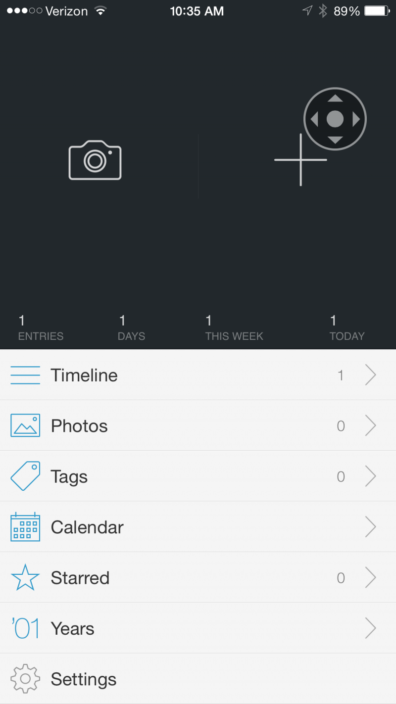
 

2015-05-11 10.35.29


Clicking the camera gives you the option to use the last photo taken, take a photo or choose from your photo library.
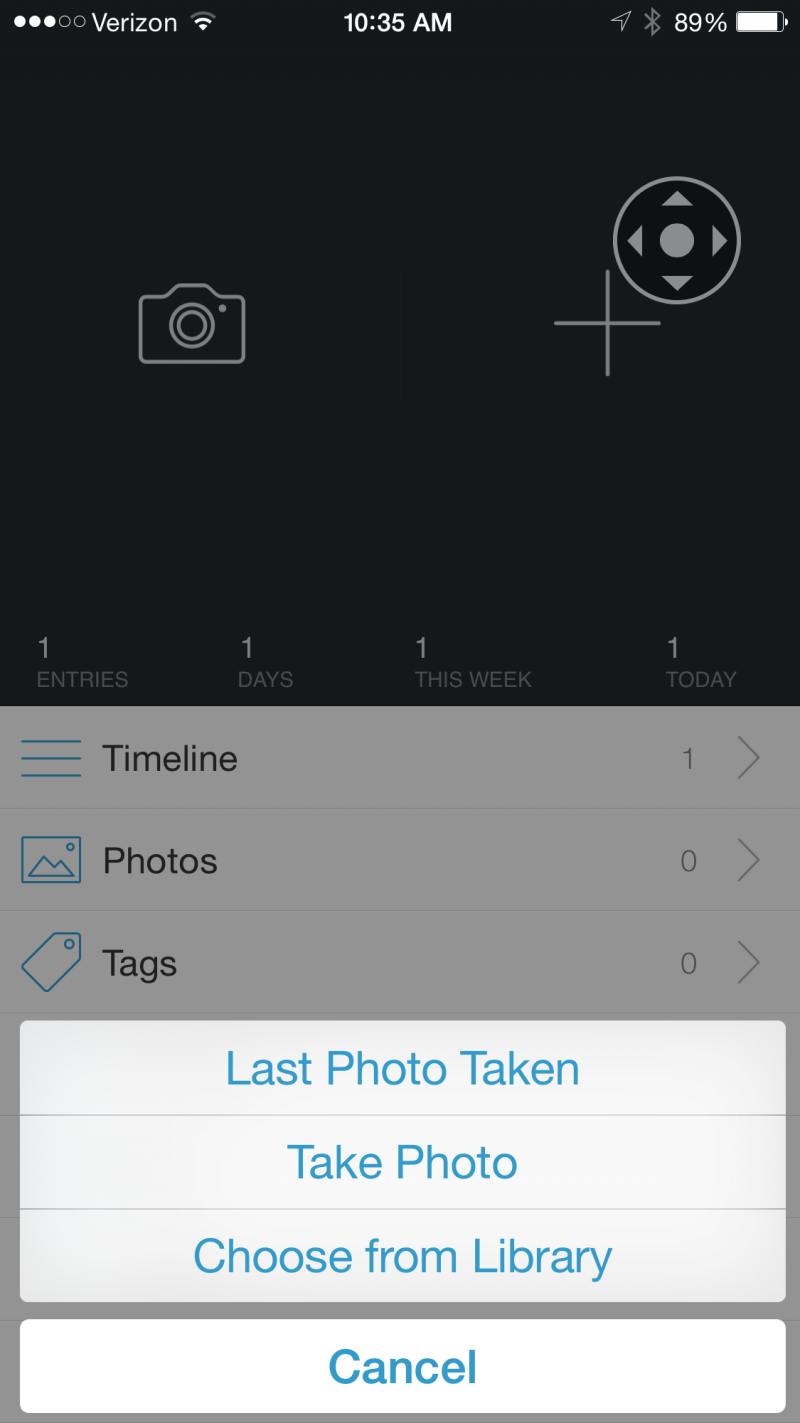
 

OOPL: Taking Photos


Once you choose or take a photo, you will be prompted to journal about it. And that photo and journal entry will be added to that day.


Collect is also an iPhone app. Again, it is super easy to use. Once you open it, the home screen looks like a calendar. When you select the date, a menu pops up asking you whether you want to access your photo library, dropbox, or take a photo.
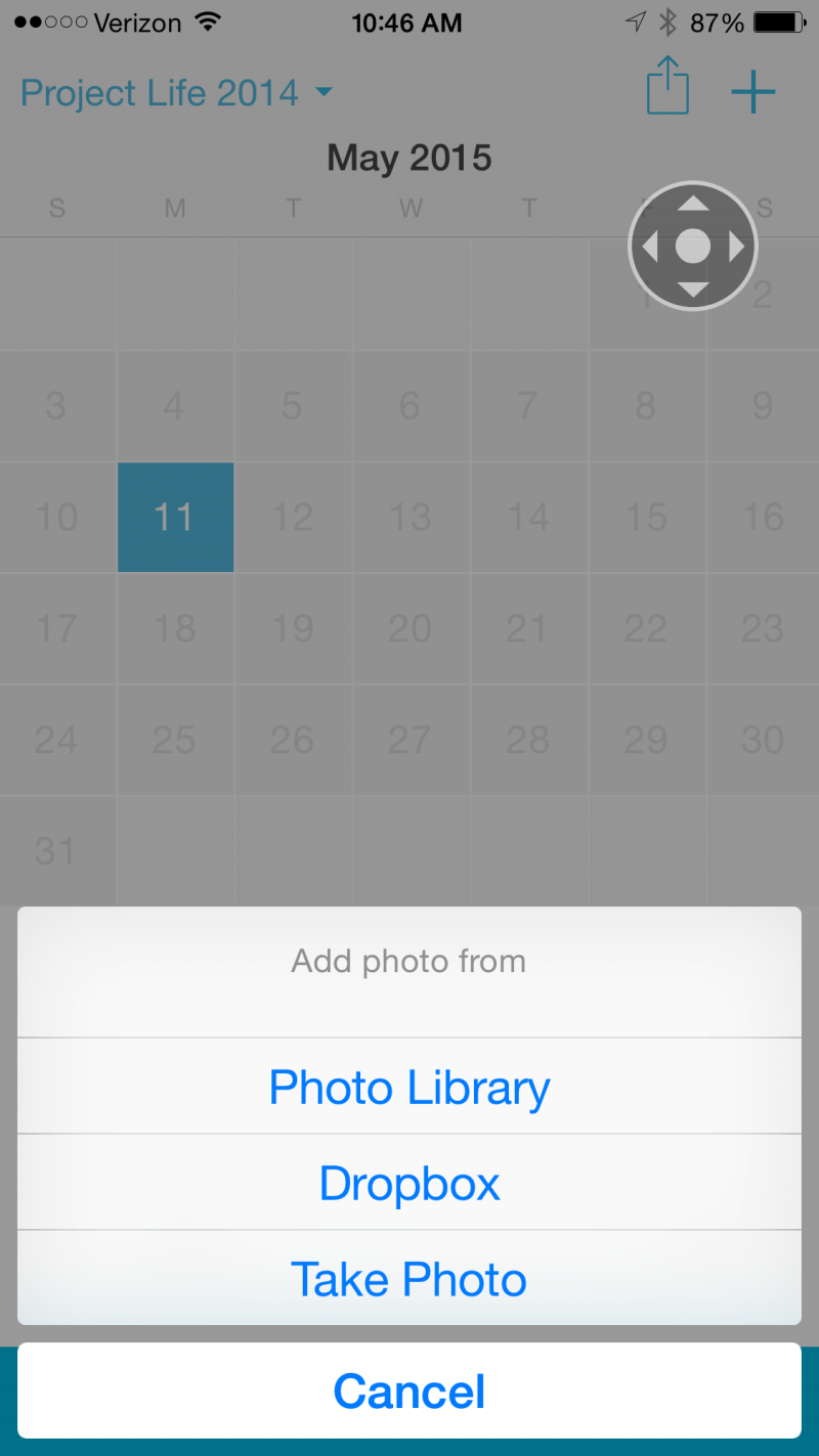
 

2015-05-11 10.46.16


Once you add a photo to the date, you are given the option to add notes to it.
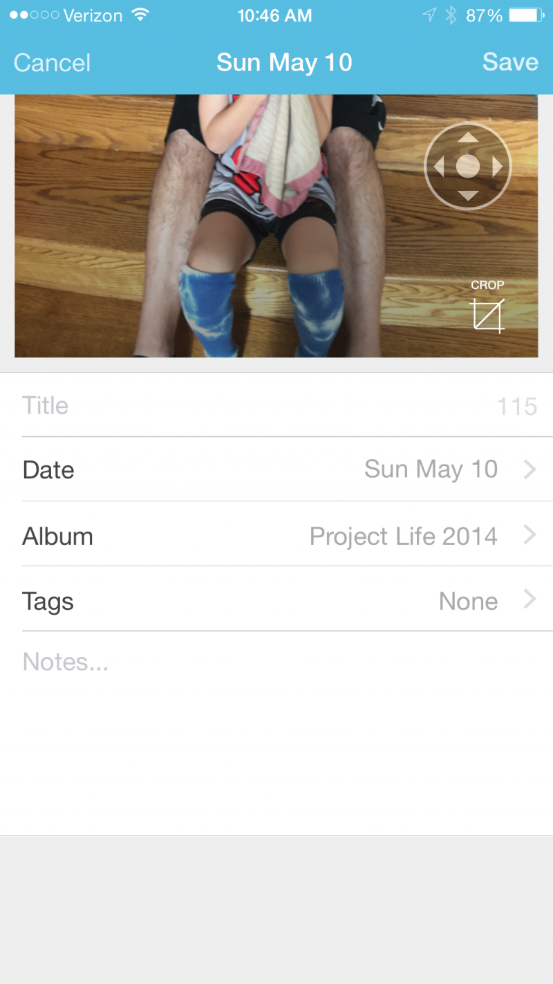
 

2015-05-11 10.46.32


And finally, for iPhone and Android users, another app that works similarly is Diario, which is also available on your PC and Mac Desktop. (Although I have never tried it personally.)


Photo A Day

Perhaps the hardest hurdle to overcome is figuring out what to take photos of. Some days are easy and others are more difficult and this is where the beauty of documenting your everyday life comes in. It’s finding interest in the mundane. I get my inspiration from other Pocket Scrapbookers. I find looking at their pages and following their blogs very helpful. In addition, there are a lot of Photo A Day prompts out there. Some of my favorites are:


And that leads me to my purpose for this blog series. I’d like all of us at The Digital Press who are working on  documenting our everyday lives to support each other. Let’s share with each other what and how we are documenting our every day, every day. We have started a thread in our forum, which you can find here, to do just that. Let’s help each other tell our stories. Let’s give each other the push we need to take a photo every day (or almost every day) and let’s tell a story every day. Each day, check into the forum and tell us what you took a photo of and what story you told. If you want to share the actual photo, that’s even better, but you don’t have to. But please do stop in and support your fellow scrappers by sharing your strategies for success.


And be sure to stop by next month when I share how to get your photos off your camera and onto your computer.


Jen FlahertyJen is a member of the Pocket Team at The Digital Press. Having scrapped digitally for many years, she has come to embrace the simplicity of Pocket Scrapping since it fits more easily into her busy lifestyle of shuttling her three children from field to field. When she is not on the computer, you will find her working out or really doing anything else she can besides cooking, cleaning and doing laundry.

More Easy Ways to Upload to Instagram

Hey digi- and hybrid scrappers! I hope you are ready for a tutorial about how to get your layouts on instagram easily and in the blink of an eye. Because if you’re like me, you want your layouts to be seen. The more, the better.

When I began uploading my layouts to Instagram, I thought it’s complicated and extra work. Now that I played a little and found ways, it’s actually not that much more work and it’s even saving me some time on other tasks. What I love most though is the fact that I can be anywhere and use my phone to upload to Instagram and in the same step to facebook. I can be on the couch while watching tv, while I’m waiting in line at a store, while I’m having a little downtime… you get the picture.


More Easy Ways to Upload to Instagram


Why would you want to upload your layouts to Instagram anyway? For me in the beginning it was just another way of giving my designers additional airtime. I uploaded my layouts to spread the love a little more. Over the months it has become an inspiration board, informational tool, documentary of my own life and much more. The community at Instagram is a little different from facebook. It’s closer and more „intimate“. I get a lot more views and likes. I happily like the posts of the people that I’m following, too. It’s really a loving place.

How do you get your layouts up to Instagram in a whim? I know of three different app uploads. It depends on your choice of online tool. Do you use flickr, photobucket or dropbox to upload your layouts to show them to your creative teams, family or friends? Do you use facebook for doing that? Then it’s even easier to get your sweet stuff on Instagram and at the same time on facebook. Once you did it a few times, it’s a breeze.

All the phone screenshots you see here are taken from my S4. Although I’m not 100% sure if this works on apple devices as well, it might just be the same process. As far as I know, the windows machines have instagram beta running currently. I tested it and I couldn’t upload from other apps than the standard windows photo gallery. Sorry!

To use this tutorial easily, you have to have Instagram installed on your phone and know how to upload pictures from your phone’s gallery to Instagram. You have to be logged in to the app.

First and foremost, you use your own picture cloud service. I use flickr and dropbox and have used photobucket in the past. All three are available as an app for android and apple devices.

When you want to upload to Instagram, you have to get the coordinating app for your service first. Install the app, log in to your account.

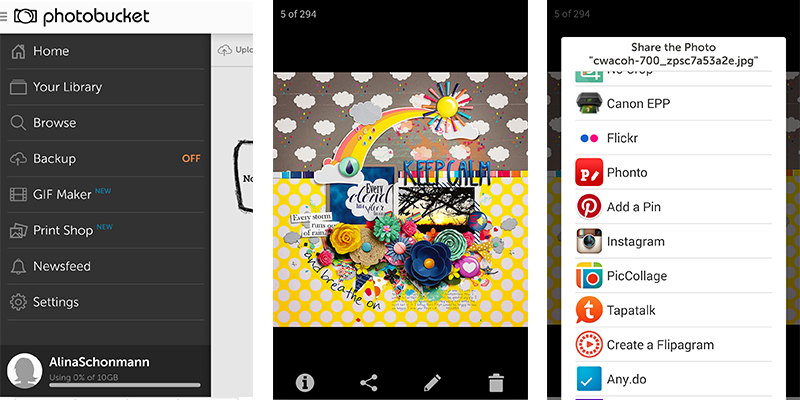
Because I know lots of you use photobucket, I will get you through the uploading process from there first. The photobucket app is called Photobucket Share Print Photos.

  1. On your computer: upload your layout to photobucket like you usually do.
  2. On your phone: open photobucket, access your uploaded layout (via „your library“)
  3. Tap on the „share“ button, that looks like three connected dots in a half triangle.
  4. Search for Instagram, tap on the icon
  5. The usual Instagram dialogue runs now (crop, edit) and you can insert your text before you post it.


More Ways to Upload to Instagram
Upload via Photobucket

There is no need to download your layout to your phone first. You can directly upload from your cloud service to Instagram.

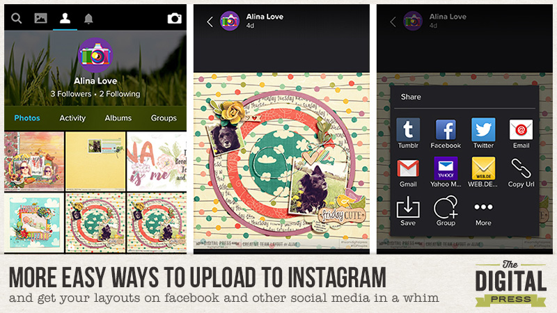
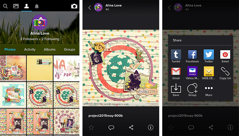
  1. The upload process from flickr is the same, only that you use the flickr app.
  2. To access your earlier uploads, tap on the portrait icon in the top line, then access your layout (left screenshot).
  3. Then tap on the share icon/the connected dots (middle screenshot)
  4. and if Instagram doesn’t show up, tap on “more” (right screenshot).


More Ways to Upload to Instagram
Upload via Flickr

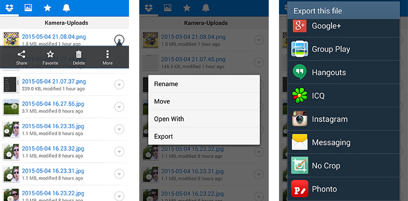
From dropbox I can’t use the share button.

  1. I have to tap on the three dots in a row “More” on the right (left screenshot)
  2. and tap on „Export“ (middle screenshot)
  3. and on the Instagram icon (right screenshot) to start the upload to Instagram.


More Ways to Upload to Instagram
Upload via Dropbox

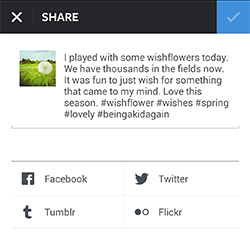
So far, so good. If you want to make your upload even more efficient, you might want to share your layout on various other social media. On my phone I can share to facebook, twitter, tumblr and flickr. You can do that on the same page in Instagram, that you type your text in before you post. Your device might ask you to log in to the service if you didn’t do it before.


More Easy Ways to Upload to Instagram
Sharing to other social media from Instagram

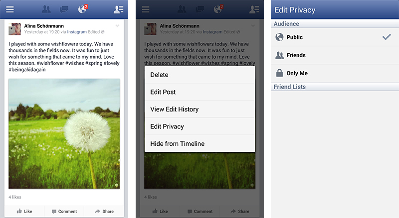
When you share to facebook, your layout appears with your full text from Instagram on your timeline and you can share it to any facebook group or friends. I show you how.

  • Search for the posting you made via Instagram on your timeline (left screenshot)
  • Be sure first, that the setting for the posting is public, otherwise your picture might not be visible.  To check the privacy settings tap on the tiny light gray downward arrow on the upper right of the post (left screenshot), tap on “Edit Privacy” (middle screenshot) and set it to “Public” (right screenshot). If it has been on public the first time, it will most probably always be.
  • Tap on “Share” (left picture, low right)


More Ways to Upload to Instagram
Check the privacy setting of your post in facebook.
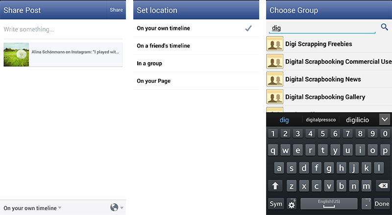
  • Left screenshot: In the low line on the right you see the earth icon on the right. This shows, that it’s a public post. Tap on “on your own timeline” (down left)
  • Set it to “In a group” (middle screenshot)
  • Choose your group or type in the group you want to share your layout to (right screenshot).
  • In the next dialog you can share it directly as it is or you can also add more text if you want to (not shown here).


More Ways to Upload to Instagram
Share your facebook post on facebook groups.

In case you want to add more info like product links on facebook along with your layout, I’d recommend doing this step (the sharing in groups) on your computer as it’s not that easy to get your links into your post on the phone.

Some more info on hashtags.

  1. Use hashtags. If you want your layout or picture to be seen, use them. For instance every time I upload a layout with my dog in it, I use #dogs and #dogsofinstagram and #dogsofig. I get a lot of likes from people who would usually not see my layout. People who don’t even know scrapbooking! The more views you get, the more people will follow you. Don’t be shy on hashtags. Think of words that fit your layout in any way and type them in. My phone shows me how often the hashtag has been used on Instagram in the past when I have typed it in. This helps you in deciding if you want to use it or not.
  2. Once you typed a hashtag in, your phone remembers it. You won’t have to type it in again and again. My phone even remembers series of hashtags I used and I just have to tap on them, to make them appear in my text.
  3. Recommended general hashtags for your layouts: #digiscrap #digitalscrapbooking #digiscrapbooking #scrapbook #scrapbooking #pocketscrapbooking #hybridscrap #hybridscrapbook
    Of course you don’t have to use all of them, but if you want to, you can! There are many more. I learned a lot by looking at other Instagram peeps and watching what hashtags they use.
  4. Recommended hashtags for your The Digital Press layouts: #thedigitalpressco #TDPinspire and the hashtags of the designer, whose product you used, if you want to.
  5. Please mention us with @thedigitalpressco when you upload your The Digital Press layouts, so that we can like your layout and time and time again we might regram (repost/share) your layouts on our own instagram account. Wouldn’t that be great? When you set your Instagram account to private, we usually can’t regram your posts. Sometimes it works, sometimes it doesn’t.

I hope this has been helpful and you are full of motivation to try new things out! We hope to see you on Instagram! Follow us @thedigitalpressco . Please remember …co at the end! This is the real one.


AlinaAbout the Author: Alina enjoys sitting in front of her large computer screens too much. Apart from that she loves walking her dog and watching sunsets while being amazed of life in general. She is married to her best friend. Tries to manage the needs of her two cats and her dog and badly fails when they all want their cuddle time at once. Everything else is scrapping, taking photos and currently crafting. Having said that, she needs a bigger craft room.