Category: Tutorials

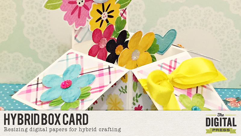
How to make a hybrid box card

DonnaEspiritu-LifeCaptured-hybrid

Hi all! Donna here to share with you some tips and tricks that I do when I create hybrid projects.

1. Re-sizing patterns

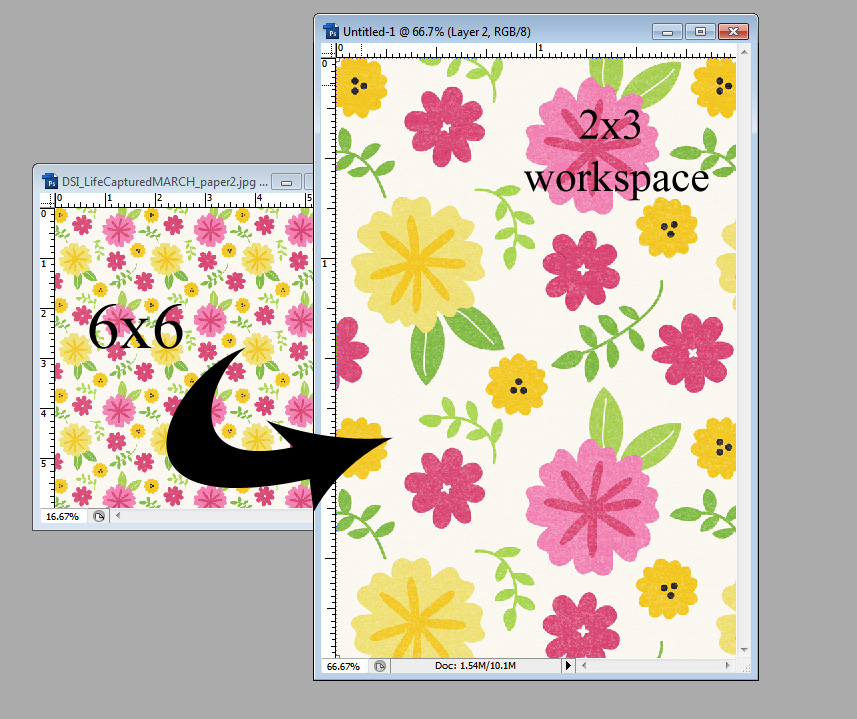
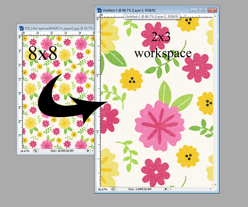
In traditional or paper crafting, they have sizes like 12×12, 8×8 and 6×6 paper pads. The last two are perfect for card-making. They’re basically shrank 12×12 patterns. Digitally, it’s super easy to replicate.

Here are image comparison when you re-size a paper to 6×6 and 8×8, respectively.

2

1

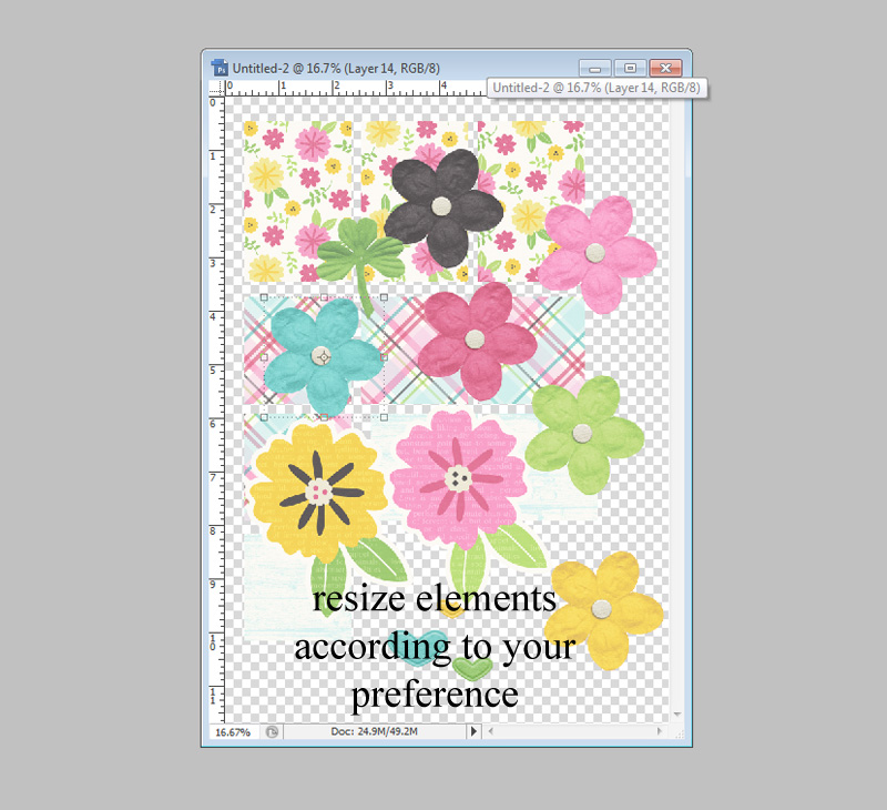
For this particular pattern, I like the 6×6 version better for the card I have in mind. Below is a sample of how I collage my elements. I re-size them first before printing, of course.

3

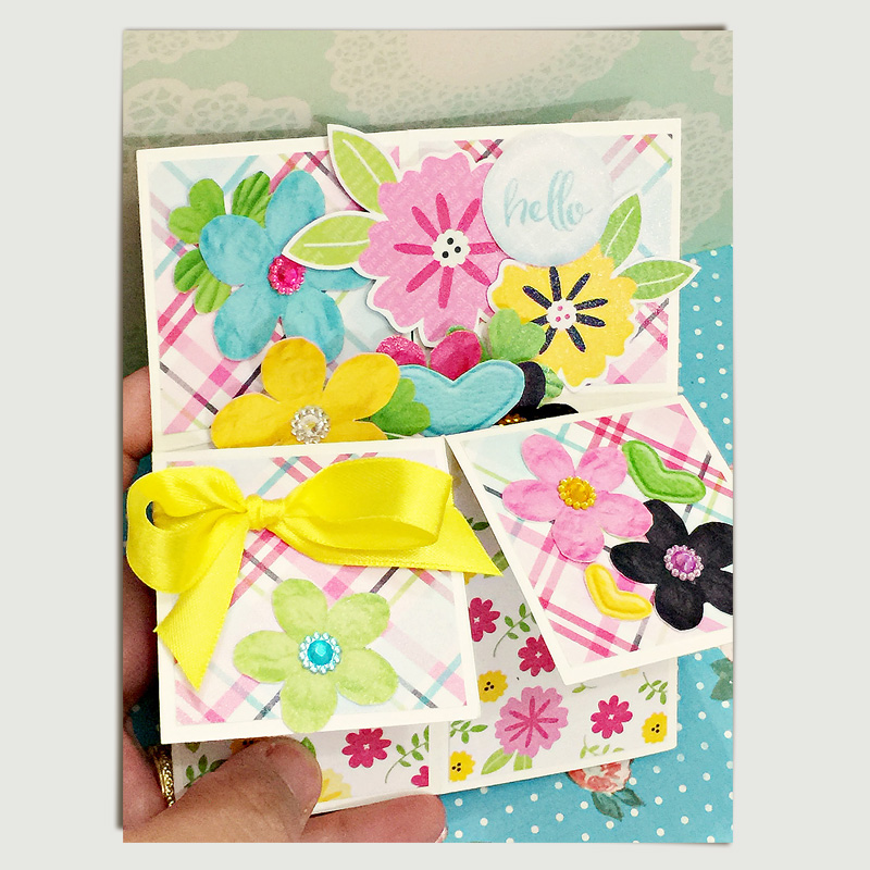
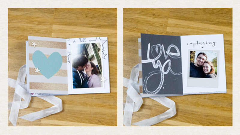
Here is the card after the print/cut/paste/assembly process (closed)

DonnaEspiritu-LifeCaptured-hybrid003

And you can watch this video for a short tutorial on how I created this super fun card:

Thanks and hope you liked what I shared today.

Have a great day!

Donna

About the Author: Donna Espiritu is a new mother to a little girl and wife to a very supportive husband. She is currently living in the Kingdom of Saudi Arabia with her family. When she is not scrapbooking, she likes to read some sci-fi/romantic/time-travel themed books or watching old episodes of some of her favorite tv shows.

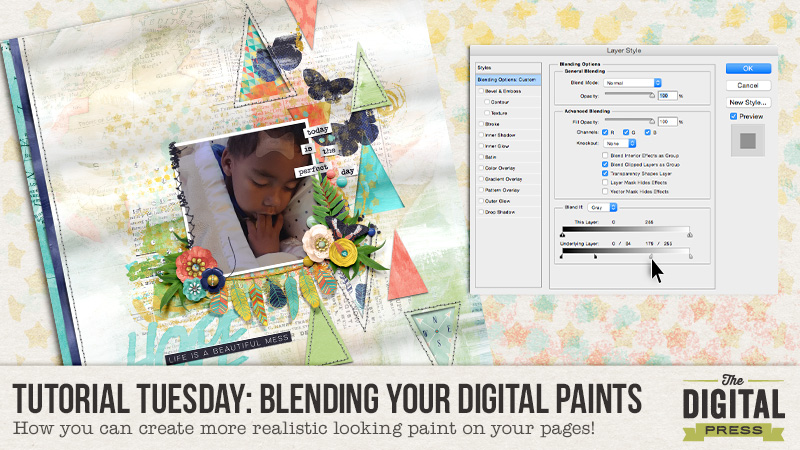
Tutorial Tuesday: Blending Your Digital Paints! | The Digital Press

Tutorial Tuesday: Blending Your Digital Paints!

Tutorial Tuesday: Blending Your Digital Paints! | The Digital Press

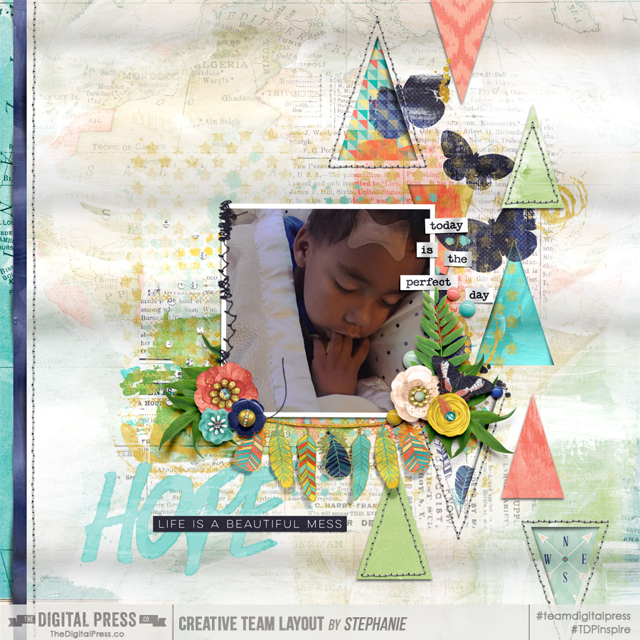
Hey guys! Stephanie (aka: PuSticks) here today to show you a simple trick for blending digital paints on my scrappy pages! First, lets have a quick chat about real paint. When you use real paint on paper, your colors blend together right? When you layer wet paint over dry paint layers, typically some of the dry paint will show through your wet paint. When we have digital paint, we don’t always get that type of effect without a little tweaking! Take a peek at one of my recent pages:

Hope by PuSticks - Tutorial Tuesday: Blending Your Digital Paints! | The Digital Press

*click here to see page credits*

As you can see, I like my paint! Now, I used a few different techniques on this page to create realistic looking paint but today we’re going to focus on the technique that provides the biggest effect: Blending Sliders.

NOTE: I’m working in Photoshop CS6 but this also works in CC. If you’re using Photoshop Elements or another program, I’m sure there are ways of achieving the same type of look, perhaps if anyone has any tips for those programs, they can leave a comment below with some ideas!

Step 1: Place Your Paint!

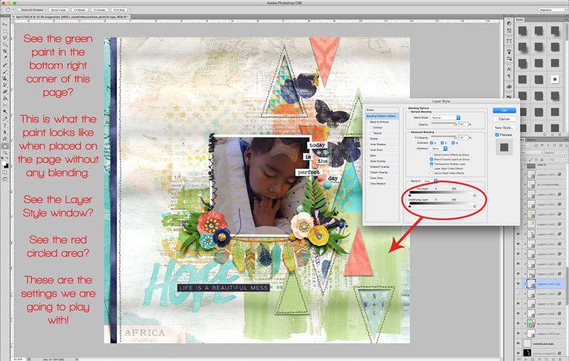
The first thing you need to do is put the digital paint on your page. As you can see below, I’m using the same page as above but we’re going to focus on the green paint area in the lower right corner:

Step 1: Place Your Paint - Tutorial Tuesday: Blending Your Digital Paints! | The Digital Press


To pull up the “Layer Style” window, you can double click on the layer you want to edit or on the menu bar, select “Layer -> Layer Styles -> Blending Options”. At the bottom of this pop up window, you’ll see two sliders, these are what we will be playing with!

Step 2: Blending Digital Paint!

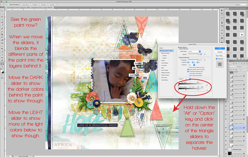
Okay, now that we have our Layer Style pop up open, we need to play with those sliders! We’re working only with the bottom most slider in this example. If you drag them back and forth, you will see your paint slowly disappear! Well that’s not what we want at all! We need to split the slider triangles. To do this, we need to hold down the “alt/option” key and then click on the little line in the middle of the triangles. Now we can slide the halves independently! Move the dark slider on the left towards the middle to show more of the dark colors from the layer below, move the right light triangle towards the center to show more of the underlying light colors. Play around with these until you like how your paint looks!

Step 2: Blending Digital Paint - Tutorial Tuesday: Blending Your Digital Paints! | The Digital Press

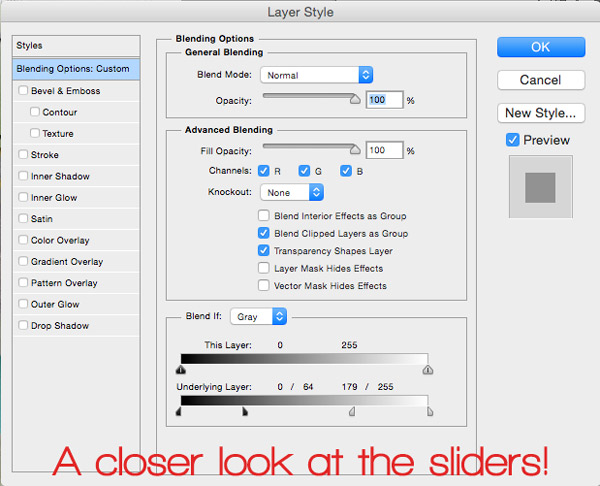
Sometimes I also play with the top slider too if I don’t like how using only the bottom one makes my paint look. If you’re feeling adventurous, play around with this slider too to see what type of painty looks you can come up with! If you’re curious, here’s a closer look at what my Layer Style pop up window looks like from the above photo:

Layer Style Pop Up Close Up - Tutorial Tuesday: Blending Your Digital Paints! | The Digital Press

Bonus Idea!

You know what else this technique is fun to use on? Pattern papers! Blend some grungy papers together, or use a layer mask to block out areas of the paper and then blend them together, or clip papers to shapes and then blend the shapes into the background paper… the potential uses of this little trick are amazing! So go grab some digital paint, papers and all that fun stuff, make a neat page, then upload your new masterpiece in the gallery! I look forward to seeing your painty goodness popping up around here soon!


Stephanie

About the Author: Hey guys! I’m Stephanie and I’m a scrapbook addict… and a Disney nut… and a Netflix junkie! I seem to do everything “all-in” when it comes to things that I’m passionate about. I don’t have a “style” per say, some days I’m feeling clean and simple, other days I’m art journaling with abandon! Outside of my creative outlets, I enjoy spending time with my family, especially when it’s at Disney World with my two sons! Also, I thoroughly enjoy stepping on small Lego pieces at 1am…wait…

Create Hybrid Journal Cards with Digital Kits

Create Your Own Journal Cards with Digital Kits


Sometimes I fall in love with a digital kit and all the fabulous patterned papers and embellishments only to find out the kit doesn’t have any pre-made journal cards for Pocket Scrappers like me. But since becoming friendly with the shape tool and clipping masks in Photoshop, I make my own cards in just a few minutes and can customize to my needs.

Create Your Own Journal Cards with Digital Kits


I used Mari Koegelenberg and Scotty Girl Design’s new collection called Party Animals to make this hybrid page about my daughter’s 5th birthday party this past week. It was the perfect collection and perfect timing.

Create Your Own Journal Cards with Digital Kits

I made a video showing my process in creating these hybrid cards. Please let me know if you have any questions or comments. I’d love to hear them.


brenda

About the Author: Brenda Smith is a mother of two littles and wife located in Southern California. When she is not scrapbooking, you can find her working full-time, trying to finish up her college degree with online classes, or sleeping because there are never enough hours in the day. Hybrid scrapping satisfies her addiction to technology and her addiction to paper and glue.


Flourish | Your Recoloring Skills

blog-recolor

Once upon a time I used to recolor by using the Colorize option.  The results were not always optimal.  One day while playing with the Hue/Saturation adjustment layer I learned that I could pinpoint specific hues and change them!  This changed my recoloring-life.  Seriously.  It was a moment where the heavens opened and angels started singing!   If you aren’t afraid of watching a very silly/giggly tutorial hit play.  If you want a step-by-step text/image tutorial just keep on scrolling!

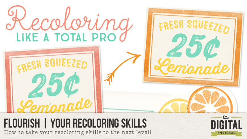
If video tutorials aren’t you thing here is a step-by-step of how I created the above effects!  The kit used for this tutorial is called Lemonade Stand by Mommyish. It is 50% off Tuesday-Thursday! *inserts shameless plug*

Lemonade Stand by Mommyish

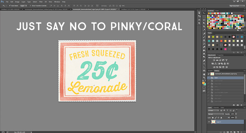
Open the element or paper you would like to change.  For this I have selected a little word art piece that I want to remove the coral in exchange for a gender neutral orange.

tut1

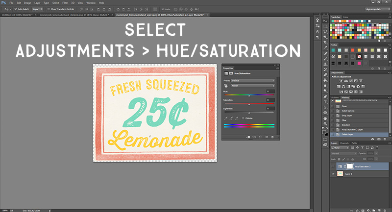
Above this layer you add a Hue/Saturation adjustment layer.  If you do not have this on your tool palette you can get to it by going to Window > Adjustments then click  the Hue/Saturation icon. hue-sat

tut2

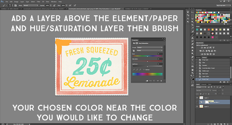
After I have added the adjustment layer I create a new layer above both the element/paper and adjustment layer.  I take my paintbrush and just scribble over the element with the color I want to achieve.  For this tutorial I want to change the coral to orange.

tut3

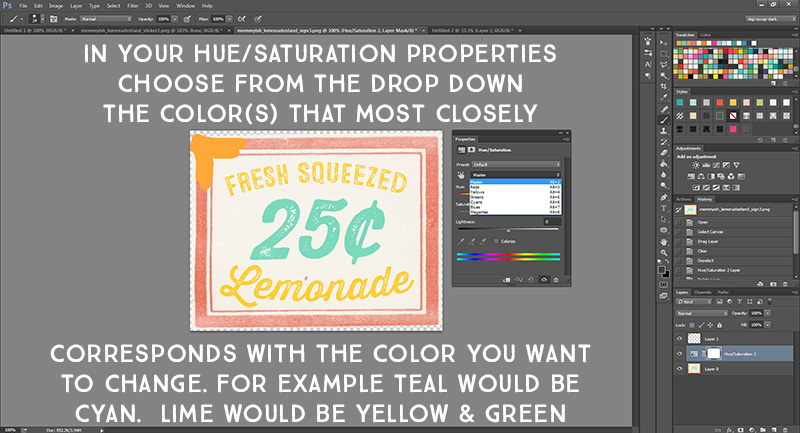
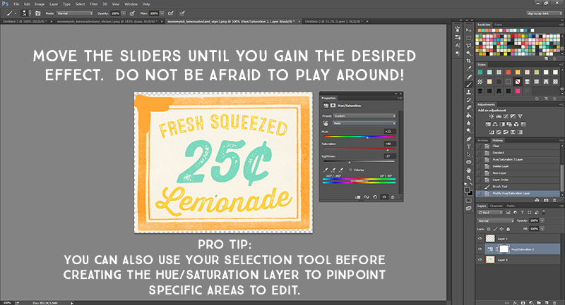
After I have my color sampled I then play around with my adjustment layer.  This is where the magic happens!  You will need to determine the main colors of your element and then adjust accordingly.  Coral uses a red hue so from the drop down I choose red as the color I would like to adjust.  If I was going to change the teal color I would choose cyan.  If I was going to change the yellow I would choose yellow.

tut4

There are three sliders you can move.  The first is the most important: Hue.  By sliding this we can change the coral to orange.. or any other color!  Saturation effects how much OOMPH the color has while lightness can either deepen or lighten it up.  By using all three you could create completely different effects.  Play around and have fun!

tut5

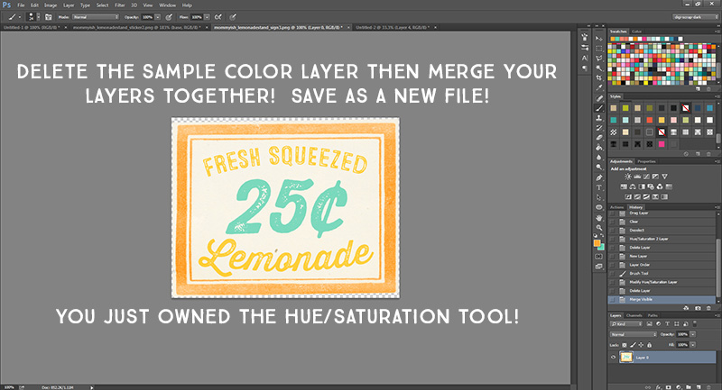
When you have accomplished the look you want you can delete the sample color layer and merge the adjustment layer with your element.  I save the file as something new and call it done!  You can also pull your edited hue/saturation layer into other element documents with the same color you want to change to gain the same color effect on multiple items (as you can see in the first image of the post)

tut6

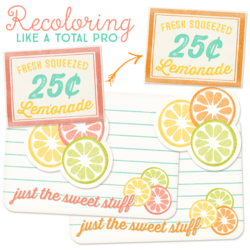
As you can see to the left here are a few samples of the elements in the kit and then a quick recolor to remove the “pink coral” with a more gender neutral orange that also matches the kit!  Many times we may like a kit but one color might be off-putting to our personal tastes.  It is easier than you think to recolor one specific hue in a palette!  While this may be a bit more of an advanced tutorial – once you get the hang of it you will find yourself going back to this technique over and over again!

Recoloring like a boss


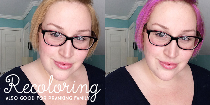
In the past I might have used recoloring skills to pull pranks on long-distance family members.  (or maybe I just wanted to see if I could pull off pink hair)  My hair pulls from a yellow hue.  All I did was add the hue/saturation layer and adjust the yellow slider while erasing some extra color areas to maintain realism. (the lamp shade behind my shoulder, for example) You can use your eraser brush on the hue/saturation layer!

blog-rc-1

I hope you enjoyed this somewhat silly tutorial.  Don’t be afraid to play around.  You never know what fun effects you might accomplish just by experimenting!


Leah/Mommyish

 About the Author: Leah is the designer behind Mommyish and owner of The Digital Press. She lives in the beautiful lower Hudson Valley of NY with her husband, two girls, and in-laws! She has a love for all things geeky and quirky. In addition to being a graphic designer, she is an avid pianist.

Pocket Minibook

jcminibook-blogheader

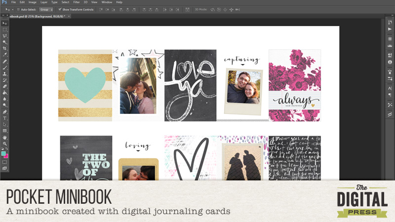
Creating pocket pages with 3×4 cards is definitly not the only way those cute cards can be used. Today I want to show you how I created a minibook using different cards and a few of my favourite photos. One of them is actually the very first picture that was taken of us, so it is very special to me. It’s the top right one. The others are selfies we took during our citytrips in the netherlands and belgium.

So let’s get started! First of all I created two rows with five journaling cards each in photoshop. I have a A3 printer, so I was able to print everything at once, but it is totally fine to create it with a A4 / lettersize paper aswell, you will have more rows then with three cards each.

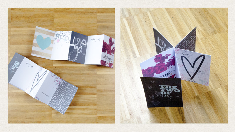
Next step is to print the cards, without the photos and frames, cut the rows and fold them after each card. You can glue them back to back together, but leave the first and second card like they are for now. Your book should now look like the right picture below.

jcminibook-blog1

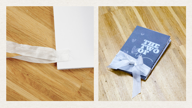
Now you get some ribbon, I like to use snug hug seam binding ribbon for minibooks, and cut it to one long and one shorter piece. The long one should go 2-3 times around the minibook. Glue both of them between the first and the second card, as you can see in the left picture below. The picture on the right shows you what the finish book will look like.  When the ribbon is in place and looks like you want it, glue card one and two together and you are done with the base for your minibook!

jcminibook-blog2

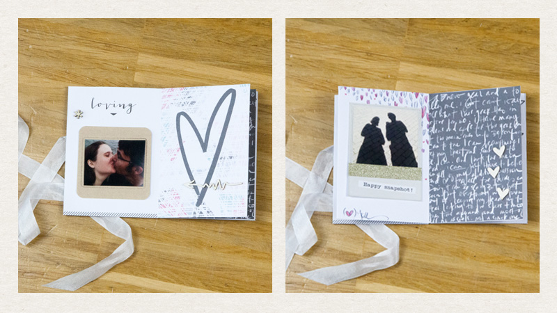
I printed the frames on the same paper as the cards and used my selphy for printing the photos, so they are printed on photopaper. I also added some wood veneer to my finished book. The next pictures show you what my finish book looks like in detail. I really love how it turned out!

jcminibook-blog3

jcminibook-blog4

Thanks for reading and see you next time!


Anika About the Author:  Anika is part of the hybrid team here at thedigitalpress.com. She loves to travel and use the photos her boyfriend takes (thanks for that!) to scrapbook. Digital, paper and hybrid. When she is not scrapping, she is most likely playing a computer game or in a city searching for a geocache.

Listen to your Lazy Side

Listen to your Lazy Side

I’m back again with another tutorial based on a question asked on my last post – how do you use a gradient as a clipping mask?

First, I converted a flower photo into a black and white pencil drawing as I showed you in my last tutorial.
flower drawing

I flattened the flower image and copied it into a new layer on top of this grey background paper I want to use for my layout.
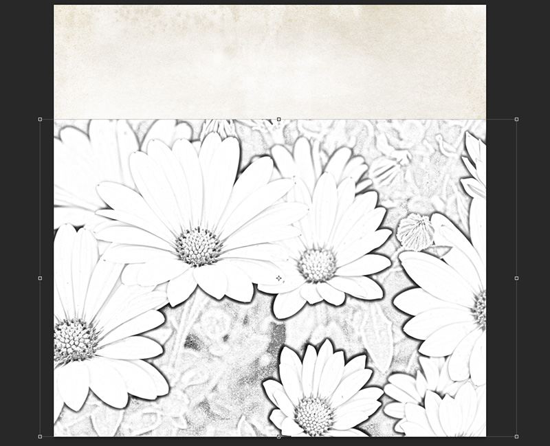
flower drawing

Next, I want the flower drawing to look like it is growing upwards from the bottom of the page, and I want it to be pretty big.  After re-sizing, it looks like this:
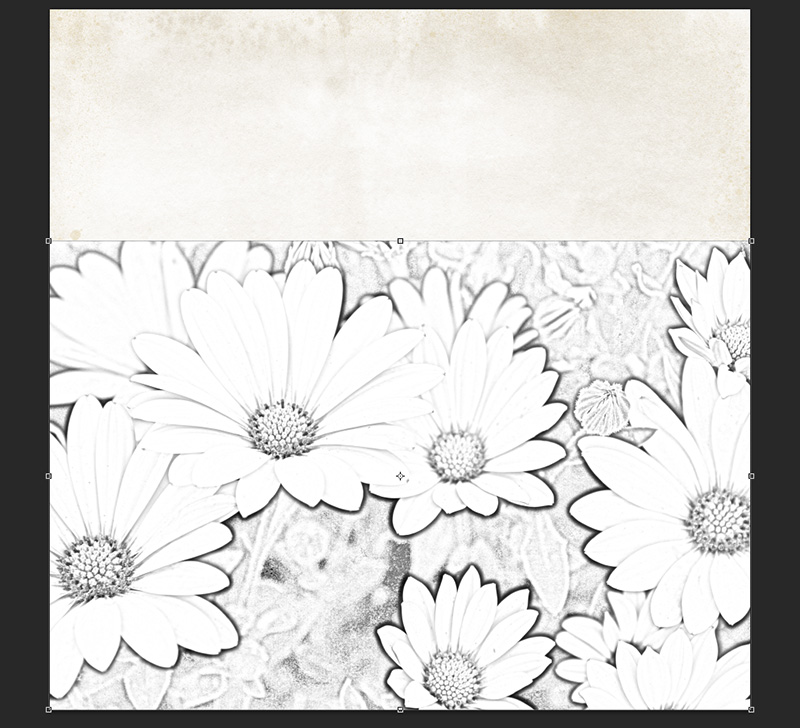
flower drawing layout

Then, I want to blend this into my background paper, but I’m a super lazy scrapbooker, so I’m going to use a gradient fill to do the heavy lifting for me on this layout.

First, create a new layer in the layers palette.  The new layer should be between the background paper and your pencil drawing.

I don’t want to do a ton of erasing after doing the gradient fill, so I’m going to use the outline of my photo layer to make a boundary for the gradient.  With the new blank layer in between your other layers selected, hold your mouse over the layer thumbnail of your pencil drawing layer in the layers palette and ctrl-mouseclick on the thumbnail.
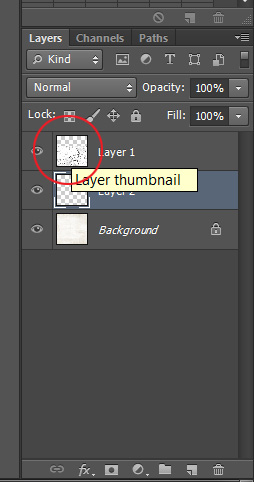
Layer Thumbnail

Your pencil drawing layer will have the dotted selection line around it, but in the layers palette, the middle layer will still be selected.
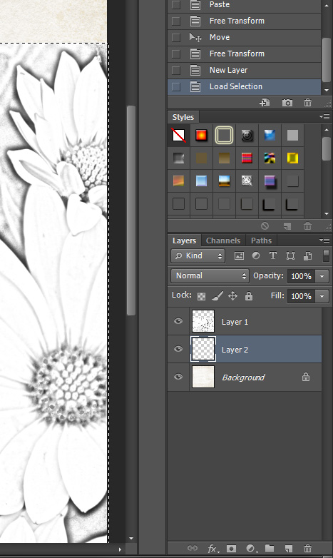
flower drawing layout

It will be easier to see what you are doing for the next steps if you turn the visibility of your pencil drawing layer off in the layers palette (click on the eye symbol associated with that layer).

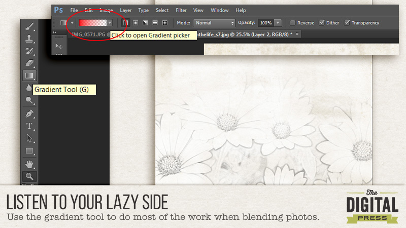
On the left toolbar, select the Gradient tool (or use the ‘G’ key as a shortcut).
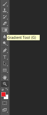
Gradient Tool

In the top toolbar, click the Gradient Picker drop-down box and select the solid to transparent gradient.  This will appear as a color on one side and transparent (the white and gray checkerboard pattern on the other).

Gradient Picker


I’m using red as my main color here so that it’s easier to see.  Since the gradient will be used as a clipping mask, it doesn’t matter what the main color you are using is.  Make sure the Dither and Transparency boxes on the right side of the toolbar are checked.

The Gradient tool draws a gradient from solid to transparent (in this case).  So click first on the side of your line drawing that you want to be solid, then, drag your mouse in the direction you want the photo to fade.  Because we are using the outline of your pencil drawing layer as a selection boundary, it will limit where the gradient ends to inside the selection.  My document now looks like this:
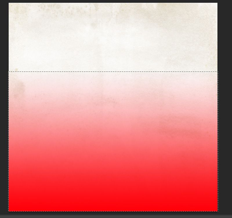
Gradient

Turn your pencil drawing layer back on (click on the eye next to the layer thumbnail).  We are going to clip this layer to the gradient underneath it.  You can do this one of two ways:

  1. Hold your mouse between the pencil drawing and gradient layers and hold down the Alt key. Your cursor will turn into a box with an arrow pointing downward next to it.  Click your mouse button and the top layer will now be clipped to the middle layer.
  2. Right click on your pencil drawing layer and choose ‘Create Clipping Mask’.
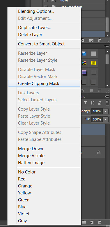
Create Clipping Mask

My layout now looks like this:

flower drawing layout

You can move the pencil drawing and gradient layers around until your layout looks good, and you can also use the eraser tool on the gradient layer to tailor the blending to your liking.  For the eraser, I like to use a big brush at 5% flow – this only erases 5% of the area that I move my mouse over for each pass, so this blends well and it’s hard to see where I’ve erased.

After some erasing at the top, and around each flower (where the flower petals appear to have shadows), photos, elements and journaling, my completed layout looks like this:
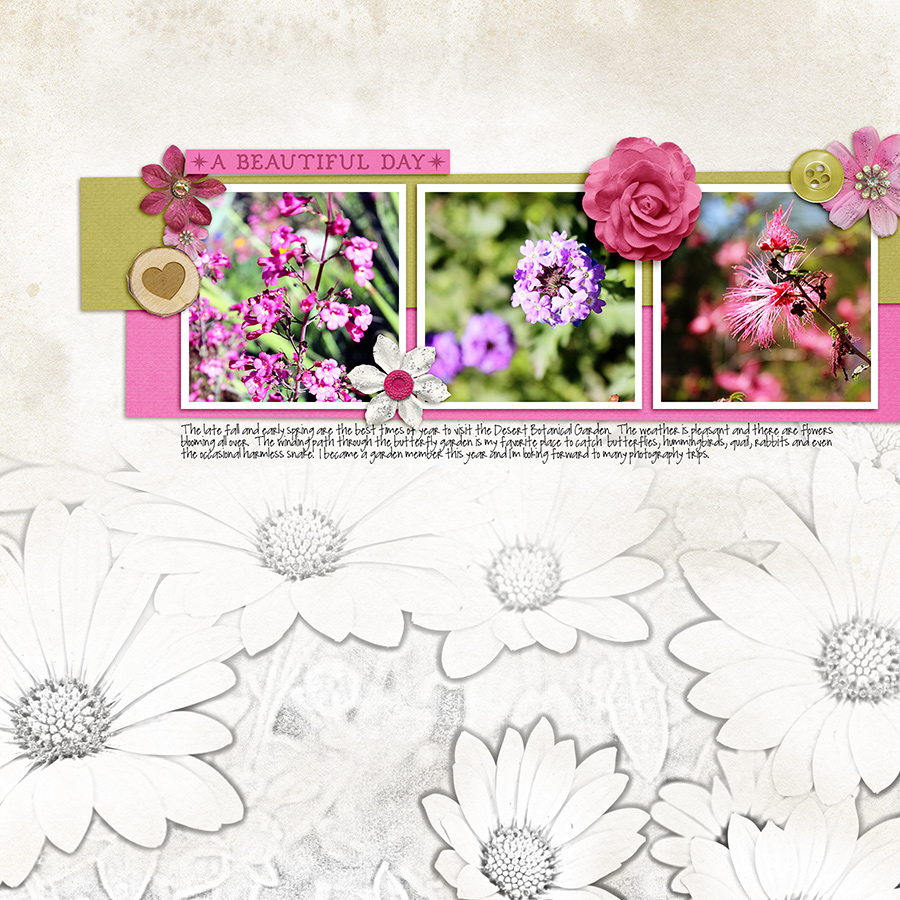
Gradient Blending Layout

I hope this was helpful – happy scrapping!


Supplies Used:
Winter Berries
by The Digital Press Designers
A Day in the Life: Solids by Sugarplum Paperie


KacyAbout the Author:  Kacy is an Environmental Engineer living in Arizona with a elderly, cranky, pudgy, but insanely cute calico kitty.  She enjoys scrapbooking, crocheting, dancing awkwardly to electronic dance music, Grumpy Cat, Scottish accents, drag queens, cupcakes, bacon,  Stephen King books, smirking, very crude inside jokes, and men in kilts.