Category: Tutorials

Tutorial Tuesday | Using Text Effects

Hello, and welcome to another edition of our Tutorial Tuesday series here on The Digital Press blog! Today I thought it would be fun to talk about how to use elements from a kit and text effects in our photo editing software to create unique and fun page titles and/or word art pieces.

For this example, I’m using Photoshop as my photo editing software. I’ve already created my page, and now want to combine a digital embellishment and a text effect to add a fun page title. Doing this is super easy!

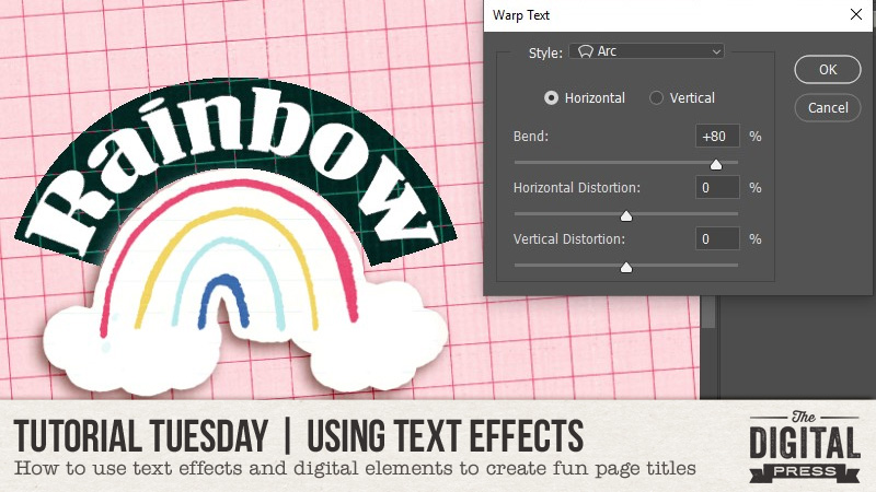
First, I want to curve the word “Rainbow” around a rainbow element, as shown here…

Step 1 — Place the element that the text will wrap around onto the page canvas.

Step 2 — Use the ‘type’ tool to type the desired word or phrase (in this case, I used “Rainbow”).

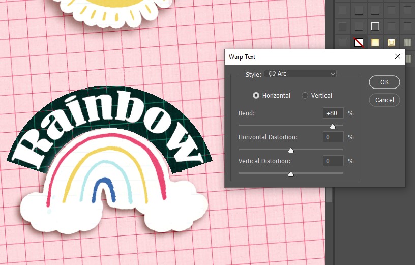
Step 3 — With the text layer selected and the type tool active, look toward the top right of the type tool’s toolbar. There is an icon of a “T” with a curved line underneath. Click that icon.

Step 4 — At this point, we can choose different styles. As you can see in the image above, I choose the ‘arc’ style with a bend of +80.


While the arc font over the rainbow was cute… it wasn’t what I mad in mind. I wanted something a little more subtle. Therefore, using the ‘curvature pen’ tool I curved my text directly over my element, as shown here…

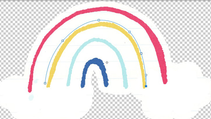
Step 1 — Create a new layer and select the right pen tool for the job (in this case, I used the ‘curvature pen’ tool). Create a path using the pen tool. In my example, I created a path over the yellow part of the rainbow (see image above).

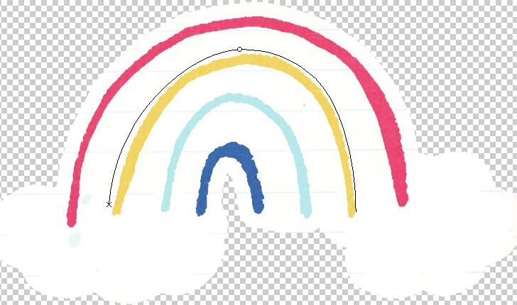
Step 2 — Select the ‘type’ tool and click towards the beginning of the curve path. The line will change from blue to black (see next image), and you will notice the cursor appear…

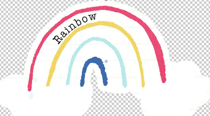
Step 3 — Type out your word or phrase. The text will follow the curve of the path you created, as opposed to going in a straight line…

That’s it! So easy, right?

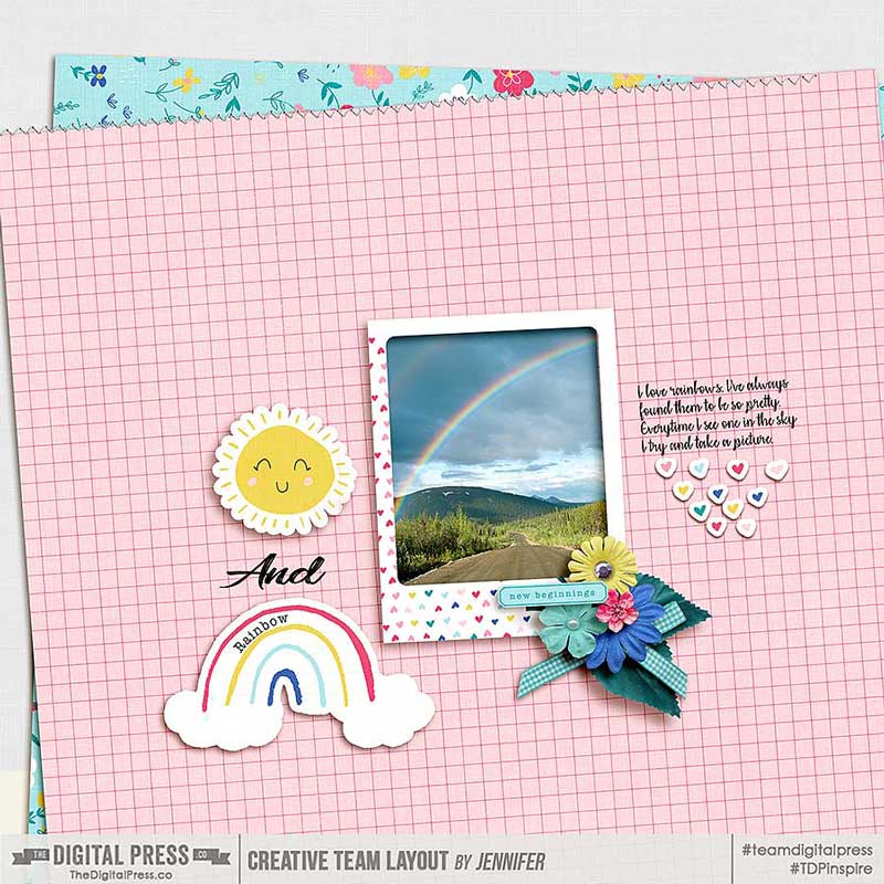
Here’s a look at my completed layout with the text layered on top of the element to create a custom page title. I think the title looks much cuter this way!

Hopefully this quick and simple technique will help you try some new things to create your own custom titles (or even your own word art pieces) on your next project!


About the Author  Jennifer is a creative team member at The Digital Press and lives in New York City. In addition to digital scrapping, she enjoys watching rugby and hockey and reading romance novels.

Hybrid How To | Make a Pretty Paper Wreath

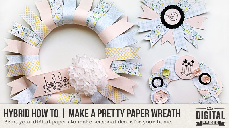
Hello everyone, and welcome to another edition of our Hybrid How-To series here on The Digital Press blog! Today I’m going to teach you how to make some pretty paper wreaths using products from your digital scrapbooking stash.

It looks like Spring has finally arrived for many of us, and it is a welcome sight for sure! This season brings us back outside, perhaps doing some gardening or work in the yard. It’s the season that feels fresh and new, so for me I thought about bringing some spring color into my house by using my pretty digital papers and word art from The Digital Press to make some paper wreaths for decoration.

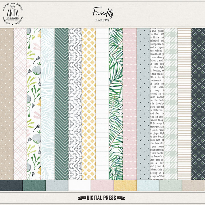
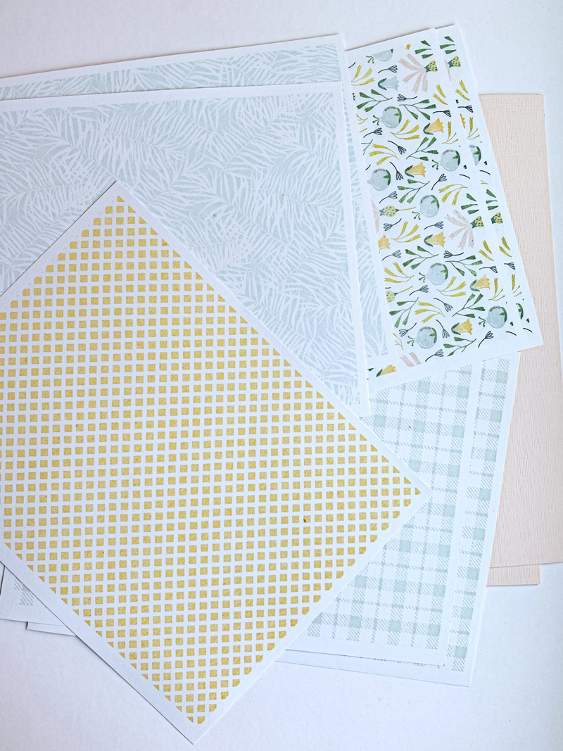
I ended up making three easy decorative wreaths — each of which can hang or be propped up on my mantle or a table, etc. They add the perfect touch of seasonal decor to my home. The hardest part was selecting which gorgeous patterned papers to use… but I finally decided on the Frivolity Papers by Anita Designs, shown here…

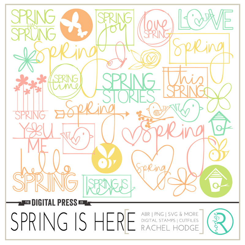
I also picked out a word art/stamp set to use to decorate my wreaths; I love the spring designs on the Spring Is Here set by Rachel Hodge…

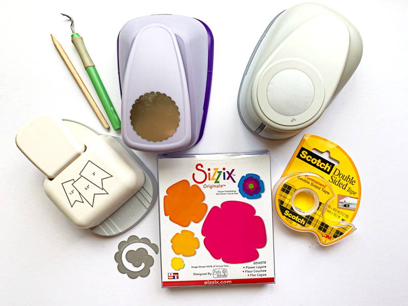
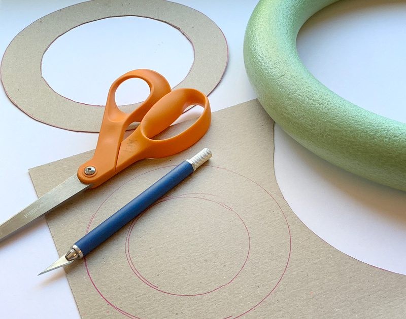
Finally, here is a quick look at some of the tools I grabbed out of my scrap stash to use for this project (you can easily adapt your own project to whatever tools/punches/shapes/etc. you happen to have on hand!)…


To begin, I bought a foam floral wreath from my local craft store. This one measured about 11 inches wide; they come in different sizes and are not too expensive. For the other two wreaths I just made myself a template using chipboard I had on hand. I drew a circle onto the chipboard using a cup, and then another circle around it using a bowl to outline the first circle. I cut everything out using scissors and a craft knife.

I decided to work on the large foam wreath first.

First, I selected my papers and printed them on my printer. My printer’s largest print size is 8.5″ x 11″, which worked fine for this project. I simply filled each 8.5″ x 11″ space with one of my 12″ x 12″ digital paper patterns from my stash, and then printed it out in full-sheet format, as shown here…

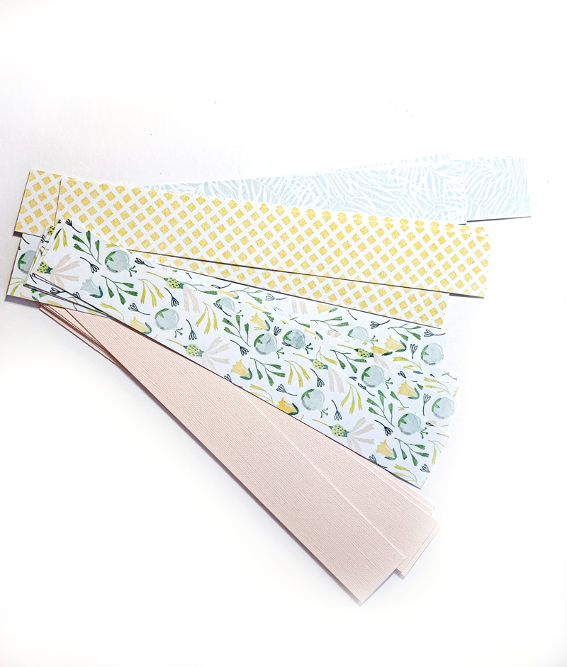
I loved having these gorgeous papers in my hands! After printing, I cut my papers into the strips that would later become the banner shapes that cover the wreath. I cut the strips 1 ½ inch wide and 10 ½ inches long, and I ended up with 5 strips out of each of the 4 patterns I printed. The number of strips you end up with will vary depending on how big of a ring you choose and how much you overlap your banners… but expect to use about 25 strips for a wreath this size.

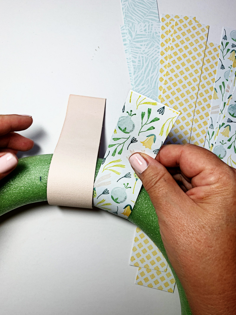
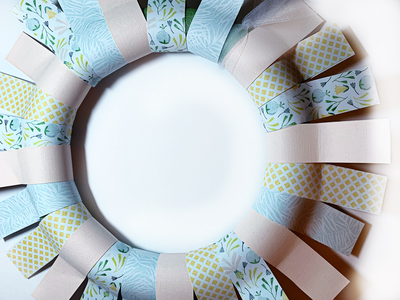
Next, start attaching the strips around the foam wreath. I attached the papers together at the ends, so the paper is not actually attached to the foam and therefore is fairly loose around the wreath. You can make the strips overlap slightly, but don’t worry if a bit of the foam wreath shows thru (you can fix this later on).

I started attaching my paper strips using a tape runner, but found it wasn’t holding them together well enough, so I switched to double-sided tape instead. It seemed to work much better. I think a strong glue adhesive would work well, also.

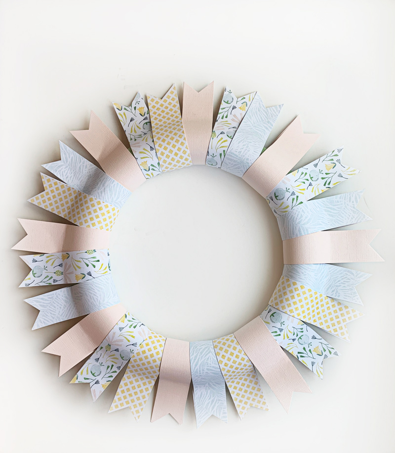
I worked in a somewhat random pattern, using a bit more of the solid cardstock. Here is what my wreath looked like after all the strips are on it…

Pretty already, right?!

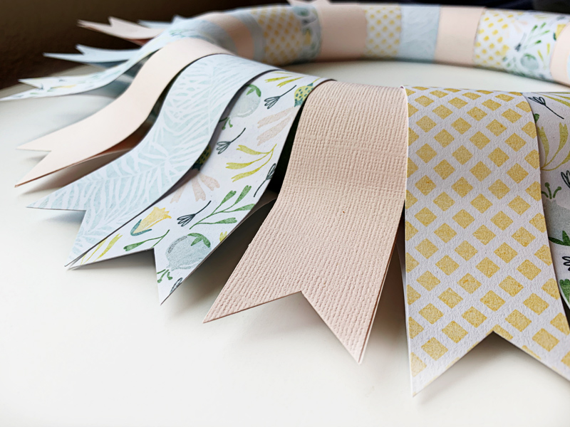
Next, I punched the paper into “banners”. This can be done a variety of different ways; I have a banner punch, so I used that… but it could be just as easy simply to cut the ends with scissors, too. You could also cut the strips into banners before attaching them to the foam… either way will work.

Once the strips were attached and cut into banner shapes, I could have stopped right there — I already thought this wreath would look great with a vase and flowers in the center sitting on a table.

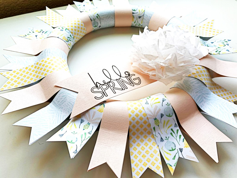
But…instead, I decided to add a banner and some gorgeous digital word art by Rachel Hodge by printing it out on my printer and then attaching it with double sided tape. I then added a tissue paper flower I made by folding tissue paper, securing the middle with a string, and then fanning out all the layers.


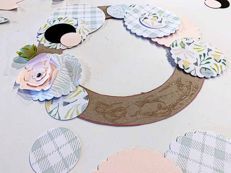
The next wreath I set out to make was the one using the chipboard backing that I had cut out by hand (see above). For this one, I decided to get out a few of my circle punches in various sizes — from 1 inch to 3 inches, in both regular and scallop edges.

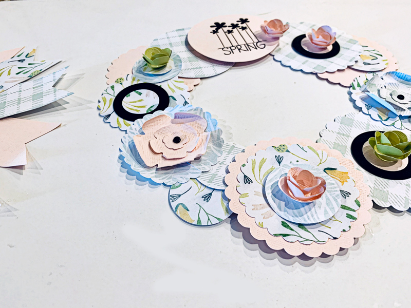
I punched circle shapes into the paper I’d printed out… and then put these circles down on top of the chipboard piece. I put the larger circles down first, and then just built on top of them with the smaller circles — all before actually gluing anything (just to get an ideas of the pattern placements, balance, etc.).

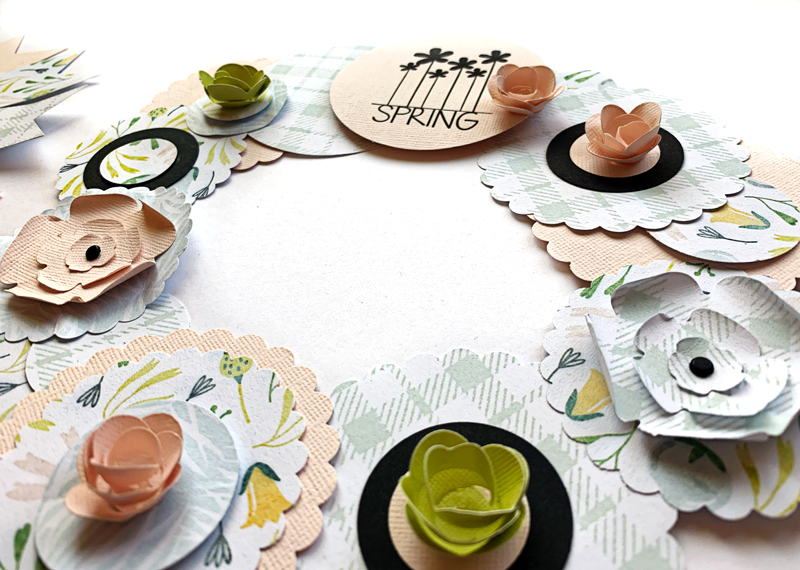
Then, I printed some more word art onto cardstock and punched it into a 2-1/2″ circle. I attached the various circles to the cardstock base, this time using my glue gun. I made sure all the chipboard was covered, and then I cut some flower shapes using my CuddleBug and Sizzix dies and added the flowers to some of the circles to add some dimension and variety. I love the way this one turned out, and it was so quick and easy!

Here’s another look…


Lastly, I got to work on the small chipboard wreath (this one was the smallest, at approximately 5 inches in diameter).

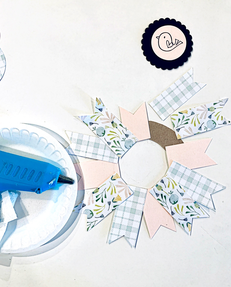
For this one, I used strips varying from about 4 to 6 inches long… punched them with my banner punch… and then just adhered them with a glue gun (this time, I did not wrap them around the chipboard base; you’ll see why, below).

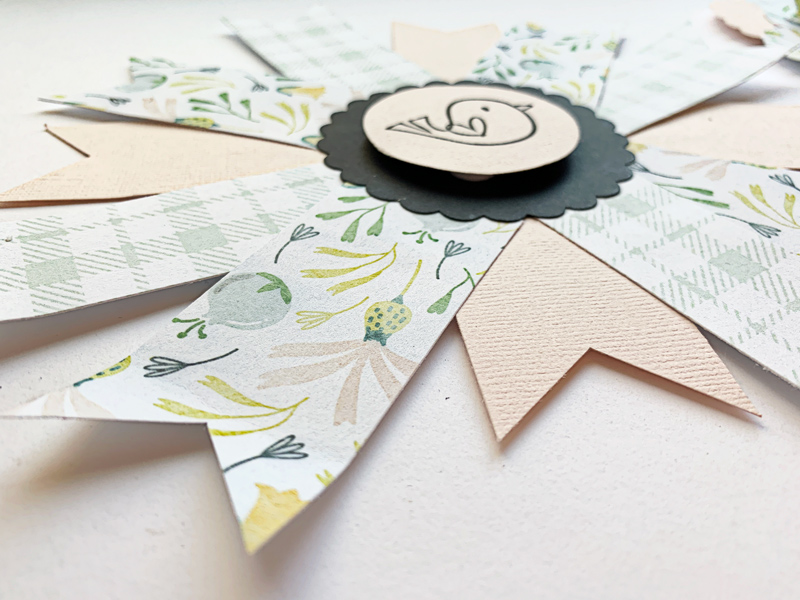
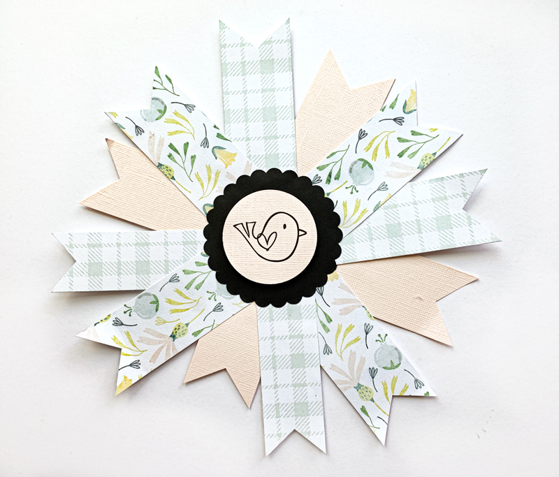
After adhering them, I punched a 3 inch scallop circle and a 2 inch image of a bird from the word art collection, and used those pieces to cover the center of the wreath, as shown below. I raised the circle of bird using pop up dots to add dimension. I added the center scallop circle to the middle making sure to cover over all the banner edges.

Here’s a look at the final product…

Isn’t it cute?

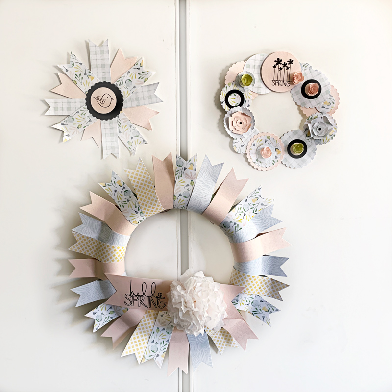
Here is a look at all three wreaths hanging on my closet in my office! They make me smile every time I walk in the room!

And that’s it! Each one was so simple… and fun to make. I hope I’ve inspired you to use your own digital products to make a paper wreath — whether for spring, or at any time of the year! We would love to see pictures of your completed projects in the Hybrid Gallery at The Digital Press!

Happy Spring, everyone!


About the Author  KerriAnne is a homebody who resides in the desert SW. She started scrapbooking when her kids were little and hasn’t stopped despite the teenagers rolling their eyes and sticking out their tongues!  When not scrapping or being a chauffeur, she can be found consuming large amounts of iced coffee.

Tutorial Tuesday | Make Your Layout Pop

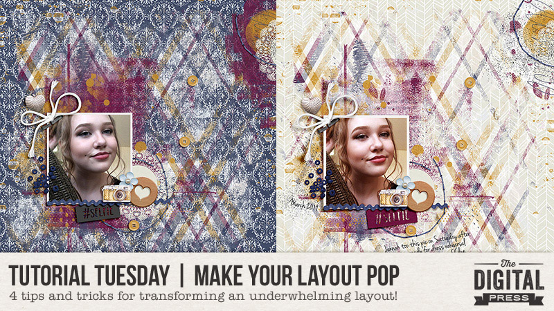
Hello, and welcome to another edition of our Tutorial Tuesday series here on The Digital Press blog! It’s Kelley here, and I’m here today to offer up some tips and tricks for transforming underwhelming layouts by using one of 4 different techniques that can make your layout pop! This is my first ever tutorial post here on The Digital Press blog, and I’m super excited to share these tips with you today!

You know how sometimes when you are scrapping, a page is just not looking right? Something might just seem a bit ‘off,’ and you find yourself tempted to throw the whole page out and start again? While I’ve certainly thrown pages out, it’s really pretty rare for me. I tend to try a whole slew of things to make my page more appealing, and normally can find something that works better. So today, I want to show you a few things that you can do to “save” your page (or, if your page is already feeling pretty darn awesome, you can just use these ideas to add a little extra wow factor!).

Four Ways to Make Your Layout Pop

For today’s tutorial, this is the layout I’ll be working with…
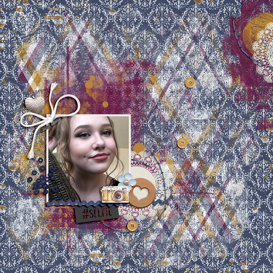
In my opinion, this layout could definitely use a little more ‘oomph.’ It looks kind of drab… the background paper I originally chose just isn’t working with the painty design I used… and there doesn’t seem to be a lot of dimension to the page.

How to tweak this around to fix it? Here are a few options…

1.  Change Out The Background

The first thing I always do if my page is looking off is to try changing out the background. I’m sure this one is a pretty obvious tip, but that’s because it really does have the power to change a page from ‘meh’ to ‘wow!’ pretty easily. Here’s a look at the same layout with a different background…
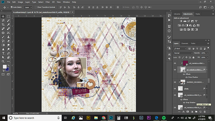
It’s really interesting to change it up completely to see what happens! Go from a pattern to a solid… from a dark color to a lighter one… etc.  In this case, because I ended up using a lot of paint on my page, I felt like the darker blue patterned background I originally went with was not working out as well. I thought it looked too dark and muddy (hard to see the paint layers), so I decided to go with a much lighter paper, instead. I think it looks much better!

2. Add Custom Shadowing

Adding custom shadows is something that I do to almost all of my layouts. It just adds more realism and oomph to the page. Unless I’m feeling particularly motivated, I’ll just custom shadow 2 or 3 items… but really, you can go all out with this if you are feeling it!

Here, I custom-edited the shadows on the photo, the string, and the ric rac…
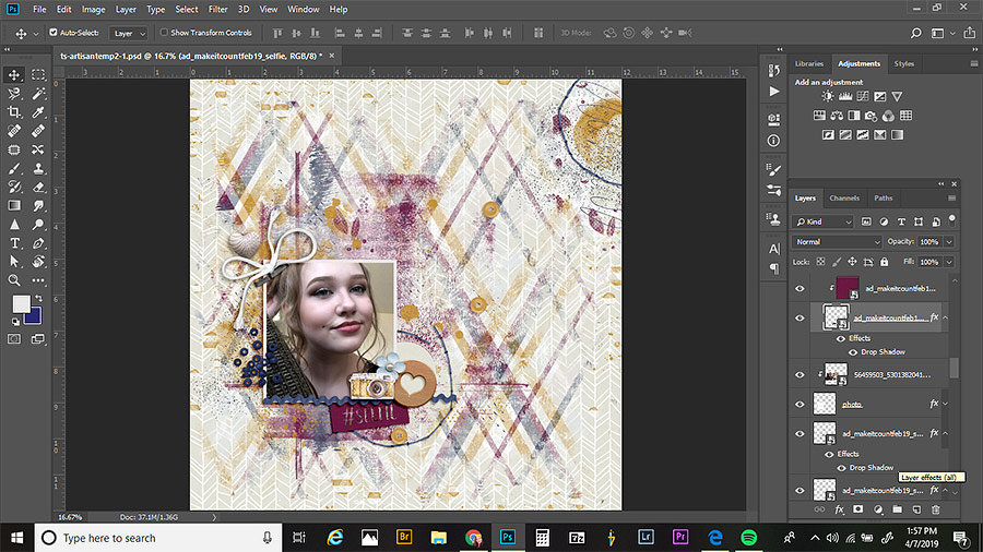
There are a lot of ways to do this, but what I normally do is start out by adding a custom shadow to a photo or paper piece; this will allow it to look like a corner is slightly lifted, and just make it all look more realistic, overall. First, select the photo (or the clipping mask, if you’ve used a photo spot on a template). Then, in the layers panel, right-click on the drop shadow for that layer and click ‘create layer.’ This puts the shadow on its own layer. Next, select that shadow layer, and select the smudge tool in the tools palette. You can experiment with what size brush works for you, but I tend to use a medium size brush. Next, just hover over a corner of your photo that you’d like to adjust.  In order to make the corner look a little bit lifted, just click and drag a little bit in the direction of your shadowing. For added variation on the page, I also usually pick a different spot to reduce the shadow size to make it look like that part of the photo is glued down really well.

3. Color Balance Adjustment

This is quick and easy, and it is something that helps out a lot if you think that your page just isn’t looking pretty, or if you think the photos aren’t looking quite right with the page.

If you look at the photo up above, and then compare it with this next one… you’ll see that the first one has a grayer, bluer tone. I edited it with deeper reds in the shadows and yellows in the highlights, which gives it a much warmer look…
There are 2 ways I add these color adjustments.

The first is something I do simply to help the photos “go” better with the page. To do this, just click on a photo in the layers panel, then click on the color balance adjustment layer. What you’ll do next is going to depend on the look of your page. I select shadows from the color balance drop-down, and hen slide the sliders until I like how it looks with my page. A lot of times for me, this means adding blue to the shadow layer, but it really just depends. You have to experiment! Next, I’ll select highlights and then midtones, doing the same thing (but not adjusting the bars all the same).

The other way I add a color adjustment is just a means of altering the color on the overall page (i.e. not to make a photo “match” the page better… but just to give the entire page a slightly different look). I do this when I just think my page looks kind of ugly. This is something I do at the end after I’ve flattened my page; I duplicate the flattened layer, and then apply a color balance layer to the whole page to change up the look.

4. Soft Light Layer

Honestly, I use this last little trick on almost every single layout I create. Occasionally, I don’t like the look and will delete it after trying it out… but the majority of the time, a little soft light boost really takes a page to the next level.

Here’s a look at my page, from above, with a soft light layer added…
How to do this?

Once you are finished with your page and have flattened it down, just hit CTRL+J to duplicate the page. Then, with your duplicated layer selected, change the blend mode to ‘soft light.’ You’ll often get a pretty crazy looking effect at first… but the key here is to reduce the opacity pretty far down, until you get a look you like. It really varies, layout by layout, how much opacity I use… but usually it’s somewhere between 10% to 50%. In the layout above, I landed at about 25% opacity on the soft light layer.

Well, there you go! These are four of my favorite tricks to change a page from ‘meh’ to ‘wow!’ with just a few little steps. I hope you find them useful in your scrapping!



About the Author  Kelley is a member of The Digital Press creative team. She lives in Iowa with her 5 children, 3 cats, and 4 hamsters. She works full-time as a medical transcriptionist from home. She discovered digital scrapbooking as a member of Clickin Moms about 9 years ago and was immediately hooked.  Kelley also enjoys cooking, spending time with family, all things art, crafts, sewing, and soapmaking.
Tutorial Tuesday | PART 4: Use Products from TDP to Scrap on Your Phone

Hello, and welcome to another edition of our Tutorial Tuesday series here on The Digital Press blog! Today I’m here to to share an update to our “phone scrapping” series that ran here on the blog back in 2016. There are a bunch of new features and capabilities in the Project Life app nowadays, compared to when we ran the first three parts of our series — so we figured it was time to update you!

If you missed the first 3 parts of this series… you can find them here:

  • PART 1: transferring your own digital products into the Project Life app
  • PART 2: adding text to your own pocket cards imported into the app
  • PART 3: creating non-pocket style pages using the app in combination w/ photo editing software

The Project Life App has been an integral part of me being able to catch up on 7 years’ worth of pictures and memories in only 2 years’ time. The Project Life App has continued to grow and add some really cool features, which I’m going to talk about today.

When I first started using the Project Life App, I was very pregnant with baby #2. I still hadn’t done my first son’s baby book, or any of the thousands of pictures I took of him in his first 3 years, or any of the photos from the years before him. I hated that I had gotten so far behind on scrapbooking our family’s memories. Once I realized how easy it was to use the Project Life App, however, I told myself I would use it just to catch up on the early years of our marriage, and then I’d go back to my pretty Photoshop layouts for my son’s baby book. Well… as I began to crank out pages quicker than I EVER would in Photoshop alone… I realized I had found my saving grace for scrapbooking. In all honesty, I felt a little guilty buying kits in the Project Life App when my computer was FULL of beautiful digital kits… and I wanted to use them… but it was just easier to stay in the app. That is… until the Project Life App began adding new features. 🙂

For reference, I use my Samsung Galaxy 9 phone for the majority of my scrapping. We Android users often refer to ourselves as the ‘red-headed stepchildren’ of the app world (our updates always come 1-2 months later than the iPhone updates, for the Project Life App). But the new updates have been totally WORTH THE WAIT!

FREE FORM TEXT

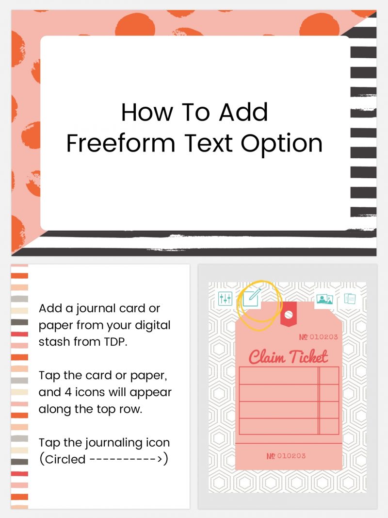
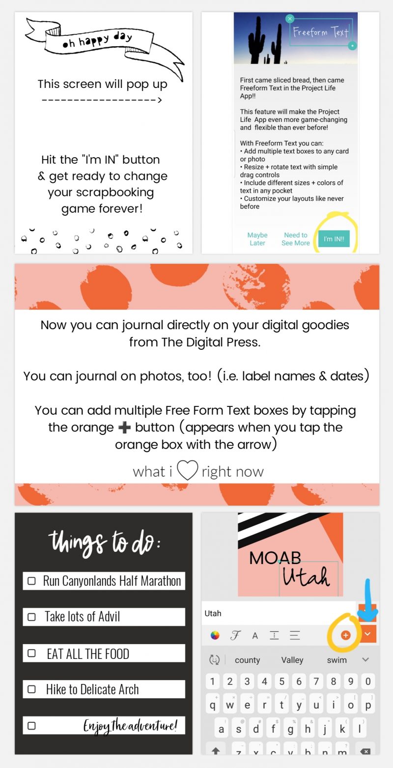
The first feature I’m going to talk about is “Free Form Text“. Free Form Text allows you to add a text box to any pocket or picture. Prior to the update that included Free Form Text… when using TDP products in the PL app you would need to use another app (like Rhonna or Pixel Lab) to journal on your cards or photos (this previous method was covered in the 2nd part of our blog series, found here). Then you’d have to save the new card that included text to your gallery, go back into the PL app, and add it to the layout as a photo. Free Form Text eliminates those extra steps. I remember totally geeking out about this update last May. I could FINALLY use all my beautiful digital kits from The Digital Press! Free Form Text is an add-on in the app, but in my opinion it is a great feature for only $2.99.

Check it out…


[ examples above were made in the Project Life App using Rachel Etrog’s March Stuff Journal Cards ]

Now, there are some limitations to the Free Form Text feature. The text box will not wrap to the confines of the journal card (or photo), so you will have to hit the “enter” key to go to the next line. If you have a large amount of journaling, it may take some tweaking to get it just right.

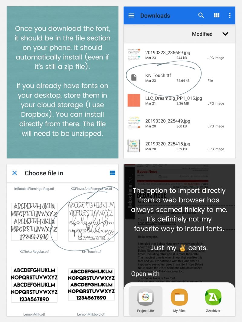
ADD YOUR OWN FONTS

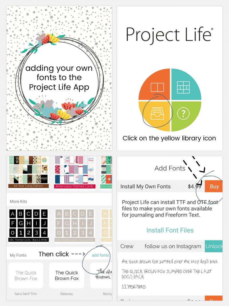
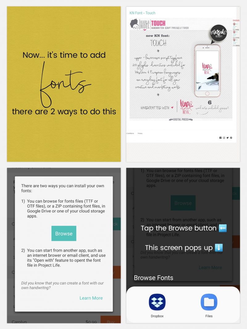
The next feature that totally changed my app-scrapping game was the  “Add Your Own Fonts” (Font File Installation) feature. You can add ANY font to your Project Life pages, and you are no longer relegated to using the fonts available in the app. This feature — plus the Free Form Text — means you can add titles in beautiful script fonts, add dingbats to your photos, etc… the possibilities are endless! Like Free Form Text, this feature is an add-on to the app and it’s a bit more expensive at $4.99, but still very worth it, in my opinion! The ease of not having to switch apps and add extra steps to the process when making a page are priceless to me.

[ examples above were made in the Project Life App using Rachel Etrog’s A Boy Life Journal Cards, Papers, & Karla Noel’s Touch Font ]

The majority of the time, I download fonts through my desktop, unzip & install, then copy to my Dropbox Fonts folder. I love app-scrapping, but sometimes I just need a bigger screen to see what I’m doing. 99% of the time, I’m installing fonts from my Dropbox. You can find lots of cute fonts at The Digital Press HERE.

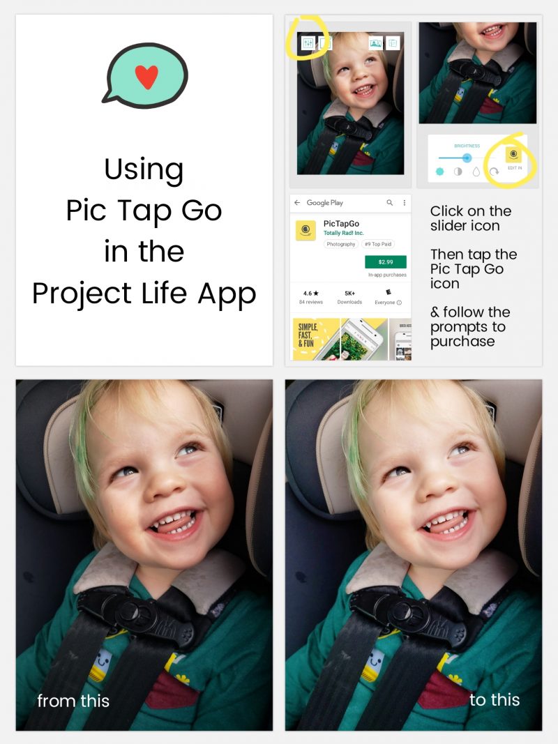
PicTapGo

The newest feature that I’m going to tell you about is “PicTapGo“. This app has been available for iOS users for a long time, but it just recently became available to Android users in August 2018. It became integrated into the Project Life App in early September. It is a great photo-editing app and I almost always lighten/brighten my photos using the “Brightside” filter (usually turned down to 50-ish% depending on the photo). Remember, when scrapping on your phone, your photos may look bright enough, but because your phone screen is back-lit, they will often print darker than what they appear on your screen. You can turn your screen brightness down on your phone while you’re working, or simply lighten your photos. It’s another great addition to the Project Life App — and at $2.99 as an add-on feature, it’s another upgrade that I think is worth it to have a better photo-editing system integrated directly in the app. I tell you, I will pay for the ease of NOT having to leave the app to complete my layouts!

[ the journal card on the example layout shown above is from the Meow Journal Cards set by Dunia Designs ]

The edit is a subtle difference on this particular photo, above, but you get the point!

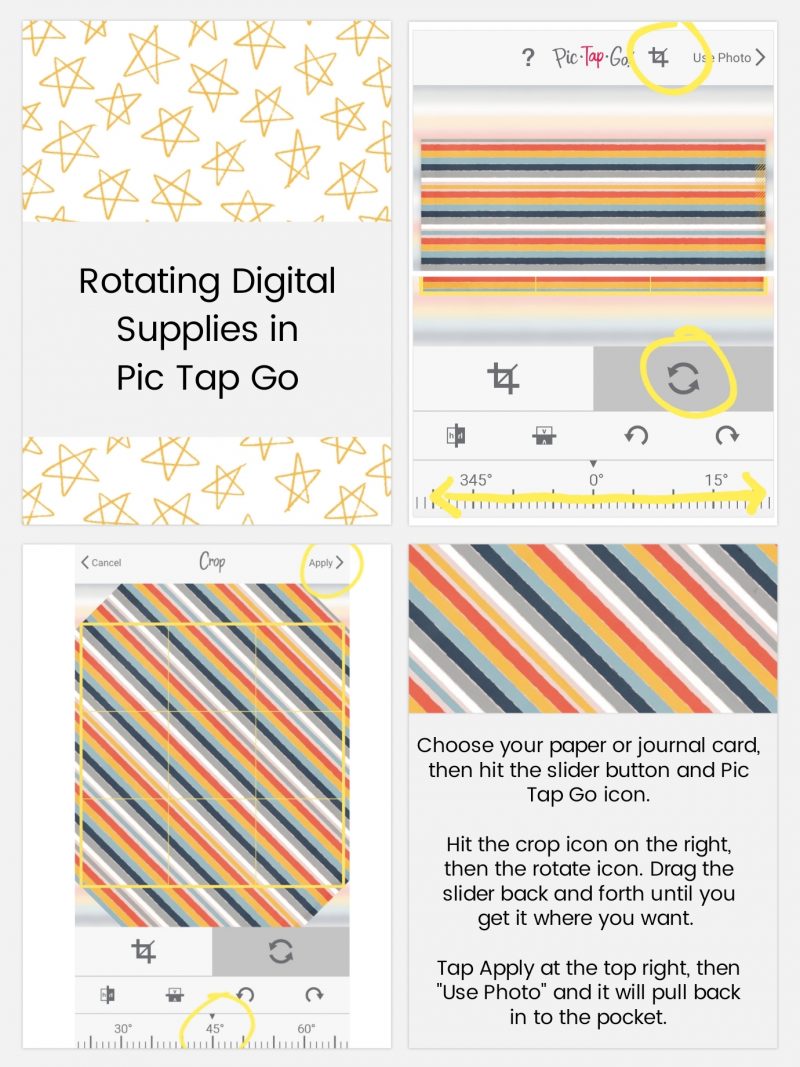
Another cool tool in PicTapGo is the rotate function. I love using patterned papers in my digital pockets, but sometimes I find that I want to tweak them a little (for instance: turning striped papers on a 45 degree angle to get a different look, etc.). Here’s a look…

[ this example layout, above, uses papers from the TDP Designer Collaboration collection Control ]

Pretty easy, right? I also made the title card (top left) using Free Form Text. It’s actually the letter “I” (two of them), rotated and stacked on top of each other (clever, right?!). Yet another reason to download the Free Form Text option.

One quick reminder — you should always back up your pages from the app. Don’t rely on the app as a way of storing your completed layouts (I learned this the hard way one time… but never again, you guys!). How to do this? Well, for myself… as soon as I’m done with a page, I export a “social sharing” copy to my phone gallery, and a 12×12 size to my Dropbox. I recommend always exporting at least the 12×12 size, even if you plan on printing at 8×8 or 10×10 — because at least you have the option to print at a bigger size later, if needed (if you save at 8×8 and decide later to print larger, you will lose quality and it’s not recommended; better to save the larger size, just in case!).

I hope this post helps you see the possibilities of using the Project Life app with your TDP goodies. If you are completely new to the Project Life app, be sure to check out the original post in the series here. The third post in the series is also a really fantastic resource, and talks about using the Project Life App and Photoshop or PSE together (which is probably my favorite way to scrap now!). I love the clean lines of pocket style layouts, with some embellishments added later to give it that little something extra.

Be sure to post your layouts that use TDP products along with the Project Life app in the gallery! We’d love to see what you come up with!

Happy Scrapping!


About the Author  Ashley is a member of The Digital Press creative team. She lives in Utah with her husband, 2 young boys, and 1 lazy (but lovable) pup. She works full-time at a busy medical clinic. She has been scrapbooking since childhood… scrapbooking digitally for 10 years… and most recently (& obsessively) app-scrapping on her phone. 
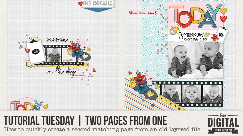
Tutorial Tuesday | Two Pages From One

Hello, and welcome to another edition of our Tutorial Tuesday series here on The Digital Press blog! Today I am excited to share with you a method for quickly creating a 2-page spread by making a second complimentary page from a page you have previously created and saved as a layered file (such as a PSD file in Photoshop).

Often, we all scrapbook pages randomly… which leaves lots of holes in our chronological gathering of pages. When we decide to compile and print a book, however, these holes really become obvious and we are left with a collection of random pages that likely don’t look as pleasing when printed side by side in a book. When it comes time to print an album, we might wish to create a second page to go next to our first page (thus creating a 2-page spread), so that when a book is opened the two consecutive pages flow nicely together.

But… what if we don’t even remember what digital kit we used to create that first page? It could take hours to sift through our digital stash to locate the right kit. This is when my technique may come in handy. Read on and see….


Basically, when I open up the layered file of a scrapbook page I’ve already created in the past, it is almost like opening up a mini kit to scrapbook with (but in this case, the shadows are already applied and maybe even clusters are already created). All of the papers and elements I used the first time are available in that layered file. Let me walk you through the process of using them to create a second page.

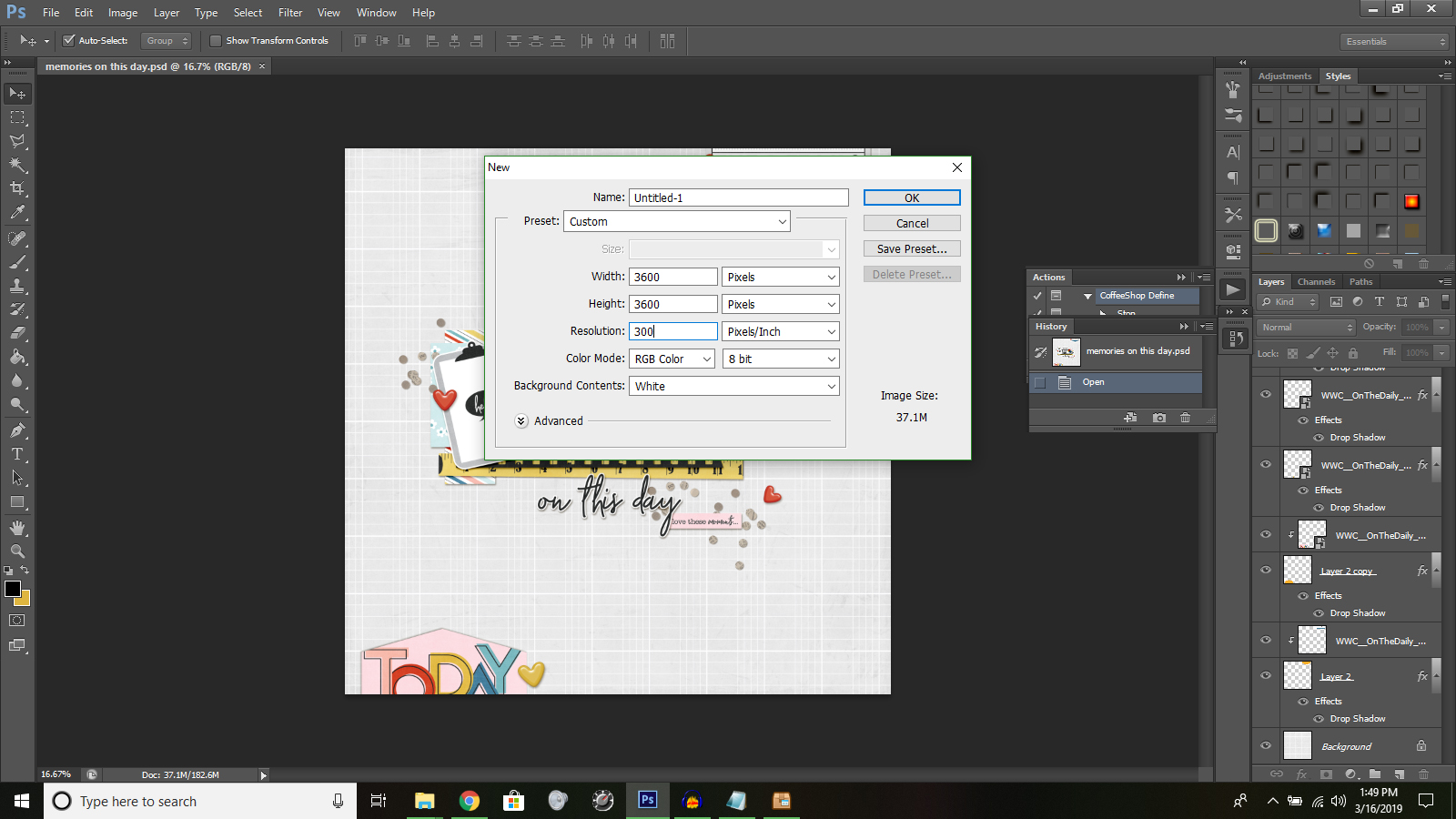
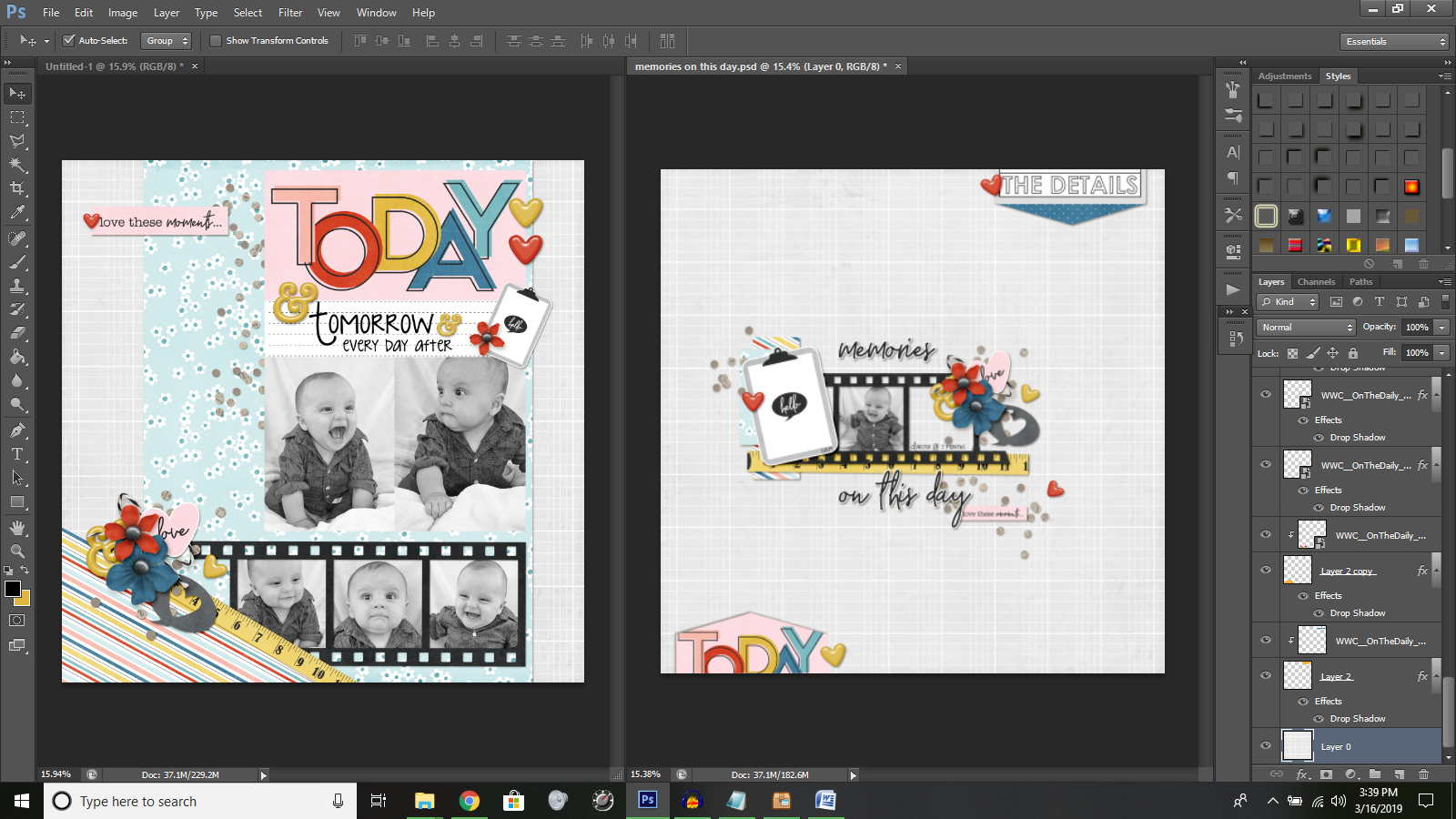
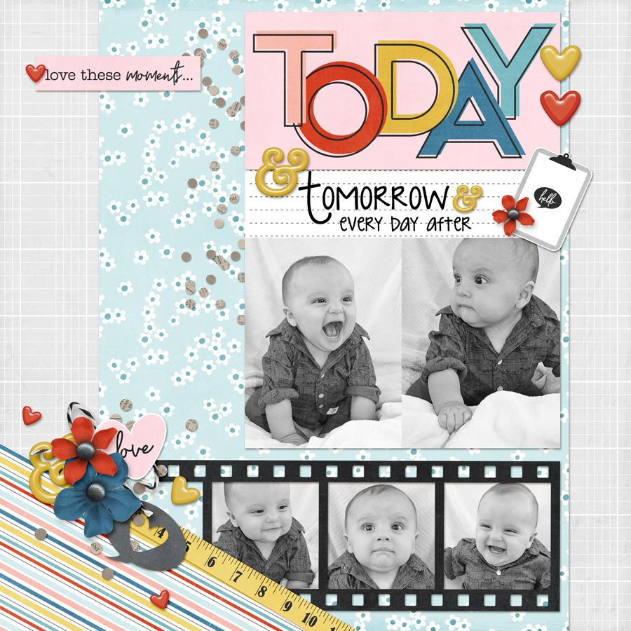
First, open the original layered file you want to use to create a second matching page (if working in Photoshop or a similar program, it will likely be a PSD or TIF file). For this tutorial I will be using a page I created using Laura Passage’s collection On The Daily, featuring my darling grandson…

Next, you’ll create a new project making sure your color mode is the same as the original (mine was created in RGB 8 bit color). You will also want to match the width, height, and resolution of the original page…

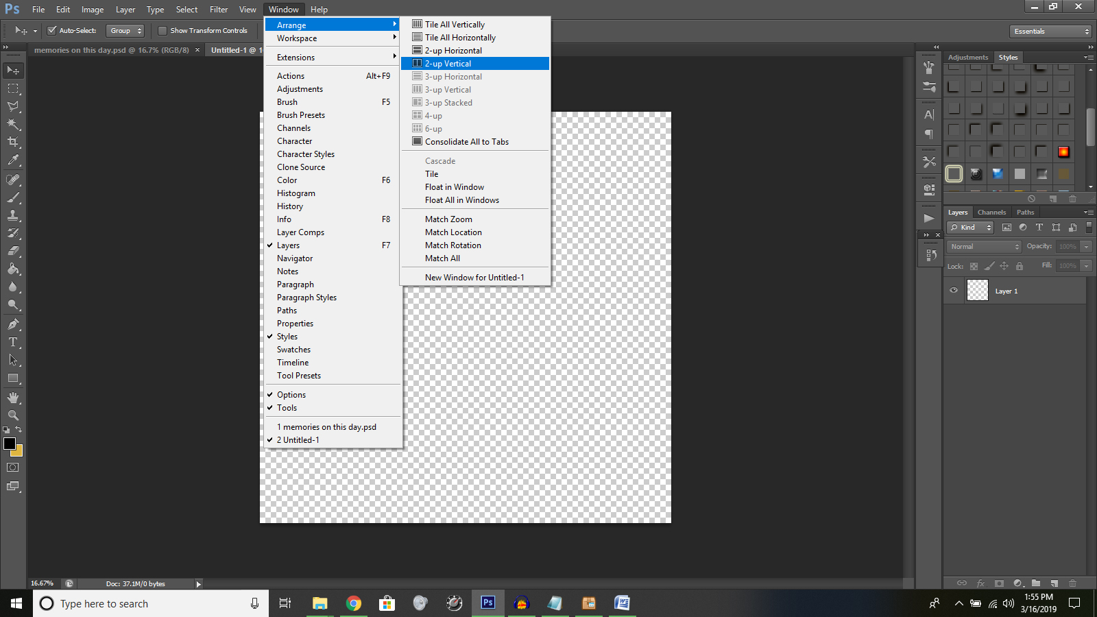
From the menu bar along the top, select Window > Arrange > 2-up Vertical. This will place your original layered page and your new transparent page side by side in Photoshop…

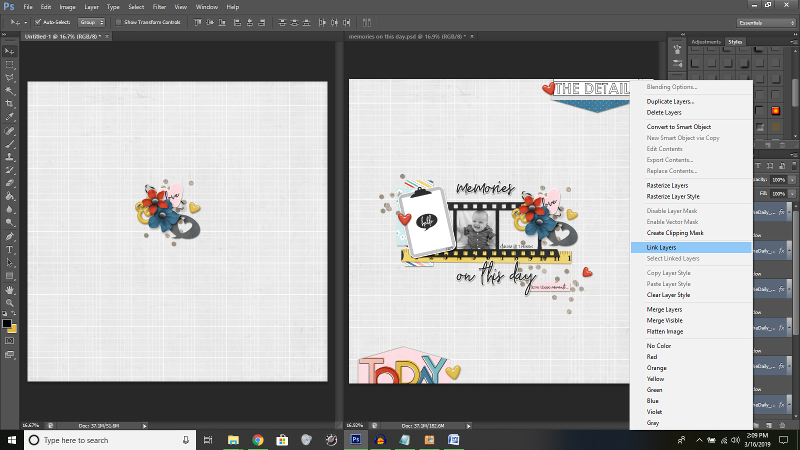
Next, click on your original layered page to make it active. Your layers palette should be visible on the right. Select one of the papers from your original page to use as the background paper for your new page (if you want to use the same background paper as the original, you may need to ‘unlock’ the paper by clicking on the word “Background” in the layers palette and allow it to be renamed; for example as “Layer 0”). Once you’ve selected a paper to use, simply click on it in the layered image and drag it over and drop it onto the new blank page next to it. Re-center the paper onto the new page as needed.

Now you can probably guess how the rest of the process goes: you will continue to select items off of the original layered page and drag-drop them onto the new page.

Another fun trick — you can select multiple items at one time and drag them to your new page together, as-is. For instance… suppose you really like a cluster you created on the original page, and you want to use it again on the new page. Well, you can select all those items together on the original page and then drag them to the new page to create that same cluster. If you want to make sure they stay together you can even “link” those layers together after dropping them onto your new page (in the layers palette you will find all the cluster items highlighted from the recent drag and drop; you can right-click the mouse and select “link layers” from the menu, and these items will now be linked together and move as a unit wherever you preposition them on the page). You can also resize the cluster items together at one time, keeping the cluster proportions the same since they are linked.

As I previously mentioned, another of the great things about this process is that the shadows you applied to the original pieces will follow over to the new page, too. This saves you a step in the time it takes to create the second matching page.

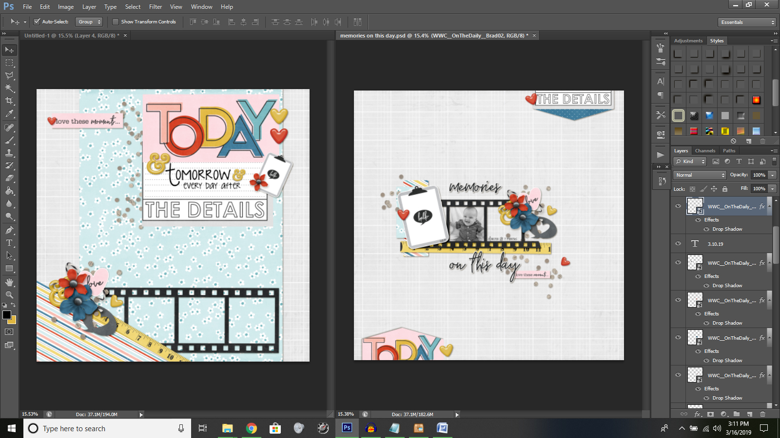
Once you are satisfied with the basic design of the page, it is time to add your photos…

Take a quick look at the page to decide if you need to add any last items or any journaling.

And… as easy as that… you have a page that nicely compliments the original!

I hope you can use some of these ideas to create some matching 2-page spreads complete your scrapbooking albums, too.


About the Author  Tiffany is a creative team member at The Digital Press and has been scrapping for over 25 years. She resides with her family in Idaho, but dreams of warmer climates. Family will likely keep her in Idaho so vacations will have to do. Her scrapbook subjects include her husband, four children, one grandson and two dogs – as well as whoever and whatever will stay put for the snap of the camera. Other things that keep her busy include teaching fitness classes at the gym and working as a hospice/home health nurse. 

Hybrid How-To | Selfie Shots in Mini Frames

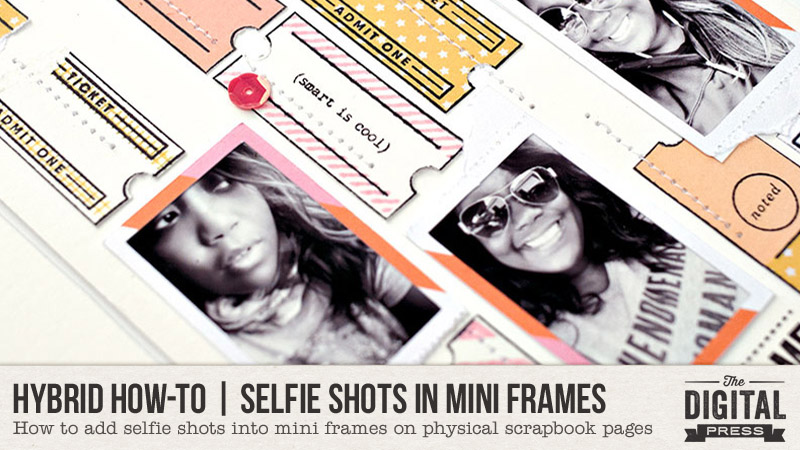
Hello everyone, and welcome to another edition of our Hybrid How-To series on The Digital Press blog! Today I am here to show you how fun and easy it is to add selfie shots into cute little mini frames on your physical scrapbooking layouts. For the purpose of this tutorial, I’m adding mine into a Traveler’s Notebook spread (so you can see how tiny they can be!)…

Before we dive into the details of this process, though, let me introduce myself! I’m Wendy Morris-Saponaro, and I’m a “seasoned” hybrid memory-keeper and super excited to be on the creative team here at The Digital Press as a hybrid artist. I’ve been a scrapbooker for about 20 years in creating for many scrapbooking manufacturer companies… from Prima Marketing to several online scrapbooking companies. Yes, long long time… within the past few years with the changes in the scrapbooking industry, I’ve leaned more to hybrid scrapbooking (using digital supplies to create physical paper layouts/projects)… and typically in the Traveler’s Notebook format. I never see my addiction ending anytime soon. HA!


First, let’s take a selfie… get ready, smile, pose….

You know you are as guilty as myself in grabbing your phone, which is pretty much always glued in your hand, to snap that necessary selfie before picking up the fork and knife, jumping on this-or-that ride, or standing in front of a landmark sign… right? My husband would have his fair share on comments for my selfie shots that consist of about 20 takes before I pick only one from the batch that I like. Ha!

Let’s dive into a few ways that you can use your never-ending stream of phone camera selfies and incorporate them into your next digital or hybrid scrapbook layout…

Browse Through All Those Selfies

You might be amazed at how many selfie photos are sitting on your phone that you are planning to scrapbook but never print out. In selecting my photos, I browsed through my iPhone (i.e. “solo” selfie, selfies with others, etc.). The auto Selfies folder on the iPhone is a great jumpstart to see what is sorted there to select photos.

I use an Epson XP-6000 printer, and I just arranged my chosen photos in a collage format on a 4×6 photo sheet in the Epson app… and then printed out my top three choices. Don’t be afraid to use duplicate photos if they are your favorites. Just do you! Ha!

Also, to add, my two-page layout is a Traveler’s Notebook-sized spread, so I was focusing on selfies that would fit a vertical style for the flow of layout. You could easily adapt to a horizontal format, however, if that is your preference.

Frame it Up

I’ll give you a helpful clue… you’ll want to look for a collection over at The Digital Press that has photo frames in the kit…

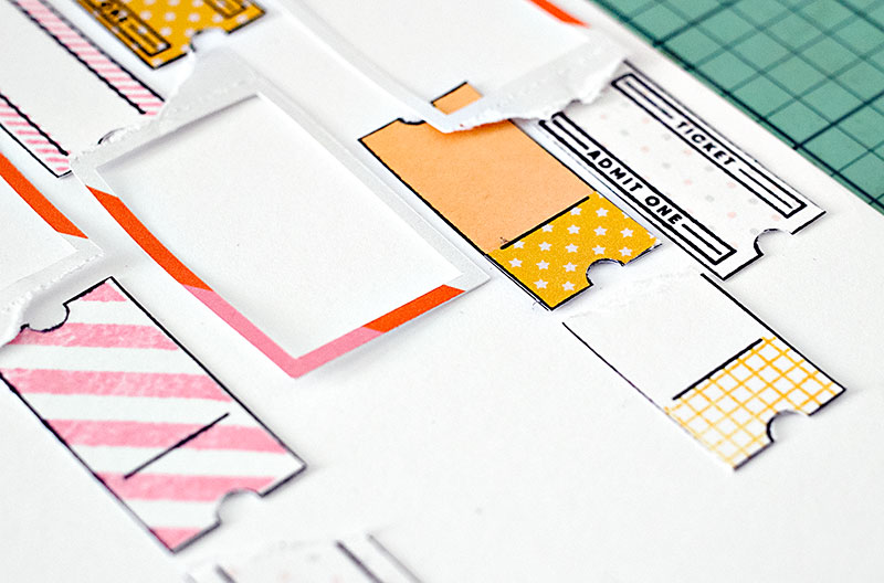
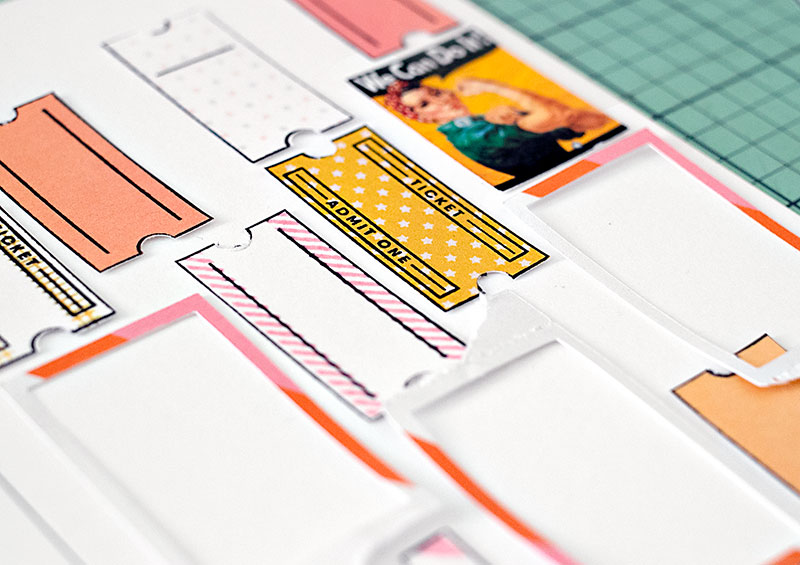
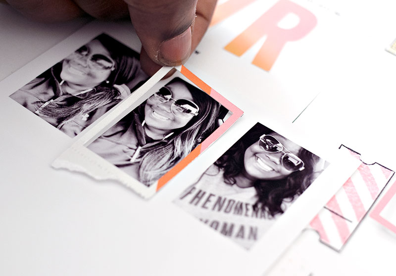
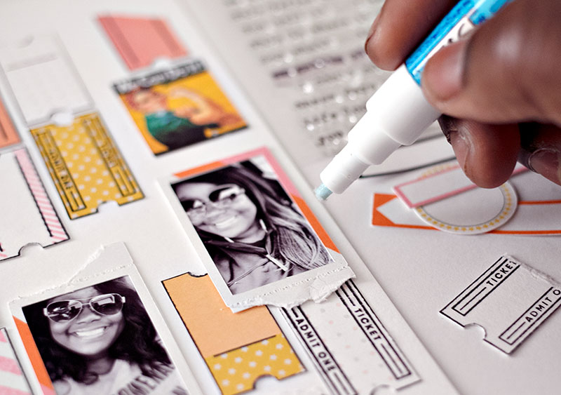
I chose the GRL PWR Kit from ninigoesdigi for my layout. The photo frames in the package of elements from the kit were just perfect for framing my selfie photos. I used the Cricut Design Space software to re-size the photo frames to a mini version. Then, I used my Canon printer and Cricut Explore Air 2 to “print and cut” the frames to the perfect size for my photos, as shown here…

When you choose to print your digital papers, elements, and journal cards, the awesome thing is that you can re-size things to a preference for the size of your project.

As a hybrid artist, I love this ability to customize the digital elements to the size needed for my project!

As you can see, above, I grabbed up some of the items from the elements pack in the kit to print and add as fun bits here and there.

Compliments that Pack the Punch

As you will usually find in 99.9% of my layouts, I use stamping as a compliment to “telling the story” around my photos. I have MANY stamps (no shame in that)! HA! I used some stamps to compliment around the theme of ‘girl power’ in my layout, as shown in the next couple of images…

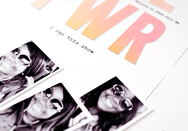
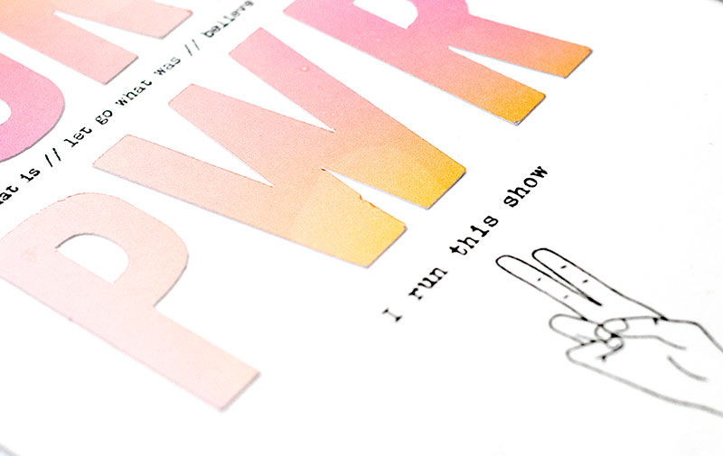
Also, as a fun touch, I love the ombre effect to the paper in the GRL PWR Kit …and the letters “GRL PWR” (shown below) were already in the ombre effect in the elements pack. I wanted that bold effect of the letters as the title…

Then, I accented the title with stamped phrases and wording here and there.

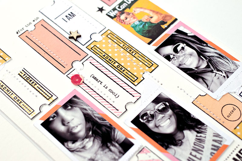
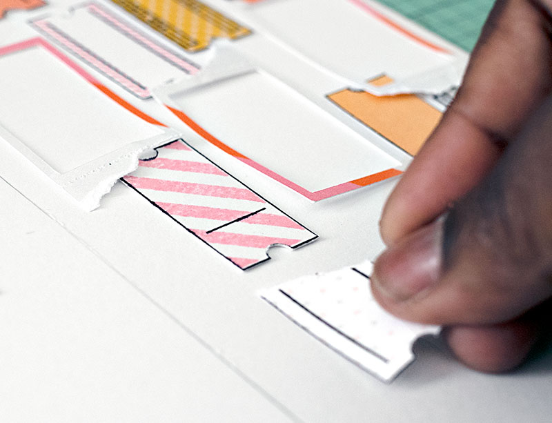
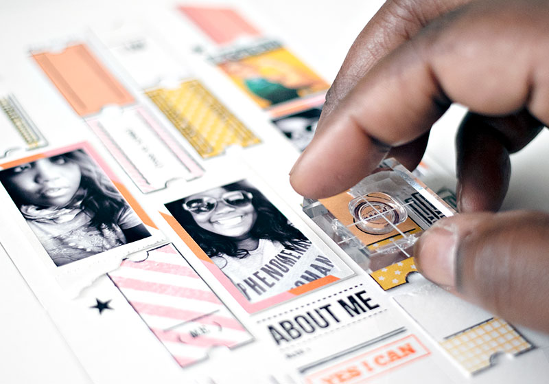
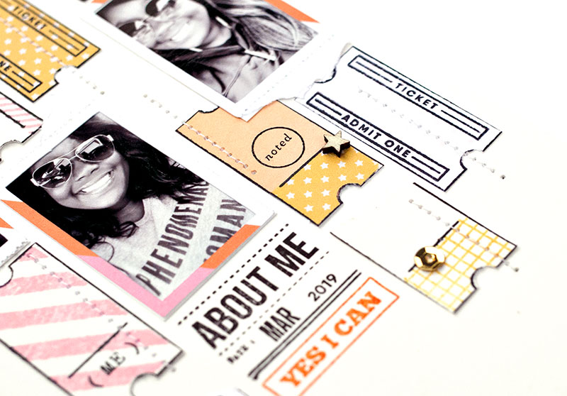
I also used a ticket stub stamp…

…and I even added bits of patterned paper from the GRL PWR Kit to some of the ticket stubs as accents and to add variety.

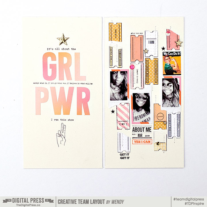
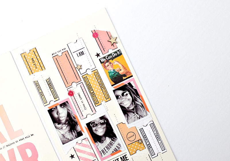
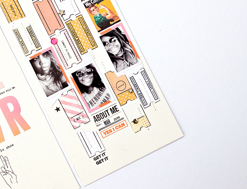
Here’s a look at the overall effect on the right side page of my finished layout…

Isn’t it a fun project?

I challenge YOU to look through your phone and grab up a few selfies to scrapbook, also — either in digital or a hybrid format. Share with me your thoughts in the comments section of this post after trying out my tips for inspiration.


About the Author  Wendy has a strong passion for the arts, lots of creative spirit, and is fearless in working with new products and techniques. During the day, she works full-time as an Audit Manager. Wendy and her family live on the Gulf coast of emerald waters in Navarre, Florida. Her husband is from Italy and is an amazing Executive Chef at an Italian restaurant in Navarre. Her daughter is a Yorkie named Principessa. Wendy has over 20 years of experience in the scrapbooking industry. She has been published several times in print and online scrapbook magazines, and has designed for several manufacturer’s creative teams. Wendy is currently designing for The Digital Press as a hybrid artist.