When I’m looking to make a successful composition in a photograph, one of my go-to tactics is to use the Rule of Thirds to find a place to put my focus of interest. But, with the rise of the square format in recent years, I’ve been looking for alternative ideas and it struck me that, with the dominance of the square format in scrapbooking, that these ideas can apply in my other hobby too.
Apparently, when we look at a image in landscape orientation, we scan from left-to-right. If the image is portrait, we scan from top-to-bottom. Because of this, it can be advantageous to put elements in the image (or layout) on the right for landscape and towards the bottom for portrait. This stops the gaze travelling out the other side of the image and on to something else! But in a square image, the eye is much more likely to move in a circle around the image, this means that we don’t have to worry so much about the viewer wandering off, but it means that we have to think about how we guide the viewer around the frame or page in a slightly different way. It can sometimes have the effect of making the image less dynamic. Depending on our intent, that can be useful – or it might be something we need to counteract.
So, what are we trying to achieve? We need to work out what the focus of our layout is. Often it’s the photograph itself, but it could be the journalling, the title-work or even a part of the photograph if we’re using a large image. Once we know that, we can use the papers and elements to guide our viewer around the layout to finally arrive at our focal point.
Let’s look at some examples from The Digital Press’ Creative Team:
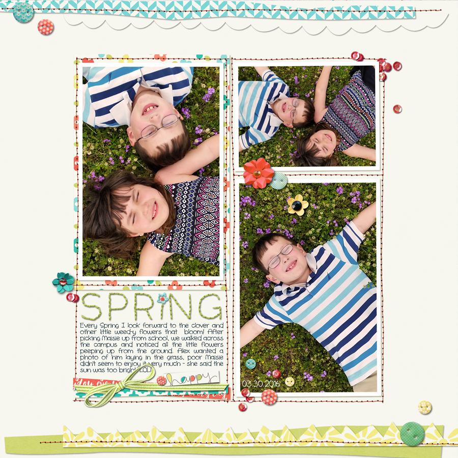
In this layout, Arielle has used a frame within the layout to effectively turn a square layout into a more dynamic rectangle.
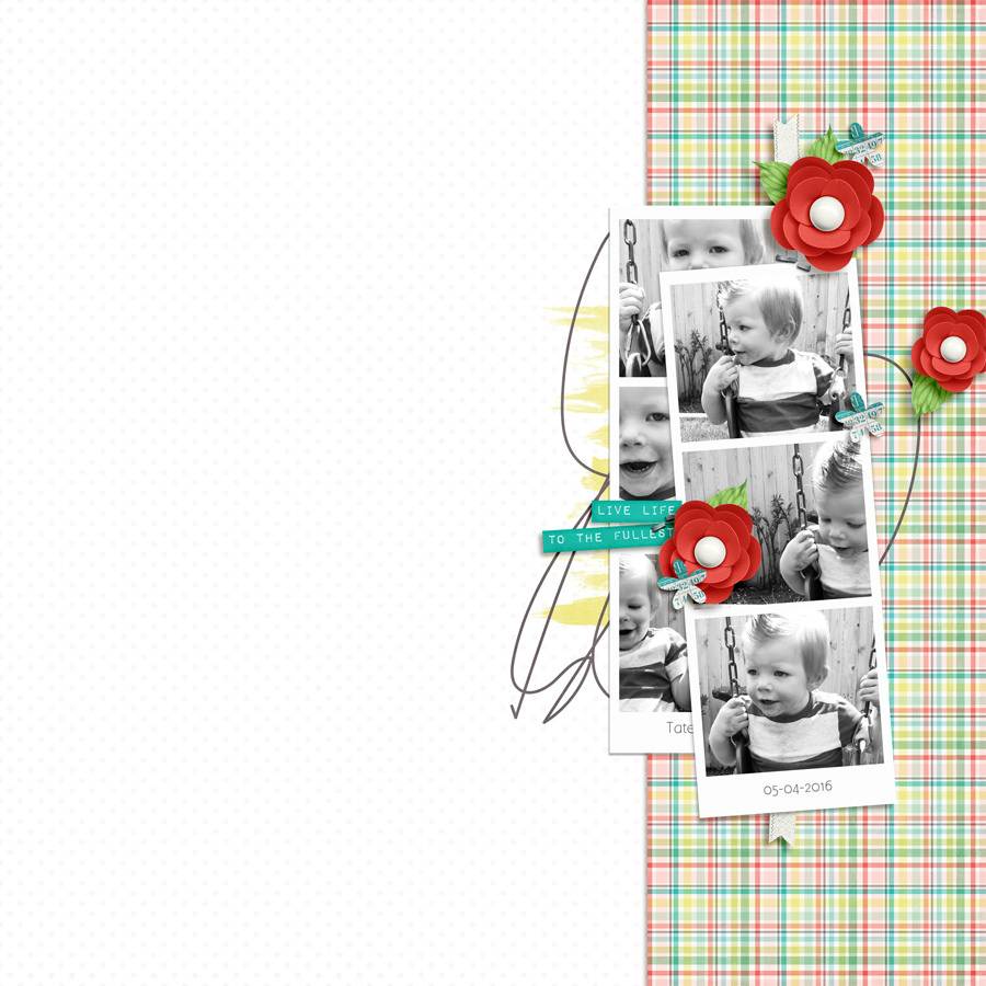
Next, Hillary’s use of strong rectangles results again, in a dynamic composition where we scan down the page and then back up to focus on the adorable photos. The brights reds of the repeated flowers contrast against the more subtle colours of the rest of the layout to ensure that we’re focussing on the most important part of the page.
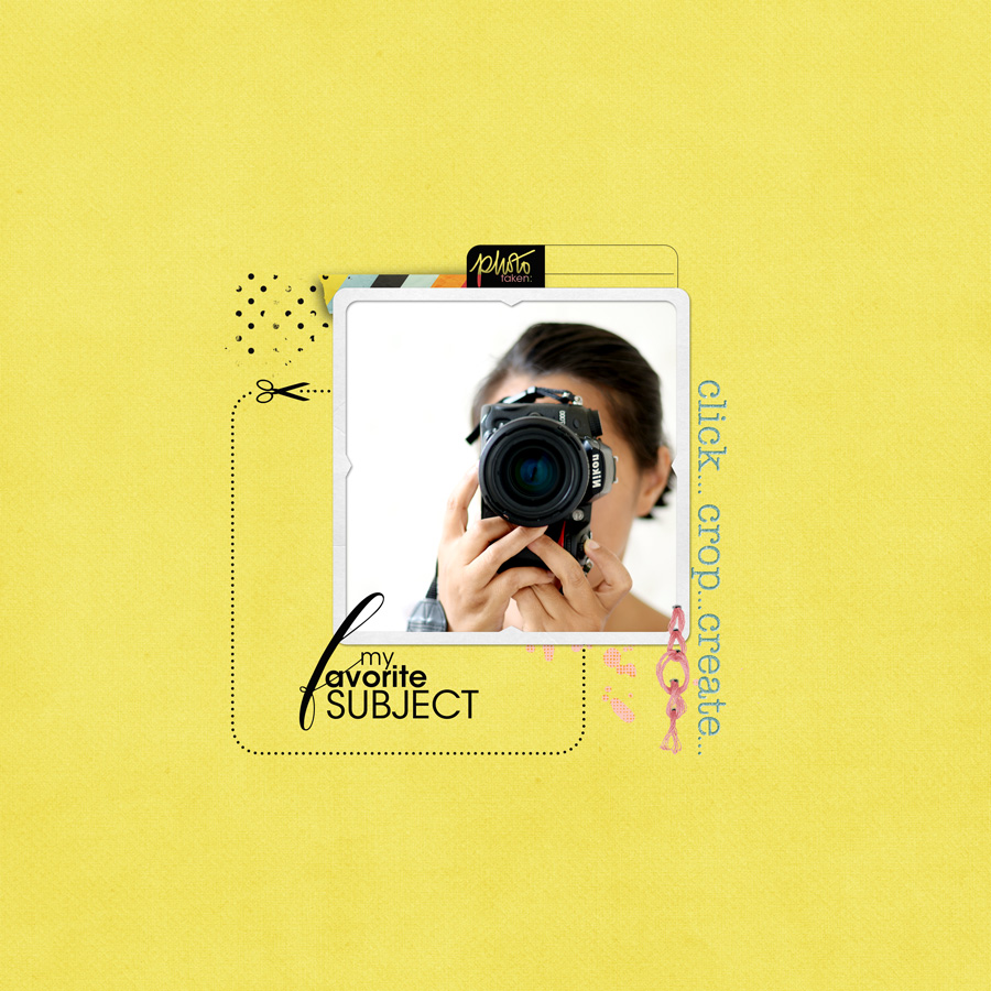
This layout from Bao, shows clearly the calming effect of placing the focal point in the centre. Her subtle use of color and minimalist design reinforces that feeling.
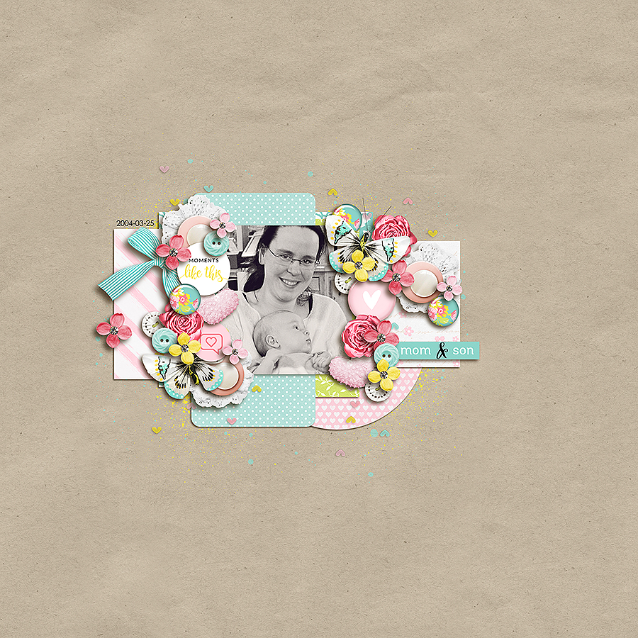
Biancka has a rectangle within her square frame, but in this layout, her positioning of her papers and elements have, along with the white space around them, defined the area without need for an actual frame or mat.
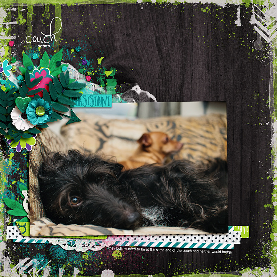
When using a larger photo, it can be sometimes harder to define where the focal point of the layout should be. Rae has used the face of her lovely dog and the elements around the edge draw my eye in a circle in to connect with his gaze.
Of course, one of the best things about scrapbooking is that we can use all these rules to give us a starting point, we can adhere to them strictly or we can ignore them completely and do whatever makes us happy! It’s worth stepping away from your layout for a while though. You’ll come back with fresh eyes and when you open it up again, think about how your eye travels around the layout and see if you can move anything around to guide the viewer to exactly where you want them to look.
![]() About the Author Jude is part of the creative team here at The Digital Press. She lives in the UK with her husband and two fantastic girls. She loves traveling, and would be off in her campervan every weekend if she could get away with it. She loves time spent exploring new places, trying new experiences and photographing them! She also spends too much time on the computer, and still doesn’t go running as often as she says she’s going to.
About the Author Jude is part of the creative team here at The Digital Press. She lives in the UK with her husband and two fantastic girls. She loves traveling, and would be off in her campervan every weekend if she could get away with it. She loves time spent exploring new places, trying new experiences and photographing them! She also spends too much time on the computer, and still doesn’t go running as often as she says she’s going to.
