How far have you been come with your New Year’s resolutions? If you made it to today, you pretty much left the danger zone. The first 21 days of the new year will show if we will make it or break it. I set a resolution, that I will try something new in my creative realm at least once a week. If this wasn’t your resolution, don’t worry. I hope after you read this tutorial you WANT to try something new.
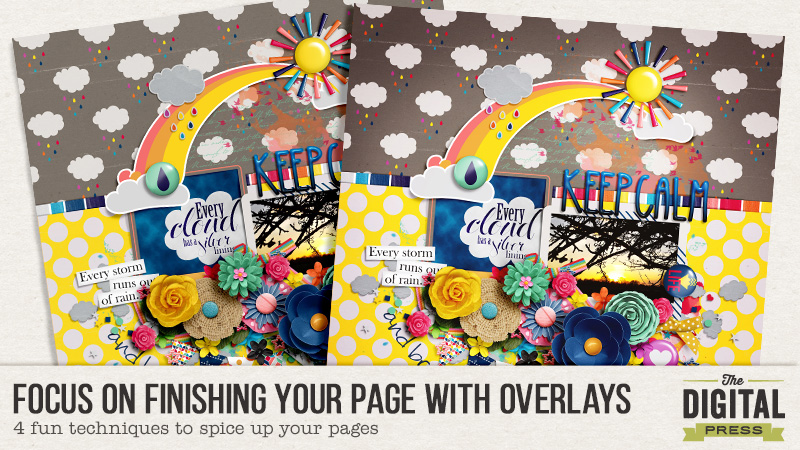
You wouldn’t believe how detailed I can become when it comes to finishing my page. I can spend up to a quarter of my scrapping time with finishing details AFTER I completed my page embellishing. I often tweak my shadows until there is nothing but custom shadows left on my page items. I can show you how I do this in my next tutorial. Today I will narrate a bit about my other obsession: Overlays on the whole page. They come in various colors and benefits. I will show you how I use color and gradient overlays, blended textures and photo actions for my page finish. This usually doesn’t take me that long. It can be pretty fast once you know how to do it.
Color Overlays
Color overlays can create a special mood on your page like vintage, fresh, clear, girly, dreamy… whatever you think fits. It can also help in gaining color consistency, especially when you draw elements from different kits with different tones or shades.
In short how you do it: Go to the top of your layers panel, 1. click on the adjustment layer icon and on 2. Solid Color. The color picker dialog opens and you 3. chose a hue and your 4. tone or shade (more to that later). Then 5. set your blending mode to overlay or soft light, opacity 8-15%. You can always play with blend modes or opacity, hue, saturation and brightness to your liking. 6. You can always change your color by double clicking on the layer color.
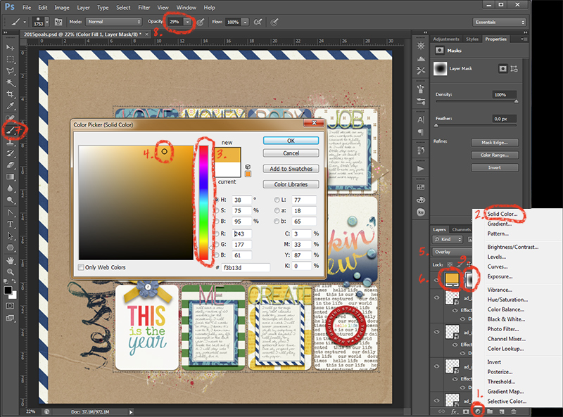
Depending on the color you chose, you will get different effects. For a vintage effect, use an orange hue. Sometimes a deep purple will work like that as well. For freshness, use the hue spectrum from green to blue. If you want it hazy, use the screen or lighten blend mode. Of course you can always take the effect away from parts of the page when you mask it out. 7. Use a soft brush on the layer mask 8. with 20-30% opacity and turn the foreground color to black before you 9. partially hide the layer by brushing into the layermask. With all overlays I usually go very subtle. Someone looking at the layout will most likely not notice the overlay although the mood that is created is noticeable.
Gradient Overlays
The effects of gradient overlays are pretty similar to the color overlays. You can create a little more movement on your page when you use them like a color overlay. I usually apply them to make the page seem more like a real paper page. What you do here is to make the parts of your page that are close to the virtual light brighter and the other parts darker.
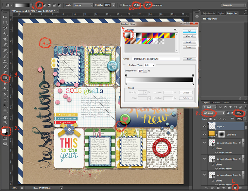
1. Create a new layer on top and 2. choose white as your foreground color. 3. Click on the gradient tool in your toolbox. It’s housed with the paint bucket tool. 4. Choose the first gradient in the list and use the 5. linear gradient with 6. Dither and Transparency checked. Before you drag the gradient out, be sure to know where the shadow on your page falls. This is the side where the page has to get darker. 7. Drag your gradient line from the virtual light source of the page to the side where the shadow falls. 8. Set the blend mode to Soft Light and opacity to about 30%. You can always change the gradient later by using the gradient tool again. Play around with the gradient and the blend mode settings.
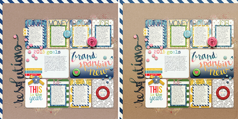
Here you see the difference it makes. I used two color overlays, both masked off for a gradient effect without using the gradient tool. Plus the black and white gradient overlay. The page feel is sunnier and has a little more dynamic with the lighter/darker effect of the gradient.
Textures
If you really want to play around and try something a little weird, use textures. You can get free textures everywhere on the internet. Of course you can also buy them. Just google „photo textures“. Your digital scrap stash might be handy as a texture provider as well. Pretty patterns or worn paper textures may work. Or you create some textures by yourself. Use your camera and try it out!
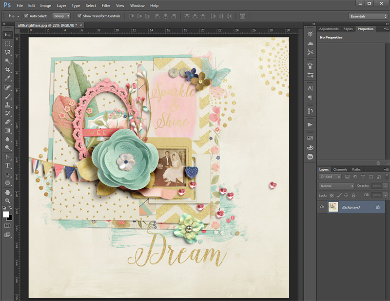
I will show you how I used two photos I shot myself on the following layout.
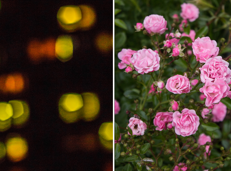
One with roses, one with something I shot when I got bored at a party. I just photographed the windows of the house across at night. For blending a texture in, the photo doesn’t have to be perfect in any way. You can get creative here!
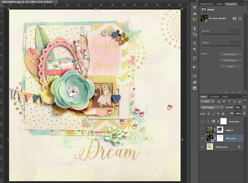
I layered the bokeh shot on the layout with blend mode Color Dodge at 40% opacity. The difference is very subtle. It’s just a little added dreaminess. It’s most visible on the large blue flower.
The roses were a little trickier. I used blend mode Hard Light at 12% Opacity plus an adjustment layer Hue/Saturation, colorize checked with an orange hue and lot of lightness. You don’t have to remember these settings! Play around with the settings on your page until you get something you like. Use what comes to your mind to get the look you want.
You can mask out the texture partly. Pick a color of the overlay (at Normal blend mode 100% Opacity), that will blend like a neutral to your overlay photo (you have to try before) and paint it in to the parts where you want no texture. If your brush won’t paint on your picture, you have to rasterize it first (right mouseclick on the picture layer → rasterize layer). You see how my layer icon of the roses look when I painted a blend-neutral color in. On my page you can see how the roses blend in on the edges of the cluster but leave the cluster itself like it was before because of the green I painted in. Textures can be used widely and wildly, especially on art journaling pages.
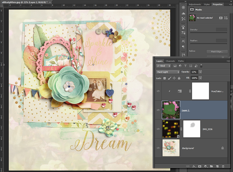
Photo Actions
Photo actions are also available on the internet. You can buy them but there are lots of free samples out there as well. With an action you can get special effects and bring in a mood with one click. This is like a color overlay, only much more elaborate and with more features available. The action does it all for you. I bought several action sets that I really love and use them frequently in my photography. With some of the actions you can also enhance your finished layout. Usually it’s better to save and flatten your image to a jpg first. There’s a whole science to getting your actions installed, just google „install actions on *insert software version* *insert system*“ (for me it’s ps cs6 windows) and you will get the help you need. Be sure to check whether the action is suitable for your software and system.
Every action set works differently, only the start is usually the same. 1. Go to your actions palette (also via Window → Actions) and 2. click on the action you want and the 3. play button. Let the action be played. Sometimes prompts come up. Just follow them. You will see a new group or several layers in your layers panel when it’s finished. 4. You can now play with the layers until you get the result you like.
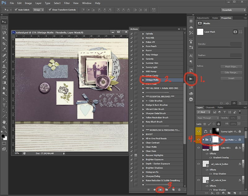
I tend to use any vintage, matte or hazy action. Sometimes even sunbursts are available. I use them, too. To not overwhelm the page, I take the action layers back a lot. I want it subtle. You may have noticed that I locked the layers of my overlays in this screenshot. I often do that when I want to change something on the layout after I applied my overlays. This way I can access the layers beneath with auto select.
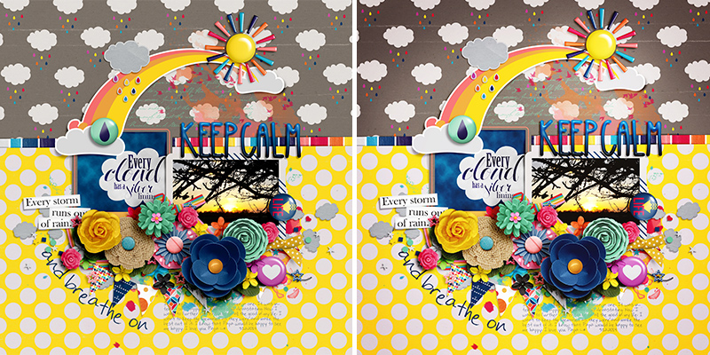
Here I share with you one last example of before and after. First one without an action, the right one with an action that has some features in it like enhancing saturation and contrast and adding a vignette with a brown hue.
I hope your brain is burning by now and it’s not only because it was a lot to cover here, but you feel inclined to try any of these suggestions. You would make me and other readers so happy when you show us your layouts with overlays. What comes easy for you, what makes you crazy, I take it all 
Other than that, have a great day!
 About the Author: Alina enjoys sitting in front of her large computer screens too much. Apart from that she loves walking her dog and watching sunsets while being amazed of life in general. She is married to her best friend. Tries to manage the needs of her two cats and her dog and badly fails when they all want their cuddle time at once. Everything else is scrapping, taking photos and currently crafting. Having said that, she needs a bigger craft room.

Wow, so many new things to try! Great tutorial. I’m pinning this to come back to again. Thanks!
Thank you so much, Shayla! Let us see your outcome
WOW. Now I know why your pages are so amazing. What an awesome tutorial, Alina.
Oh, thank you, Pamie! What an honor to hear that from you