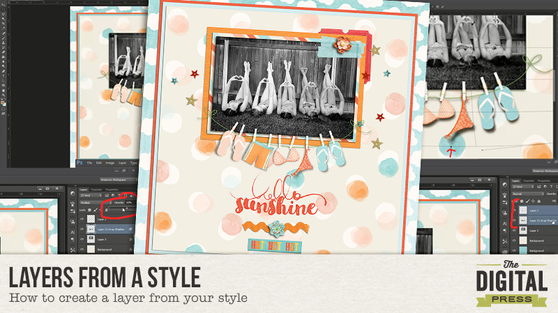
Heidi here with a quick tip when using your styles. Today we are going to use our shadows style to give them a little dimension. Have you ever looked at a layout and saw the shadow for an item going in different directions not just the typical 120 degrees? Do you wonder how it was done? Well, I am going to walk you through a simple way to achieve that.
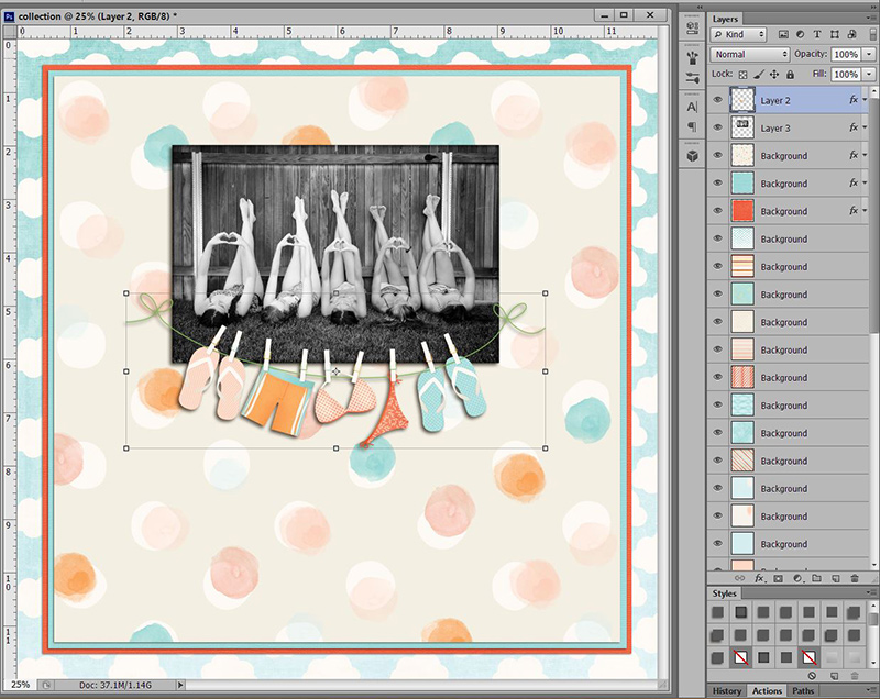
First thing you want to do is add your shadow style to your layer. I added the shadow to the banner. Notice that the entire banner’s shadow is going 45 degrees…as the style tells it to.
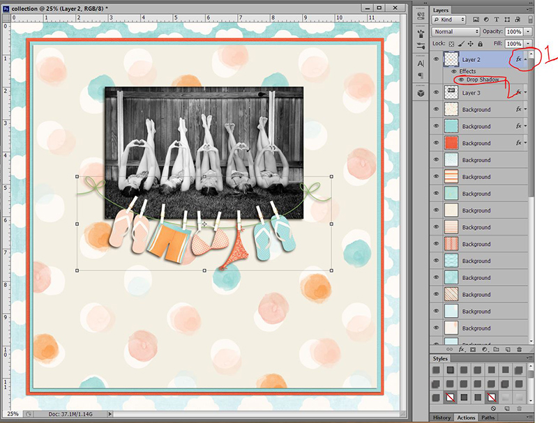
Next, you are going to make your shadow show by clicking on the arrow next to the “fx” (#1). If you have applied any other styles to your item, they will show up here. I have only applied a shadow style. Place your mouse over “drop shadow” and right click (#2).
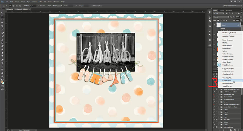
You will see a long list of things you can choose from … go down to the bottom and click “create layer” (#3).
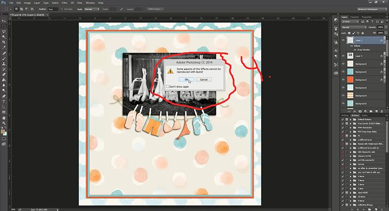
You will probably get a pop up box asking if you are sure you want to do this, click ok.
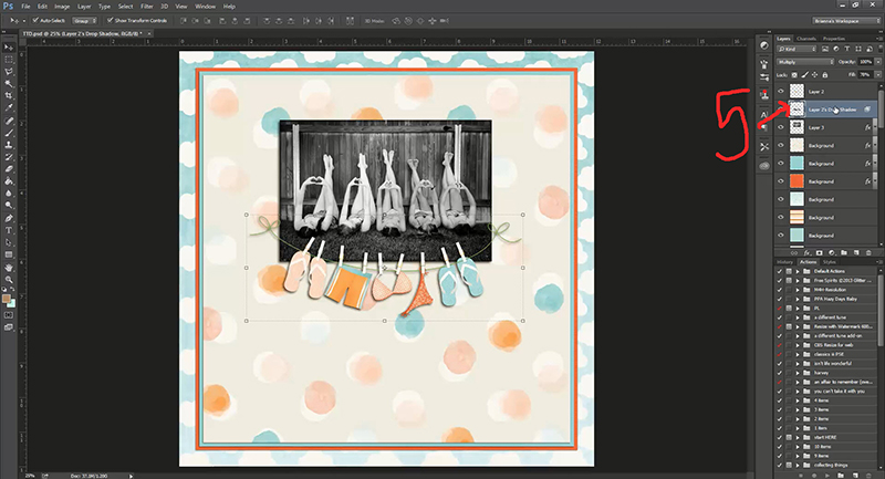
Look in your layers, do you see how your shadow is now a separate layer? It is no longer a style.
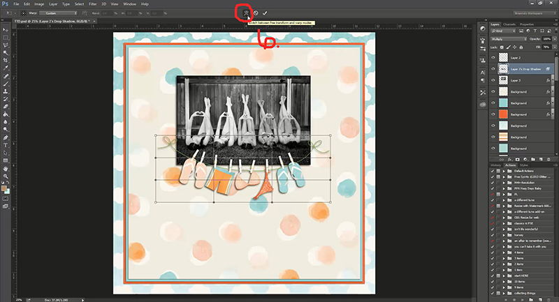
Make sure your shadow layer is highlighted (it should automatically already be highlighted when you created a layer.) and hit “control t”. Look up at the top of photoshop and you will see 3 “buttons” pop up. You want to select the one I have circled #6 Free transform/warp control.
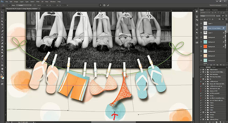
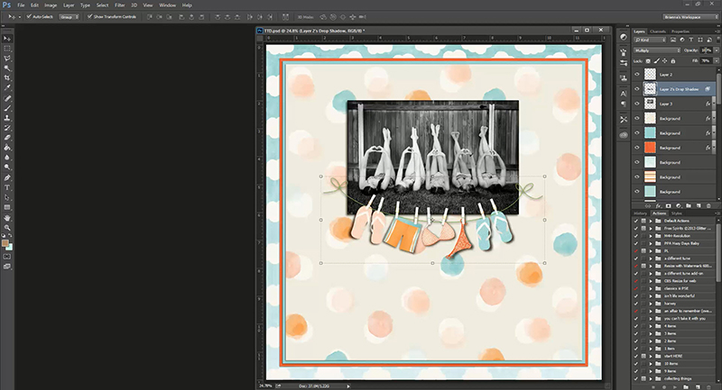
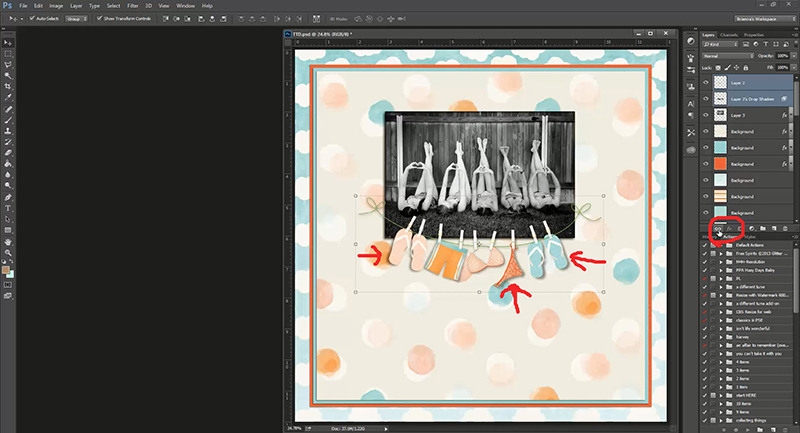
Notice how the banner has a grid over it? That grid will allow you to move specific parts of your shadow. See my small red arrow at the bottom of the picture? That is where I placed my mouse and slightly pulled the shadow down. See how the bikini bottom shadow is now going the opposite direction I originally put it? Remember, my shadow style was 45 degrees … I just pulled the shadow layer -45, or down and to the right. But also notice that it moves the WHOLE shadow. The closer you are to where the mouse is located when I move my layer, the more the shadow will move. The farther away you are from the mouse, the less the shadow layer will move. Notice how the left blue flip flop’s shadow is a little bigger than the right? That is because the left flip flop is closer to where my mouse is moving the shadow layer.
Now it is just a matter of playing with the layer. It will take practice!!! Even while creating the shadow for this layer, it took me a couple of tries. If you really mess up, go back to the top and hit the circle with the line through it. It won’t save what you have done and put your shadow layer back to it’s original state. Hit “control t” again and start fresh. A little movement goes a long way. My main focus was the bikini bottom. Once I got that looking how I wanted (the shadow going the opposite direction of the pink flip flops), I went through and adjusted the other items. The bikini top was really off, so I had to carefully adjust that, go back and adjust the bikini bottom and so on.
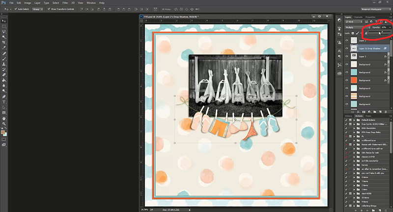
This was my finished product. Now looking at this, I really don’t like how harsh my shadow is. So making sure my shadow layer is still highlighted, I went up to my opacity and turned it down until I liked the softened look.
Once you like what you have done with you shadow, highlight the layers of both the object and the shadow of the object (my banner and my banner’s shadow).
Find your link button (circled in red below) and click it. This is a really important step!! If for some reason you need to move your banner, your shadow will move with it. If you don’t link it, then just your banner will move and the shadow will stay behind. Also, make sure you do not put anything in-between your item layer and your shadow layer. I do not like to merge my layers in case I need to go back and tweek my shadow once I have finished my layout. If I do need to tweek my shadow, you will need to un-link the layers. Otherwise, your transform button won’t work.
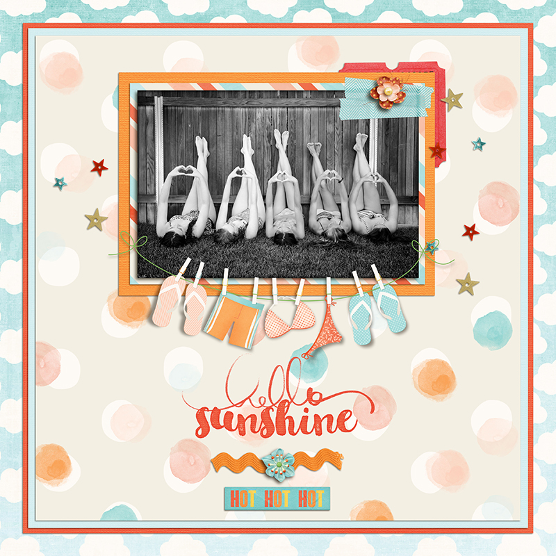
Notice the direction of the shadow of the pink flip flops and the blue flip flops? The are going opposite directions … you can’t achieve that with just using a shadow style. You now have a banner that is a little more realistic … like it is blowing in the wind. 🙂 You can use this method to pull your paper shadow out a little bit to make the paper look bumpy or crinkled, make a corner of a banner rolled up, etc. Use your imagination!
Let’s see you try this tutorial … join us in the forum!
About the Author: Heidi has been scrapping for 17 years. Her passions include dark chocolate, photography of her family and reading Christian fiction. When not doing one of these activities, she can be found working at an elementary school library or enjoying being a SAHM.



Great tutorial — I wish I had CS. Can this be done in PSE? I have version 12
Oh, I just saw the tutorial list for the month …. I’ll check back on the 9th! Thanks!
I just scheduled that blog post Pam- I too use PSE12 so check back- but like Erin said- there’s some good info in the Summer School Forum!
Pam, also check in the forums on the sixth in the Summer School Section. There just might be something there that helps. 😉
Pam, yes, I use this in PSE12, but I have an action that puts the shadow on its own layer. There is another way to do it too. https://www.youtube.com/watch?v=zTzd9NyIGm0
You can duplicate the element layer without a shadow, go to hue/saturation and take the saturation down all the way, maybe darken it some, give it a slight blur, then put it below your element. Then you can transform it with Image/Transform shape/Distort.