Have you been drawn to a piece of art and wondered what is it about that particular piece that you love over any other? There are lots of reasons why you might be attracted, but the most likely reason is in the subconscious. Sometimes you’re drawn in by things you can’t quite put your finger on. It’s all about composition!
In photography, it’s not just what you shoot that counts – the way that you shoot it is also important. Poor photo composition can make a beautiful subject look boring, but with a little thought, you can create a wonderful image from the most ordinary of situations. Don’t feel that you’ve got to remember every rule and apply them to every photo you take. Instead, spend a little time getting familiar with each one one of them individually and they’ll become second nature. You’ll soon learn to spot situations where the different rules can be applied to the best effect.
Here are the top rules of composition to think about:
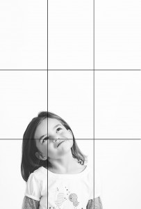
- Rule of Thirds – probably the most common rule you’ll hear about from photographers. Imagine that your image is divided into nine equal segments by two vertical and two horizontal lines. Try to position the most important elements in your scene along these lines, at the points where the imaginary lines intersect. This will add balance and interest.
- Balance – Placing your main subject off-center, as with the Rule of Thirds, creates a more interesting composition, but it can leave a void in the scene, which can make it feel empty. Try to balance the weight of your subject by including another object of lesser importance in the empty space.
- Leading Lines – When we look at a photo, our eye is naturally drawn along lines. By thinking about how you place lines in your composition, you can affect the way the viewer sees the image, pulling them into the scene and towards the subject. This gives the viewer a virtual journey through the scene.
- Viewpoint – The viewpoint has a tremendous impact on the composition of a photo. As a result it can greatly affect the message that the photo conveys. Rather than just shooting from eye level, consider shooting from high above, down low, from one side or the other, from afar, or close up.
- Background – The eye is great at distinguishing between different elements in a scene, but a camera will naturally flatten the image into a two-dimensional image. Pay attention to what is in the background, and try shooting at a wider aperture to add dimension to the scene.
- Symmetry and Pattern – We are surrounded by symmetry and patterns, both in nature and man-made. They can make for very eye-catching compositions, particularly in situations where they are not expected. Another great idea is to break up the symmetry or pattern with your subject to create tension or a focal point in the scene.
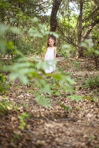
- Depth – Depth can be created in a photo by including objects in the foreground, middle ground, and background. Another way to create depth is by overlapping or deliberately obscure part of an object, in focus, or out of focus. Either way, the viewer will naturally recognize an overlap and mentally separate the layers, creating more depth.
- Framing – Sometimes, we all need a boundary. By using natural frames, such as trees, archways, or holes, you can isolate your subject and focus the main point of interest.
- Cropping – The crop of your photo can greatly change the mood of your overall image. An image at full crop can give the viewer a sense of the whole scene, while cropping in tight will result in the undivided attention on the subject. Don’t be afraid to fill the frame with your subject.
- Breaking the rules through experimentation – now that you know the rules, you can practice each of them and find situations in which each will work the best. You can also experiment and try new things. Try combining them, making your own, or throwing them all out of the window! It’s really about personal preference and having fun!
Here are a few examples of the rules above:


The challenge is to make a new layout using a photo that follows one of the first NINE composition rules above
Now, for the rules…
- Pages must be created using 100% TDP Products and loaded in the gallery no later than midnight EST on February 28, 2015.
- Please link your gallery listing in this thread: CHALLENGE
- Link your comment in this thread in the monthly challenge tracker thread. You can find it here: February’s Tracking Thread.
- Have fun!!!
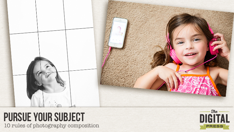
For my LO, I’ve decided to go with “fill the frame” I LOVE close-ups of my kids’ eyes and this one is no exception. I used Scotty Girl’s All Geared Up kit.
 About the Author: Farrah Jobling is a member of the Creative Team here at The Digital Press. She lives in Denver with her amazing family, Mike, Nicholas (8), Claire (5) and Hope (7 mo puppy). She works from home as a photographer and enjoys scrapping her personal photos.


One comment