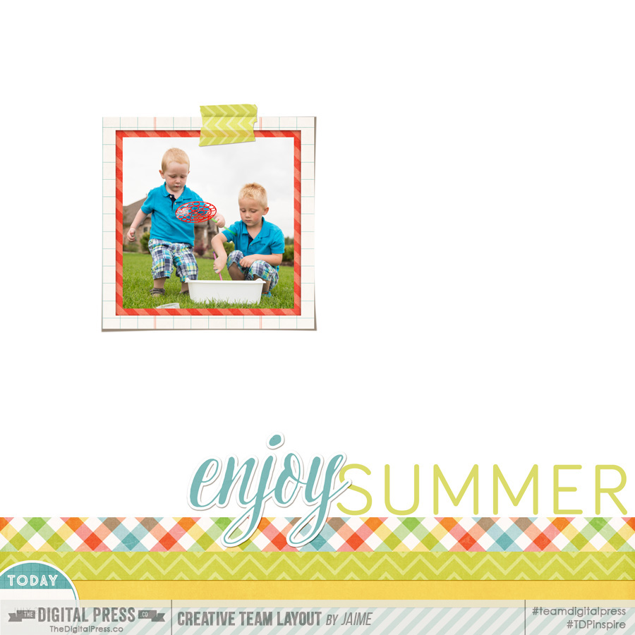
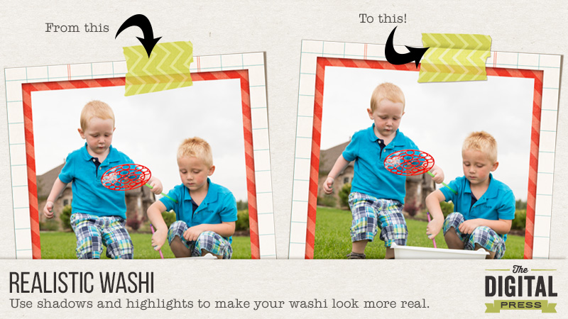
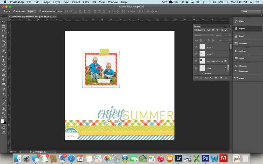
Washi tape is probably one of my very favorite elements to scrap with. I love it both in real life and in digital form. In this tutorial, I’m going to show you how to use shadows and highlights to make your washi tape look a bit more realistic on your layouts. I’m going to use this layout below. I have everything finished on it, and the washi placed. The only thing left to do is add shadows to the washi tape. You can see here that it just looks a little flat with no realistic dimension.
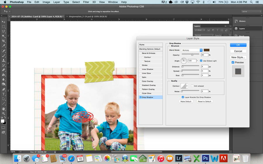
- First, add a basic drop shadow to the washi tape. The settings below are what I used, but use whatever suits your preference. I typically prefer a small shadow on washi tape, because if you look at a piece of real washi tape on paper, it doesn’t come off of the paper much. There’s not a lot of shadow there.
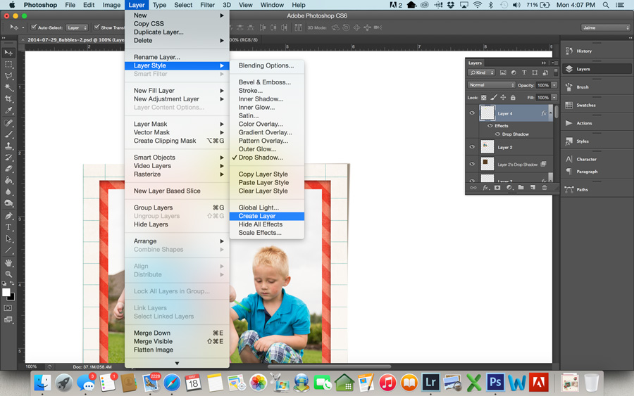
- Now, we’re going to put this shadow on its own layer. To do this, go to Layer>Layer Style>Create Layer. This will put the drop shadow on its own layer below the washi tape.
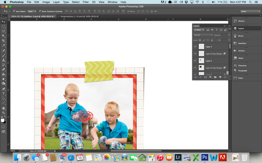
- Even this shadow makes the washi look better than it did, but the shadow darkened the washi tape. I like to preserve the transparency of the tape. To do this, load a selection of your washi tape layer by using Command-click (or Control-click for Windows) on the tape layer in the layers palette. This should give you marching ants around your tape. Now click on the shadow layer in the layers palette, and hit delete (make sure you are on the shadow layer before hitting delete… this is important). This will delete the shadow that sits directly beneath your tape and bring back the transparency of the tape. (You can use a layer mask if you’d rather not permanently delete it, but I never have wished I had it back, so I just go ahead and delete.)
- Command-d (or Control-d on Windows) will deselect the tape.
I think this looks good, and you can stop here if you like. I have left my tape with a basic shadow like this sometimes when I am trying to save time and get a page done. If you want to take it one step further to make the washi tape really look like it’s stuck on your page, follow the steps below.
- First, you need to select the item the tape is holding down. In my layout, it’s the framed photo of my boys. Command-click that layer in the layers palette to load a selection.
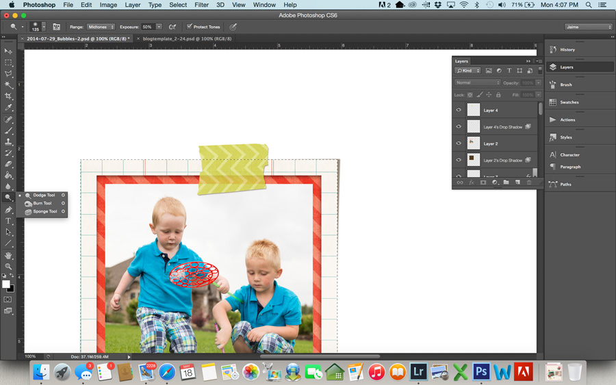
- Next, select the dodge tool from your tool bar. At the top of your screen, you want a soft brush that’s big enough to brush over the bottom part of the tape covering the photo. For this particular page, I used a brush size of 125. Set your range to Midtones and the Exposure to around 50%. You may need to play around with this exposure depending on the specific tape and how dark or light it is. Most of the time 50% works pretty well.
- Make sure your washi tape layer is selected in the layers palette on the right, and brush over the tape 2-3 times. This highlights the part of the tape that is “stuck” to the photo.
- If you think about pressing a piece of tape over a photo in real life, it’s going to leave a little crease where photo meets the background page. In this next step, we’ll create this look digitally.
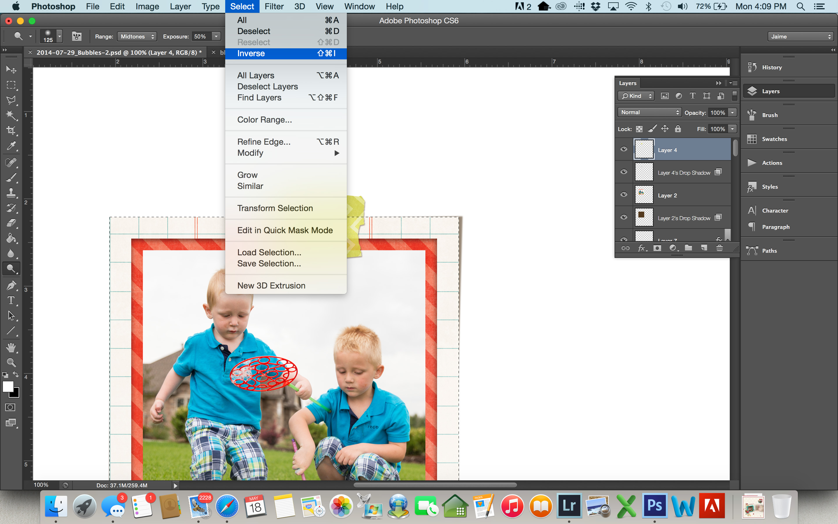
- Your frame selection should still be loaded (meaning you have marching ants around your frame). If it’s not, select it again. But now we want the tape that outside of the frame area, so we’re going to select the inverse of what is currently selected. To do this, go to Select>Inverse. It won’t look any different, but now everything except the frame is selected.
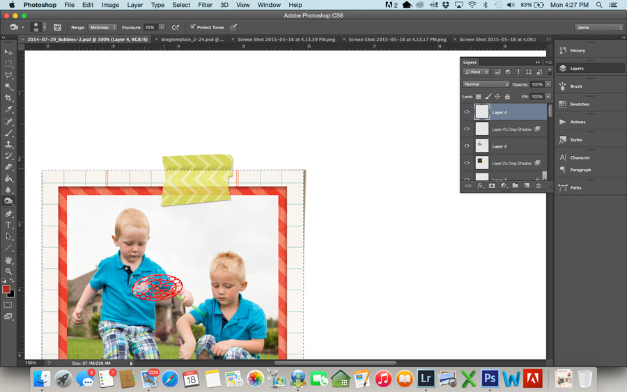
- We’re going to use the Burn tool to add some shadows to the top part of the tape where it is “sticking” to the page. Select the burn tool from the toolbar.
- This time you want a pretty small brush… just big enough to shadow the tape right at the edge of the photo. I used a brush of size 35, and for this particular tape I set my exposure to 25%. If the shadow isn’t as dark as you like, you may want to change this to 50%. Use the burn tool on your washi a few times along the edge of your selection, until the shadow is as dark as you want it.
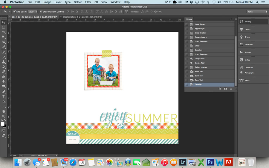
- Command-D to get rid of your selection, and you can see the end result.
Here’s a look at the final layout:
 About the Author: Jaime is a member of the creative team here at The Digital Press. She is a stay-at-home mom to 4 boys and 1 girl. When she’s not chauffeuring, volunteering at school, or helping with play costumes, she likes to digitally record her family’s memories, improve her photography skills, and read (there’s always a stack of books on her nightstand).


Thank you so much for these great tips. Love knowing how to remove the shadow from just the washi tape (or other transparent element) in addition to make the washi tape look more realistic!
Thanks for the great tutorial! I will definitely try this tip. 🙂
Thank you for this information. I was just trying doing something similar the other day and wasn’t sure what I wanted to do.
Can the initial removal of the shadow behind the washi tape be done in PSE?
In the older versions it wasn’t doable in PSE. I’m not up to date with the newer versions. I can show you a way around it. It’s in my tutorial with the tucked in photos. Quote: “Create a shadow for your photo (on a separate layer)
…
For PSE users: ctrl/cmd+click on the layer icon to get the marching ants around the photo → Select → Modify → Feather → 10px. Create a new layer beneath the photo and fill the selection with a dark gray, brown or simply black. Deselect the selection with ctrl/cmd+d. Nudge the shadow to the side where you need it. In my example I left it pretty much where it was. For a deeper shadow simply copy the shadow layer (ctrl/cmd+j) and maybe decrease opacity of the upper shadow layer when needed. Link the photo, frame, clipping mask and shadow together.”
The 10px might be too wide for the washi. Try 5px or less instead. Here is the full tutorial: http://www.thedigitalpress.co/tuck-it-in-hide-your-photo-corners-under-paper/