Hello, everyone, and Happy Friday! Today, we are a week away from Christmas… and there is so much going on! The festive spirit is in the air, and here at The Digital Press we haven’t slowed down in quite a while! First came Digital Scrapbooking Day (DSD) in early-November… and then came our site’s 1st birthday celebration at the end of November… which immediately morphed into our 12 Days of December blog series during the first half of this month… and now we are already thinking about what to do next year!
Our theme this month at TDP has been that of “Simplification” — which immediately made me think about ways to simplify our memory-keeping. The answer came quite easily — going back to basics! For me, that meant turning to the focal point of my memory keeping — the photos (and the story I tell via those photos). We all know that old saying about a picture being worth a thousand words.
To get going with this idea of simplifying things by focusing on my photos, I am going to share a few layouts I made to illustrate my point.
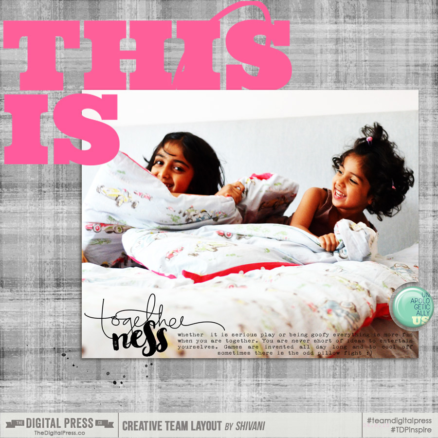
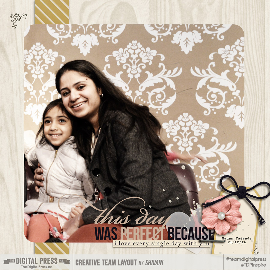
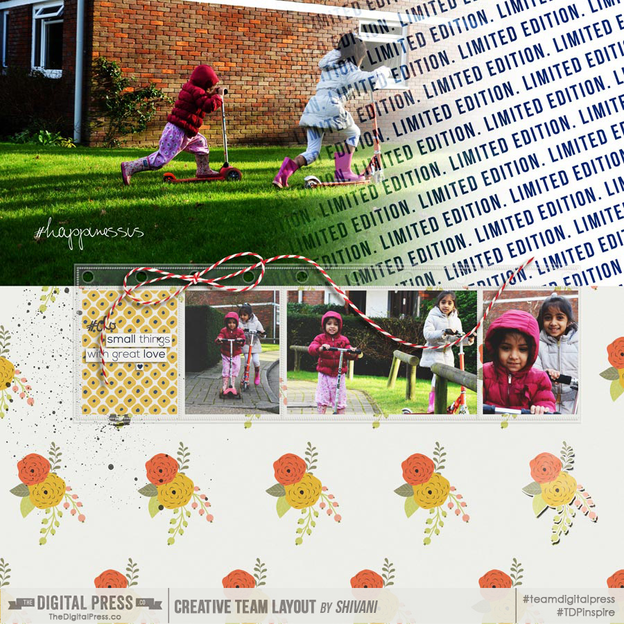
1. Go Big! When I have good photos (oh, those rare occasions when I’m not critical of that shot I took!)… I do like to show them off. It is a simple way to simplify the page design by focusing on the gorgeous photos. Go big, and let them have the glory they deserve.
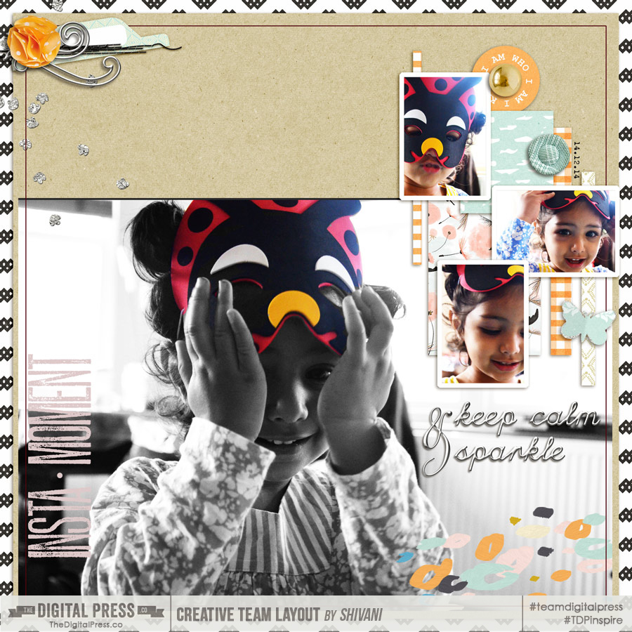
2. Go big, but don’t lose the details. Here, I have used a big photo but also captured a bit of detail with the addition of smaller photos. It’s the best of both worlds!
3. Sequence This is my favourite method when I like to show a bit of movement and give an inkling of what’s been going on. A series of different shots can read like a story; you can see the variations and enjoy them, whilst being fully aware of the theme. Cropping the photos cleverly can also help show movement, as shown in this layout:
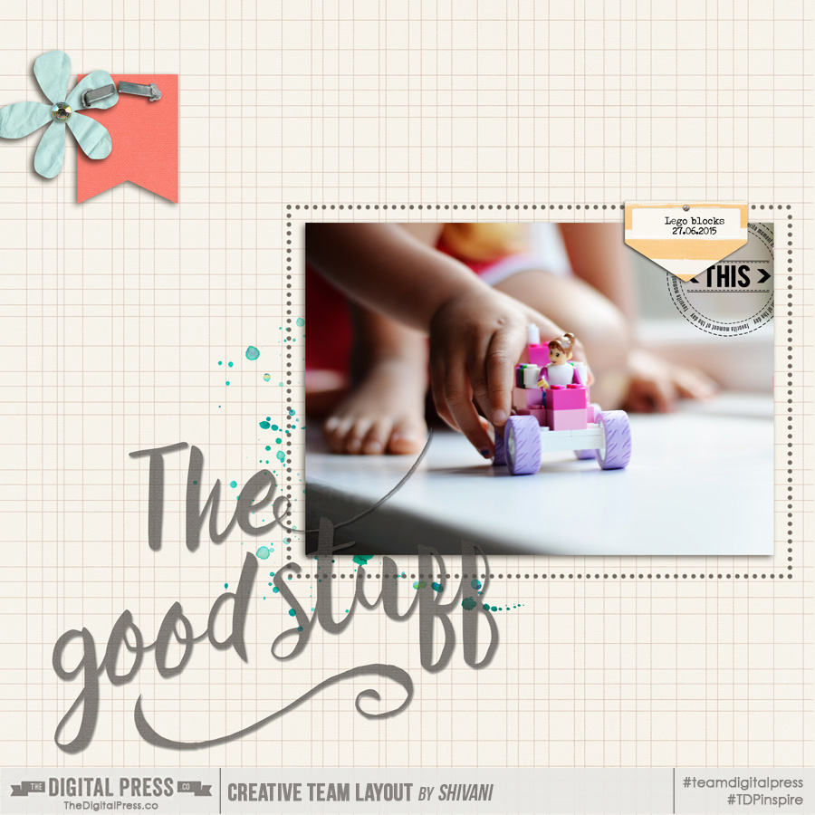
4. Unique perspective This is all about using a different angle or detail, rather than going traditional:
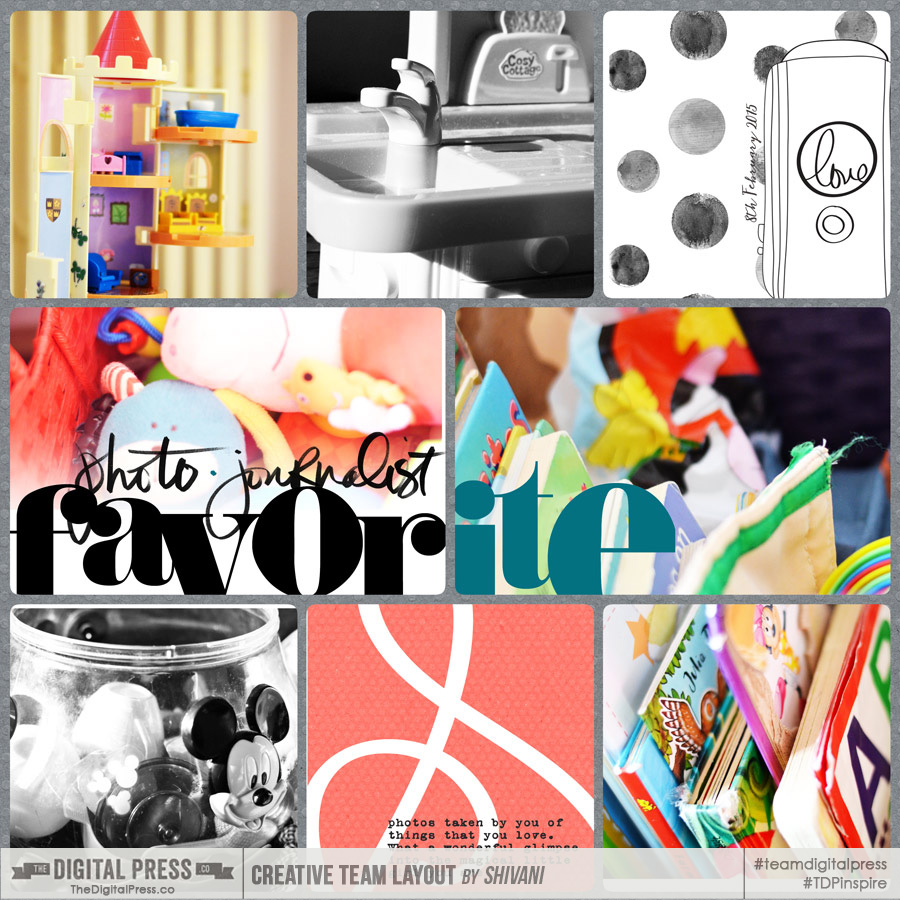
5. Inanimate How about capturing the inanimate things around us? They can tell a story just as well as any portraits. Some of my favourite things to scrap are my kids’ toys. Here’s a look at a layout with shots that my daughter took of her toys:
As you can see, there is a common theme in all of these layouts: each one focuses on the photos. Embellishing is quite toned down, and instead each one is more likely to include a piece of word art or two, or a catchy title. This helps put a context to the layout, allowing the photo itself to captures the memory and tell the story.
So, that’s it… my tuppence worth of thoughts. Hopefully it gives you some great ideas… because I have just the challenge for you! Come to the forum to check it out here; I can’t wait to see some of your own layouts based on these ideas!
And as always… enjoy scrapping, and may the creative spirit be always with you! 🙂
About the author Shivani Sohal is a donner of many alter-egos. A finance professional by day in busy London, she morphs into a normal mum of two in the evenings and weekends. She is constantly found with her fingers in too many pies and juggling the metaphorical balls. That is living on the edge for her; aided by the two ankle biters and a darling hubby who define the warm and mushy for her. She is ferociously dedicated to memory keeping – almost immune to any nay-sayers (or equally disruptive crying children or annoying house fires!!!);keeping her head down and forging ahead at all times.
