Hello everyone! Today I’m here with you on the blog to go over some of the basics of using text boxes, while also exploring some of the lesser-known functions. I will also share some thoughts on how journaling doesn’t always need to be about documentingsomething; it can very well be simply used as a design element.
I will be demonstrating the methods shown in today’s tutorial in Photoshop Elements 11 (PSE11); the information should translate very similarly to other versions of PSE and/or to Photoshop (PS) itself.
So… let’s get started!
1. Using a basic rectangular text box
Choose the text type tool on your tools panel and draw the boundary of the size of the text box that you would like. Once you have done that, you will see the flashing point of the cursor inside the box. Any text you add will be automatically wrapped to fit the boundaries of this box.
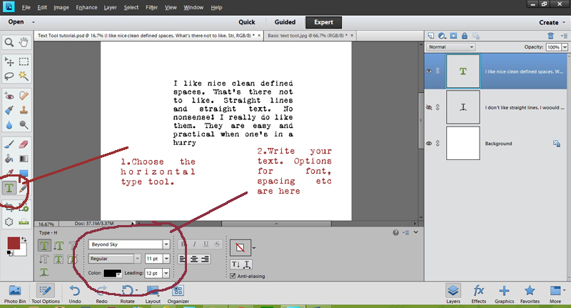
Re-sizing: Once you start your journaling, you may realize that you need more (or less) space that you initially thought when you created the text box. Fear not! Simply drag the diagonal corner of the box outward or inwards to the desired size. Note that the default settings in PSE will either make the text smaller or larger to fit proportionally into the newly-sized text box. You will simply need to change the font size back to what it was originally… and then carry on!
2. Adding a bit of flair to the text box
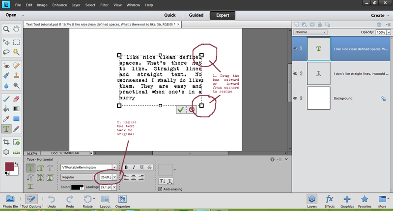
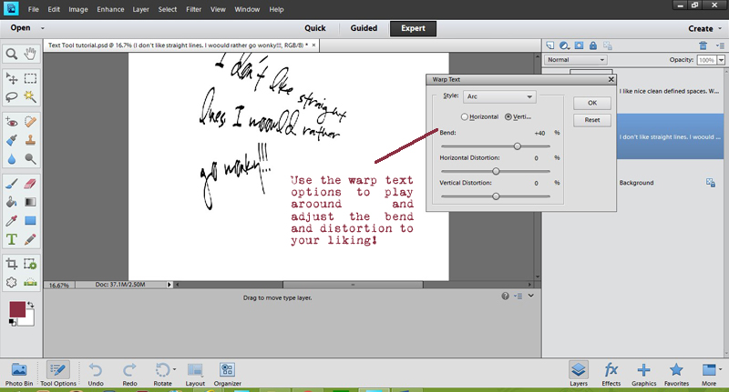
Imagine that you don’t want your text box to be nice and clean (straight lines, etc.). There are some very simple ways to add a bit of a ‘zing’! Consider the warp text tool; it changes the shape of the box (and in the process, the text within it) to create some very unique results. What better way to add some playfulness to your layouts!
3. Using other shapes as text boxes
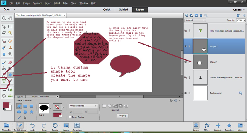
Text does not have to be limited to the rectangular or square shapes; we can use other custom shapes too. There are many ways to do this… one of which is to actually create a path that follows your shape. Not all versions of PSE have this capability, however, so I came up with a “hack” that allows you to create a faux-text-path, of sorts. 🙂
To do this… choose the shape you want to use, put it onto your page (temporarily), and then with the text type tool selected… follow the same steps as described above. Because the text is on a separate layer from the text, you can approximate the shape you chose with the text itself. Then, once the underlying shape is hidden (something you can do by clicking the “eye” shape to the “off” position in the right-hand layers palette area)… you will have an interesting shape of journaled text…
4. Using Text as a design element
Another way in which text boxes can be used is as a design element. There are quite a few ways to do it. Repeating captions or phrases in an interesting shape, warping text to fit in with the design of the layout, blending it with the photo, etc.
I’ve created a few examples for you here. In the first layout shown below, I have used the text “on a shape” option to write a few phrases in a circular path. Copying this multiple times and nesting the circles within each gives a nice effect…
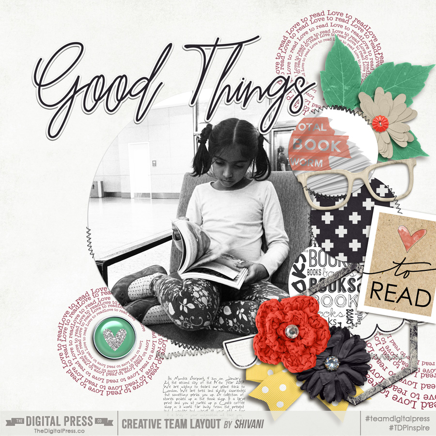
In this second layout, I have followed he same approach… but instead, I merged all the various text in the shape of the heart and blended it with the background…
As you can see, there are lots of uses for the text box… and fun little tricks you can use to open up its many possibilities and realize the many different ways it can be put to use. If you try some of these tricks or your own, please share your finished project with us in TDP’s gallery!
‘Till next time… keep scrapping and keep sharing. 🙂
![]()
About the Author Shivani Sohal is a donner of many alter-egos. A finance professional by day in busy London, she morphs into a seemingly normal mum of two in the evenings and weekends. She is constantly found with her fingers in too many pies and juggling the metaphorical balls. That is living on the edge for her; aided by the two ankle biters and a darling hubby who define the warm and mushy for her. She is ferociously dedicated to memory keeping — almost immune to any nay-sayers (or equally-disruptive crying children or annoying house fires!); keeping her head down and forging ahead at all times.


This is great. I have never used the text watp tool so gonna be interesting to play around with it
I love learning new ideas, Thank you.
Glad you liked it!
Hi Maggie, Same here. I stumbled on it while I was preparing this tutorial. Its amazing how you can discover little things like these 🙂