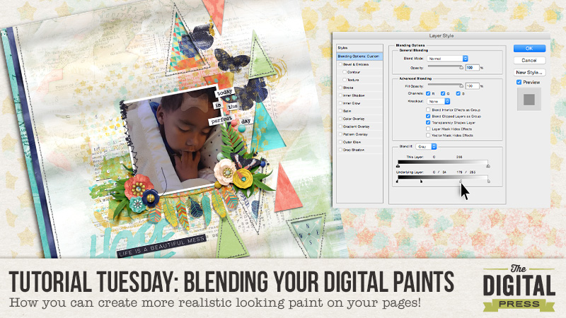
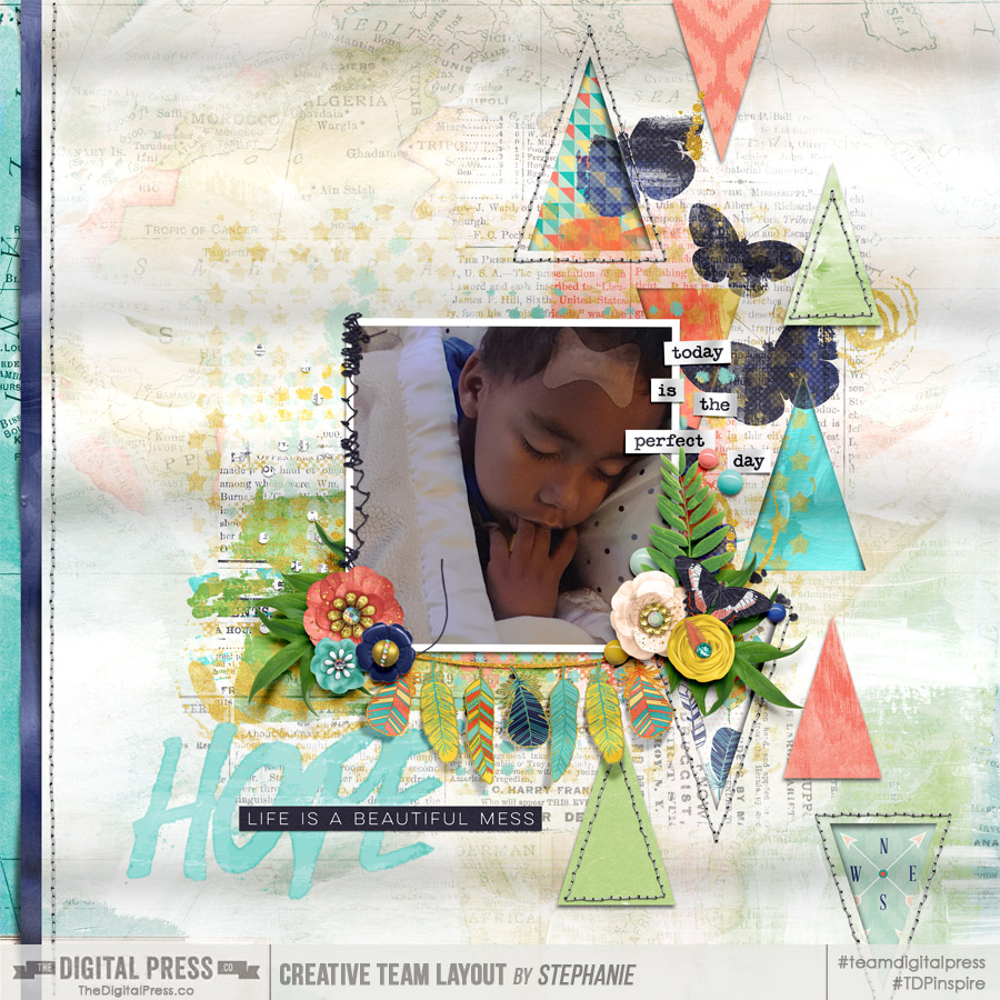
Hey guys! Stephanie (aka: PuSticks) here today to show you a simple trick for blending digital paints on my scrappy pages! First, lets have a quick chat about real paint. When you use real paint on paper, your colors blend together right? When you layer wet paint over dry paint layers, typically some of the dry paint will show through your wet paint. When we have digital paint, we don’t always get that type of effect without a little tweaking! Take a peek at one of my recent pages:
*click here to see page credits*
As you can see, I like my paint! Now, I used a few different techniques on this page to create realistic looking paint but today we’re going to focus on the technique that provides the biggest effect: Blending Sliders.
NOTE: I’m working in Photoshop CS6 but this also works in CC. If you’re using Photoshop Elements or another program, I’m sure there are ways of achieving the same type of look, perhaps if anyone has any tips for those programs, they can leave a comment below with some ideas!
Step 1: Place Your Paint!
The first thing you need to do is put the digital paint on your page. As you can see below, I’m using the same page as above but we’re going to focus on the green paint area in the lower right corner:
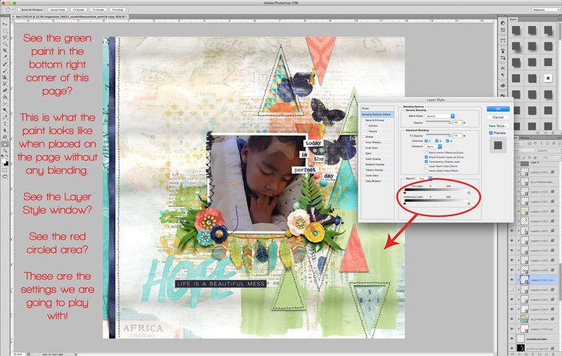
To pull up the “Layer Style” window, you can double click on the layer you want to edit or on the menu bar, select “Layer -> Layer Styles -> Blending Options”. At the bottom of this pop up window, you’ll see two sliders, these are what we will be playing with!
Step 2: Blending Digital Paint!
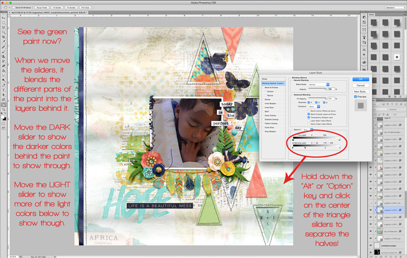
Okay, now that we have our Layer Style pop up open, we need to play with those sliders! We’re working only with the bottom most slider in this example. If you drag them back and forth, you will see your paint slowly disappear! Well that’s not what we want at all! We need to split the slider triangles. To do this, we need to hold down the “alt/option” key and then click on the little line in the middle of the triangles. Now we can slide the halves independently! Move the dark slider on the left towards the middle to show more of the dark colors from the layer below, move the right light triangle towards the center to show more of the underlying light colors. Play around with these until you like how your paint looks!
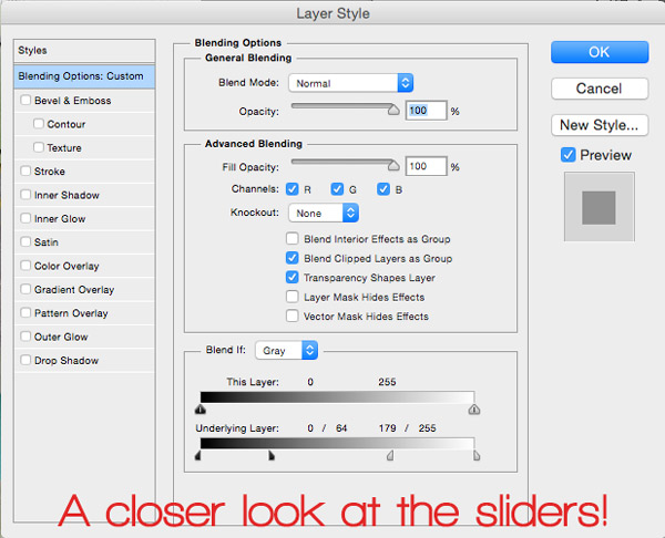
Sometimes I also play with the top slider too if I don’t like how using only the bottom one makes my paint look. If you’re feeling adventurous, play around with this slider too to see what type of painty looks you can come up with! If you’re curious, here’s a closer look at what my Layer Style pop up window looks like from the above photo:
Bonus Idea!
You know what else this technique is fun to use on? Pattern papers! Blend some grungy papers together, or use a layer mask to block out areas of the paper and then blend them together, or clip papers to shapes and then blend the shapes into the background paper… the potential uses of this little trick are amazing! So go grab some digital paint, papers and all that fun stuff, make a neat page, then upload your new masterpiece in the gallery! I look forward to seeing your painty goodness popping up around here soon!
About the Author: Hey guys! I’m Stephanie and I’m a scrapbook addict… and a Disney nut… and a Netflix junkie! I seem to do everything “all-in” when it comes to things that I’m passionate about. I don’t have a “style” per say, some days I’m feeling clean and simple, other days I’m art journaling with abandon! Outside of my creative outlets, I enjoy spending time with my family, especially when it’s at Disney World with my two sons! Also, I thoroughly enjoy stepping on small Lego pieces at 1am…wait…


I often use this technique on fonts, too, to “fuse” them with a paper as they would do IRL! I don’t use much paint so I never thought to do it on paint, too, but that makes total sense! AHA MOMENT!! LOL