Hello everyone, and welcome to another edition of our Tutorial Tuesday series here on The Digital Press blog!
So what are we talking about today? Good old frames.
What comes to your mind when you run across a frame or set of frames in kit? Put a photo within it? Well, yes, that’s what I do too! Mostly. But then… frames can also be so much more, and I am hoping I can illustrate some examples for you today. I am using the term “frames” loosely — the same tips can apply to simple photo borders, etc.
So… let’s dive right in! Here are a few of my favorite ways to use frames while scrapping a page…
1. Doing what it says on the box
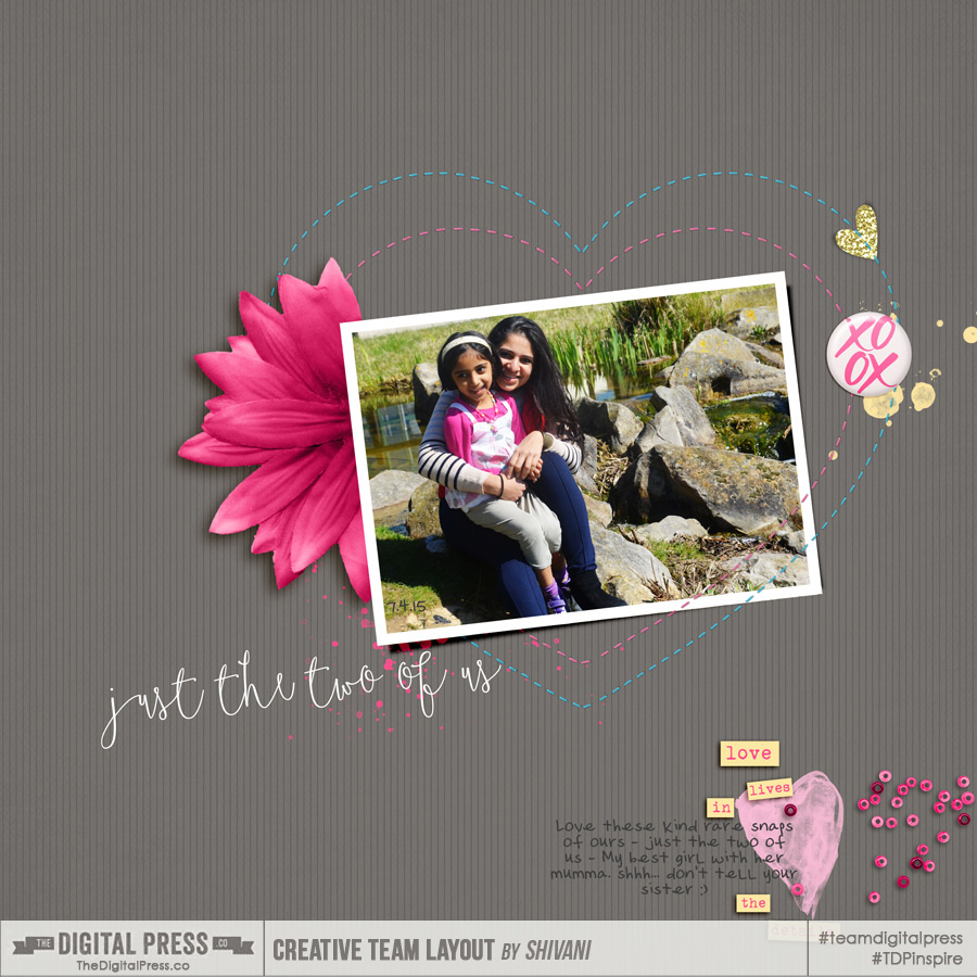
Frames, when used correctly, can add so much to a digital layout — just framing your beautiful photos and adding prominence. Take at look at the example shown below; it wouldn’t quite look the same without the white border frame around the photo, would it?
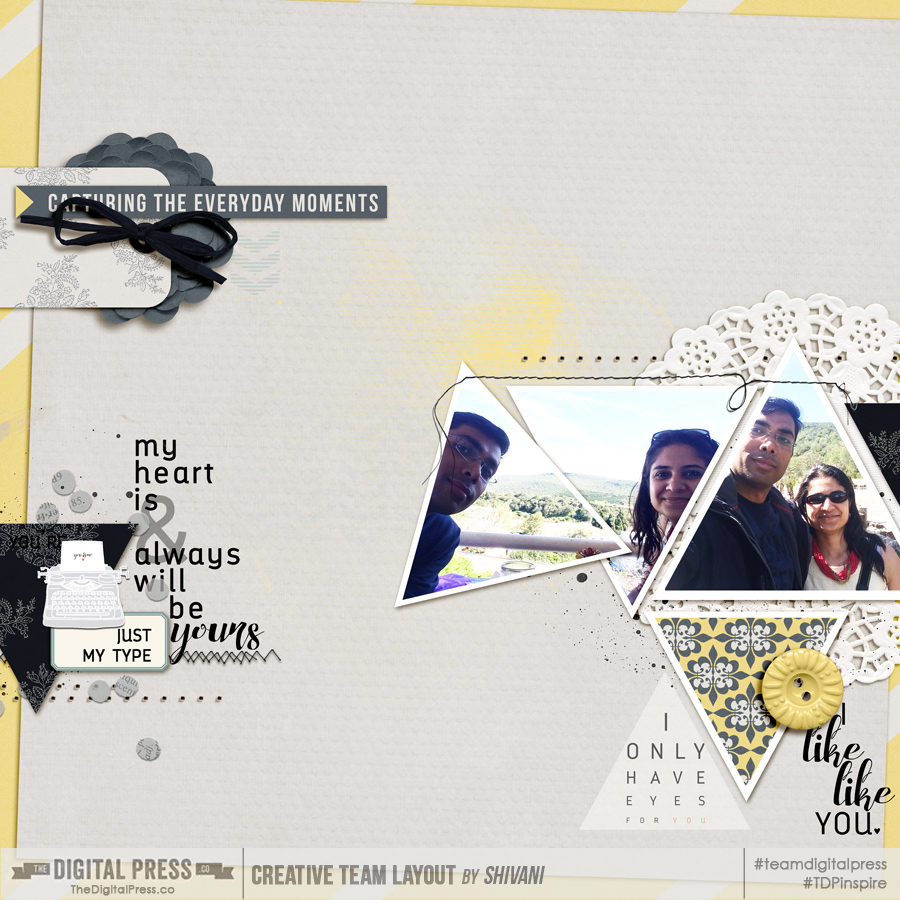
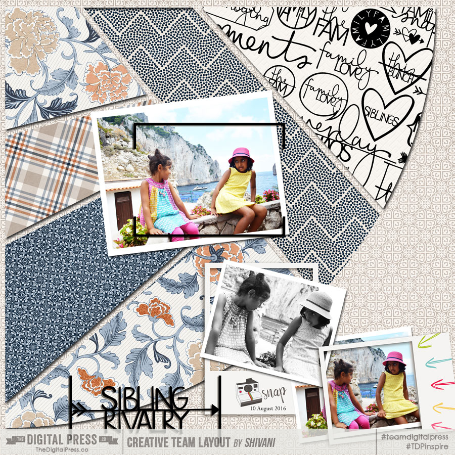
Frames don’t have to just be boring rectangles or square, though. Other shapes work just as well. I experimented with triangular frames in the next example, moving them around to suit my photos (and also splitting one photo between two overlapping frames; more about this later)…
2. Showing off details/key parts of your photo
I am sure you emply a lot of different means to bring out the details in your stories. Sometimes I like to do that by repeating a series of photos, and also highlighting some aspects using frames. In the following example, the different frames (and especially the one with multiple colored arrows) worked really well to show the dynamics between the sisters…
3. Adding dimension & focal points
I love that a frame can be used to add dimension to a layout. One of my favorite techniques is to clip a photo to a mask but use the frame on top of that to selectively show off some part of the photo or generally use it for a ‘cool’ effect. Here are few different examples of this technique…
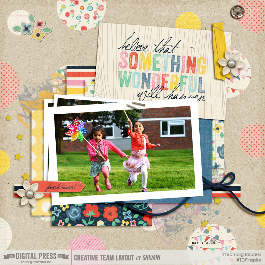
In that first example, above, I used the “stack” of frames to add dimension to this 100% digital (flat) page. Stacking the frames is a fun way to create that effect. Here’s another example of that…
I love the effect that’s created here, of a stack of framed photos (arranged slightly askew, as though the photos were casually left on a table). It really creates a great dimensional effect with minimal effort, don’t you think?
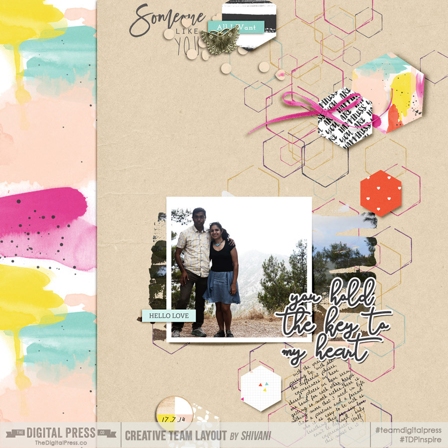
In the next example, though, I used a combination of a frame and a mask; this helps add a focal point onto the layout and also ensures that the two duplicate photos — one clipped to the paint mask, and other to the frame — are linked so any adjustments are consistent between the two.
4. Using frames as design elements
Frames can also be used as design elements to accessorize your layouts.
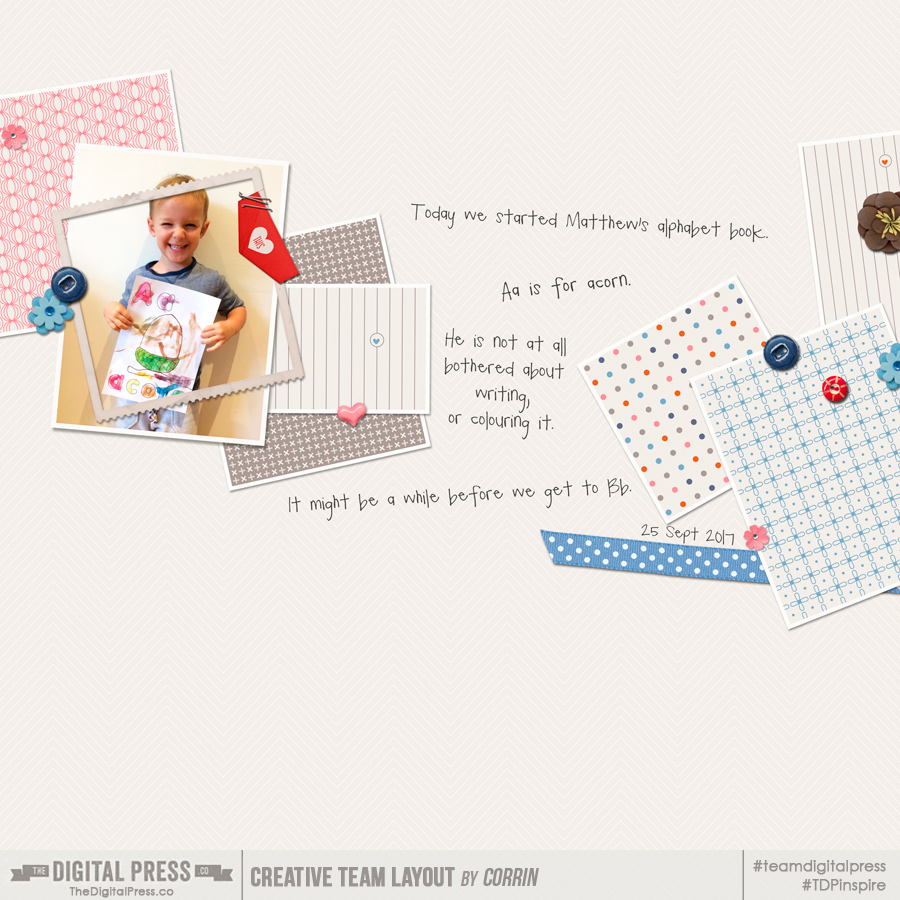
In the next example, TDP creative team member Corrin used the frame on top of her cute photo (slightly askew) to draw attention to the photo. And it looks brilliant, doesn’t it? It definitely adds to the fun quotient of this layout…
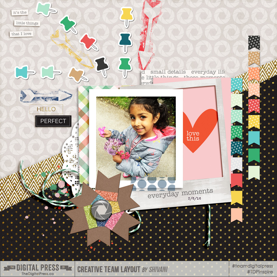
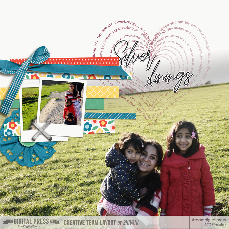
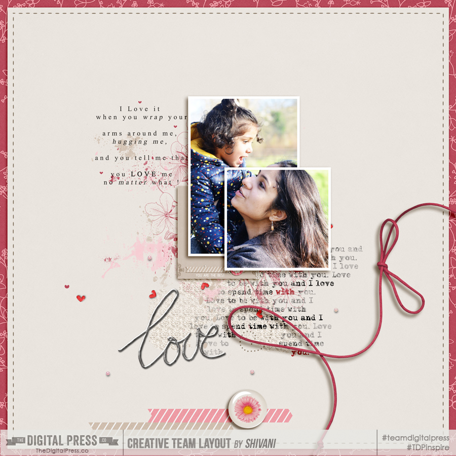
In the next layout, I have used couple of frames — one for the photo and other just to add layering as well as partially show off the journal card underneath…
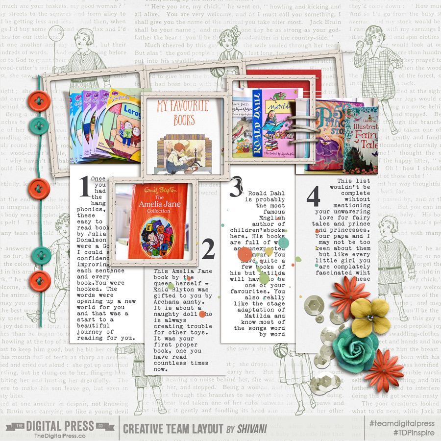
And in this next example… loads of frames! Looks like I have gone overboard! …but I love the quirkiness it adds to my layout…
5. Frames on pocket pages(?!) Yes! Why not?
So far, we have largely gone through examples of using frames on traditional layouts. But what about pocket pages? Well, they are definitely not out of bounds!
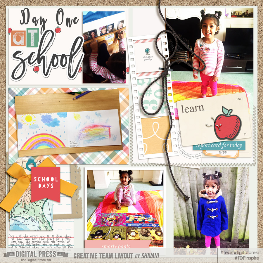
In the next example, I have used some photo borders and a few other frames placed here and there. It definitely adds so much detail to the layout and helps move the eye around — taking in all the different aspects of the story captured…
6. Splitting a photo into multiple frames or putting multiple photos in a frame
You can play around with how you want the photos split — it may be a subtle effect, as in the first layout… or a more dramatic split, as in the second layout…
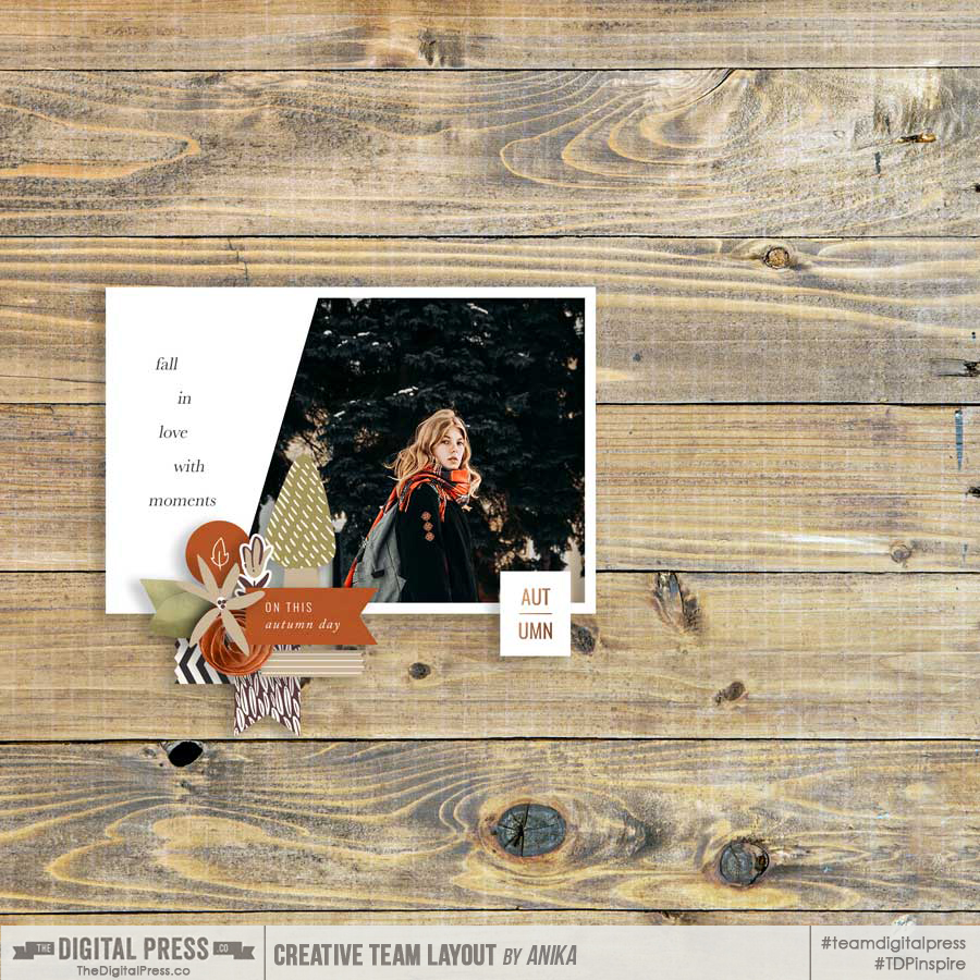
Conversely, sometimes I struggle with cropping my photos just right to match the frame I’m using. Fret not! Creative freedom to the rescue! You may choose to use a photo and a Journal card together in a frame like TDP Creative Team member Anika has done here…
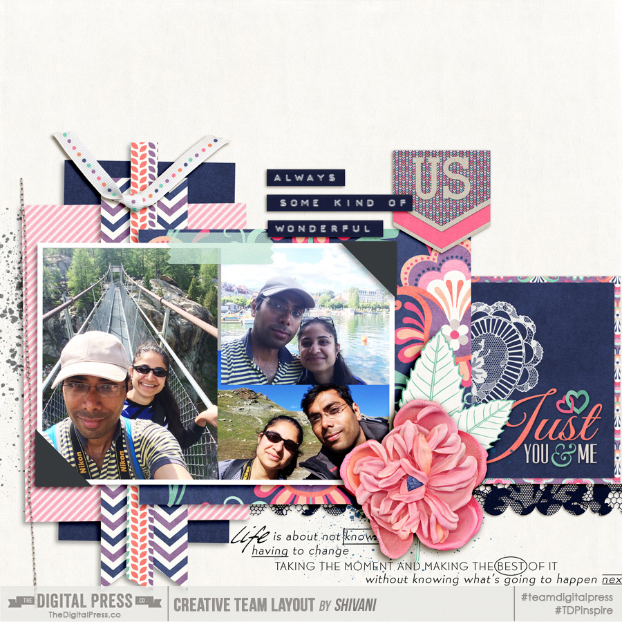
Or you can crop and size multiple photos in one big frame…
So these were just a few tips to enhance your layouts with frames! Hope you found them useful. I think the most important rule to remember is that there are no rules! It’s all about your interpretation, and if it works for you.
I can’t wait to see some of your creative uses for frames — do share your layouts with us in the gallery, and link us up in the comments below this post! As always, happy scrapping!
![]()
About the Author Shivani Sohal is a donner of many alter-egos. A finance professional by day in busy London, she morphs into a seemingly normal mum of two in the evenings and weekends. She is constantly found with her fingers in too many pies and juggling the metaphorical balls. That is living on the edge for her; aided by the two ankle biters and a darling hubby who define the warm and mushy for her. She is ferociously dedicated to memory keeping — almost immune to any nay-sayers (or equally-disruptive crying children or annoying house fires!); keeping her head down and forging ahead at all times.
So fun! Thanks for the great ideas!
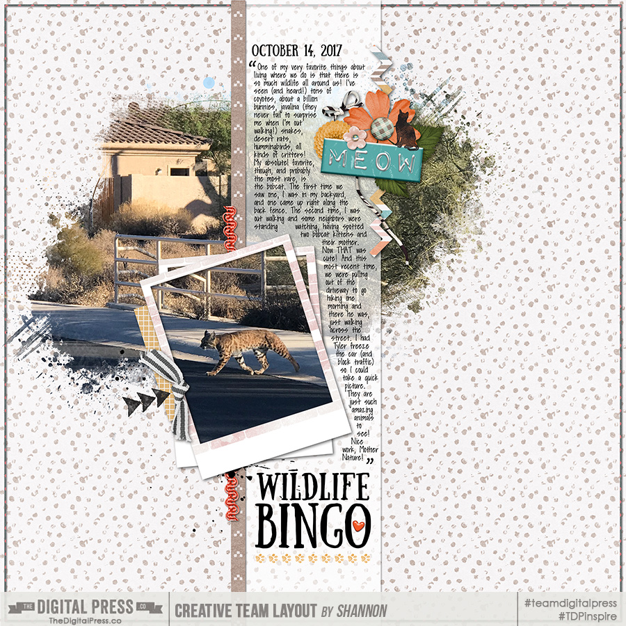
Any way you could tell me what the fun font is that was use for the “Wildlife Bingo” text?
Thanks!!