Hey everyone! I hope you are enjoying the various shades of Autumn wherever you are. I certainly am waiting for the leaves to turn a rich autumnal colour and take some leaf jumping pics of the kids. 🙂
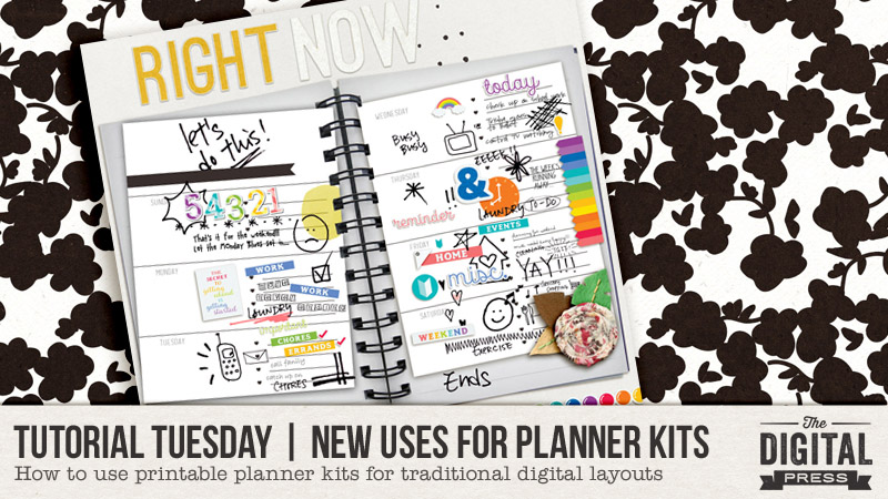
Today I am here to share some ideas about ways to use all of the lovely planner kits you can find in The Digital Press’s shop — but for traditional digital layouts. Not everyone has jumped aboard the planner craze this past year, but there are so many cute products. Why not use them in other ways? Today I am here to show you how.
I have always wondered about all these gorgeous planner stuff in the shop. Because I don’t do hybrid or paper scrapping, I have always sort of believed that these items are just not for me. But then curiosity got the cat (or rather, me!), and I looked into the idea of using these items on my digital layouts. At first glance, you may think there is not much one can do with planners except, yes, make a planner/record-keeping kind of page. But the many possibilities may just surprise you, yet!
My first attempt involved using planners and printables in my usual way — I treated these as I would any other digital element. I clipped them to shapes and used them as paper pieces in their own right. I found that I really liked the end result; they add to the look of the layout, which is about a snapshot of a fun day…
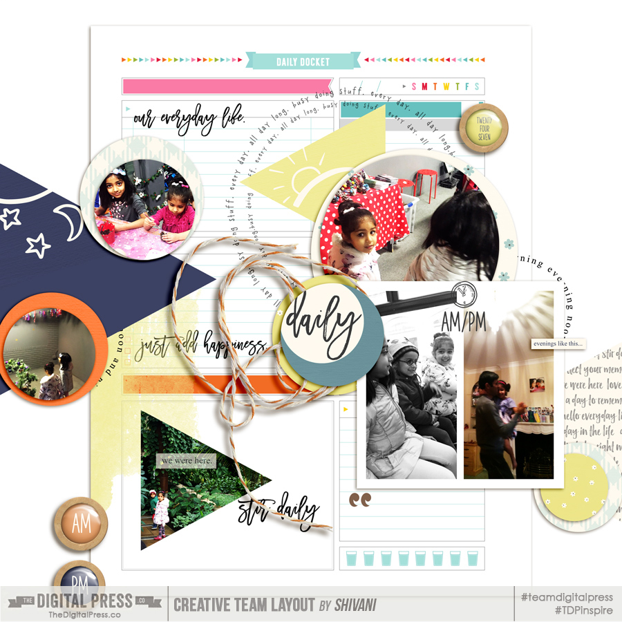
[see link here for credits]
In my second attempt, however, I used multiple planner pages and layered them to create a focal point of paper mats. Not only do I think that it enhances the interest of the page… but it also adds a depth that looks almost real! This one’s definitely a keeper for me…
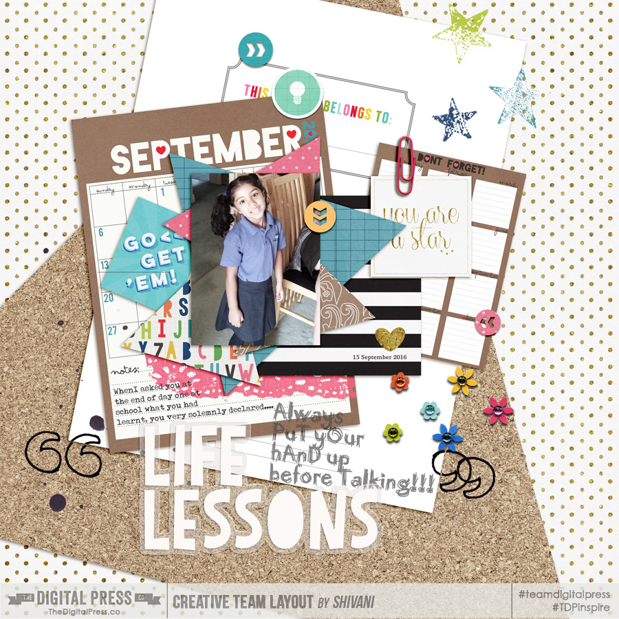
[see link here for credits]
But planner kits contain more than just papers. What about those cute little stickers, tags and other embellishments? You could use them individually, of course, but here I wanted to showcase how to use them purely as design elements. So I have used them to form leading lines on the page… arranging them in a flower or any other interesting shape. The possibilities, again, are endless…
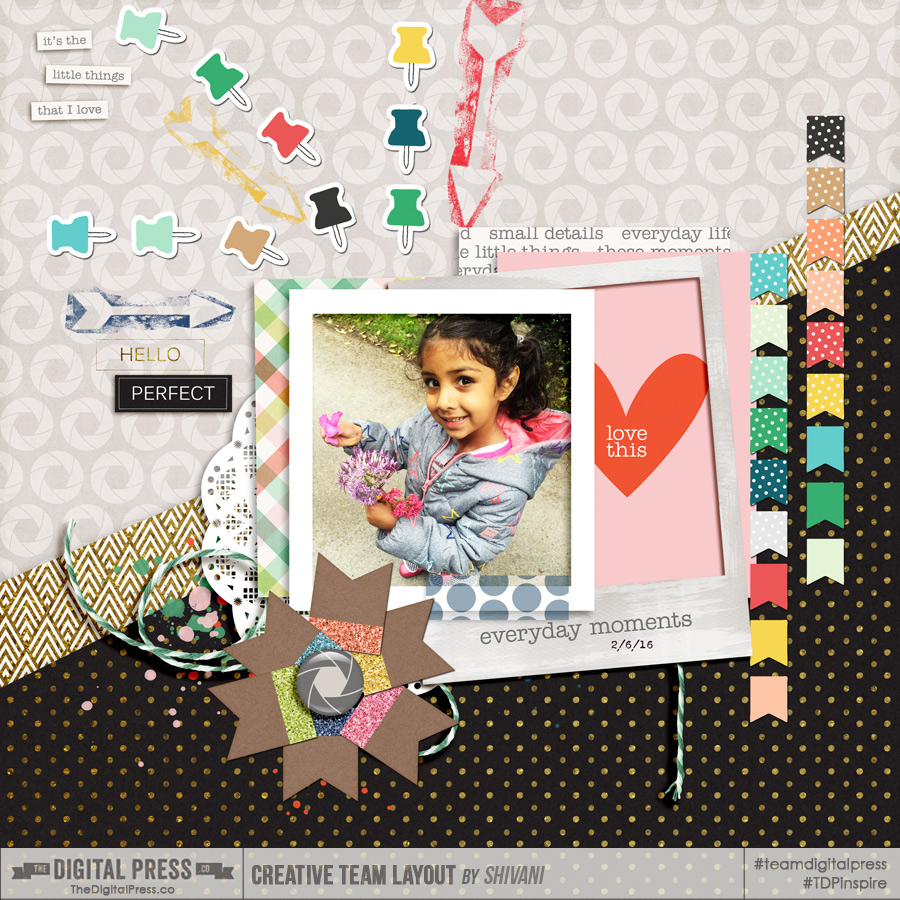
[see link here for credits]
And how could I not also create a traditional planner page?! As you can see, this is messy, colourful, and random… but that’s the beauty of it. To mimic my own physical daily planner/journal, I tried couple of things here. I have focused on the shadowing a bit more, again to give that realistic look. For example, when I was placing those planner pages as though they were attached to the journal, I used clipping masks to reveal the binder holes beneath selectively and then added a large shadow. I won’t lie — that took some time, but I like the end result!
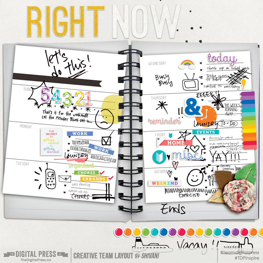
[see link here for credits]
So there it is… my little venture into the world of planners, and using these great digital planner products for other purposes! As you can see, there are no rules here or right/wrong ways of using them; you can experiment and find a style that works for you. Hope this post has given you some ideas and more importantly piqued your curiosity! If you do try some of the above styles or come up with your own, please share with us in the gallery. I would love to see them!
![]()
About the Author Shivani Sohal is a donner of many alter-egos. A finance professional by day in busy London, she morphs into a seemingly normal mum of two in the evenings and weekends. She is constantly found with her fingers in too many pies and juggling the metaphorical balls. That is living on the edge for her; aided by the two ankle biters and a darling hubby who define the warm and mushy for her. She is ferociously dedicated to memory keeping — almost immune to any nay-sayers (or equally-disruptive crying children or annoying house fires!); keeping her head down and forging ahead at all times.
