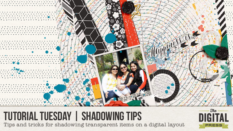
Have you ever noticed that the preset shadows don’t work so well with vellum and other transparent elements? I struggled with it for a long time, and although I can’t profess I have mastered it all… I do have a trick or two to share with you today.
For this tutorial, I am working on a layout using River~Rose’s fabulous new collection Pursuit of Happiness…
In the following image, my layout is almost complete… and as you can see there are a couple of transparent acrylic elements on the page — the heart and the ampersand. With preset shadows in Photoshop, my layout looks like this…

Now the biggest quibble I have is that dark shadow showing through the transparent acrylic element. See how “grey” it looks? Logically, any transparent/translucent object that lets light through shouldn’t throw such a defining shadow. And that’s what we need to modify.
Step 1
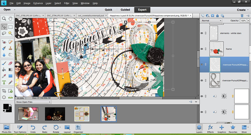
First, you will separate out the shadow from the element (i.e. put it in its own layer). I do this using Photoshop CS2 (old free version of Photoshop!), and then open up my layout again in Photoshop Elements (PSE), which is what I’m showing my steps in for the screenshots in this tutorial. Once you have your shadow on a separate layer, you will press CTRL and select the element thumbnail in the layers panel. This will make the “marching ants” appear around the element, like this…
Step 2
Now, with that selection still on, you will click on the shadow to “cut away” the selection. Now you have two layers of shadow: one that shows immediately beneath the element, and the peripheral shadow that sticks out around it. We want this peripheral shadow to be pronounced — while at the same time downplaying the central part (see layer 2 in the screen shot).

Step 3
We can do this next part more than way…
a) Hide the shadow that appears under the ampersand entirely (as shown in the screen shot below)
a) Decrease its opacity (see top right of the layers panel and play with the slider till you like the effect)
c) If your transparent element is on a solid paper or background, it helps to recolor this part of the shadow in darker hue of the same color.
Play around till you are happy with the result you achieve.
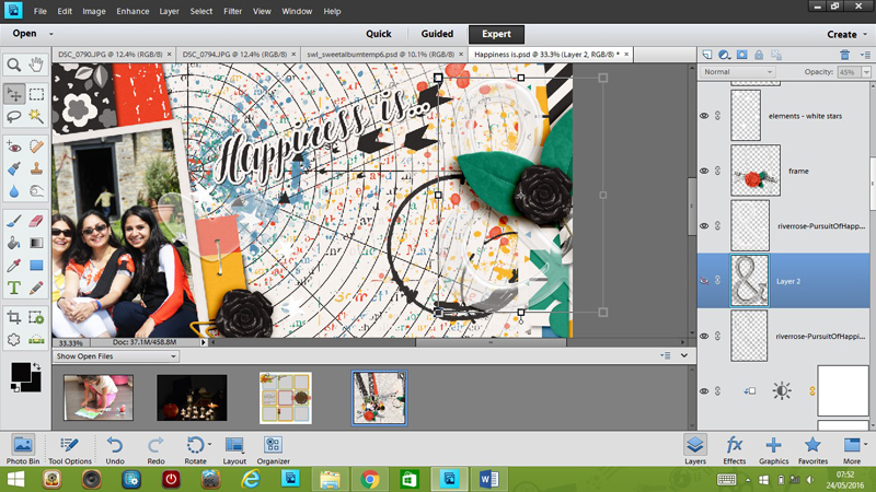
And voila! …here’s my final layout. Compare this layout with the copy at the beginning of this tutorial, and see if you can see the subtle yet noticeable difference this makes…

I hope you found today’s tips to be useful! If you have your own tricks about shadowing transparent items, please do share them. I would love to try out something new.
Until next time, then… happy scrapping!
About the author Shivani Sohal is a donner of many alter-egos. A finance professional by day in busy London, she morphs into a seemingly normal mum of two in the evenings and weekends. She is constantly found with her fingers in too many pies and juggling the metaphorical balls. That is living on the edge for her; aided by the two ankle biters and a darling hubby who define the warm and mushy for her. She is ferociously dedicated to memory keeping – almost immune to any nay-sayers (or equally disruptive crying children or annoying house fires!!!); keeping her head down and forging ahead at all times.


How clever! This looks so much nicer! Thank you for the cool tip!
Su