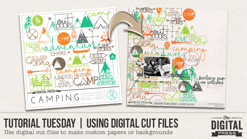
I love cut files. I yearn to make lots of beautiful hybrid pages with little shapes and words cut out of colored paper and delicately adhered to my layouts, or tucked safely away in transparent pockets. But, reality has a bad way of crashing down on me. I don’t own a digital cutter. And I lack the patience to hand cut more than one anything. But I still love cut files, and I frequently used them as elements or stamps in my all-digital layouts. I also use them to customize background papers for my all-digital layouts, and simple technique I’ll share with you today….no scissors required.
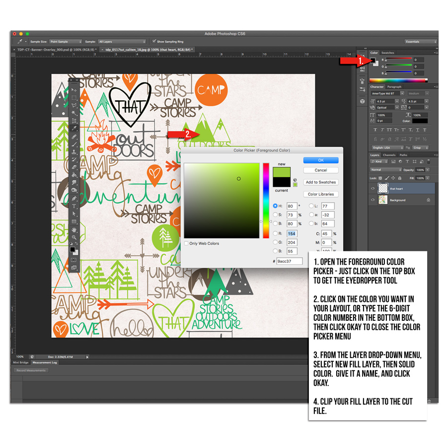
Cut files aren’t just for hybrid scrappers! They can totally be used in an all-digital layout too. The technique for using cut files to make a custom paper or background is fairly easy. Open a new layout, and drag in a lightly textured solid background paper. Select and open all the cut files you want to add. I use the .pngs, and drag them to roughly where I think they should be when I first pull them into Photoshop. The most time-consuming part of this process is moving around the cut files to fill the space. Since I like a full, but not cluttered look, I overlap some, and duplicate others, being sure to keep some space between the duplicates so the paper doesn’t feel repetitive . Sometimes I change the color of an element to give it better flow in in the background, or to make it coordinate with the rest of the cut files I’m using if I’ve got cut files from different sets. To do that, I use the color picker to select the exact color I want, then create a new fill layer using the steps shown in the next image.

You could also use the paint bucket tool to change the color of the cut file, but you still have to follow steps 1 and 2 above to get the desired color in your bucket. Once I have the cut files colored and arranged the way I want, I merge them into a single layer, then apply a distressing mask to give the paper a stamped look. That’s it. Easy custom background paper using cut files.
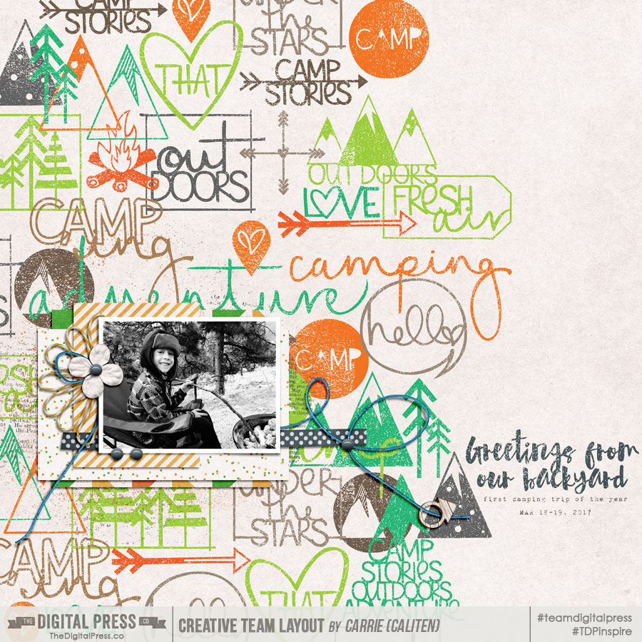
Here’s my finished layout. I used cut files from the Camping Set and a freebie that coordinates with the Love This Set by Rachel Hodge. The papers and elements are from Homecation by May guest designer ninigoesdigi.

This technique is great for more than just background papers too. It works well on a smaller scale too – say for a 3×4″ or 4×6″ pocket or filler card. Cutting files are available in themed sets in the TDP store. There are also usually a handful in the monthly TDP store collab kits, and the Monthly Chronicle collections, as well as the quarterly Digiscrap Parade. This technique could also work well with the digital stamps that are included in many of the digital kits in the TDP store. The opportunities abound, and I encourage you to try using digital cut files on your next all-digital layout!
About the Author Carrie is a creative team member here at The Digital Press. She and her family enjoy spending time outdoors, year-round, near their home in Colorado. In addition to scrapbooking and the occasional hybrid home decor project, Carrie also reads voraciously, accumulates fabric, makes soap, brews beer, grows hops, and tries to keep indoor plants alive.

That’s such a cool idea… I never would have thought of that! Thanks for this tip!