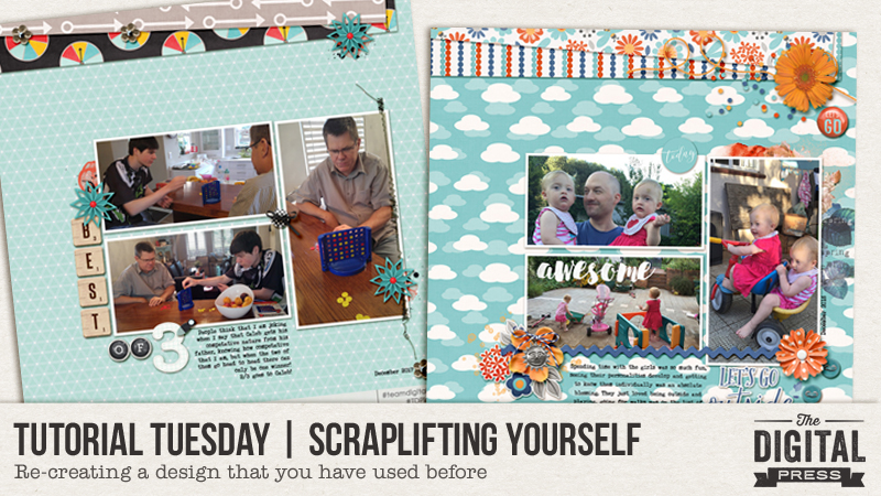
Welcome to another installment of our Tutorial Tuesday series here on The Digital Press blog! Today, I am here to advocate for a simple technique that will help you create more scrapbook pages (and faster, and more easily!) — scraplifting yourself.
I would like to use this post to encourage you to be gentle on yourself and not feel as though every layout you create has to be a masterpiece… while also helping you to avoid feeling as though creating layouts leaves you feeling drained. It’s a hobby and it should be fun, right?
Let’s be honest… life is busy, and there are so many things that have to be done all the time. Often we find that by the time we sit down at the computer to take advantage of a few moments of crafty “me time,” our creative energy seems to have dissipated.
How to solve this?
You can always turn to your tried-and-true sources for inspiration. I love The Digital Press Gallery; Pinterest is another fun source of ideas (as is Instagram, as people are posting their scrapbooking creations there more and more often all the time nowadays!). Sometimes, though, I find that I use up all of my scrapping time just looking at other people’s layouts without doing anything with my own photos and getting any of my stories told. Oops! This ends up leaving me feeling despondent and uncreative.
An easy fix for me is to choose the photos I want to scrapbook, and then look at my own arsenal of previous layouts… with the goal being to re-create one that uses the same number of photos, along w/ a new/different kit or collection. I just clip (Ctrl-G) the new papers and photos over the existing ones, and swap out the embellishments with new items from the kit I am working with the second time around.
For example, let’s take this layout that I created for TDP’s 3-for-3 challenge in March 2017…
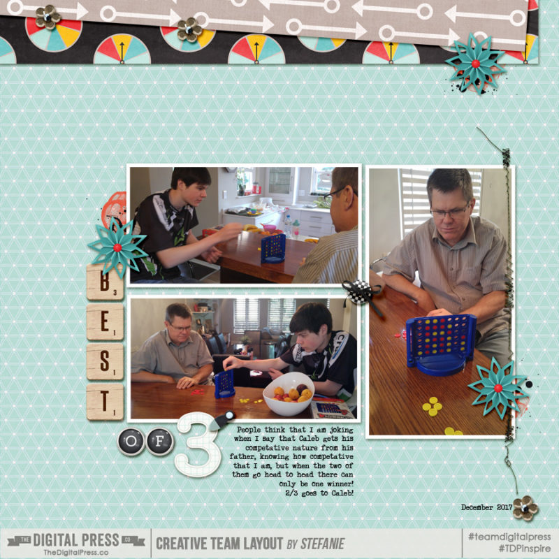
Characteristics of This Layout:
- 3 photos
- 3 different patterned papers
- visual triangle of clusters
- engaging title
- complimentary colours of red and blue
- right-aligned journaling
I still love this layout, and so for the next layout I had just 30 minutes to create and I started with 3 photos of my grandnieces playing outside of the holiday house we shared in December.
I kept the placement of just about everything exactly the same –the photos, papers and journaling — and I changed up the date, etc. Instead of creating a new title, I used a pre-designed piece of word art from the newest TDP Designer Collaboration “Fresh Air“. I still have foundation layers of paint and a scatter. Three points of orange, with a fourth embellishment spot that is tone-on-tone blue to break boundaries and add a different shaped element for interest. I added shadows as I went along… and in 30 minutes, it was finished and ready to be printed!
Here’s a look…
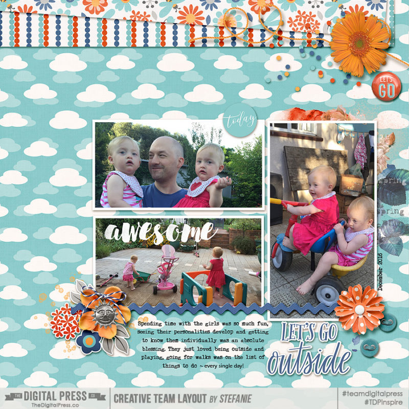
Again, Characteristics of This Layout:
- 3 photos
- 3 patterned papers
- visual triangle of orange
- wordart title
- complimentary colours of blue and orange
- centered journaling
I decided to use this page’s composition one more time. For this last layout, we had a family BBQ on the day before we left Johannesburg and I wanted to highlight the men’s role in cooking and that the women had a relaxed off duty kind of day. 🙂
For this newest page, I wanted to include a 4th photo of my hubby grilling the meat… so I nudged the photos to the right and squeezed him in there. You can see more similarities with the second layout than the first, including white piece of word art layered over the photo, and centered journaling. Of course, these layouts look strikingly similar — but you could also mix things up by turning the design 90 degrees, or by flipping the paper layers found at the top to the bottom of the page, instead (or changing up the font, etc.). I went for speed over creativity, though, and as these layouts will be separated within the family album of 2016 with different opposing layouts I can almost bet that no one will even notice that they’re almost the same…
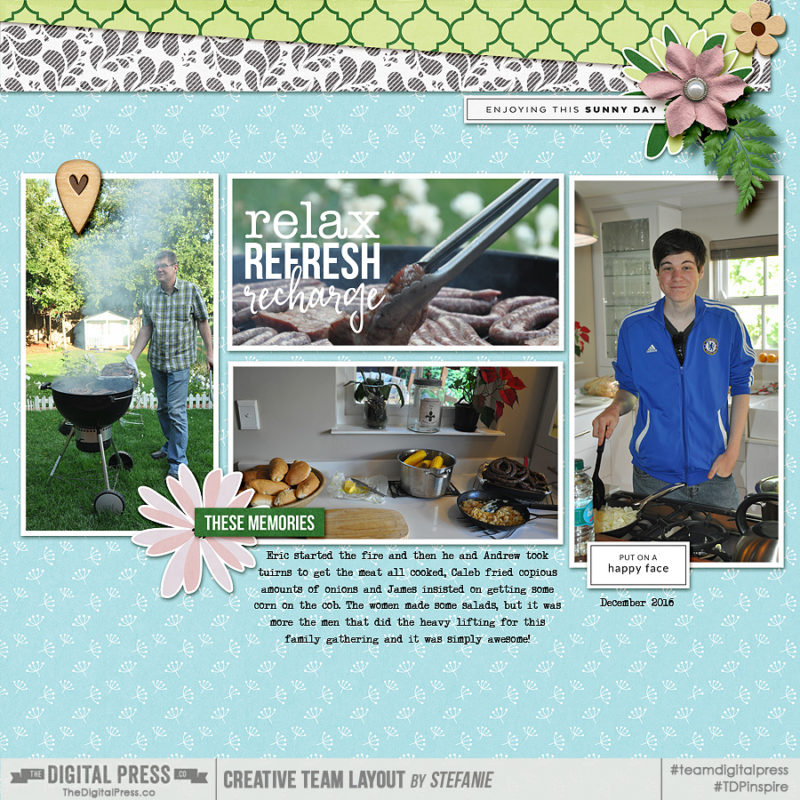
Characteristics of This Third Layout:
- 4 photos
- 3 patterned papers
- diagonal/asymmetrical points of pink
- Blue, green and pink
- wordart title and sub-titles
- centered journaling
What do you think? Do you have 30 minutes to spare, in which you want to complete a brand-new layout in just that short time? This technique will help you do so! Just turn to a tried-and-true layout design that you already love… open that PSD or TIF file… remove the papers and embellishments… and start again!
If you give this a try, I’d love to see your results! Feel free to load your layouts to The Digital Press Gallery, and you can even link us up to the original layout in your credits/description if you want to.
 About the Author Stefanie is a member of the creative team here at The Digital Press Co. She is a mom of three older children, all living in Cape Town, South Africa, with her hubby of 29 years and their two cats. In her free time she loves digital scrapbooking, dabbling in photography and reading.
