Tutorial Tuesday | Protecting Privacy

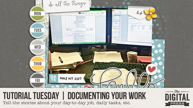
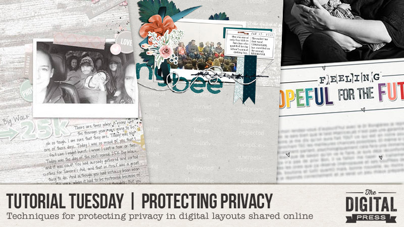
Hello, and welcome to another edition of our Tutorial Tuesday series here on The Digital Press blog! Today, I’m here to share some tips and techniques for protecting your privacy when you share your digital layouts online (both in galleries and on social media sites like Instagram and Facebook, etc.).

So many of us go to great lengths to protect our privacy — shredding anything with our names, addresses, or credit card numbers… or using screen names instead of real names, etc. — but not everyone goes to those same lengths to protect their own privacy in public scrapbook galleries or on social media (or maybe even realizes that personal information is being shared for anyone to see).  I know this is a very sensitive subject, and there are a multitude of opinions out there, but this tutorial focuses on techniques for protecting privacy — yours, your family’s, and also that of people you don’t know who may have inadvertently ended up in your photos or as part of your story — whenever you publicly post your digital layouts online.

First up, a couple of words on privacy, and what you ethically can and probably should not do. You can post any of your own information, details or photos – up to and including as much personal detail that you want. I’d say you can make this decision for your own immediate family too. You probably should not post identifying information or pictures of other people, and if you decide you are going to post information or photos about other people, you can easily avoid a potentially sticky situation by checking with them first. There are many reasons why people don’t want their name or face posted online without their permission, and accommodating those requests is not only courteous, but in keeping with the posted rules of many online galleries, including the gallery here at TDP.

Let’s start with about journaling.  I suppose the easiest way to protect privacy is just to leave out the salient details – exclude names, dates, places and any other identifying details.  But this kind of defeats the purpose if you scrapbook for memory keeping and you want those details recorded permanently. One option is to save and print your layout with the complete journaling, but post a modified version to the public galleries. In this scenario, there are many different ways to proceed.  First, assign aliases or nicknames to people or places in your journaling.  Second, use your original journaling, but obscure the pertinent details. There are several different techniques for hiding words or otherwise camouflaging your journaling that we’ll go over here:

  • use the Smudge tool to smear individual words (most commonly names and places);
  • use the Brush tool to “line out” words (those redacted military documents come to mind);
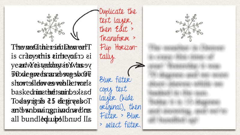
  • copy your text layer, then either flip it horizontally or apply a blurring filter.

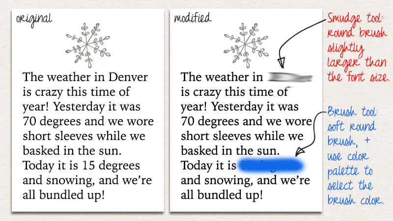
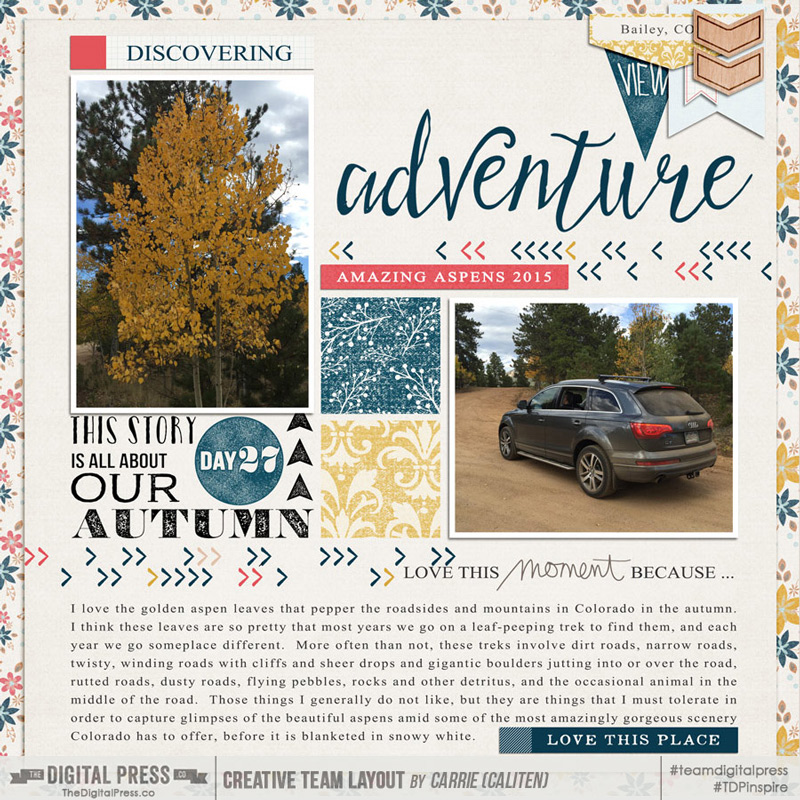
Let’s take a closer look at each of these. First up, the Smudge and Brush tools. The Smudge tool icon looks like a finger pointing toward the lower left corner. Select that tool then choose a round brush and change the brush size to something slightly larger than your font size. I prefer to modify my journaling before flattening my layout into a single layer, so at this point I rasterize my text and work on that layer. You can run that smudging brush back and forth over the words you want to obscure using the mouse, or you can click on one end of the word, push the shift key, then click on the other end of the word to get a perfectly straight line between those two points you clicked. In the image below, I applied the smudge brush twice to the word Denver (in the journaling on the right). This technique is the most commonly applied privacy protection technique I’ve come across in the TDP gallery.

20180227_image1

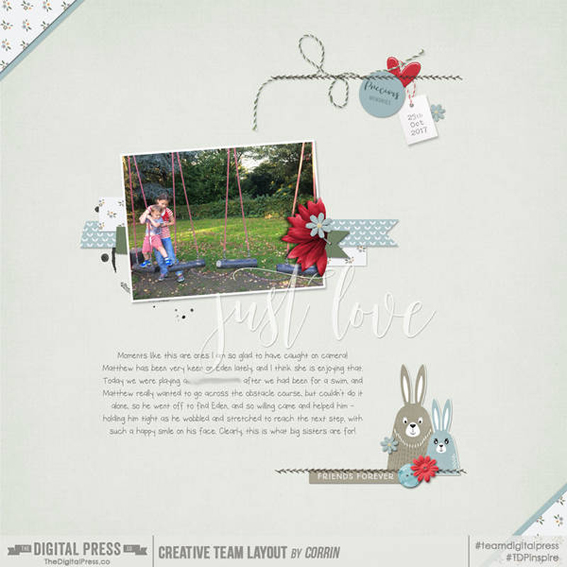
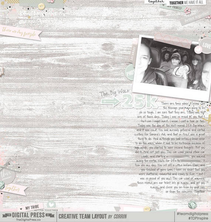
The smudge technique is probably the most commonly used one for removing pertinent details from journaling. In the example below, TDP CT member Corrin smudged out a place name in the middle of her journaling.

The Brush tool, which has an icon that looks like a paint brush, can be used to line out or redact words, or, if you’ve got a uniform background color, “erase” selected words from your journaling. Your text layer does not need to be rasterized to apply this technique. Select a color darker than your text to make the redaction obvious (like the blue in the example above), or a color that matches your background layer to make it look as though the selected words have been erased. (Note that this same technique can be used to highlight words in your journaling; just put the brush layer under the text rather than on top of it.) Both the smudge and brush techniques are useful when you only want to obscure a handful of words.  These techniques can get time-consuming for removing more than a few words though, and there are easier techniques to apply to entire journaling blocks.

The third technique, useful for obscuring large blocks of journaling, includes copying and modifying your journaling layer. In the image below, I show two different techniques that can be applied to entire text layers – the horizontal flip and the blurring filter. To use the text-flip method, simply duplicate your journaling layer, then, with that new copied layer selected, click Edit from the top menu bar, then Transform, and Flip Horizontally. Don’t delete the original layer. This creates an effect like the one shown on the left side of the image below. This technique works well for scripty fonts, or fairly consistent and wide leading (spacing between the letters). You can see in the example below that some words are still legible, which may or may not be the desired effect.

20180227_image2

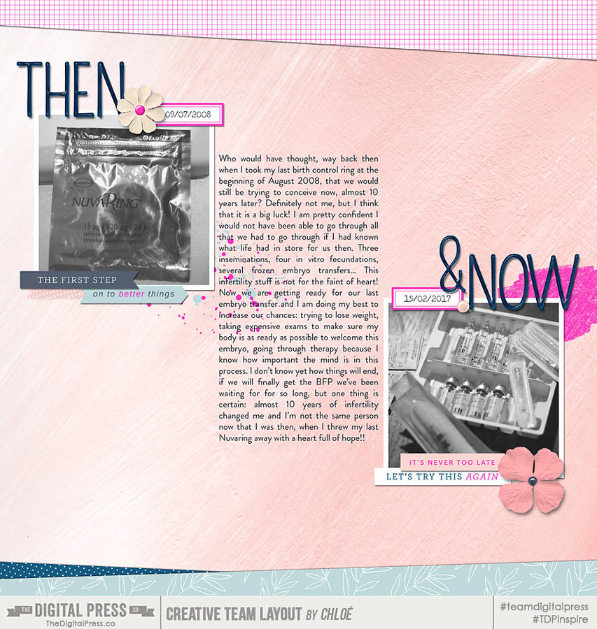
The final technique to obscure journaling is to blur all the text sufficiently that it cannot be read. To use this technique, first duplicate the text layer and rasterize it. Delete or hide the original text layer. Select the rasterized text layer, then select Filter from the top menu bar, then Blur, and choose from one of the myriad different blur techniques. The example below shows a 10-px Field Blur, but the Gaussian blur also works well and is a favorite of several members of the TDP CT. The blur filter is useful when you want all the journaling obscured, but still want to include it for placement on your final page.

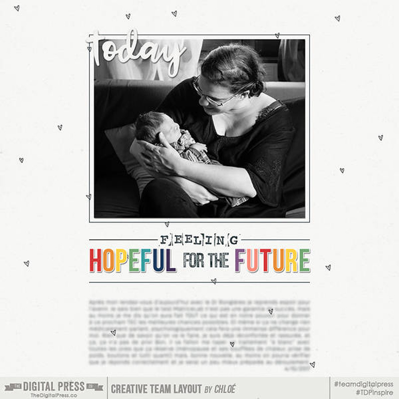
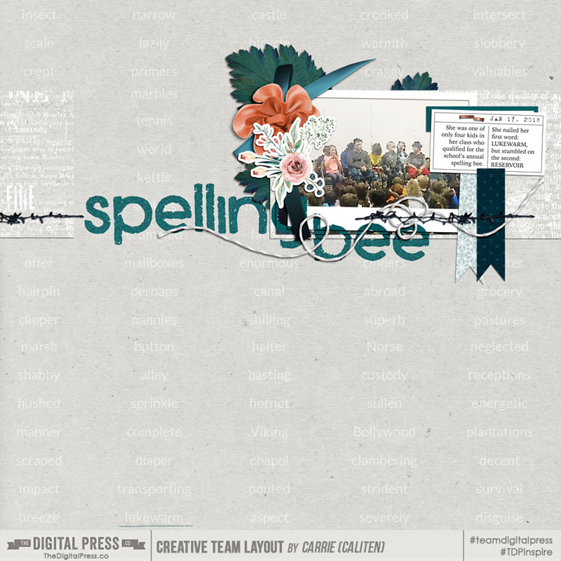
TDP CT member Chloe applied a blur filter to her entire journaling layer in this example:

Other, non-destructive techniques for obscuring journaling include using a small font size (I prefer 10-pt font on my printed 12×12 layouts, but that often makes my journaling hard to read on screen), journaling in a color that is very close to the background paper color, or reducing the opacity of the journaling layer, and covering all or just crucial parts of your journaling with digital elements or photos. The possibilities seem nearly endless, but at the end of the day, protecting personal information, identifying details or routines is the name of the game here.

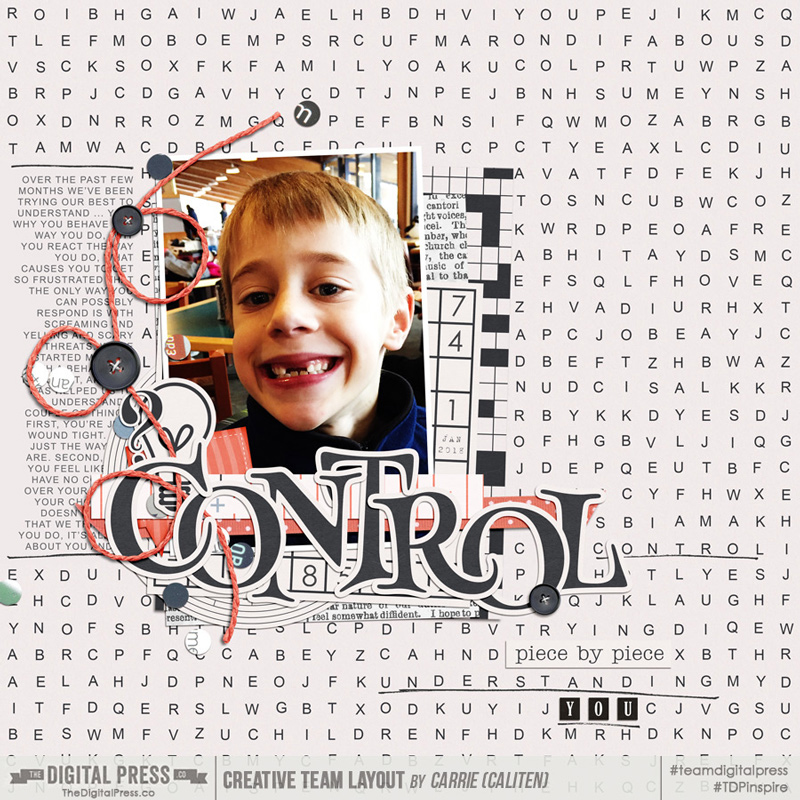
In this example, I used strategically placed elements (a button and some confetti) to cover up parts of the journaling that I didn’t want exposed.

caliten_control

Now let’s talk about photos. Protecting privacy in images may be something you’re more familiar with, but may not think to apply to the photos on your layout. From my experience, some people are more diligent about not showing their face online than they are about sharing personal information. For our purposes here though, we’ll include faces and any other unique identifying details, such as tattoos, license plates or car registration details, parking or access decals on vehicle windshields, and school or other establishment logos. There are times when it’s easy to just strategically crop your photo(s), or cover part of the image with an embellishment, journaling card or cluster, but also times when that just won’t work. Let’s focus on those latter cases. The techniques for obscuring these details in photos are similar to those discussed above for journaling: smudging, brushing, or applying a blurring filter.

To apply smudging to a photo, simply use the Smudge tool as you would for journaling, and go over the detail you want obscured. (With a small brush, this technique also works reasonably well for removing unsightly forehead wrinkles!) To use the brush technique, create a new layer, then select and apply a small brush area over the detail that you want hidden. I applied this technique in this layout of mine below to obscure the numbers and letters on the car’s license plate.

tdp_ad_goingplaces_caliten_aspens2015

Probably the most common technique for masking faces that I’ve noticed in the TDP gallery is using a blur filter on a small shaped mask layer.  To do this, create a new layer, then make a small oval to cover the face.  Ensure that the layer is similar color to the background (this technique is far less noticeable when applied to black and white images), rasterize it and apply a blurring filter (Filter > Blur > ….). If you have the time or inclination, you could also do a photo extraction (wherein you make a copy of your photo, and mask out all but the part that you want to have in focus), and then blur the background using a blur filter.

In this example, TDP CT member Corrin very subtly blurred one of the faces in the photo on her layout, below. Using a black and white photo really helped to draw attention away from that one blurred face.

corrin_25kB

And lastly, in the layout below I used a picture grabbed from my kids’ elementary school web page.  It was a grainy photo to start with which really helped the blurring mask to blend in. After placing the photo where I wanted it on my layout, I duplicated the photo layer. On top of the top photo layer, I created a new layer with an oval mask that only included the little girl in the orange shirt (she’s mine, and has given permission for me to show her unblurred in the photo), and moved it below the top photo layer.  I sharpened the photo, applied a color filter, and clipped it to the oval mask layer.  Then, on the original (bottom) photo layer, I added the same color filter then applied a standard Photoshop blur filter.  This particular one was Pixelate > Crystallize.

tdp_ad_mood_caliten_spellingBee

Protecting privacy in public galleries is a personal choice. Here we covered a handful of techniques for obscuring pertinent information in your journaling and faces or other identifying information in your photos. If this is something you do regularly, or something you’re now considering doing, I hope that you now have a new technique or two to try.


caliten About the Author  Carrie is a creative team member here at The Digital Press. She and her family enjoy spending time outdoors, year-round, near their home in Colorado. In addition to scrapbooking and the occasional hybrid home decor project, Carrie also reads voraciously, accumulates fabric, makes soap, brews beer, grows hops, and tries to keep indoor plants alive.

Hybrid How-To | Using Watercolors On Layouts

Hi everyone, and welcome to another edition of our Hybrid How-To series here on The Digital Press blog!  Today, I’m here to show you how to create a physical layout using watercolors (using fun paint that you can make to perfectly match your digital kit).

If you’ve followed my posts here on the blog in the past, you know that I love working with paper and physical elements — and especially stamps. I also love to use watercolors on my scrapbook pages! Sometimes, I even scan my paints and turn them into digital printables. It’s so much fun, and I can match my paints with my digital stash and  stretch my crafty budget that much more.

The first thing I’ll tell you when it comes to using paint on your layouts… don’t be afraid! Trust me, it’s easy, fun, and even relaxing! Think of it like this: we’re not going to make a painting to go into a gallery… we only want to make pretty stuff for our own layouts!  🙂

For my project today, I will be using the digital collection Mood by Anita Designs…

When I first saw the gorgeous watercolor florals in this beautiful collection, I knew I wanted to paint something to match them. Then, I started thinking about painting some leaves below the printed florals. For my project, I actually didn’t make a previous digital version in Photoshop (which, sometimes, I do). This time, I simply chose my favorite elements, cards, and papers and then printed all of them, as shown in the image below…

I also printed some florals and cards onto vellum paper (see it on the right, above). Look how beautiful and soft they turned out! 🙂

When choosing these items and printing them out, I actually knew that I might not use all of the items… but it is not a problem. Now I have some pretties ready to use in my memory planner, which I love to play with as well!

After I printed all these goodies, I had some fun relaxing and fussy-cutting them, while planning out my spread. You’ll see below that I made a spread with a traditional scrapbook page and a pocket page.

Finally, after cutting it all out… here is the gorgeous stuff that I had in hand, ready to play with…

With all of these items in hand, I started thinking about my color palette… and then I grabbed my sketchbook and began testing some different greens…

After choose my color scheme, I painted some samples on my sketchbook, just to know how I’d like to arrange my leaves…

Here’s a look at my painted leaves underneath one of the pretty sticker elements from the digital kit I worked with…

When I was satisfied with my paint, I grabbed my white cardstock paper and arranged my photos and mats… just to make sure where to paint my leaves…

I made a mark on the middle of my page and just painted some leaves, branches, and berries… very similar to what I had done before in my sketchbook while practicing…

Here is a look at my 2-page spread after I had finished my paint and placed some floral stickers, word art pieces, and some other word bits in a simple design with the patterned paper as a border…

Then, after placing my photos and elements, you’ll see that I decided to paint some more leaves onto the upper left corner, in order to give more balance to my design.

I also used the vellum cards as the mats for my photos, and also placed some vellum florals as the first layer of my clusters.

Here’s a close-up view of a few different areas of the project…

Finally, to finish things off, I added some stamps, some wood veneers, and some gold stickers along with a gorgeous big gold heart.

I like to print my journaling and cut it into strips because I’m not a big fan of my handwriting directly on the page (and sometimes I ruin my work by making a big mess!). 🙂 Here’s a look…

As you know if you’ve followed me here on the blog, I love to add texture to my work… so I added a delicate doily, more wood veneer, glitter sitckers, and word stickers.

Finally, I think the “cherry on top” is a vellum floral which I just stapled on my soft pink card. I really loved how this spread turned out!

If you’d like to give this a try, too, don’t forget that you can earn challenge points at TDP! Come visit the CROSSWORD SECTION in The Digital Press forum, and you’ll find this month’s Hybrid Challenge thread (for each month’s Hybrid Challenge at TDP, you get to choose one of the month’s”Hybrid How-To” tutorial posts from here on the blog and make your own version). If you choose to give today’s project a try… all you have to do is make a hybrid page using some digital elements and papers and add some watercolor paint, as shown above (it doesn’t have to be leaves, though; you can paint what you want — whether circles, hearts, background washes — whatever your imagination comes up with!). You’ll see how fun it is! Give it a shot, and share your final results with us! We can’t wait to see what you come up with.

Have a great weekend you guys, and happy scrapping!


PERFIL TDPAbout the Author  Andrea Albuquerque is part of the Hybrid Creative Team here at Digital Press. Andrea has been a scrapper since 2010 and a photographer since 2012. Although she adores the flexibility and creativity of digital, she can’t resist playing with paper, paint, and embellishments… so hybrid scrapping is the perfect medium for her! She lives in Brazil with her hubby.

Foodie Friday | Laura Passage

Hello, and welcome to another edition of our Foodie Friday series here on The Digital Press Blog! This week we are lucky to be featuring TDP Designer Laura Passage (formerly known and loved by many as the designer behind the Wishing Well Creations brand).

Laura has already been featured twice before, here on The Digital Press blog… so if you would like to learn a little more about her, check out her first feature from July 2016 HERE and her second feature article from July 2017 HERE. You can also learn a lot about her, and her design style, by having a browse around her fun and fabulous store at TDP,

But if you are really here at the blog for the food today — and keen to get to the delicious recipes — we won’t keep you waiting any longer! Here is a quick peek at the deliciousness we have each whipped up in the kitchen for you this week…

[ photo credits: (1) Hello Fresh, (2) A Sweet Pea Chef, and (3) TDP creative team member Corrin ]

What is all of that deliciousness you see pictured above, you ask?

  • Tomato and Zucchini Ragu
  • Faux Banana Chocolate Ice Cream
  • Luscious Lemon Cake

Tomato Zucchini Ragu

Says Laura… “This is one of our family’s favorites… and it’s awesome because it appeals to just about everyone (even the pickiest of eaters, like kids!), and it’s loaded with veggies! The secret to this recipe is the surprise ingredient — soy sauce — which turns a regular ho-hum tomato sauce into the most flavorful, perfect concoction ever. No joke… I don’t know why I never thought of adding soy sauce to something like pasta sauce before, but it’s AH-MAZE-ING.”

INGREDIENTS

  • 1 lb ground turkey or beef
  • 1/2 lb spaghetti (or noodles of choice)
  • 2 small zucchini (each about 8″ long-ish?)
  • 1 medium yellow onion
  • 1 large can (28 oz) diced tomatoes (or crushed, or whatever type you prefer)
  • 1/2 oz fresh thyme (can use 1 Tbsp-ish of dried thyme, if desired — but fresh is better, if you have it!)
  • 3 Tbsp soy sauce
  • 3 cloves garlic
  • 1 tsp chili flakes (red pepper flakes)
  • olive oil
  • parmesan cheese for garnish (optional)

INSTRUCTIONS

  • Wash and dry all fresh produce. Bring a large pot of salted water to a boil.
  • Cut zucchini lengthwise into quarters, and then slice into 1/4 or 1/3-inch pieces.
  • Halve, peel, and small-dice the onion.
  • Strip the fresh thyme leaves off the stems (skip this step if using dried thyme).
  • Peel the garlic and then finely mince… or put the peeled cloves into a garlic press and set aside for use later in recipe.
  • In a large (12+ inch) skillet or high-sided frying pan, cook the ground meat in about 1/2 Tbsp olive oil… breaking it up into smaller pieces while it cooks.
  • When meat is browned but not fully cooked, season with salt and pepper and then add onions and zucchini and cook it (stirring often) for about 5 more minutes, until vegetables begin to soften.
  • Add the soy sauce, the thyme, and the minced garlic (or use garlic press, pressing straight into the pan).
  • Add the pasta to the pot of boiling water and stir occasionally to keep it from sticking to itself. Cook for about 10 minutes (until al dente), and then reserve 1/2 cup of pasta water before draining the pasta in a colander.
  • While the pasta boils, add the can of tomatoes to the pan of meat/vegetables, and then add the chili flakes (to taste! they’re hot… only add as much as you like, with regard to the spiciness). Stir constantly for a minute or so, until everything is coated in the tomatoes.
  • Add the pasta water to the sauce mixture until sauce is the desired thickness.
  • After draining pasta, add it to the sauce and toss to coat pasta completely in the ragu.
  • Serve the pasta topped with parmesan cheese, if desired. Enjoy!
[recipe tweaked and adapted from Hello Fresh by Laura Passage]

Faux Banana Chocolate Ice Cream

Says Laura… “OK, so… usually on Foodie Fridays, we offer up recipes for a main dish, a side dish, and a dessert. But you know what? Our family views that pasta sauce, up above, as a main dish AND a side dish because it’s so chock full of everything — protein, carbs, veggies, all of it! And so… clearly the only option here is to double up on dessert recipes, because it’s what we all want anyway. And this one? This one is so fun, because it’s sorta healthy! It’s free of added sugars, and it’s also dairy-free! And soooooo yummy (and even customizable).”

INGREDIENTS

  • 6 large ripe bananas
  • 4 Tbsp unsweetened cocoa powder
  • OPTIONAL: other variations could include a tablespoon or two of peanut butter (= chocolate peanut butter ice cream!)… or a cup of frozen strawberries (banana split ice cream!)… or you could skip the cocoa powder and instead mix in dark chocolate chips/chunks (= Chunky Monkey ice cream!)… or really, anything else your brain can dream up to go with banana ice cream!

INSTRUCTIONS

  • Cut the bananas into approximately 1/4-inch slices, and throw them onto a parchment paper-lined baking sheet that will also fit into your freezer (IMPORTANT! haha). The slices don’t have to be lined up all neat and tidy or anything… you just want to be able to freeze them and have them remain in basically separate pieces.
  • Freeze the banana slices for a couple of hours… just long enough for them to harden so they’re not sticky when you run them through a food processor / blender.
  • Add the frozen banana slices into a food processor or blender, and process until the mixture has a thick, creamy consistency.
  • Add the cocoa powder and process again until totally blended together.
  • The mixture will be pretty soft at this point… so it’s usually best to re-freeze in an air-tight container for an hour or so, just to make the consistency more ice cream-like, before serving.
  • OPTIONAL: if, however, you were planning on adding another ingredient (see variations, above, at bottom of ingredients list)… add it after you’ve added/blended the cocoa powder, and process once again until well-blended.
[recipe tweaked and adapted from A Sweet Pea Chef by Laura Passage; makes about 6-8 servings ]

Luscious Lemon Cake

Says Corrin… “This is one of my own recipes… and it is something of an antique, having been given to me by my lovely neighbour not long after we moved into our current home. It has been a family favourite ever since!”

INGREDIENTS

  • 4oz/115g soft butter
  • 6oz/170g caster sugar (superfine sugar)
  • 6oz/170g SR flour (sifted)
  • 4 Tbsp/60ml milk
  • 2 large eggs
  • the grated rind of 1 lemon

FOR THE SYRUP

  • 3 rounded Tbsp icing sugar (powdered/confectioner’s sugar)
  • 3 Tbsp/45ml of lemon juice

INSTRUCTIONS

  • Grease and line a 2lb loaf tin, or a 7″ round tin.
  • Warm the oven to 350F (180C/gas mark 4).
  • Cream the buttter and sugar together in a bowl.
  • Add the eggs, grated lemon rind sifted flour and milk, and mix well to a soft dropping consistency.
  • Place into your baking tin smooth the top.
  • Bake for 40-45 min (until firm).
  • While the cake bakes, mix the sifted icing sugar with the lemon juice to make the syrup.
  • Pour the syrup over the cake as soon as it comes out of the oven.
  • Leave in the tin until completely cooled… and then, enjoy!

Doesn’t that all look so yummy?! I hope you have a chance to try out some of these dishes soon (you won’t be disappointed)! If you have any questions don’t hesitate to ask in the comments, below… and if you try something and love it, we’d love to hear about that too! 🙂

Meanwhile, it wouldn’t be a designer feature week without a fantastic sale and a special Free-With-Purchase offer! Not only is Laura’s entire shop marked down 30% OFF throughout her entire feature week (sale prices will be valid through 11:59pm ET on Thurs 3/1)… but she also has the following Free-With-Purchase offer available in her shop all week long, as well — spend $10+ in the Laura Passage shop at The Digital Press and get her Flip Flop Season | Kit completely FREE!


CorrinAbout the Author  Corrin is a member of the creative team here at The Digital Press. She is a fan of the Big Bang Theory and a lover of cozy pajamas. She lives in the breezy South of England with her husband and 4 crazy kids, who regularly discover & plunder her secret chocolate stashes! She is still trying to get the house straight after moving nearly 4 years ago. Who knows… maybe this will be the year she reaches the bottom of the laundry pile!

Tutorial Tuesday | Documenting ‘Then and Now’

Hello everyone, and welcome to another edition of our Tutorial Tuesday series here on The Digital Press blog! Today we are going to talk about scrapbooking ‘Then and Now’ pages. I have used this technique many times in the past… but was recently prompted to think about it again when my teenage step-daughter posted a stunning selfie on Instagram. I just stared at this beautiful young lady, and I couldn’t stop thinking about the cute little girl that walked into my life ten years ago. In that moment, I knew I had to create a layout comparing and contrasting the past and present.

There are several approaches to creating a ‘Then and Now’-themed layout, but I want to start with a few tips…

  1. Make Your Comparison Clear — When creating a layout that compares and contrasts, it’s important that the viewer clearly understands what is being compared.  For example, scrapping your photos at a distinctly different size can immediately convey that there is a comparison being made.  If you would rather keep the photos the same size, it helps to make sure the subject in the frame is also the same size.  You could use one black and white photo, and one colored.  Finally, you can clearly split your layout into two distinct sections to show the comparison.
  2. Embrace Your Photos — When using a technique such as this, you may hesitate to use older photos that may not be the best quality. Use them! The quality doesn’t matter as much as the connection you are making, and the memory you are documenting.
  3. Be Open-Minded About the Scope — The photos you are using do not have to be years apart. It could be that the photos are only weeks apart (or even yesterday/today — think: kids getting braces off their teeth, etc.)… but as long as the story is clear, the comparison can be easily made.

To begin giving you some examples and eye candy… we’ll begin with one of The Digital Press’s talented creative team members, Carrie, who created this lovely layout that clearly conveys the comparison of two people in the same spot, many years apart.  She did this by using a colored photo and a black and white photo… keeping the subjects the same size… and using journaling to tell her story. Take a look…

[ credits: Wanderlust Collection by Little Lamm Paper Co. and Then and Now | Photo Masks by Anita Designs ]

This next layout, created by TDP creative team member Chloe, uses both photos and journaling to show the connection between her ‘Then and Now’ comparison. This is a beautiful layout that clearly shows the journey that she has been on. In this instance, the journaling tells her story, and the photos show the time gap…

[ credits: Fresh Starts Papers and Elements by k. becca and Straight Up Alpha by Dawn by Design ]

Finally, here’s a look at my own layout — based on the comparison and memory I described up above, about my step-daughter Avery and a look at her present-day self as compared to the little girl I first met a decade ago…

[ credits: Quick Scraps Vol. 09 Templates and Shine by Anita Designs ]

Now that you’ve seen a few visual examples and have (hopefully!) been inspired to create a page like this of your own… I wanted to share a few ideas about approaches you can take when documenting these types of comparison memories.

Focus on current changes — This approach would be used when comparing, for example, the first day and last day of a school year.  It’s best used when there hasn’t been a lot of time that has passed between photos.  It’s contrasting your child, loved one, or pet when there hasn’t been significant physical changes, but there has been maturing or changes that are unseen.  You would definitely want journaling on your layout to tell the story, because in this approach, it’s often not as evident in the photos.

Focus on similarities or differences — This is a really fun approach, and to explain what I mean, I’m going to use an example.  I would use this approach if I wanted to compare and contrast a photo of myself at the age of seventeen, to a photo of my child at the same age.  Your journaling could talk about your likes and dislikes, or similarities and differences.  You could have a lot of fun with this by displaying the differences in your music playlists, favorite foods, hobbies, and I could go on and on…

Focus on the journey — This approach is probably the most commonly used.  I adapted this approach when creating this layout of Avery.  There are many years between the photos, and it’s quite evident that I’m comparing the two.  You can use journaling in this approach, but you could also forego the journaling, and just have the photos and a title.  It’s all about the journey between the photos in this approach.


My hope is, after learning about the schools of thought surrounding this type of layout, and seeing it in action, you are inspired to try it out. It’s truly fun, and the possibilities are endless when it comes to topics. Start with surveying your photos… and I bet you will find a myriad of photos that are rich with possible connections between yesterday and today!


Heidi
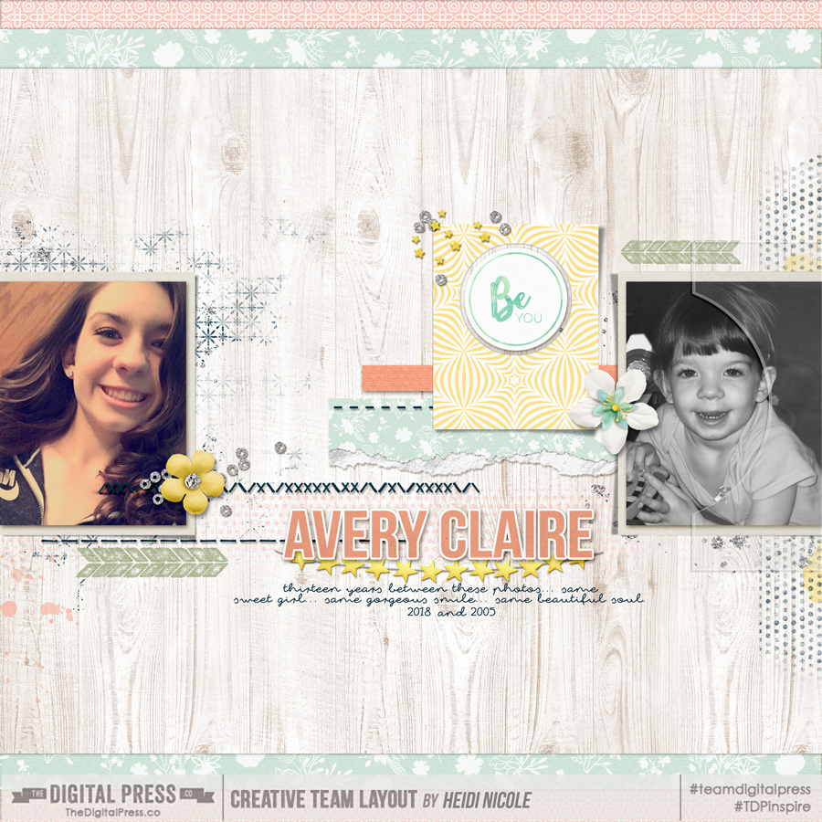
About the Author  Heidi Nicole is happily married to an amazing man, a step mama to 2 wonderful kiddos, and mama to 3 sweet and sassy furbabies. She’s a radiation therapist by day, and creator of pretty things by night (she’s pretty confident that she’s hit superhero status, but refuses to wear a cape). She loves cats and huskies, coffee, audio books, “Friends” reruns, St. Louis Blues hockey, cooking, baking, and traveling. Oh, and wine… she really likes wine. She lives a normal and happy life, and enjoys all the absolutely extraordinary people she gets to share it with on a daily basis!

Foodie Friday | ninigoesdigi

nini2

Hello everyone, and welcome to another edition of our always-popular Foodie Friday series here on The Digital Press blog! This week, we are excited to be featuring Nini of ninigoesdigi. Nini joined The Digital Press as a permanent designer this past year, and therefore this is her first feature on the blog. We are so excited to have her sharing her recipes with us, as she loves to cook and has whipped up some really unique things in her kitchen this week!

Nini

What are those yummy things you see, above?

  1. Ham Mousse
  2. Quiche (without pastry)
  3. Gateau au Chocolat

Ham Mousse

INGREDIENTS

  • 250 g of white ham
  • 400 ml (2 cups) of fresh cream (divided in 250 ml + 150 ml to be used separately)
  • 6 g of gelatin (soak it in a little bit of cold water – this time I tried with only about 2 g to see if it was less hard and I prefer that texture. You will need to test and see what you prefer)
  • salt and pepper to your taste (depending on the saltiness of the ham too)

INSTRUCTIONS

  • Cut  away the hard bits (hard gristle) the white ham might have. I take out the white soft greasy parts too. I only keep the pink meat of my ham 😉
  • Put 250ml of liquid fresh cream in a saucepan with the ham cut into small pieces on medium heat. Don’t let it boil. Take off the heat once it starts make bubbles.
  • Place that mixture in your blender, or like me, mix with a hand mixer until smooth. Add the gelatin. I am not patient so when the recipe said “blend 10 minutes until smooth” I totally didn’t follow through lol. Just blend as desired until you think it is smooth enough for you. Scrape the mix from the sides too so that everything gets well blended.
  • Cool the mixture by placing your bowl or saucepan on an icy bain-marie (water bath). Slowly mix with a spatula to cool it down evenly.
  • Whip the rest of the fresh cream so it gets to be the same consistency of the ham mixture (about 80% of normal whipped cream).
  • Add the cream and ham mixture to the cooled mixture in the bain marie and mix gently together. If it is not seasoned enough for you, you can add salt and pepper to your taste.
  • Pour into a bowl and refrigerate for at least 20 minutes before serving.

Special note: this amount makes quite a bowl of ham mousse so maybe you could try half of it first, if you are concerned it will be too much.
I love to spread it on a slightly toasted baguette pieces, or fresh baguette. One suggestion: if you have a French baguette that is 1 day or 2 days old, spray a bit of water on your slice before you toast it. It will help bring back the good crunchy outside/soft inside taste, like a fresh baguette.


Quiche (without pastry)

INGREDIENTS

  • 200 g of diced bacon
  • 3 eggs
  • 500 ml of milk
  • 100 g of flour
  • 140 g of grated Gruyère / but for the one on the picture I used grated Parmesan
  • salt (to your taste but depends also on the bacon) + pepper

INSTRUCTIONS

  • Brown the bacon bits in a pan.
  • Spread them in a cake pan/mold (about 24cm, and buttered).
  • In a pitcher/bowl, mix the flour, the eggs one by one, the milk, 140 g of grated cheese, or Parmesan like I did. Pour the mix on top of the bacon.
  • Bake for about 40 minutes at 180°C or 200°C (350°F/390°F) depending on your oven you might need more or less time. Take a look sometimes to see if it’s not too burnt! lol

Special note: I usually make this when I have guests, for a party and I use silicon mold with many divisions. That’s why in my picture I have serving sized  bits of quiche (some round, some square). Perfect for an appetizer, no? Since there is no pastry/pie at the bottom you can make as many shapes as you like. But don’t forget to adjust the cooking time if they are smaller than a whole pie. I loved using the Parmesan instead of some other grated cheese. The cheese taste was delightfully  stronger.


Gâteau au Chocolat

INGREDIENTS

  • 200 g of black chocolate (70%)
  • 125 g of butter
  • 100 g of flour
  • 8 to 10g of baking powder (I usually put 10g)
  • 4 eggs (separate yolks and whites)
  • 200 g of sugar
  • 1 pinch of salt

INSTRUCTIONS (20 mins preparation time)

  • In a saucepan melt the chocolate with the butter. Remove from the heat and pour in the flour and the baking powder. Mix well.
  • Pre-heat your oven to 180°C (350°F)
  • In a bowl beat the yolks with the sugar until they whiten. Mix with the chocolate.
  • Beat the whites with a pinch of salt. Add them to the chocolate, mix slowly so that the meringue doesn’t break too much.
  • Pour the mix in a mold that has been buttered and floured.
  • Put in the oven for 30 minutes. Check around the end of the cooking time by sticking the cake with a knife to see if it comes out dry. I actually don’t mind it to be a little humid as it means the outside is cooked but the middle is still a little moist. Yum! Be careful that the top of the cake doesn’t burn too much. If you think it’s too cooked but need to add a few more minutes because the inside is not yet cooked, add a layer of foil on top.
  • Let it cool before you turn it out.

Special note: This is my all-time favorite. I use French cooking chocolate that I bring back from France or that my mum kindly sends me to Japan. It is a 70% cacao chocolate bar. I tried with the cooking chocolate selling in common Japanese supermarkets but it got super greasy… I don’t know why. Maybe there was too much fat in that chocolate? But I won’t make that mistake twice.


These recipes all sound fabulous, and definitely easy enough to pull off! Please share in the comments if you try the recipes, and let us know what you think of them!

Meanwhile, as is always the case with our designer feature weeks — they come with a fantastic week-long sale and a special Free-With-Purchase offer. You’ll be excited to know that the entire ninigoesdigi shop at The Digital Press will be marked down 30% throughout her feature week (sale prices will be valid through 11:59pm ET on Thursday 2/15)… and if that weren’t good enough news, she will also have the following Free-With-Purchase offer available in her shop all week long as well — spend $10 in the ninigoesdigi shop at The Digital Press and get the following brand-new FULL KIT completely FREE!


small avi

About the author Stefanie is a member of The Digital Press creative team and a stay at home mother of three older children living in Cape Town, South Africa with her hubby of 29 years, two of their three children and 4 Siamese cats. She loves photography, traveling and digital scrapbooking, documenting the good and the ordinary everyday.

Tutorial Tuesday | Documenting Your Work

Happy Tuesday! I’m so excited to be here on The Digital Press blog today for this week’s Tutorial Tuesday. I thought we’d focus on documenting our job/work when we create scrapbook pages to memorialize our lives.

We all do some sort of work in our lives… whether it’s paid employment, raising children, managing our homes, volunteering in our communities, taking care of family members, or even growing a garden. In many ways, the work we do is central to our daily lives and to our identity as a whole. I think getting stories about our work into our scrapbooks is a great way for other people to get a closer look at what makes us who we are. It gives our family and friends more insight (and respect) for all that we do that they never suspected. Additionally, it’s a great way to document important aspects of our daily lives that we’ll want to be able to look back on and remember in the years to come.

There are so many ways to document your work… but I thought I’d share a few different ideas to help get you started. And, don’t forget, you can document ANY kind of work — paid or unpaid, outside or inside of the home, or any other arrangement that work consists of in your life!

Ideas to get you started…

  1. Create a scrapbook project that provides an overview of the many different jobs (or types of work) you’ve had over your lifetime.
  2. Scrapbook about the ‘details’ of your work — what you do, your title, your boss/coworkers/employees, details about your daily schedule or routines, your commute (or lack of a commute), where you do your work, and more.  You can even include details such as your pay (or lack of pay), where you go to lunch when at work, or how you’ve grown in your job (raises, promotions, etc).
  3.  Create a scrapbook page that shows ‘a day in the life’ of you and your work.
  4.  Tell the story of how important work is in your life.
  5. Create a page that tells what you love about your work — what’s working and what brings you joy.
  6. Tell the story of the not so great things about your work — what challenges you, what you wish you could change.
  7. Scrapbook about the work you do at home — such as your approach to housework, outlining the work no one realizes you do, and/or what you love or hate about the work you do at home.
  8. Scrapbook a page about a specific project, accomplishment, or task.

I have many different jobs in my own life — I work full-time as a Project Manager, I am a creative team member here at The Digital Press, I am a wife and mother who helps maintain our home and family life, I am a book blogger, and I am a book-related bullet journaler. These are all different examples of work and its place in my life. And I’m working hard to ensure that each aspect of work is represented in my scrapbooks.

Here is an example layout that I created that tell the story about one of my job-related tasks as a Project Manager…

bankmoreways

…and here’s another example layout I created, which also documents the work I do each day in order to help me remember in the future how I spent my days…

Hello-DOL_OV800


I hope this post helps you begin incorporating your job/work/daily tasks into your scrapbook pages. I think that this is a great way to ensure that all of our life experiences are captured in our scrapbooks. Happy scrapping!


Amy

About the Author  Amy lives in Richmond, Virginia with her husband of  17 years and their 12 year old boy/girl twins. Their 21-year-old daughter is currently in graduate school at Clemson! Amy has been scrapbooking since the early 1990s but discovered digital scrapbooking in 2005 when her twins were born and has primarily scrapped digitally since that time. She is passionate about telling her family’s stories and documenting their life together! Amy is a huge reader (mostly literary fiction), and is a pop culture junkie! She also LOVES all things beauty & makeup!