Category: Inspiration

Flourish: Before & After

Flourish: Before & After


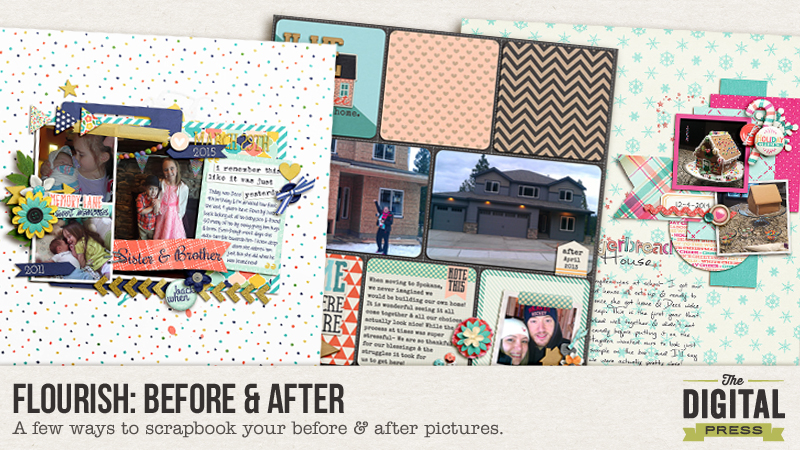
When I see the word Flourish- I think of growth, thriving and prospering. In order to grow- one must have begun somewhere and thus a before and then an after. In scrapbooking, we tend to document a moment in time or specific event. However, some of my favorite layouts are comparisons with before & after shots. I’ve rounded up few ideas to help you capture before & after photos/layouts in all aspects of your life.

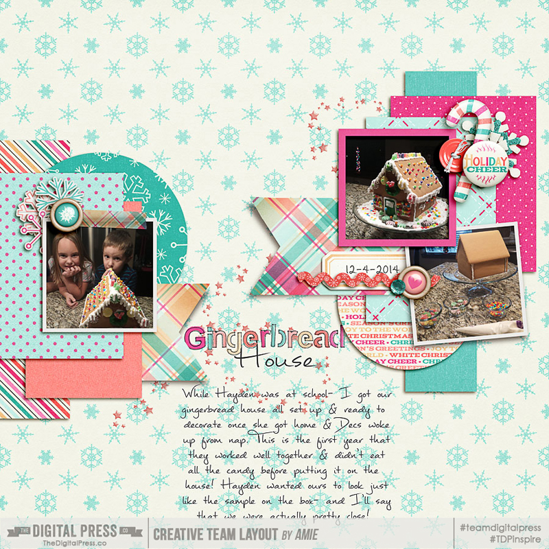
  1. Projects! I don’t know about you, but I’m a project gal! I always have a few in the works at all times. I’ve made it a habit to take before, during & after pictures of all the painting projects I’ve done in and around our house as well as crafts with the kids, building our home, baking cupcakes and organizing my office. Also think about home remodels, car and school projects. These are perfect stories to tell through scrapbooking!

Flourish: Before & After

Flourish: Before & After

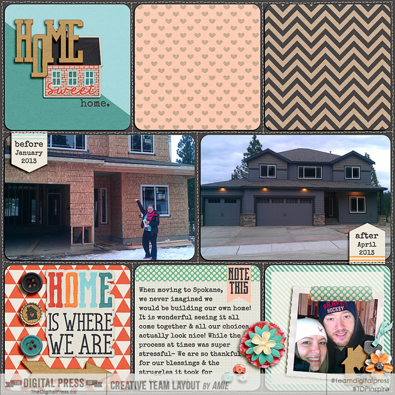
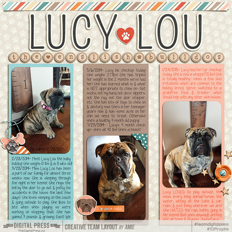
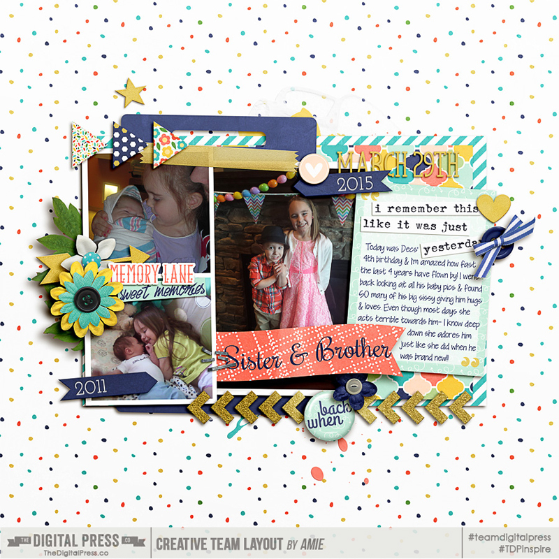
  1. Actual Real Growth! We have an English Bulldog who was the stinkin’ cutest puppy you’ve ever seen! I have SO many photos of her as a lil pup & they are super fun to compare to her beastliness now. Of course this works very well with kiddos too! I like to compare school pictures (seriously they never took Fall AND Spring School pics when I was a kid!), as well as baby vs today. Another fun idea is a picture on every birthday or comparing kindergarten to high school graduation! These ideas aren’t limited to kids/pets- what about your landscape when you first moved into your house vs. now? I’m totally guilty of taking pictures of all my pretty flowers coming up for the 1st time this Spring! Also- your Hometown then vs. now would be fun (Mine has a stop light AND a bank now!)

Flourish: Before & After


Flourish: Before & After

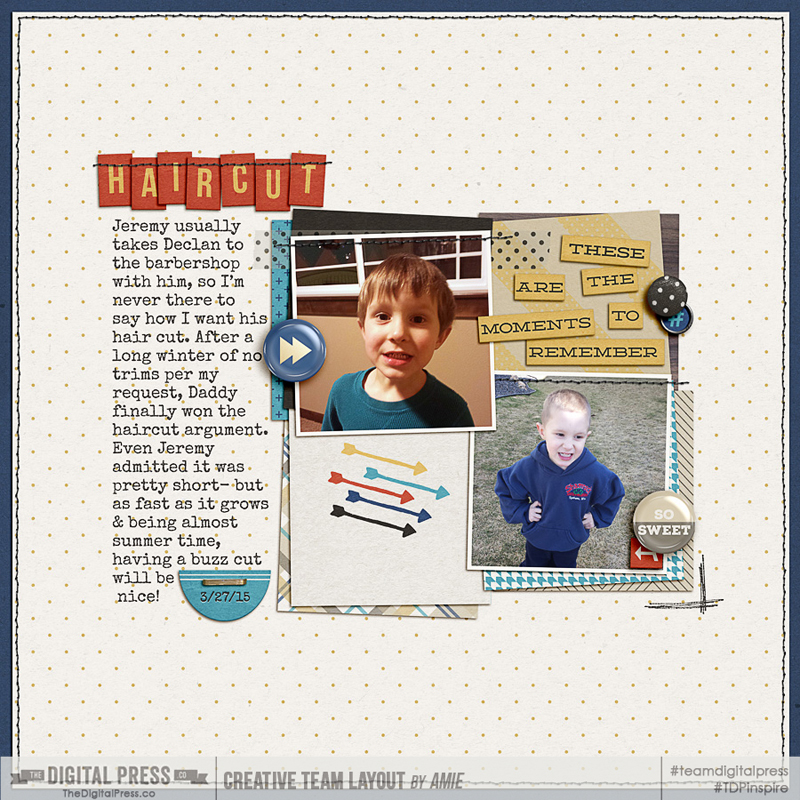
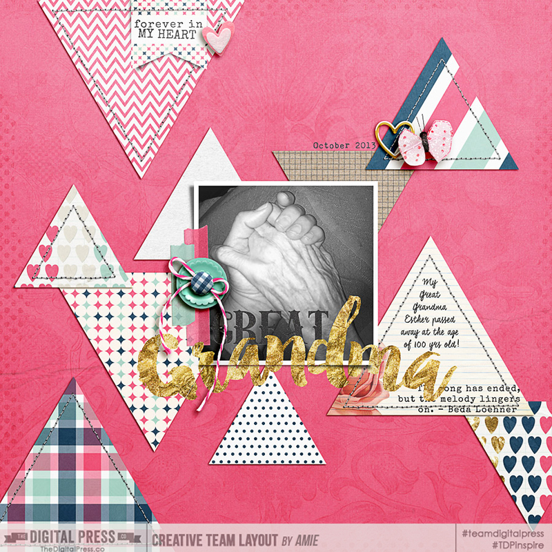
  1. Last but not least: CHANGE! This is my favorite Before & After type of layouts- Haircuts/styles, Weight loss (if you’re one of THOSE people who actually make progress- email me your plan!), Orthodontics/Braces (sorry, always about the teeth with me!), and my favorite- people’s hands (weird I know)- hands tell such a story (old vs. new). Another idea I want to scrapbook is my husband & I when we just started dating vs. now old & married! 😉

Flourish: Before & After

Flourish: Before & After

There is so much you can do with before & after photos! Please hop over to the Challenge Forum & show me your layouts! I’m excited to see your ideas! Please join me in a fun challenge over in the FORUM! Happy Scrapping!


AmieAbout the Author: Amie is a craft loving, dental hygienist in WA state who loves her husband, two kids (ages 7 & 4), English Bulldog, coffee, baking cupcakes, daffodils, glitter & sprinkles, reading a good book and lip gloss- not necessarily in that order. 

Tutorial Tuesday: Blending Your Digital Paints! | The Digital Press

Tutorial Tuesday: Blending Your Digital Paints!

Tutorial Tuesday: Blending Your Digital Paints! | The Digital Press

Hey guys! Stephanie (aka: PuSticks) here today to show you a simple trick for blending digital paints on my scrappy pages! First, lets have a quick chat about real paint. When you use real paint on paper, your colors blend together right? When you layer wet paint over dry paint layers, typically some of the dry paint will show through your wet paint. When we have digital paint, we don’t always get that type of effect without a little tweaking! Take a peek at one of my recent pages:

Hope by PuSticks - Tutorial Tuesday: Blending Your Digital Paints! | The Digital Press

*click here to see page credits*

As you can see, I like my paint! Now, I used a few different techniques on this page to create realistic looking paint but today we’re going to focus on the technique that provides the biggest effect: Blending Sliders.

NOTE: I’m working in Photoshop CS6 but this also works in CC. If you’re using Photoshop Elements or another program, I’m sure there are ways of achieving the same type of look, perhaps if anyone has any tips for those programs, they can leave a comment below with some ideas!

Step 1: Place Your Paint!

The first thing you need to do is put the digital paint on your page. As you can see below, I’m using the same page as above but we’re going to focus on the green paint area in the lower right corner:

Step 1: Place Your Paint - Tutorial Tuesday: Blending Your Digital Paints! | The Digital Press


To pull up the “Layer Style” window, you can double click on the layer you want to edit or on the menu bar, select “Layer -> Layer Styles -> Blending Options”. At the bottom of this pop up window, you’ll see two sliders, these are what we will be playing with!

Step 2: Blending Digital Paint!

Okay, now that we have our Layer Style pop up open, we need to play with those sliders! We’re working only with the bottom most slider in this example. If you drag them back and forth, you will see your paint slowly disappear! Well that’s not what we want at all! We need to split the slider triangles. To do this, we need to hold down the “alt/option” key and then click on the little line in the middle of the triangles. Now we can slide the halves independently! Move the dark slider on the left towards the middle to show more of the dark colors from the layer below, move the right light triangle towards the center to show more of the underlying light colors. Play around with these until you like how your paint looks!

Step 2: Blending Digital Paint - Tutorial Tuesday: Blending Your Digital Paints! | The Digital Press

Sometimes I also play with the top slider too if I don’t like how using only the bottom one makes my paint look. If you’re feeling adventurous, play around with this slider too to see what type of painty looks you can come up with! If you’re curious, here’s a closer look at what my Layer Style pop up window looks like from the above photo:

Layer Style Pop Up Close Up - Tutorial Tuesday: Blending Your Digital Paints! | The Digital Press

Bonus Idea!

You know what else this technique is fun to use on? Pattern papers! Blend some grungy papers together, or use a layer mask to block out areas of the paper and then blend them together, or clip papers to shapes and then blend the shapes into the background paper… the potential uses of this little trick are amazing! So go grab some digital paint, papers and all that fun stuff, make a neat page, then upload your new masterpiece in the gallery! I look forward to seeing your painty goodness popping up around here soon!


Stephanie

About the Author: Hey guys! I’m Stephanie and I’m a scrapbook addict… and a Disney nut… and a Netflix junkie! I seem to do everything “all-in” when it comes to things that I’m passionate about. I don’t have a “style” per say, some days I’m feeling clean and simple, other days I’m art journaling with abandon! Outside of my creative outlets, I enjoy spending time with my family, especially when it’s at Disney World with my two sons! Also, I thoroughly enjoy stepping on small Lego pieces at 1am…wait…

Flourish with Your Favorite Flower

Flourish with Your Favorite

Definitely, scrapping is an art. Inspiration in art comes from our heart. Many of us scrappers, if not all, approve of this view. Scrapping lets us also discover ourselves, express our own feelings or emotions and most of the time scrapping awakens our inner selves hidden under our everyday masks.

I remember when I was a little girl, I was unable to take care of flowers. Often I forgot to water them and saw them fade away slowly. My father thought it a shame, a girl who didn’t like flowers and who was unable to keep one blooming ^-^ Or in my eyes, flowers meant joyful colors, nature and life. I grew up thinking I was not able to carry on beauty or did not feel myself artsy nor creative. Instead I chose to grow with figures and a career in finance.

But I love photos.  I feel photogenic and I loved to be photographed. Then I became a Mom, deeply in love with her babies. I began to take more and more pics of my sons and I find them more photogenic than me or anyone else. Yes, I am a Mom! I was tired of keeping my thousands of photos stored on my laptop. I started to build a website for my boys but it wasn’t enough for me. I found digital scrapbooking and I started to make page after page after page after page…

The longer I scrapped, I was surprised to discover the amount of creativity out there. Each time I visited a gallery, I would ask myself how I could create those same looks in my layouts.

And most of all, I discovered how deeply I love nature and love flowers. I love to take photos and scrap them – their colors inspire me more than anything else. Yes, scrapping helps me to discover my love of flowers and helps me also to have more and more in my garden 🙂 I am so happy now that I feel able to take care of a plant and see them grow and bloom in my own way.

April’s theme gives me the pleasure to scrap layout with my favorite flower. I made one recently with a red rose. As I wandered across the gallery, I was happy to find some marvellous layouts, and see how each of us can be inspired by those beautiful color of life. Keep an eye on these two pretty creations :

The page I made is here :

Flourish with my favorite

Inspiration by Kacy :

A Beautiful Day

 and by Rae :

Vibrancy

 Come and visit the Challenge here in the forum to play along, sure you’ll join us.

Bao 
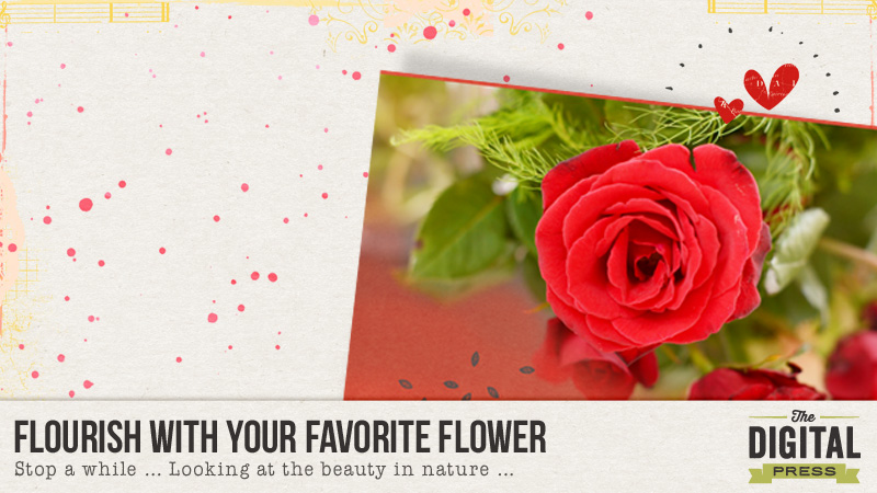
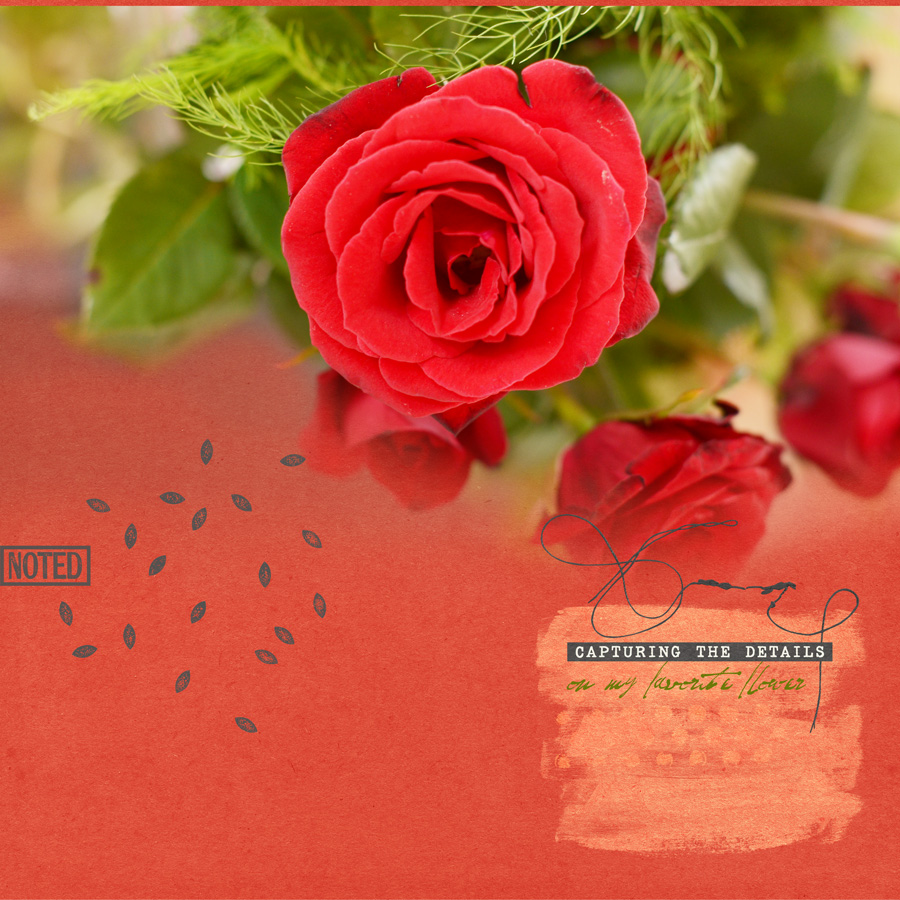
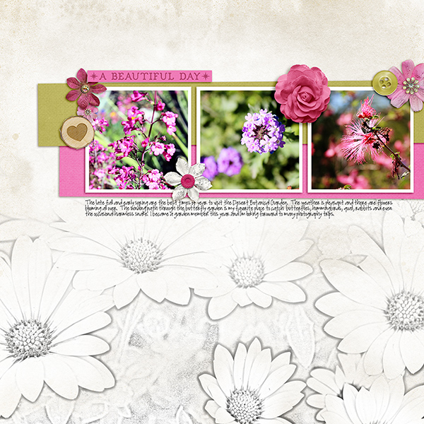
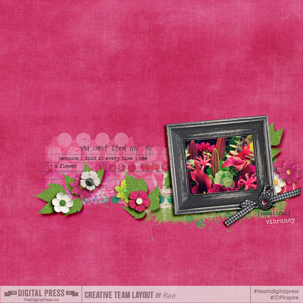
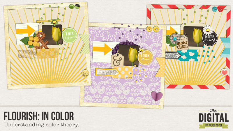
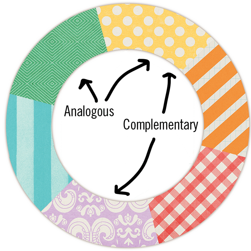
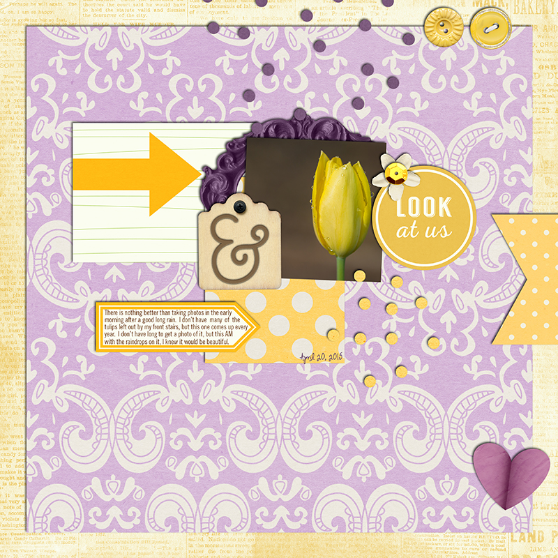
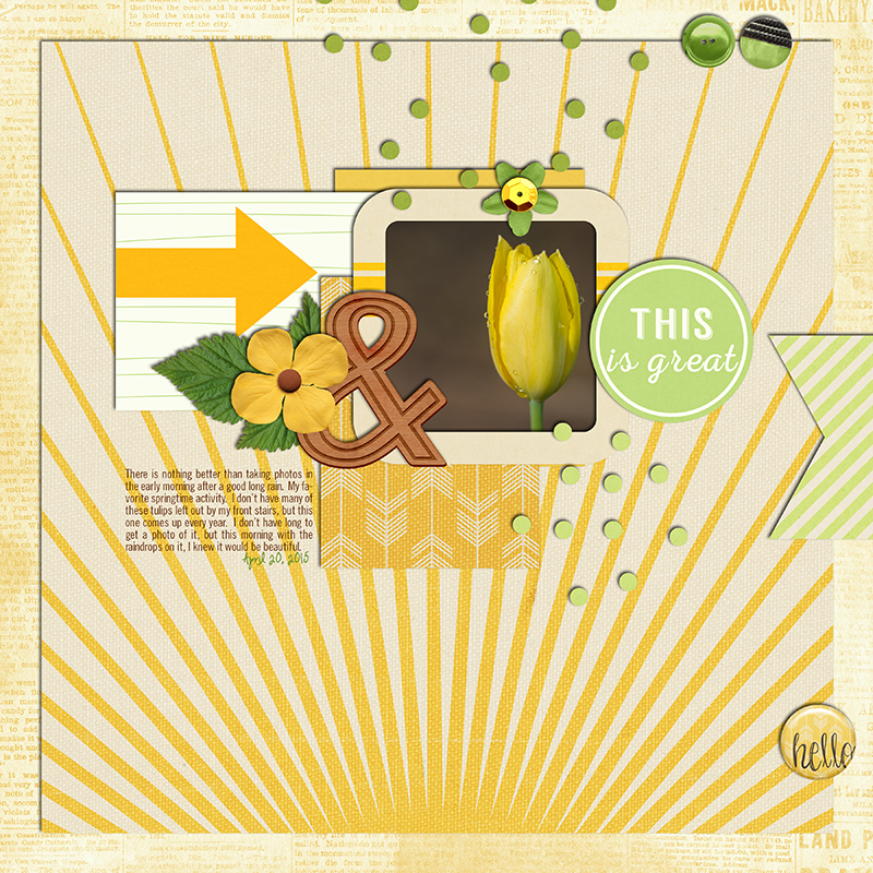
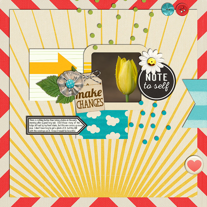
About the Author : Bao is a guest Creative Team member at The Digital Press. She has been a digiscrapper for about ten years now.  She joined The Digital Press in March and enjoys being active on the site. Her style tends to be clean & simple. Most of the the time she scraps her family’s photos. She loves, however, to scrap other subjects such as flowers, nature, the environment, foods … She says hello to all of you from her big island named Madagascar, and feel blessed to live there.

Flourish: In Color

Flourish:  In Color

Flourish…in Color.  There is no escaping color’s influence in our lives – from what we wear to the rooms in our home and cars we drive – it is all related to color.  Everyone has some opinion on color, too bright, too yellow, too dark or not red enough, etc.   There was even a debate that took over social media a couple months ago about whether a certain dress was blue/black or white/gold.  Color affects your mood, what you eat, how you sleep, what you buy….it’s ubiquitous in our daily life.

There is more than enough information on basic color theory to fill a whole year’s worth of blog posts, but I will give you some basics today.  We have all seen the color wheel.  Well, this wheel is based on the primary colors of red, yellow and blue is traditional in the field of art.  It was first developed by Sir Isaac Newton in 1666.  Since then artists and scientists have debated, changed, studied, opined on the validity of one format over another, but the essentially we can agree that any logical sequence of pure hues on the wheel has merit.

There are three categories of colors.  Primary colors are the traditional red, yellow and blue and all other colors are derived from these three hues.  Secondary colors are green, orange and purple and are formed by a mixing the primary colors.  The third category is the tertiary colors.  These colors are formed by mixing a primary color and a secondary color…officially they are called, blue-green, yellow-green  or yellow-orange, but we call them aqua, lime and peach!!

When we design our layouts, color plays a huge part in the choices we make….from the selection of a kit, to the elements we place on our layout and even filters on our photos to give color a pop or maybe warm it up.   The decisions we make during the design process with respect to color are based on theories of color harmony.  I will use the same layout to illustrate two of these color harmony theories:  complementary and analogous.

The Color Wheel (using papers from Colorful Christmas, a TDP collaboration kit found here).

Flourish:  In Color

A complementary color scheme uses colors that are on opposite sides of the color wheel.  The high contrast creates a vibrant look, but is tricky to use and works best when you want something to stand out.  Here is an example of a layout using a complementary color scheme.

Flourish:  In Color

An analogous color scheme uses uses colors that are next to each other on the color wheel.  These color schemes are often found in nature so they are pleasing to the eye.  Here is the same layout as above using an analogous color scheme.

Flourish:  In Color

Or you can always go rogue and try the add any and all colors you want!!!  Makes a completely different statement!!!

Flourish:  In Color

Credits: These layouts were created using Amanda Yi and Digital Scrapbook Ingredients collab, Time for a Change,  A Colorful Christmas by the TDP Designers and Dawn by Design and Anita Designs’ collab, Lovey Dovey.


JennVAbout the Author:  JennV is a lover of history and art (luckily she lives 5 miles outside of Washington, DC) and an accountant by training.  She currently stays home with her two boys and is pursuing a career in photography, when she is not busy volunteering for every school and county initiative!!


Tutorial Tuesday: Increasing Your Font Preview Size

Tutorial Tuesday: Increasing Your Font Preview Size
Hi scrappers! I’m here with a quick tutorial that will make your scrapping life so much better! Are you tired of staring at those tiny font previews in Photoshop? Do you feel like you need a prescription for glasses every time you try to pick a font? Well then this tutorial is for you!

These steps will work for Photoshop CC, but I will add instructions for Elements at the bottom, as well.

All you need to do is go to Type > Font Preview Size and then choose whichever size is best for your eyes. I prefer extra large. It allows me to get a good view of the fonts but still shows a decent number of them at a time.
Tutorial Tuesday- Increasing Your Font Preview Size

I hope this helps you stop squinting at your screen when looking through those fonts!

For PSE users –

Go to Edit > Preferences > Type and then check the box that says Font Preview Size. You can then choose which preview size you would like!
Happy Scrapping!

Katie

About the Author: Katie is a member of the Creative Team here at The Digital Press. She lives in Central Florida with her husband and their four sweet but crazy boys. When she’s not dodging Nerf bullets or trying to dig out from under the never ending pile of laundry, she enjoys photography, cooking, going to Disney World with her family, and, of course, digital scrapbooking.

Flourish | Declutter Your Life

Have nothing in your house


I grew up poor. There were times that we weren’t sure what we’d eat the next day. We went without a lot of things. I think, because of that, I tend to hoard hold onto everything because I’m never sure when I might need it. Our cupboards are way too full. My art/craft supply room cannot hold anything more in it. My closet is a disaster, and I may just have a bit of a “book problem.” So I finally decided that I was going to do something about it. I was going to “purge” in 2015. I was going to de-clutter and tidy up.

I bought the book “The Life-Changing Magic of Tidying Up” by Marie Kondo. I started to read it as soon as it arrived and I could tear the box open. It is amazing. About 50 pages in, I put the book down and started to purge things out of my closet. I was so inspired! I got rid of two and a half garbage bags full of clothes, fifty pair of socks, another garbage bag full of shoes, and an overflowing laundry basket of things to take to the consignment shop because a lot of them still had tags on them. By the time I got rid of all of those things, regular life kicked back in and I had twentty-five things on my t0-do list that needed my immediate attention. I set the book aside and planned to get back to reading/purging as soon as possible. And then I lost the book. I’m embarrassed to admit it, but I seriously couldn’t find it. It was lost in a pile of clutter. Wedged between stacks of mail and hastily-printed articles for my grad-school thesis. It was ridiculous. I laughed until I almost cried. I was lucky because I did find the book again, and I’m still inspired, but it was sort of an ironic wake-up call. I’m reading more and planning a weekend where I can spend the entire time focused on purging. I’m even going to rent a truck. As long as I don’t misplace the book again, I’m golden.

In my quest to simplify life, I’ve found some helpful tips along the way.

  • If you don’t really love something… if you wouldn’t buy it again at that very moment you are holding it in your hand… if it doesn’t speak to your soul… get rid of it.
  • Live with less.
  • Appreciate what you have.
  • No is an option.
  • Unsubscribe from magazines you don’t read, from snail mail that bogs you down, and from email that clutters your inbox (a great resource for this is unroll.me. It is a service that helps reduce your email traffic.)
  • Use the library. If you have a “book problem” the library is a wonderful resource that not only lessens the amount of books in your home on a permanent basis, but it also saves you a ton of money in the long run.
  • Clutter in your physical surroundings will clutter your mind & spirit. — Kaneisha.com
  • A freebie is great if you are really going to use it.

Here are some others:


collect moments not things


simplicity


The good news is that, as scrabookers, we already collect moments. And hopefully your electronic digital stash is not as out-of-control as mine. I’ve decided that I’m going to de-clutter my EHD(s) and get things under control in my digital world as I am cleaning up my physical world. I’m going to be a little more selective about downloading digital freebies, and I’m going to really put some thought into it before I buy yet another kit with a viewmaster reel in it. (I don’t know how many kits I’ve bought because I have to have the viewmaster reels. LOL.) I’m going to delete kits I have on my EHD from 2004 because I know I will.never.use.them. I’m going to unzip and file my digi kits/elements by designer and store and not let them languish in the “download” or “unzipped” folders. I’m going to focus on the kits I have and also be more discerning about what I buy.  I’m going to simplify.I’m going to de-clutter and stick to purging for 2015. It really will make life easier.


My goal is to have a workspace that always looks like this


uncluttered workspace


Join me in the challenge forum to blow off the dust and shop your stash.


Kimberlee
Kimberlee


About the Author: Kimberlee is a lover not a fighter; a stay-at-home gran, a poet, and a lifelong learner. She grooves on saturated colors, Tuesday dance parties, optimism, glitter and sunshine. She colors outside the lines.  She is a dreamer. She is a collector of moments.  She is all about the story.  Kimberlee completed her MFA in Creative Writing and is currently working toward a M.Ed. in Instructional Design.