Category: Inspiration

Tutorial Tuesday | Better in Black and White (Part 2)

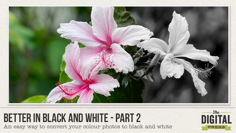
Better in Black and White Part 2 Tutorial

In last month’s “Better in Black and White” tutorial, I gave some tips on how to take better black and white photos. For those who missed it, the tutorial can be found here.

This month, I will focus on converting your coloured photos to black and white. You are probably thinking –“Well isn’t black and white just desaturated colour?” Yes it is, but if you use desaturate, or any of the other one click conversions in your photo editing software, you will get a black and white photo that is usually flat. For the photo to pop, you need to work just a little harder.  😉   A photo edited for colour rarely looks good just desaturated to black and white.

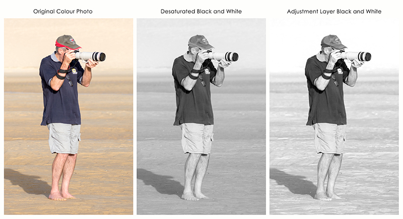
For example, the following photo of my partner was taken at the beach last week. As you can see just desaturating the photo or changing to grayscale has created a flat image. The last image uses one of my favourite conversion methods and the one I will be demonstrating today.
Better in Black and White Part 2 Tutorial

Converting to Black and White using Adjustment Layer and Colour Luminosity

(My screenshots are from Photoshop but most photo editing programs will allow you to convert using this method.)

  1. Open your colour photo in Photoshop and modify as required so that it is appealing to the eye. (This may require brightness or contrast modifications, etc.)
  1. Create a new black and white adjustment layer. (Layer/New Adjustment Layer/Black and White)
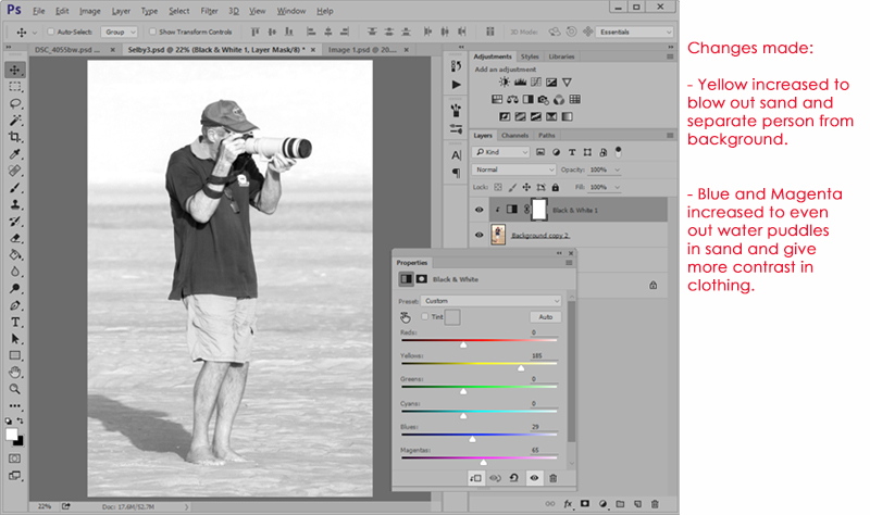
  1. Now comes the fun part – changing the luminosity of the original colours. Move the individual colour sliders to the left or right until you get an image that you are happy with. There is no right or wrong, just individual preferences.


In the previous photo, my aim was to blow out the background so that I would have a photo that could be easily blended into a background paper. These are the adjustments that I made:
 

Better in Black and White Part 2 Tutorial


Let’s look at some more image conversions and the changes made to the colour luminosity.

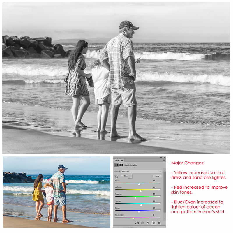
  1. This family photo was taken at the beach. I like the photo but wanted less contrasting colour.
Better in Black and White Part 2 Tutorial

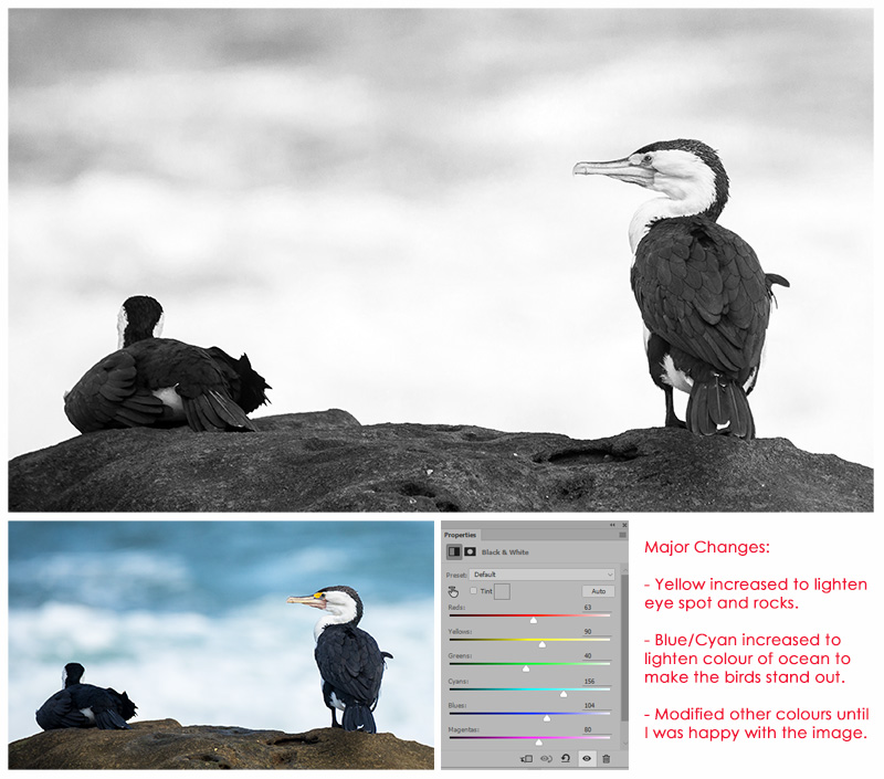
2. I took this photo of Pied Cormorants last week. I love the conversion which shows great detail in the feathers.
Better in Black and White Part 2 Tutorial

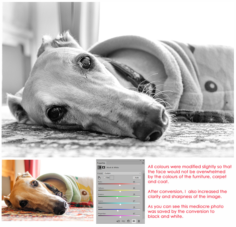
3. This photo of my darling Zsazsa did not look good in colour and was saved by the conversion to black and white. Yes sometimes you can save a photo by converting. 🙂
Better in Black and White Part 2 Tutorial

As a final step, I will often alter the brightness and contrast slightly before flattening the image and saving it as a separate file to the original. (You may need that original in the future).


As you can see this is an easy way to have better control when converting images to black and white. Please have fun trying out this technique. I’d love to see what you can do, so definitely feel free to link me up to any of your photos in the comments below.


AvatarAbout the author  Carolyn lives with her partner, eldest daughter and 3 rescue dogs on 5 acres of paradise in the hinterland of the Sunshine Coast, Australia. Her camera, along with an assortment of lenses, is never out of sight. When not taking photos, she loves cooking and gardening and of course scrapbooking.

Create a Teacher Appreciation Card


Education is very important to our family and I try to teach my children that learning is something that should be cherished. We have been very fortunate that our kids have had many great teachers at the international school they attend in Shanghai. So, whenever possible, I like to show their teachers how much we appreciate the love and care they give our children and their efforts to teach them a good set of values in addition to the normal curriculum.

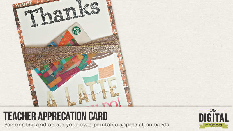
Today, I am going to show you how to create a simple teacher appreciation card with the awesome designs our talented Digital Press Designers offer in the store. I think any teacher would love to receive a heartfelt thank you and a small token of appreciation like this.

Step 1: Choose the papers and elements you want to use
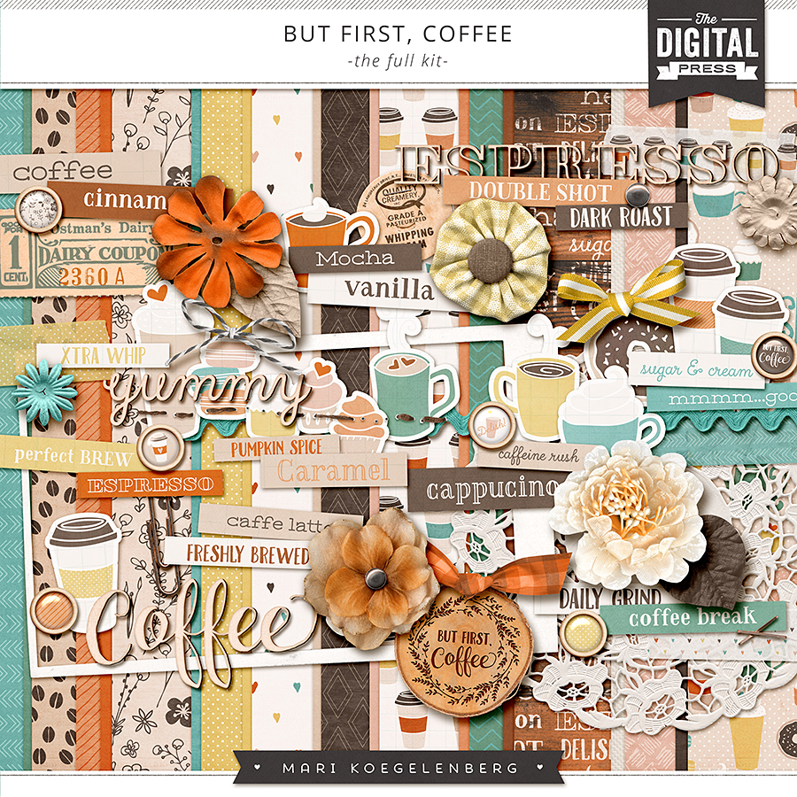
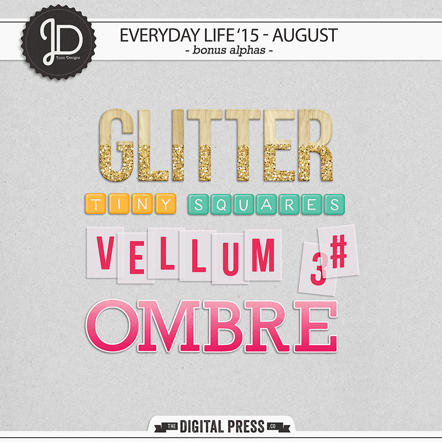
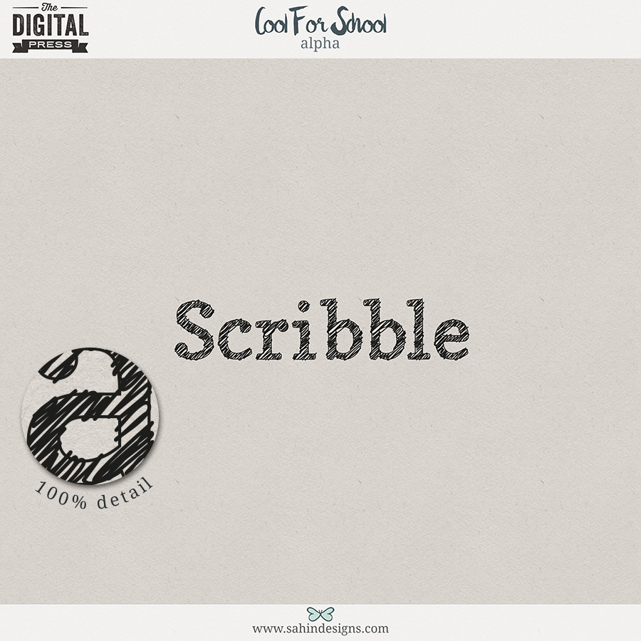
I find this the most difficult part, because I get easily lost in the store while browsing through all the gorgeous products. For this appreciation card, I have chosen the following designs: But First Coffee | The Kit by Mari Koegelenberg, Everyday Life’s 15-August | Bonus Alphas by Juno Designs and Cool for School | Alphas by Sahin Designs.


Step 2: Decide upon the format/size of your card
The next step is deciding what size you want the cards to be. As I want to include a Starbucks gift card, I need to make sure the card is big enough for the gift card to be added, so I created a 13 cm by 18 cm canvas in photoshop.

Step 3: Create your card
The next step is to choose which papers to use for the background. I opted for 2 papers: one with a nice coffee twist and one neutral paper so I could add the alphas. I added shadows to the alphas and the papers but that’s clearly all up to you. When I printed the card it wasn’t quite finished yet, so I decided to add some elements for the finishing touches.

Here is the card created in photoshop.


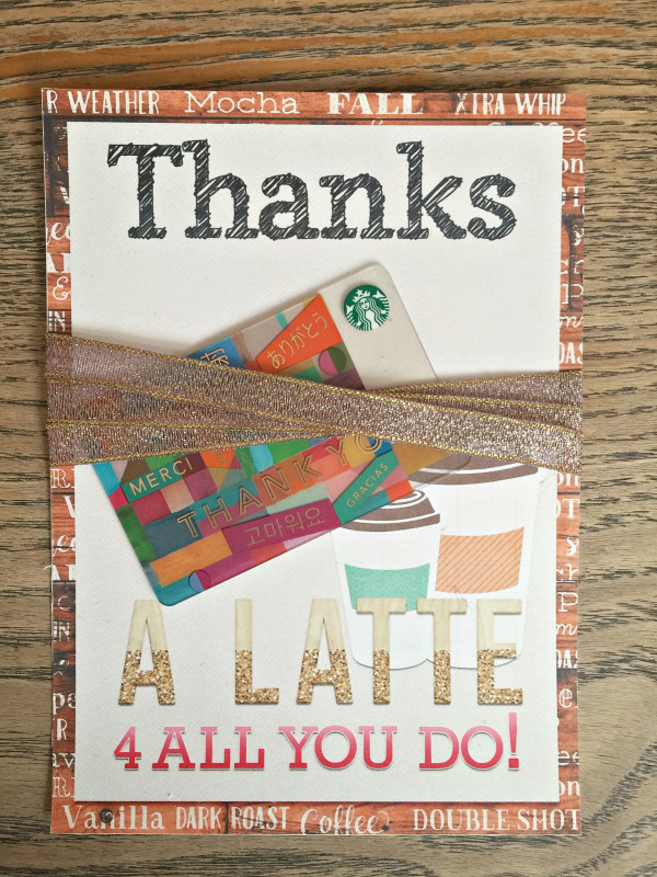
And this is the printed result. I prettied the card with some ribbon and added the Starbucks gift card.


Appreciation cards are so much fun and yet so easy and simple to make. Why not create an appreciation card for somebody you cherish? Come join today’s challenge in the forum and create one of your own! You can share your card in The Digital Press Challenge Gallery and link us up to your page in the Digital Press Challenge Forum.


CeciliaAbout the author Cecilia (aka MissK) is a member of the creative team here at The Digital Press. This Dutchie lives and works in Shanghai, China as a photographer/designer. Together with her husband, Udo, and kids Lana (7) and Tom (5), she loves to explore the world and enjoy life to the max. Carpe Diem!

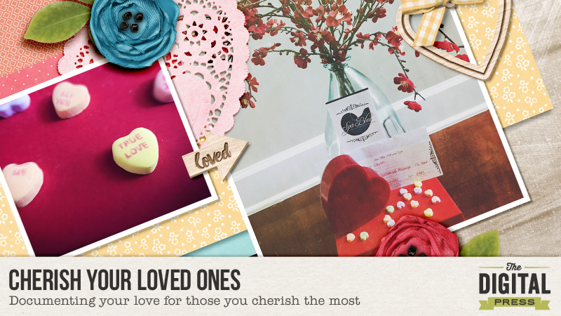
Cherish Your Loved Ones


Last week, people everywhere were seen rushing to stores and scrambling for the perfect Valentine’s Day gift, suitable for the special person in their lives. It’s a common sight during February. While it is typical for people to shower their loved ones with flowers and candy, I’ve taken a different approach.  Every year, I’ve made it a tradition to surprise my husband with small sentiments of my affection and really center the day around him.

We’ve been married for over 12 years, so it’s usually a challenge to get creative on finding the perfect gift every year. We recently bought a new home, and he’s been working extremely hard on repairs and updates. Therefore, this year I opted for a deep-tissue massage at one of Savannah, Georgia’s most sought-after spas. He was thrilled!

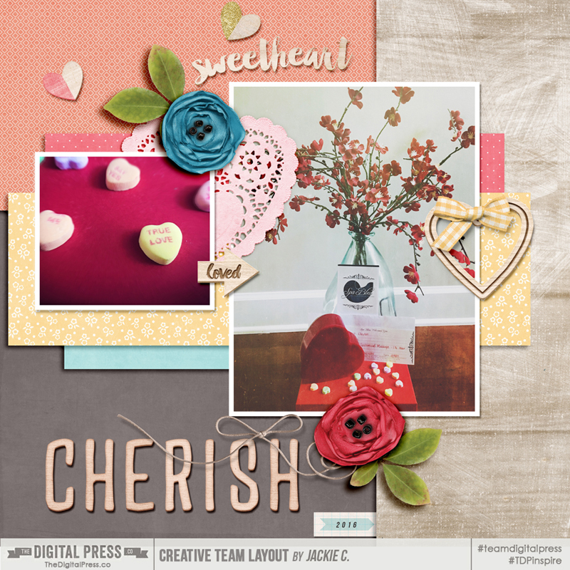
Here’s a look at a layout I created to document this year’s gift…

Cherish Your Partner


Note:  I created this layout using both Wishing Well Creation’s Project 2015 February Collection and the Cherished Mini Kit from The Digital Press. To get the page done quickly, I also used a template from Duo 6: Love Me Like You Do from La Belle Vie Designs. The entire theme of these kits centered around the word “Cherish” (our word of the month here at TDP!), and so it all fit perfectly with my layout.

The point, however, is that there are a ton of “non-traditional” ways to cherish the people you love… whether your husband/wife, your friends, or your children. Here are a few of my favorite ideas that I’ve used in the past:

  1.  Make a Candy Gram! These are so much fun and cost about $5!  You can be creative on your own or find a lot of ideas and clever wordings here: Pinterest Candy Gram Ideas
  2. Cook a fantastic meal! The key to lots of people’s hearts is through their stomach, right (as the old saying goes)? Ditch the expensive restaurants and have a romantic dinner at home.
  3. Let your loved one pick the movie! Let’s face it, not all women love action movies — but not all women love “chick flicks,” either. The same goes for men. If your taste in movies isn’t the same as that of your loved one(s)… a fun way to show your love is to let them choose, and then suck it up and “suffer through” whatever genre it is that you don’t adore!
  4. Make a mini scrapbook of current and past pictures of the two of you! The Digital Press even has some fantastic mini albums and templates that will make it a breeze!
  5. Most importantly — don’t limit these things to one day a year! Valentine’s Day is great and all, and it’s a fun way to celebrate the people we love the most. But cherishing those you love is something that can be done throughout the entire year, and being mindful of doing it regularly will only make those bonds stronger. That’s part of why I love that this post is being written the week after Valentine’s Day. 🙂

What are some ways you have chosen to cherish your loved ones? Come share your ideas (we’re always looking for ideas for ourselves!)… and join us in the forum for a fun challenge!

Happy Scrapping!


Jackie ClaytonAbout the Author  Jackie is a member of the creative team here at The Digital Press. She lives in Savannah, Georgia with her husband and 6 year old son.  She has an obsession for photography, exotic parrots, and of course scrapbooking!  
Prettify Your Pantry – Hybrid DIY Storage Containers Upcycle


My name is Alina and I like to hoard stuff. There’s always something I can think of doing with things later. Maybe I even like to hoard ideas. When I recently got all the clutter out of my kitchen drawer it dawned on me, that I need a way to store my ingredients. Since I couldn’t figure out what the optimal permanent solution for my problem would be, I thought of an interim.

And that’s when my hoarding finally made some sense. I had lots of containers saved for an unspecified diy project. Yay! Containers! They were all not matching my kitchen colors and I knew that a hybrid make-over would let them shine. I will guide you through my thought and action process for this project.


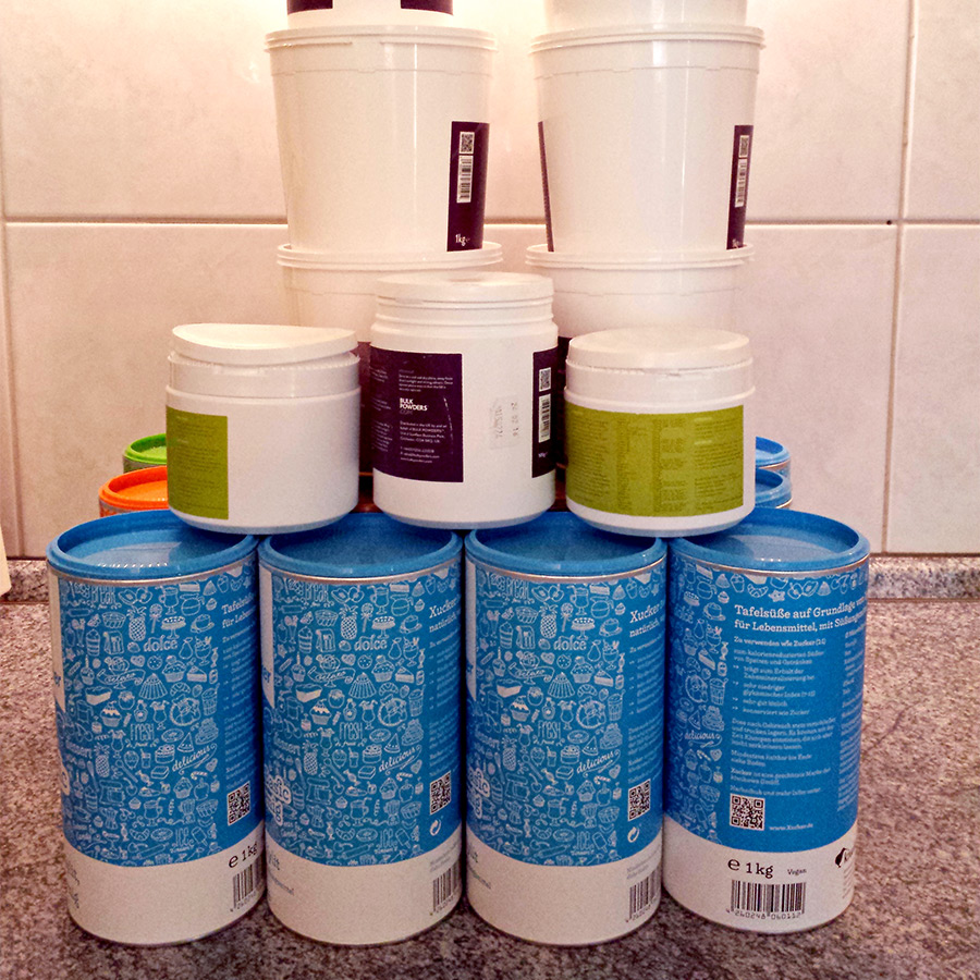
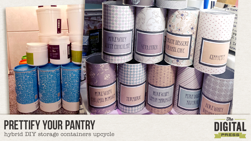
All the kitchen containers I hoarded for later use. For this project the large containers on the bottom came to new life.


First I looked through my ingredients. How big should the containers be and how many of them would I need? How many of them would fit into the space I found for them? I figured that I had 11 bulky ingredients needing a big container. The other ingredients would need a smaller container and they would fit into the drawer, so they wouldn’t need a make-over. If I had additional time and energy, I could still upcycle them later.

I cleaned the containers cautiously and let them dry before I did anything else with them.

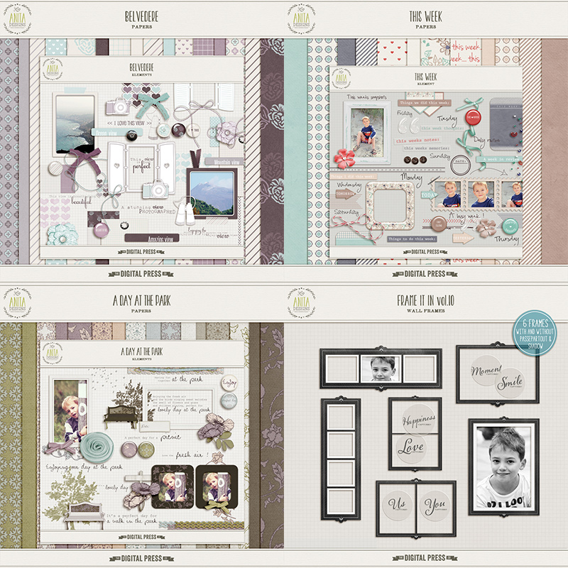
Then I thought of the colors I wanted to use. Our house is full on romantic in dusty/grayed colors and the kitchen is blue/purple/taupe/gray with a wooden countertop. I knew Anita Designs would be my go to for the style of the kitchen. I found lots of kits in these colors and the style that I needed. I was specifically looking for the patterned papers and left out the colors that wouldn’t match what I had in mind (green and red in this case).


The kits I used (linked) Belvedere, This Week, A Day At The Park, Frame It In Vol. 10

I measured the containers. They are all cylindric and have the same measurements. The size of the cover would have been larger than A4 but only a small strip would remain uncovered. Since it’s just an interim solution, I am okay with a small portion on the back of the container peeking through. I have A4 sticker paper and used it for this project.

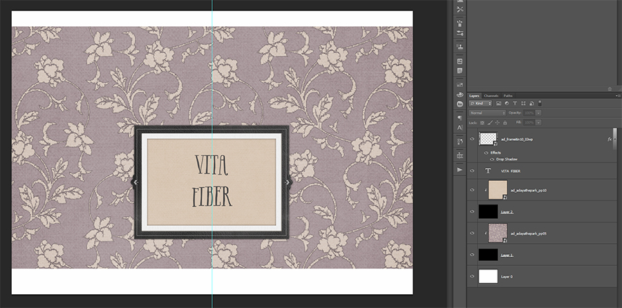
I created a template in photoshop with the measurements of the cover. It’s simply a background paper, a big frame and a large font in capital letters. I created all the covers and printed them on the sticker paper.


My template for the covers. I only changed up the papers and the captions.


Now I got serious. After cutting the excess paper off, I tried the cover on with the backside of the sticker paper still attached. I could see some of the high contrast original cover through the new cover. On those containers I used a plain paper before I covered it up with the printed paper.

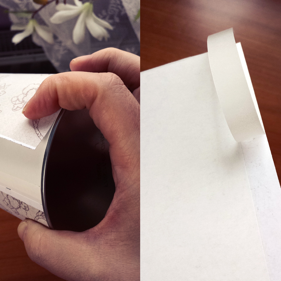
The sticking onto the container was tricky. I had to be very carefully finding the parallel lines to be able to stick the paper without creases and bubbles. Since I’m lazy, I didn’t want to draw a line on every container as a guide. So I only got the small backside off and tapped it lightly onto the container, making sure it would be fitting on the edges. Then I peeled off the rest of the backside and brushed the paper from the middle of the already sticking part to the edges and around the whole container.


Sticking only the small strip to the container to see if the sticker will fit on the edges.


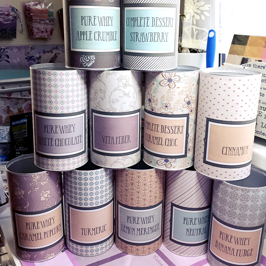
Et voilá, after several repeats, I had them done. All in all this took me about 2 hours, printing not included.


The containers on my crafting table.


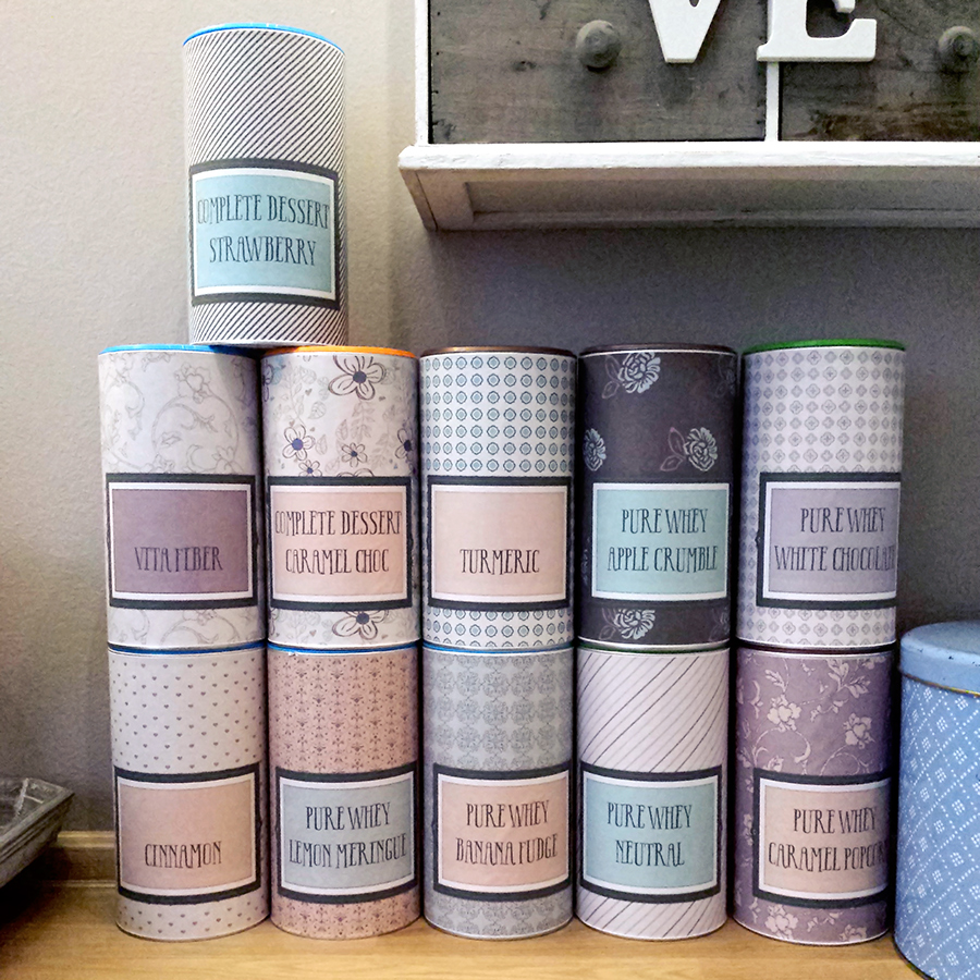
They fit perfectly into my kitchen and I’m happy when I look at them. If I wanted them to last longer, I had them coated, because the ink might come off when in touch with water.


The containers in the kitchen, where they belong.


That’s how my hoarding became something beautiful. Now I can even ease “the hubster” into the thought of keeping things a little bit more. Who knows which idea I will diy next?


alina

About the Author: Alina enjoys sitting in front of her large computer screens too much. Apart from that she loves walking her dog and watching sunsets while being amazed of life in general. She is married to her best friend. Tries to manage the needs of her two cats and her dog and badly fails when they all want their cuddle time at once. Everything else is scrapping, taking photos and currently crafting. Having said that, she needs a bigger craft room.


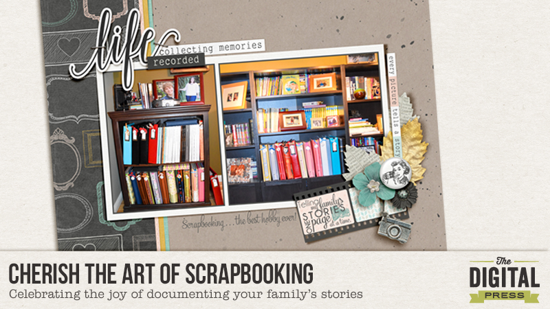
Cherish the Art of Scrapbooking and Documenting Your Family’s Stories

Cherish the Art of Scrapbooking and Documenting your Family's Stories

In all likelihood, if you are reading this post you are a scrapbooker, like me. I love everything having to do with the art of scrapbooking and telling my family’s stories.

In particular, I love:

  • The camaraderie with other scrapbookers (through the forums, galleries, and Facebook groups). The Digital Press is an awesome place to connect with other scrapbookers!
  • Shopping for the perfect scrapbooking kit to tell my stories. Do I even have to say how awesome it is to shop the gorgeous kits created by the designers here at The Digital Press? 😉 We all know!
  • The process of creating my pages.
  • Perusing Pinterest and scrapbooking galleries for inspiration for my pages. Did you know that The Digital Press has a Pinterest board?
  • Looking through my scrapbooks and watching other people look through my scrapbooks.

It’s ALL good!

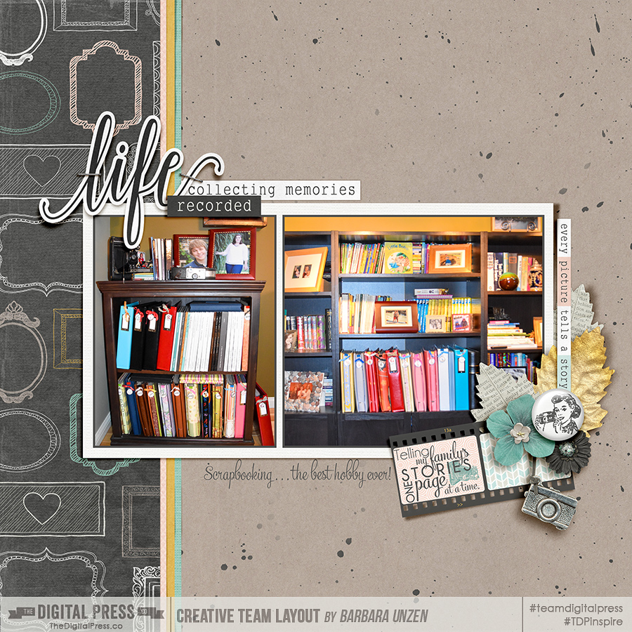
When I thought about writing today’s post about cherishing the art of scrapbooking and documenting our families’ stories, I thought about how many stories I have told on my scrapbook pages. It inspired me to take some time this weekend to pull out a bunch of my scrapbooks, page through each one, and reminisce over some of the stories. Initially, just looking over my collection and really appreciating the albums I’ve created over the years made me happy. And THEN I opened the books. 😉  It was fun seeing my kids grow older on the pages and it was also fun to see how my scrapbooking style has changed and evolved over the years. I decided that I wanted to snap some photos of what my shelves of scrapbooks look like right now to document how much I love this hobby and how happy my scrapbook albums make me! I know years down the road my shelves will have even more books containing even more stories and guess what? I can tell this story again!

Cherish the Art of Scrapbooking and Telling Your Family's Stories

NOTE: I created my page using KimB Designs A Little Focus: Elements and A Little Focus: Papers — each of which is available for only $1 this month only, during the awesome The Digital Press Pennysaver sale this February!

How about you? I’m sure you’re in love with the art of scrapbooking too! Have you documented that love on a page? Here are some ideas for pages:

  • How about snapping a photo of your scrapbook albums and creating a page, like me, that showcases your albums?
  • How about snapping a photo of  your laptop on your lap, or your computer in front of you, a favorite beverage and an external hard drive (or two) by your side as you scrap a page and then, when you scrap your page, write about how much you enjoy your scrapbooking art?
  • How about having someone take a photo of you scrapbooking? You could ask your family to talk about how they see you sitting at your computer creating beautiful art and and how much you documenting their stories means to them. Wouldn’t that make for a great page?
  • How about taking a photo of someone as they look through the pages of your albums? That would make an AWESOME page!
  • How about creating a page that talks about all the friends you’ve made in this awesome online digiscrapping community?

There are so many wonderful things we can scrapbook about cherishing our love of scrapbooking! If you’re feeling inspired, I’d love to see the pages you create that document your love of scrapbooking. Come join today’s challenge in the forum! You can share your pages in The Digital Press Challenge Gallery and link us up to your page in The Digital Press Challenge Forum.

Happy scrapping … about SCRAPPING! 😉


BarbaraAbout the Author  Barbara is a member of the creative team here at The Digital Press. She lives in Minnesota, has an awesome husband, and also has two kids: a son who is a freshman in college (and lives 2 states away – sigh!) and a daughter who is in high school. She also has an adorable soft-coated Wheaton Terrier who loves to snuggle. With older kids who don’t need (or want) her attention at all times, her life seems much quieter and she’s not always sure what to do with her free time. Oh wait … she does in fact know what to do with her free time … she scrapbooks! Life is good!
Create a Valentine’s Day Printable

Valentine’s Day Printable


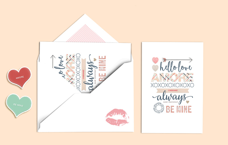
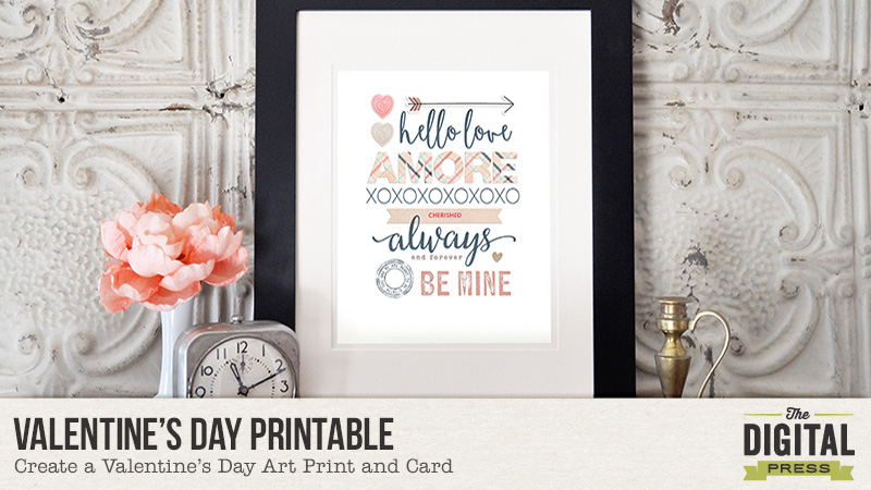
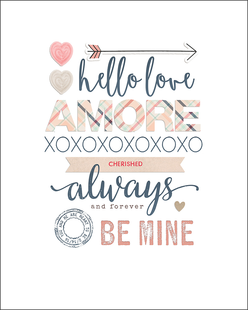
I am a hopeless romantic, and just love Valentine’s Day. Today, I am here to show you how to create a simple Valentine’s Day printable using word art and digital elements from The Digital Press. You can print and frame for a piece of artwork… or make a card to send to a loved one.


Valentine's Day Printable

Step 1. Gather a collection of Digital Supplies that includes any word art and elements you would like to use. For my printable, I used l’Amore by Little Lamm & Co., Be Mine by Mari Koegelenberg & Danielle Engebretson, and the TDP mini kit Cherished.

Step 2. Create a new 8×10 canvas in your photo-editing program (it should be 300dpi for print-resolution). Place your words on your layout until you have them arranged in the desired position.

Step 3. You can add color to some of the words, or clip digital papers to items you’ve chosen. You can even add drop shadows to a few of your words to add dimension.

Step 4. If desired, add a few digital elements to embellish your word art (you can see that mine uses hearts, arrows, etc.).

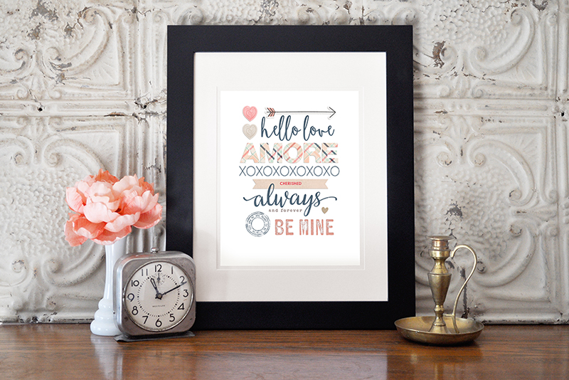
Step 5. Print it out onto paper and frame at 8×10 to show off your new lovely artwork.

Valentine’s Day Printable

Step 6. If you would also like to create a greeting card using your printable, simply re-size it to 5×7 and then print, seal with a kiss, and send to your loved one.

Valentine’s Day Printable


Cute, isn’t it? And so easy!

Hopefully this tutorial helps you think of ideas for repurposing your digital products and creating your own home printables and cards.


LindyKrickbaum

About the Author  Lindy Krickbaum is a member of the creative team at the Digital Press. She is a happily-married wife, and best friend to her twin sister. She currently lives in Johnson City, Tennessee in the United States. Lindy is a self-admitted scrap-a-holic, rarely missing a day to scrap. She also enjoys designing jewelry, reading, and traveling every chance she gets.