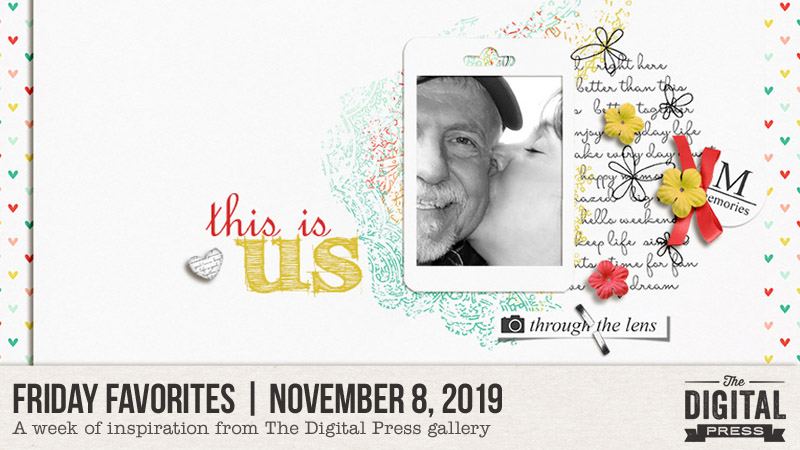
Happy Fall, and welcome to another edition of our Friday Favorites series on The Digital Press blog! I’m excited to share some of my favorite creative inspiration, found in the gallery from our awesome community members here at TDP!
Here’s a look at a few of the newest layouts I love from The Digital Press gallery this past month (they’re linked up to the original posts in the TDP gallery, so you can click through and leave them some LOVE!)…
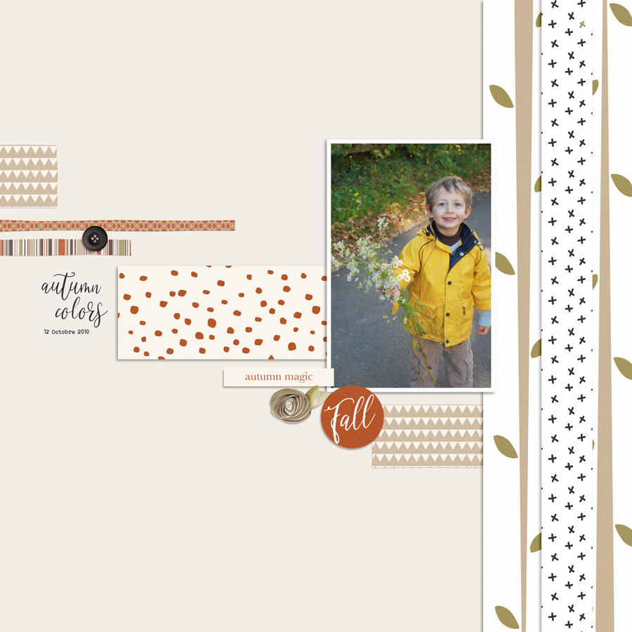
First up is this fun fall page by Anne PC. I love the way the paper strips diagonally draw the eye across the page to the photo with additional pattern papers used to create a border along the right hand side of the page to ground the photo and frame out the lovely page.
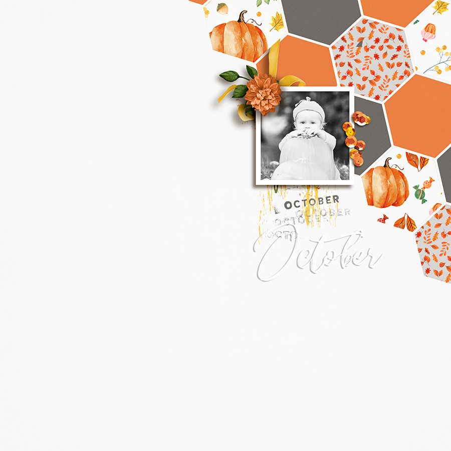
Next, I’ve picked out an impressive page by sucali. Another great page with wonderful use of pattern papers. I especially like the hexagonal shapes and use of minimal accents to complete this layout.
My next selection is a super sweet layout by TDP designer Shannel Tamara (of Gone Digital Design). Who can resist that gorgeous cluster work? As for me, I can not resist a well-designed page with lots of fabulous elements layered in a way to draw attention to the photo.
I also want to share some “oldies-but-goodies” from the gallery, as well. Here are a few throwback layouts I found in the gallery, to feast your eyes upon…
First up… I just love the clean look of this layout by sylvia. I have soooo many of her pages bookmarked into my gallery favorites. This page displays the visual triangle principle that I often use. First there is the cluster of three little flowers in the bottom left corner and then there is another larger triangle created by thee berry flair at the corner of the photo, the pink flower toward the mid-right of the page and the little blue flower flowing off the top of the page. Lovely composition!
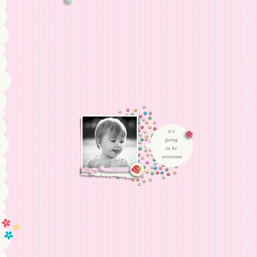
Next… check out this fantastic page by blackkathy. There are so many things that draw me to this page. I love the placement and stacking of the background papers. Naturally, I love the white space! AND… Do you see the visual triangle created with the flowers in the lower right hand corner. Yep, I can totally see myself scraplifting this beauty!
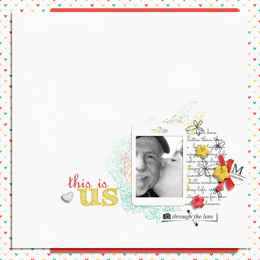
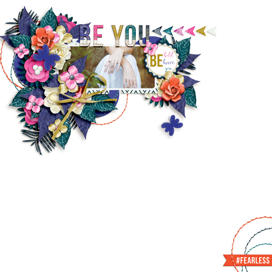
And last but not least… is this gorgeous page by chili. First of all – those clusters are simply amazing, and yep, I love the white space! Yet another great design principle of balance by offsetting the page with a few embellishments to the opposite corner and repetition of the circular stitching used in the cluster and the bottom corner too.
It’s a little addicting to browse through all of the wonderful inspiration that can be found in the gallery here at The Digital Press. When I feel stuck and need a creative boost, browsing the gallery can always get my creativity flowing again!
Be sure to check out the gallery, and then head over to the shop to check out this weekend’s newest product releases so you can grab some new digital supplies and then post your resulting projects in the gallery! We love seeing what you create with The Digital Press goodies, and you might be featured in a future edition of this Friday Favorites series here on the blog in the future, too!
![]() About the Author Tiffany is a creative team member at The Digital Press and has been scrapping for over 25 years. She resides with her family in Idaho, but dreams of warmer climates. Family will likely keep her in Idaho, so vacations will have to do. Her scrapbook subjects include her husband, four children, one grandson and two dogs – as well as whoever and whatever will stay put for the snap of the camera. Other things that keep her busy include teaching fitness classes at the gym and working as a hospice/home health nurse.
About the Author Tiffany is a creative team member at The Digital Press and has been scrapping for over 25 years. She resides with her family in Idaho, but dreams of warmer climates. Family will likely keep her in Idaho, so vacations will have to do. Her scrapbook subjects include her husband, four children, one grandson and two dogs – as well as whoever and whatever will stay put for the snap of the camera. Other things that keep her busy include teaching fitness classes at the gym and working as a hospice/home health nurse.

