There is something special about a sparsely embellished page with a large amount of white space. The photos take the leading role and the elements support the photocentric expression. I want to challenge you to take a closer look at some minimalistic pages from our Creative Team, to get inspired for your own creations!
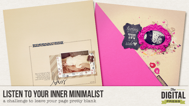
Does scrapping with lots of white space and only tiny picked elements come easy for you? For me this is foreign. I’m a little afraid of too much white space and I have to get the ellies on my page and make a mess. I feel so insecure with a close to blank page. And that is although I love a bold minimalistic spread! There are quite a few girls on the TDP Creative Team who really know how to get the “half empty” pages to work. I will show you some examples:
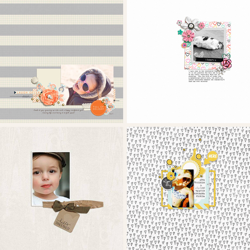
All of them have in common one tight cluster, a neutral colored background and only minimal embellishment. They all make a bold statement through their photos and embellishment placement. All of them promote a huge white space, even though the layouts by Jude and Sokee are using a strong pattern base. Farrah’s gallery is full of minimalistic pages and this one stood out because it was using only 3 further elements added to the photo and the background. Her tight photo crop adds to the striking impression.
The background doesn’t have to be a neutral at all. I found some colored background minimalist pages in the Creative Team gallery as well:
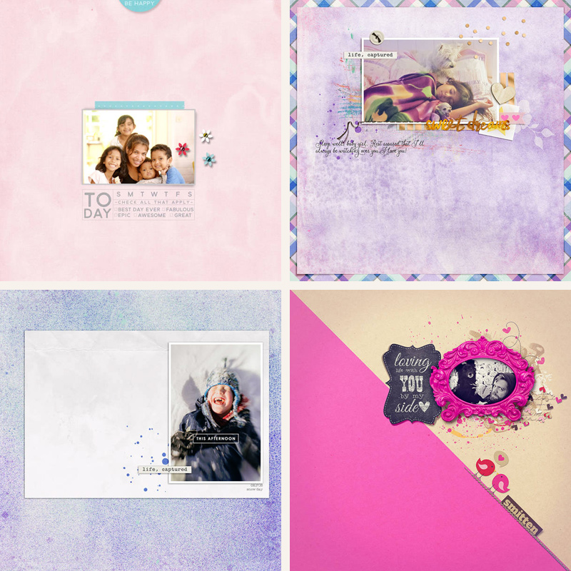
Yes, these are my favorite colors (who can resist purple and pink?). What’s to see here? Bao has expanded her cluster by using a tag wordart on the top of the page. It creates a certain tension when looking at her layout. Cynthia even gave her layout a rim. You can see that this loosens the minimalistic feel a little bit as the airy impression is “earthed” to the page’s edges. Molly used a large mat for her photo and close to no embellishments to let her photo shine. And Alina’s page (oops, that’s me) uses a two tiered paper as a background. For me this was an easy one because the white space was lifted a bit by the diagonal line and the contrasting colors.
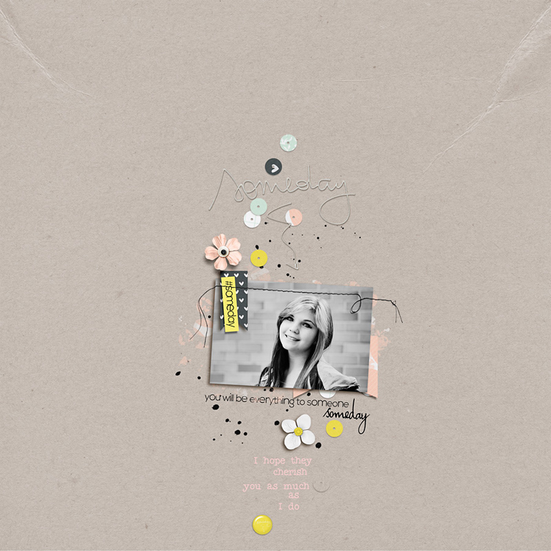
I want to show you one more. It’s a little different from the others, as it has close to no straight lines and the cluster is not tight but very loosened up, scattered and random. There is a certain lightheartedness following the arrangements of the elements. All accompanied by a pleasant smile and carefree and heartfelt wordart.
In preparation for this challenge I set up some rules for myself and had to try to make it work for me. If I can do it, you can do it, too! It took me as long as I usually tweak on my “everything on one page mess” layouts. It’s not faster per sé. I also realized that to make it look okay for me, I have to scale my cluster down a lot.
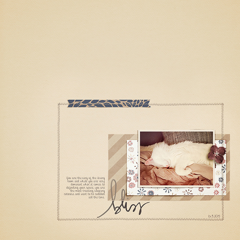
Are you prepared to listen to your inner minimalist? I’m sure it’s now whispering in your ear how your page could look, what elements you would use and which to leave. Listen closely, your inner minimalist doesn’t talk much. She keeps it short and simple 😉
You can find the challenge (click) in the forums. I’ll see you there. Have fun!
 About the Author: Alina enjoys sitting in front of her large computer screens too much. Apart from that she loves walking her dog and watching sunsets while being amazed of life in general. She is married to her best friend. Tries to manage the needs of her two cats and her dog and badly fails when they all want their cuddle time at once. Everything else is scrapping, taking photos and currently crafting. Having said that, she needs a bigger craft room.
