Hi! My name is Amie and I’m a font-aholic. That’ right folks- I’m admitting that I have a problem with downloading, sometimes even purchasing(!!!) and hoarding fonts. I just LOVE how fonts can totally change the feel of a layout! I like using fun fonts for my titles especially! And now folks- the newest version of Photoshop CC has the Glyphs Panel! TA-DA!!! Nothing like feeding my addiction huh!? SO- today I’m going to show you a few fun ways to JAZZ up your titles with fun fonts (even without the coolest new glyphs panel for PSE users & earlier versions of Photoshop.)
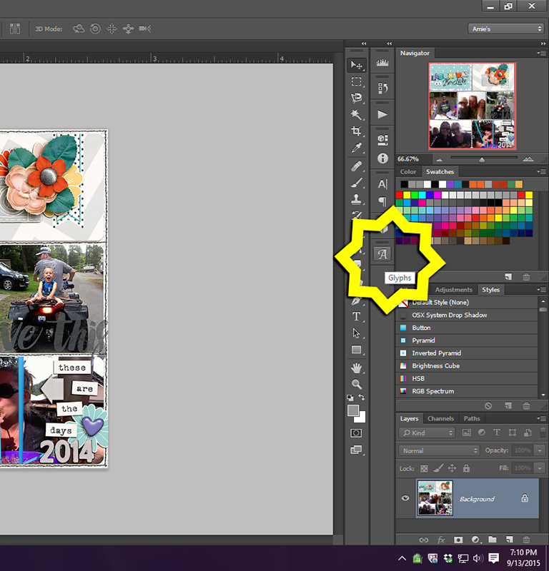
So in Photoshop CC- the Glyphs symbol is the little scripty A. I’ll walk you through how I chose my title on this particular layout.
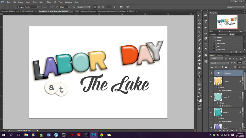
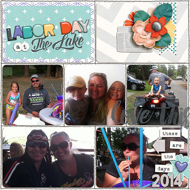
The font for “the lake” is called Everglow Regular (link)– which I just realized I purchased at some point. It’s my new favorite & with all the extras included- it’s an awesome one to have in your stash. AND it’s on sale right now… #enabler ANY HOW- The Lake is typed in the screenshot below ‘as is’ with no alternatives selected. It’s nice- but it can be SO much better!
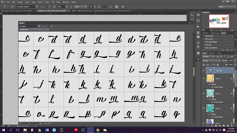
When you open the glyphs panel- you can chose your font & then some other options- you can resize the font as well as the little view boxes of each character. You can also resize the panel- as I did for this screenshot to show you how AWESOME this font is! Just look at all that fontly goodness!
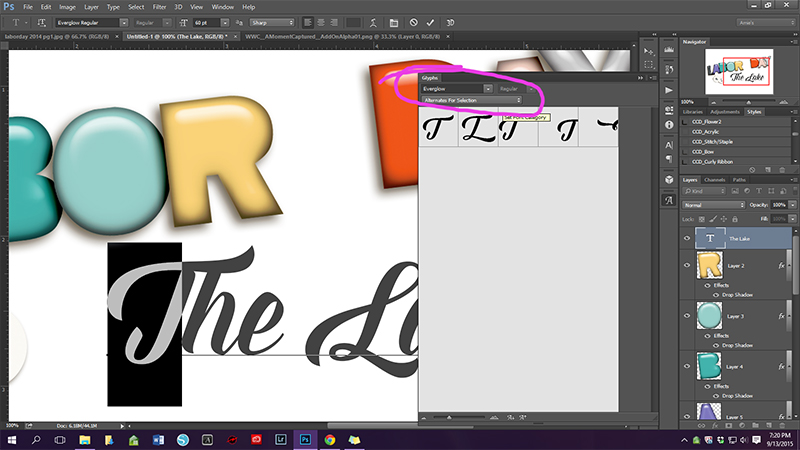
My favorite feature of the glyphs panel is the “alternates for selection” drop down menu. This basically shows you the options for the particular character selected. In the case of creating titles- it’s awesome & much faster than scrolling through the entire font plus all the alternatives. For the capital T in Everglow Regular- there are 5 alternatives. You just double click the one you want & voila! Super cool title coming right up!
I continued through my title & my final result is pictured in my layout below- I LOVE LOVE LOVE that ‘h’ in The and the extended part of the letter ‘k’ in Lake is super fun too! I also changed one of the e’s so they looked different. (all layouts linked to gallery for credits)
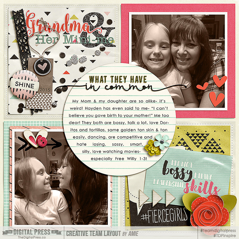
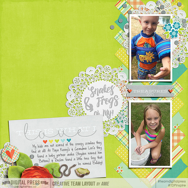
For this layout’s title- Grandma has an alternate ‘a’. Super fun & with the sticker style- it almost looks like a piece of word art! FONT is Florabella (link) (not free- but on sale!!??)
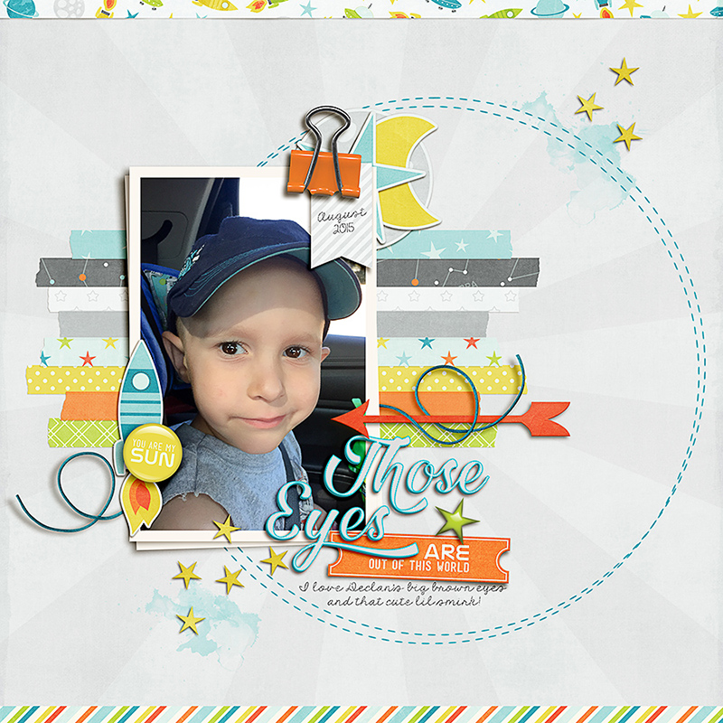
For the title on this layout- I used a lot of alternatives so that all the s’s were different. Font is Amelian Script (link) again- I have a serious addiction. I’ll get to some free ones- you’re almost there!
Last but not least- this font is Hilda Regular (link) (sorry again- but it’s not too expensive!!??) After I was happy with my alternatives (the h & the y) I applied a few styles to make the title pop even more!
Okay- now for the really good stuff! There are gobzillions of awesome free fonts out there so please don’t think I work on the side for the site I kept linking you to… I just happened to use those on these layouts, but honestly, I use plenty of free ones too! This list is just a few that I KNOW have some Glyphs, but are equally awesome as they are or in combination:
(linked)
Krinkes (PSE or earlier versions of photoshop: use the numbers to add the swashes)
Sverige Script (PSE or earlier versions of Photoshop: use the two fonts in combinations to add stylistic alternatives)
Great Vibes (Another favorite of mine!)
Blenda Script (I use this one A LOT!)
For the CC users- BUST out that glyphs panel & do some magic! For the PSE & earlier version of photoshop- I hope you were inspired at least to try some new fonts out & make some super fun titles! Please visit my challenge over in the forums HERE & show me all those lovely layouts!
 About the Author: Amie is a craft loving, dental hygienist in WA state who loves her husband, two kids (ages 7 & 4), English Bulldog, coffee, baking cupcakes, daffodils, glitter & sprinkles, reading a good book and lip gloss- not necessarily in that order.
I *LOVE* this! I may need to switch over to CC…