It’s Tutorial Tuesday and I’m happy to bring you something, that I just figured out to do myself (insert big smile here). Tucking in the photos into the paper. It’s like you make a cut into the paper and insert your photo’s corner. Only without real scissors, paper or photos of course.
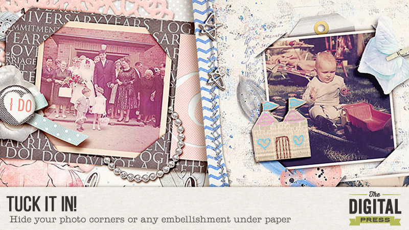
My first layout with this technique took me a while. I tried and failed many times. Ctrl-z was my best friend. I found it super complicated but now that I recreated it for you, it’s not too fiddly. I made it into tiny steps and hopefully easy to follow. I also tried to make it PSE friendly. For all the other software girls… you can do this too! I just don’t know how (insert giggle here)! I’m sure you will be able to recreate this with your software.
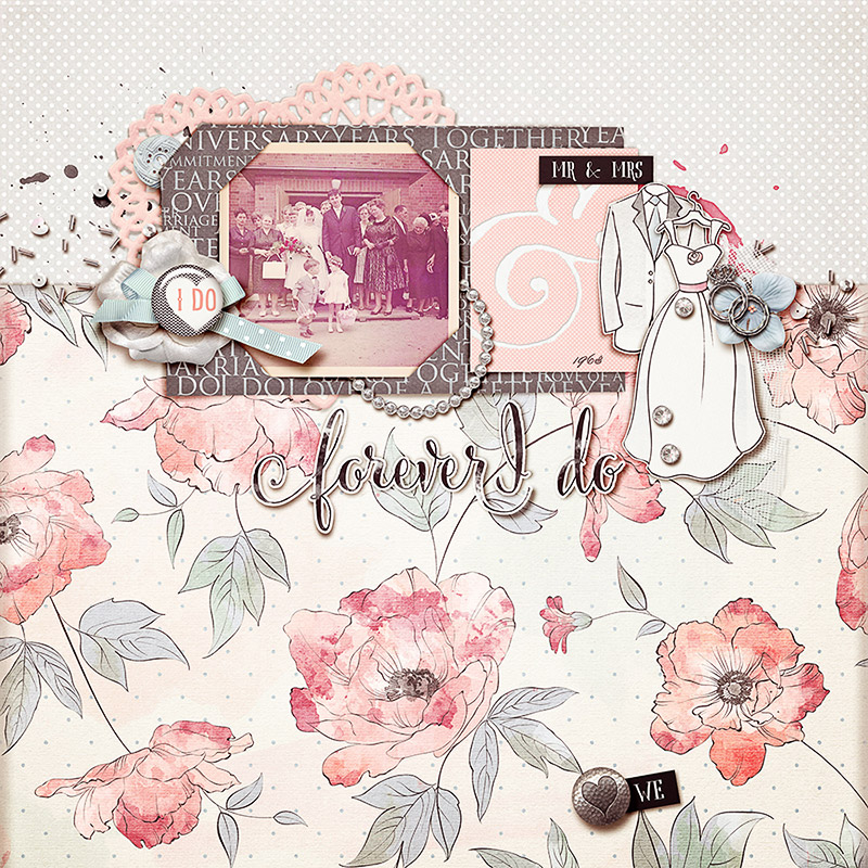
So here is my first layout with this technique:
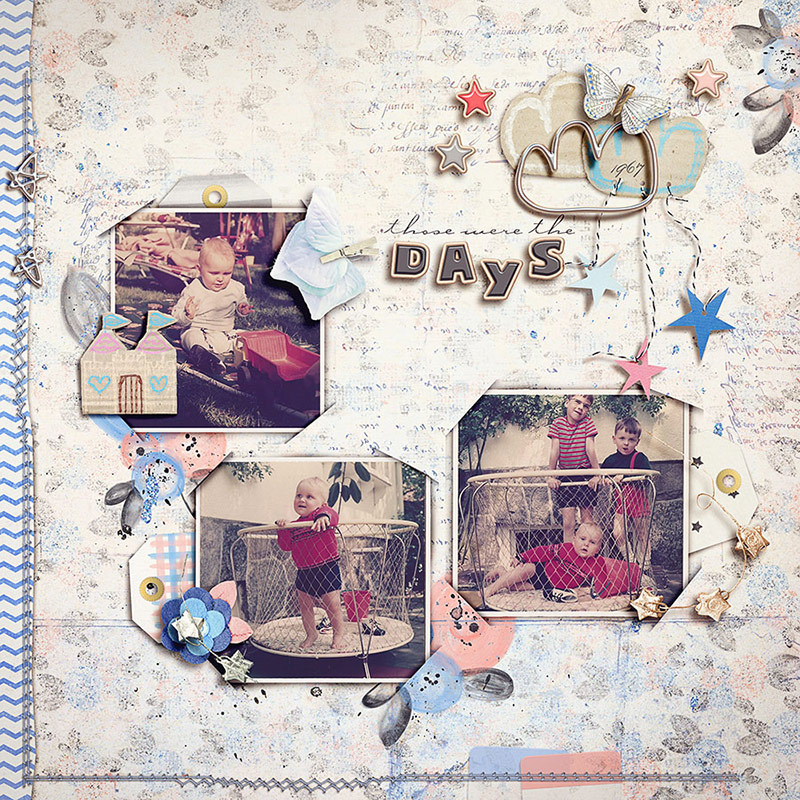
Want to have a try? Here we go:
- Choose a photo or a frame that you want to use. When you use a frame, put a clipping mask for the photo under the frame for later use. Link the frame and the mask together.
- Increase the size of your canvas to 130% (Image → Canvas Size → choose „percent“ from the dropdown menu and 130% on width and height). You should now see the checkered background around your photo. If this is not the case, go one step back (ctrl/cmd+z) and double click on the layer name in the layers panel, click „ok“ and repeat the canvas resize. For better visibility of shadows put a paper layer under the photo. The paper will not be part of the tucked in corners later.
- Create a shadow for your photo (on a separate layer)
For PS users: create a drop shadow for the photo and put it on a separate layer (right click on the fx icon of the layer → create layer)
For PSE users: ctrl/cmd+click on the layer icon to get the marching ants around the photo → Select → Modify → Feather → 10px. Create a new layer beneath the photo and fill the selection with a dark gray, brown or simply black. Deselect the selection with ctrl/cmd+d. Nudge the shadow to the side where you need it. In my example I left it pretty much where it was. For a deeper shadow simply copy the shadow layer (ctrl/cmd+j) and maybe decrease opacity of the upper shadow layer when needed. Link the photo, frame, clipping mask and shadow together.
It should now look something like this:
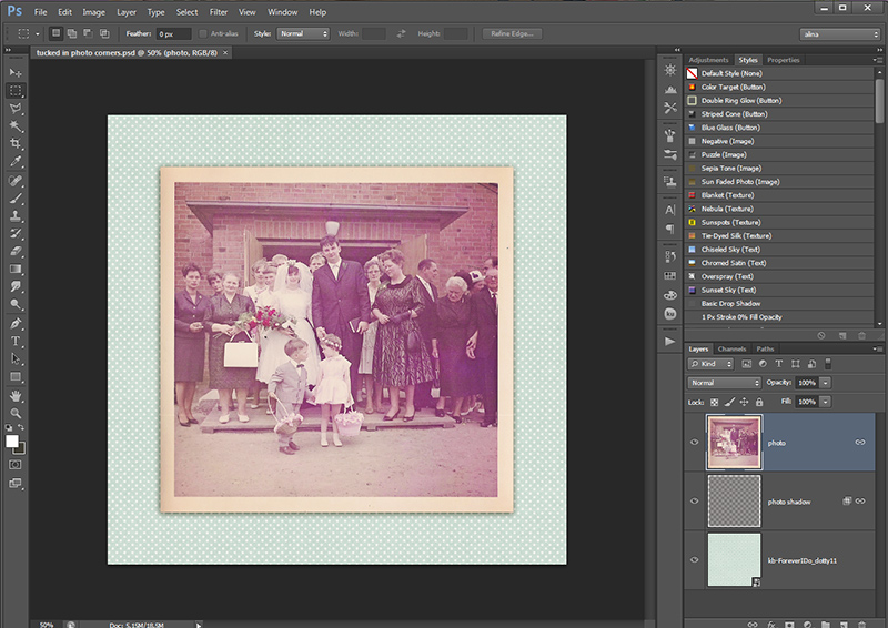
- Create a new layer above the photo and draw a triangle. You can use any method you like. I always use the polygonal lasso tool and fill the selection with a color. The triangle will later be invisible. Make the triangle so, that you cover one corner of the photo like a photocorner would (see picture). Make it so big, that you can’t see the shadow of the photo but not too big that it gets to the edge of the canvas.
- Create a shadow for the triangle (see also 3.)
For PS users: create a drop shadow and put it on a separate layer
For PSE users: Create a new layer beneath the triangle, ctrl/cmd+click on the triangle layer icon, feather the selection with 10px, fill the layer beneath the triangle with a dark color, deselect. - Nudge your shadow slightly to the middle of the photo. Link triangle and shadow together.
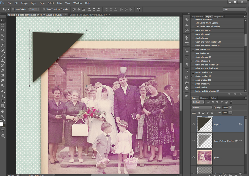
- Ctrl/cmd+click on the triangle layer icon to make a selection. Turn off visibility of the triangle.
- Delete the selection of the triangle on every layer (except for the paper and the triangle layer itself). Deselect the triangle (ctrl/cmd+d).
- Now you will still have some shadow of the triangle left where it doesn’t belong. Use your eraser with a brush size that is about half as wide as your triangle at 30% hardness 100% opacity and carefully erase the shadows that are parallel to the edges of the photo and a little of the ends of the „cuts“, so that the illusion of the cut ends is given (see photo).
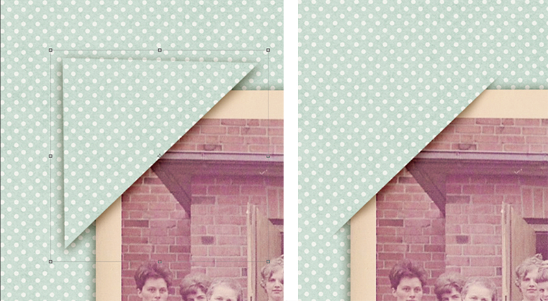
- Now it should look like one corner is tucked into the paper. If you want this on every corner of the photo you just have to copy the triangle and the shadow, turn it around and place it over the next corner, ctrl/cmd+click on the triangle layer icon and delete the triangle from the photo and the photo shadow (and the frame and photo mat if you have them).
- Save your ps or pse file for later use as a tucked in template.
- For use in your layout just drag the photo (with its shadow) and the corner shadows on your layout and link them together. You can now move everything around to your liking.
Tipps and Tricks:
- For your next tucked in photo just use your cut corner template.
- Always remember to first shadow your photo on a separate layer.
- Use your single corners for any size/edge relation of photo.
- You could also do this directly on your layout. I only wanted to show you the technique as simplyfied as I could.
- Instead of deleting the triangle from the layers, you can of course also apply a layer mask to the items and fill the mask with black after the selection of the triangle to make this technique non-destructive to the photo or frame.
- You can also make horizontal or diagonal cuts with this technique to tuck in a whole edge of your item
- Not only photos can be tucked in. Paper shapes, envelopes, flowers…
Enough said, you can do it! If any questions appear, feel free to ask in the comments! Have fun!
 About the Author: Alina enjoys sitting in front of her large computer screens too much. Apart from that she loves walking her dog and watching sunsets while being amazed of life in general. She is married to her best friend. Tries to manage the needs of her two cats and her dog and badly fails when they all want their cuddle time at once. Everything else is scrapping, taking photos and currently crafting. Having said that, she needs a bigger craft room.

Oh, it’s so easy!! Thank you, Alina!!
Yes, it indeed is! Took a moment to wrap my head around it and of course there are lots of different ways you can do it but it’s easy!
it sounds do-able!! thank you 🙂
You gotta try, it’s really fun and gives some variety to the pages 🙂
Oh my gosh. What a great tutorial!
I have done tucked in corners before, but yours is just a little different. I never thought of making a “tucked in” template. Great idea!!!
Oh, thank you, Barbara! I saw this on a layout and thought I’d give it a try. Now you reminded me, that I could use it again 😀 will try to remember that on my coming layouts 😉
Thank you for the step-by-step tutorial & for including PSE instructions. I am still learning how to use PSE, so some of this sounds a little complicated … but I’m going to give it a try. That’s such a neat look! Thanks!
Reading it might sound complicated. And using PSE it takes some more steps. I’m still sure that after some trial and error, you will be able to recreate it. Just let me know when you get stuck, I can help you out! 🙂