Hi there, scrappers!
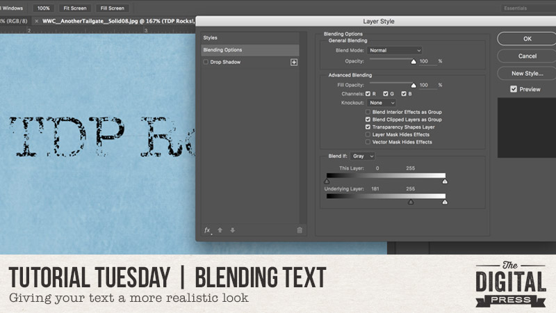
My tutorial for you today is all about making your text look more realistic. When you write or type on real paper, what you see is a mixture of the ink and the texture and material of the paper. But, when we add a type layer on top of a digital paper, we don’t automatically get the same result. I’ll show you a couple quick steps that you can follow in order to make digital text look more like it is written on the paper instead of floating on top.
- First, type your text as you would like it to appear on your layout
- Right click on your type layer and choose Blending Options (or, you can also click the little ‘fx’ button at the bottom of your layer palette)
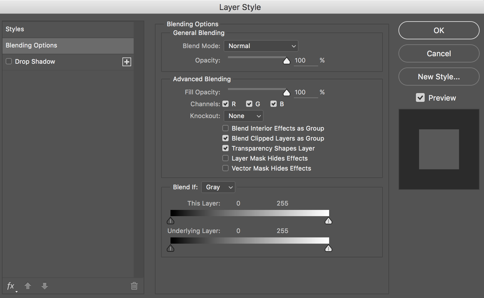
- When the Layer Style menu opens up, you will see two sliders. You want the bottom one, Underlying Layer
- Grab the left side of the bar and drag it to the right until the text starts to disappear
- Hold down the Option key and click on the little carrot you just dragged to the right so that it splits into two little arrows
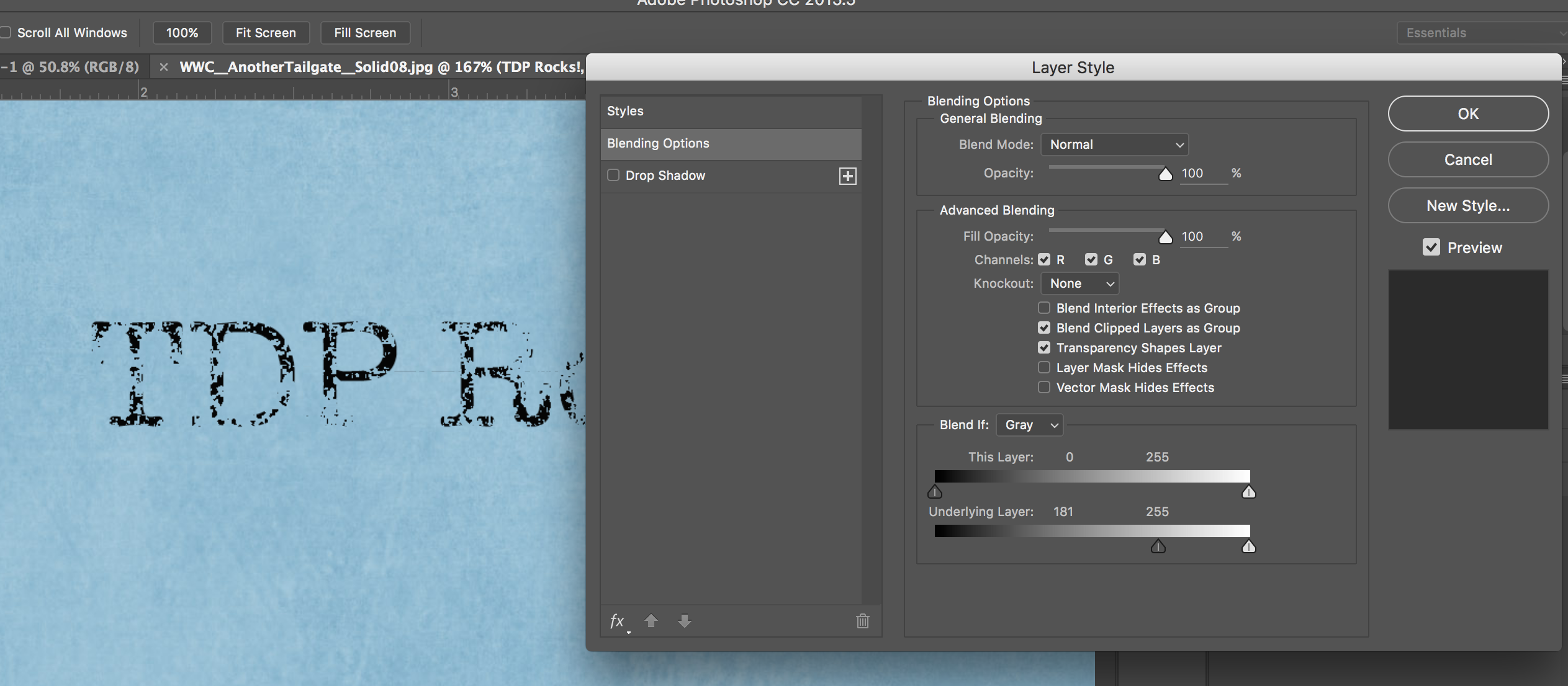
- Drag the left of the two new arrows to the left until you like the way the text looks
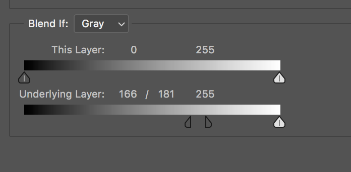
- Tweak it as much as you like until your text looks just right!
Here is a look at the original text… and the blended text… so you can see the difference!


Isn’t that great? I hope you’ll give this technique a try. I find that it really gives that extra realistic look to my digital layouts.
![]() About the Author Katie is a member of the creative team here at The Digital Press. She lives in Central Florida with her husband and their four sweet but crazy boys. When she’s not dodging Nerf bullets or trying to dig out from under the never-ending pile of laundry, she enjoys photography, cooking, going to Disney World with her family, and, of course, digital scrapbooking.
About the Author Katie is a member of the creative team here at The Digital Press. She lives in Central Florida with her husband and their four sweet but crazy boys. When she’s not dodging Nerf bullets or trying to dig out from under the never-ending pile of laundry, she enjoys photography, cooking, going to Disney World with her family, and, of course, digital scrapbooking.

What a great tip!!! Thank you for sharing the directions.
Neat trick! But it does not work on a new file with a plain white background. I guess it has to blend on top of a filled background.