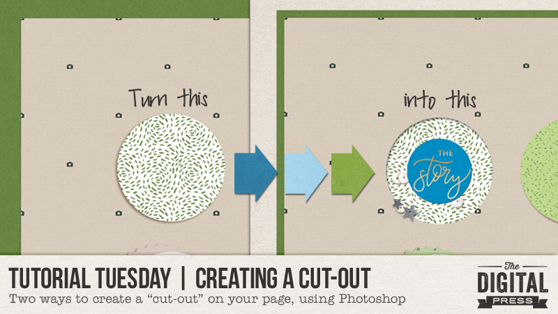
Hello, and welcome to another edition of our Tutorial Tuesday series on The Digital Press blog!
I have recently been playing with cut-out shapes on my digital pages, and I’ve really been enjoying the new layer of depth it can add to the pages. There are two different ways to create a “cut-out” look… and I will talk you through them each today!
For the purposes of this tutorial, I am using Photoshop CS5.1 — but the process should be similar for many other versions of Photoshop, as well.
METHOD #1
The first method works if you already have a journal card or shape on your page that you want to make appear as though it’s been cut out. For example, I used a template from Sahin Designs that uses a lot of circles (see below), and I wanted to make some of them appear to be cut out, rather than having all of them layered on top of the background paper.
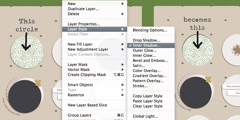
So, looking at the top-left circle, I (a) clipped my paper to the circle, and then (b) with the circle layer (NOT my clipped paper layer) selected, I used the “Inner Shadow” (rather than the “Drop Shadow”) from the shadow menu. You can find this option by going to your menu and selecting LAYER –> LAYER STYLE –> INNER SHADOW.
After you’ve changed the shadow to an “Inner Shadow,” all you have to do is adjust the depth, angle, and size of the shadow as you wish.
*NOTE* If your shape already has a shadow applied, like this particular circle on my template did, then you will need to de-select that shadow style before you select the new inner shadow. I am sure you knew that already, but it is possible I forgot to do that once or twice, and ended up with something that looked a little odd!
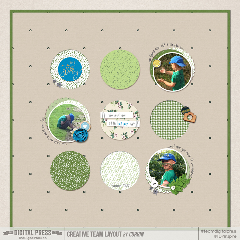
Then I repeated that same shadow style on a few other circles (one on each row), and here is the end result… 🙂
METHOD #2
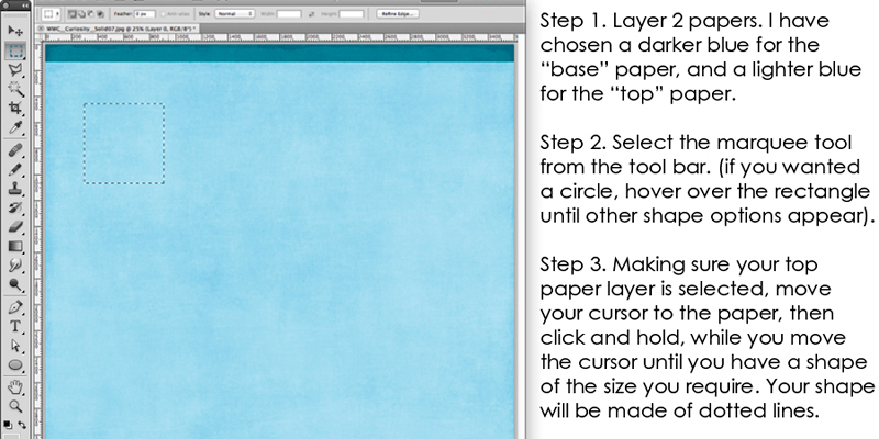
The second method will actually cut a hole out of your backgound paper, but it is also very simple to do.
Here are a couple of screenshots of my process, along with the steps I used listed along the right-hand side…
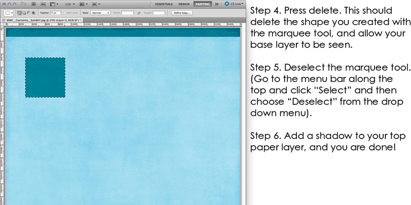
See how easy? And it’s such a fun effect, that adds some variation to a digital page!
I hope you will find these easy tips to follow, and that you will have fun creating cut outs on your pages too!
 About the Author Corrin is a member of the creative team here at The Digital Press. She is a fan of the Big Bang Theory and a lover of cozy pajamas. She lives in the breezy South of England with her husband and 4 crazy kids, who regularly discover & plunder her secret chocolate stashes! She is still trying to get the house straight after moving 3 years ago. Who knows… maybe this will be the year she reaches the bottom of the laundry pile!
