Hello everyone, and welcome to another edition of our Tutorial Tuesday series here on The Digital Press blog! Today we are going to talk about scrapbooking ‘Then and Now’ pages. I have used this technique many times in the past… but was recently prompted to think about it again when my teenage step-daughter posted a stunning selfie on Instagram. I just stared at this beautiful young lady, and I couldn’t stop thinking about the cute little girl that walked into my life ten years ago. In that moment, I knew I had to create a layout comparing and contrasting the past and present.
There are several approaches to creating a ‘Then and Now’-themed layout, but I want to start with a few tips…
- Make Your Comparison Clear — When creating a layout that compares and contrasts, it’s important that the viewer clearly understands what is being compared. For example, scrapping your photos at a distinctly different size can immediately convey that there is a comparison being made. If you would rather keep the photos the same size, it helps to make sure the subject in the frame is also the same size. You could use one black and white photo, and one colored. Finally, you can clearly split your layout into two distinct sections to show the comparison.
- Embrace Your Photos — When using a technique such as this, you may hesitate to use older photos that may not be the best quality. Use them! The quality doesn’t matter as much as the connection you are making, and the memory you are documenting.
- Be Open-Minded About the Scope — The photos you are using do not have to be years apart. It could be that the photos are only weeks apart (or even yesterday/today — think: kids getting braces off their teeth, etc.)… but as long as the story is clear, the comparison can be easily made.
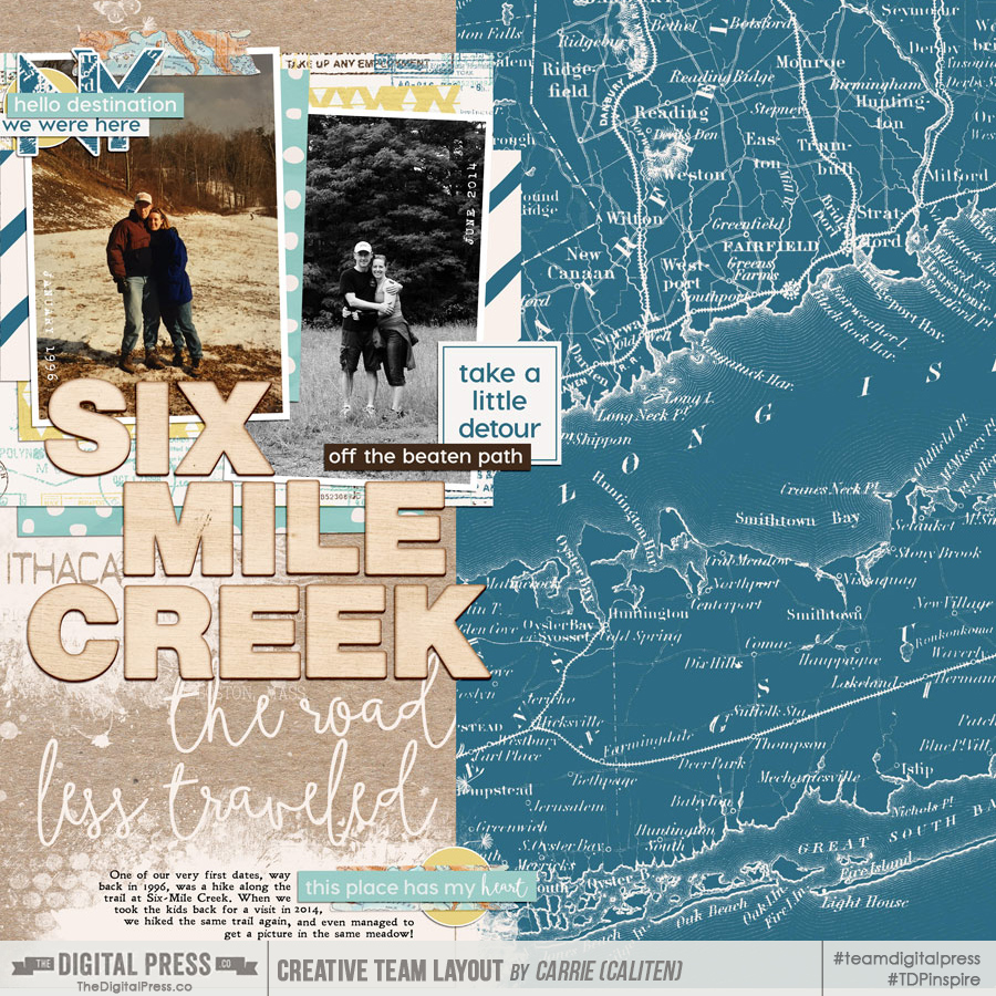
To begin giving you some examples and eye candy… we’ll begin with one of The Digital Press’s talented creative team members, Carrie, who created this lovely layout that clearly conveys the comparison of two people in the same spot, many years apart. She did this by using a colored photo and a black and white photo… keeping the subjects the same size… and using journaling to tell her story. Take a look…
[ credits: Wanderlust Collection by Little Lamm Paper Co. and Then and Now | Photo Masks by Anita Designs ]
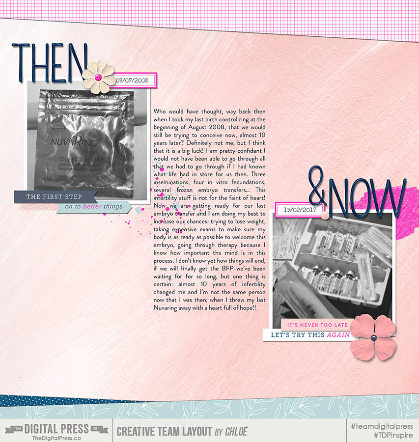
This next layout, created by TDP creative team member Chloe, uses both photos and journaling to show the connection between her ‘Then and Now’ comparison. This is a beautiful layout that clearly shows the journey that she has been on. In this instance, the journaling tells her story, and the photos show the time gap…
[ credits: Fresh Starts Papers and Elements by k. becca and Straight Up Alpha by Dawn by Design ]
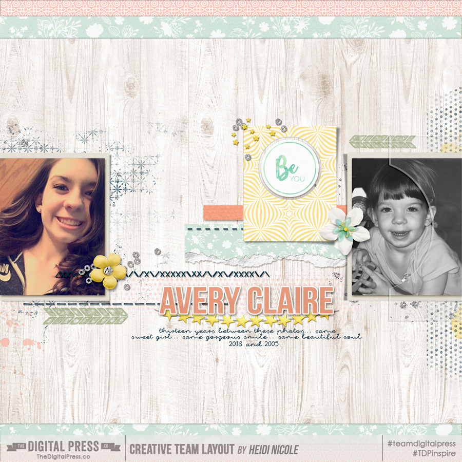
Finally, here’s a look at my own layout — based on the comparison and memory I described up above, about my step-daughter Avery and a look at her present-day self as compared to the little girl I first met a decade ago…
[ credits: Quick Scraps Vol. 09 Templates and Shine by Anita Designs ]
Now that you’ve seen a few visual examples and have (hopefully!) been inspired to create a page like this of your own… I wanted to share a few ideas about approaches you can take when documenting these types of comparison memories.
Focus on current changes — This approach would be used when comparing, for example, the first day and last day of a school year. It’s best used when there hasn’t been a lot of time that has passed between photos. It’s contrasting your child, loved one, or pet when there hasn’t been significant physical changes, but there has been maturing or changes that are unseen. You would definitely want journaling on your layout to tell the story, because in this approach, it’s often not as evident in the photos.
Focus on similarities or differences — This is a really fun approach, and to explain what I mean, I’m going to use an example. I would use this approach if I wanted to compare and contrast a photo of myself at the age of seventeen, to a photo of my child at the same age. Your journaling could talk about your likes and dislikes, or similarities and differences. You could have a lot of fun with this by displaying the differences in your music playlists, favorite foods, hobbies, and I could go on and on…
Focus on the journey — This approach is probably the most commonly used. I adapted this approach when creating this layout of Avery. There are many years between the photos, and it’s quite evident that I’m comparing the two. You can use journaling in this approach, but you could also forego the journaling, and just have the photos and a title. It’s all about the journey between the photos in this approach.
My hope is, after learning about the schools of thought surrounding this type of layout, and seeing it in action, you are inspired to try it out. It’s truly fun, and the possibilities are endless when it comes to topics. Start with surveying your photos… and I bet you will find a myriad of photos that are rich with possible connections between yesterday and today!
 About the Author Heidi Nicole is happily married to an amazing man, a step mama to 2 wonderful kiddos, and mama to 3 sweet and sassy furbabies. She’s a radiation therapist by day, and creator of pretty things by night (she’s pretty confident that she’s hit superhero status, but refuses to wear a cape). She loves cats and huskies, coffee, audio books, “Friends” reruns, St. Louis Blues hockey, cooking, baking, and traveling. Oh, and wine… she really likes wine. She lives a normal and happy life, and enjoys all the absolutely extraordinary people she gets to share it with on a daily basis!
