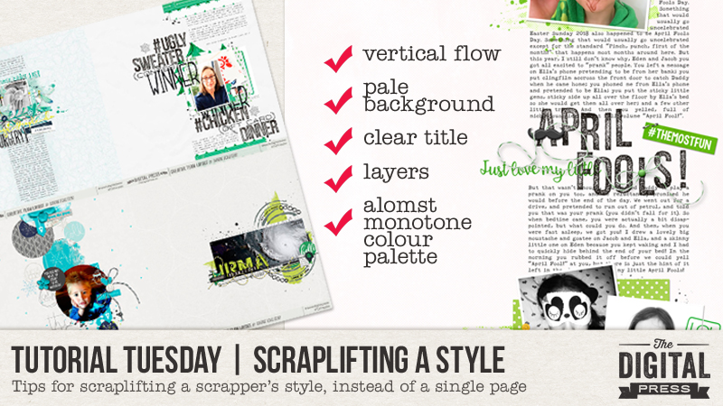
Hello, and welcome to another edition of our Tutorial Tuesday series here on The Digital Press blog! Today I’m here to share an easy (and fun!) way to find inspiration when you need a little creative kick to get you going!
You may already know what a scraplift is — and maybe you have even taken part in one or more of the scraplift challenges here at The Digital Press (?) — but just in case you aren’t yet familiar with the term… to scraplift is to copy the basics of the page design (or general feel) of another layout or scrapbook page, and then create a similar page of your own.
Today, however, I would like to suggest a bit of a different way to scraplift… by looking at another scrapper’s style, and scraplifting their general style, rather than one specific page.
To show you what I mean… let’s look at some pages by one of The Digital Press’s creative team members, Heidi Nicole. I went through her gallery here at TDP and chose four of my favorite pages, and then tried to look for some general style ideas by seeing what the pages all had in common.
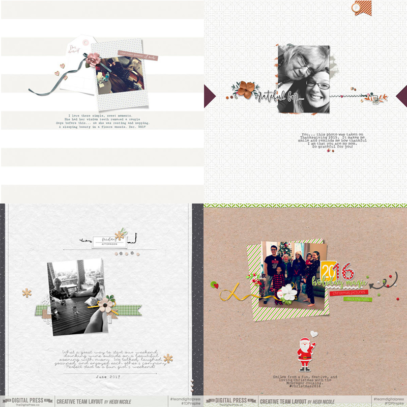
Here are some of the common features that I noticed:
- The background papers are just lightly patterened, and most of them are pale in color.
- Heidi Nicole often uses just 1 photo, which is placed roughly centrally on her page, but the photo is often tilted just a little.
- She tends to do something with the edges of the page (using paper strips, or just a little pennant flag, etc.).
- She likes to use curly string, doodles, or stitching to move your eye across the page.
- Although she may have repeated elements (beads, flowers, etc.), she tends to have one focal element (like a flower or a Santa), and small clusters of just 2 or 3 items.
So when I created a layout that scraplifted Heidi Nicole’s style, I used those style ideas — and here is how it turned out…
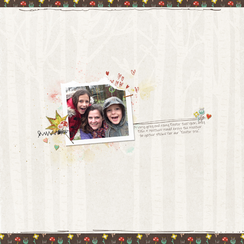
[ I used Finally Fall, the Orignal Torn Bits no3 and Borderlines no2 — all by creashens ]
After giving Heidi Nicole’s style a try… I decided to look at another of TDP’s creative team member’s galleries — caliten (Carrie) has a style I’d love to imitate, so I chose another four favorite pages to compare/contrast…
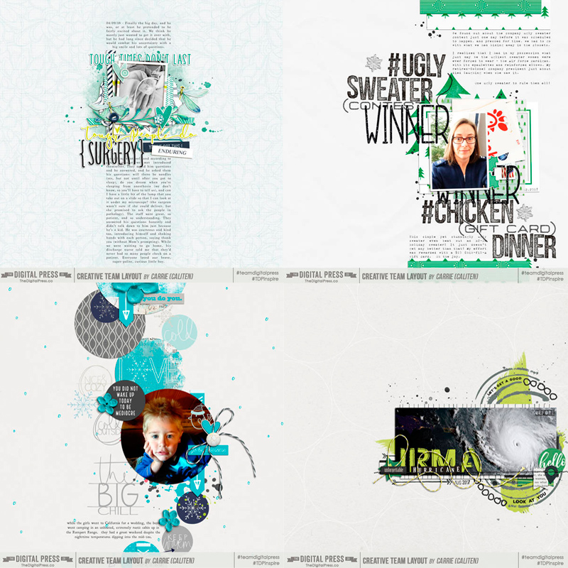
Here are some common style features I found on Carrie’s pages:
- She often uses minimal colors, so these examples use almost exclusively just 3 colors (black, white and one other color — green or blue, etc.).
- Layers! Carrie uses things such as stamps, paint, doodles, word art, mask, etc… as base layers.
- She has a clear title on each page, which she often uses more than one font/alpha/word art to create.
- There are several lines of journaling on most of her pages (and considerably more on half of these 4 pages!).
- I think most of these pages encourage you to look from the top to bottom (rather than from left to right or simply focusing on the center of the page).
- She usually chooses to journal in an easy-to-read, typewriter-style font.
So when scraplifting Carrie’s style, I made use of those style features — and here is the page I made…
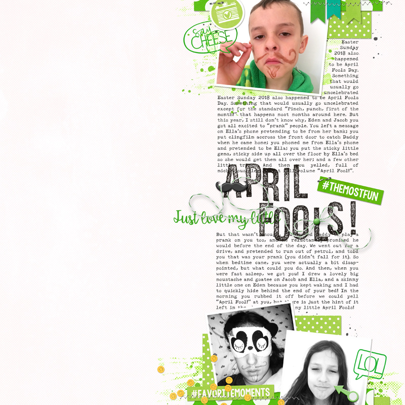
[ I used #Happy Things, Travelogue, and Project Twenty Sixteen – March all by Laura Passage + Speechies by Rachel Hodge and Sans Serif Stamped alpha by Dawn by Design ]
See how easy it is to gather inspiration by scraplifting the overall style of other scrapbookers you admire? And it’s fun, too!
I hope this idea might prove helpful to you… perhaps if you are lacking mojo and looking for a creative way to get going again (or maybe you have simply noticed a scrapper in the gallery whose pages you love… and you’d like to try scrapping a little more like that person)!
 About the Author Corrin is a member of the creative team here at The Digital Press. She is a fan of the Big Bang Theory and a lover of cozy pajamas or flip flops when the sun finally shines! She lives in the breezy South of England with her husband and 4 crazy kids, who regularly discover & plunder her secret chocolate stashes, and hopes that maybe this will be the year she reaches the bottom of the laundry pile!
